Browse 7,300+ ready-made Tailwind CSS components across 60 categories. Every variant is fully responsive – copy the code or customize it in the visual editor and export clean code.
 Tailwind CSS
Full Shuffle access forever for $249
Pay once, ship unlimited projects. No subscription, no renewals, all future updates included.
Get Lifetime AccessNew to Shuffle? Try our tools:

Create a free account to copy production-ready code from every component in the library.
Free account · No credit card · No password needed
Already have an account? Sign in
A dark-background section with a centered multi-line paragraph of body text and an outlined pill-shaped Read more button below it. Two decorative sparkle icons flank the text, one lime green on the left and one gray on the right.

Create a free account to copy production-ready code from every component in the library.
Free account · No credit card · No password needed
Already have an account? Sign in
A dark-themed "Our Team" section displaying six team members in a three-column grid, each with a circular portrait, role label, and name. The layout is centered with a small green eyebrow label above the heading, and no interactive controls are visible.


Create a free account to copy production-ready code from every component in the library.
Free account · No credit card · No password needed
Already have an account? Sign in
A split-screen newsletter signup section with a dark left panel containing a lime eyebrow label, large headline, supporting text, email input, and a lime Subscribe button. The right side displays a full-height lifestyle photograph of a person seated on steps.

Create a free account to copy production-ready code from every component in the library.
Free account · No credit card · No password needed
Already have an account? Sign in
A split-screen authentication page with a dark background. The left column contains a login heading, Google and Apple sign-in buttons, an email field, a lime Log in button, and a sign-up link; the right column shows an illustrative portfolio card and trusted-by brand logos.

Create a free account to copy production-ready code from every component in the library.
Free account · No credit card · No password needed
Already have an account? Sign in
A dark rounded modal dialog asking whether to save or discard unsaved changes, with a close icon, a bold heading, a supporting sentence, and Cancel and Confirm pill buttons. The lime-green Confirm button is the primary action.

Create a free account to copy production-ready code from every component in the library.
Free account · No credit card · No password needed
Already have an account? Sign in
A horizontal row of six grayscale company logos (Royal Bank of Scotland, a dot-grid logo, DRIFT, Seek, Deloitte, Wise) centered on a near-black background. It functions as a social proof or customer logo bar on a marketing page.

Create a free account to copy production-ready code from every component in the library.
Free account · No credit card · No password needed
Already have an account? Sign in
A dark horizontal banner titled Cookie Consent with explanatory text about cookie use and consent choices, a close icon at top right, a lime primary Accept All Cookies button, and an outlined Log in button. The text block sits on the left while actions are grouped on the right.

Create a free account to copy production-ready code from every component in the library.
Free account · No credit card · No password needed
Already have an account? Sign in
A horizontal dark navigation bar showing the Nightsable logo on the left, text links for Home, About us, Wallet, and Blog in the center-right, and an outlined pill-shaped Get in touch button on the right. A blue strip runs along the bottom edge.

Create a free account to copy production-ready code from every component in the library.
Free account · No credit card · No password needed
Already have an account? Sign in
A dark marketing section promoting the Nightsable app, featuring a tilted phone mockup showing a balance and crypto asset cards on the left, and a heading, short description, and App Store and Google Play download badges on the right. The lime-green eyebrow label and star accent add a single highlight against the dark background.

Create a free account to copy production-ready code from every component in the library.
Free account · No credit card · No password needed
Already have an account? Sign in
A dark split-screen sign-up component with a left column containing Google and Apple social sign-up buttons, an email field, and a lime Sign up button, plus a sign-in link. The right column shows an illustrative portfolio card and a "Trusted by" logo strip.

Create a free account to copy production-ready code from every component in the library.
Free account · No credit card · No password needed
Already have an account? Sign in
A dark-themed blog section with a centered eyebrow label and 'Blog' heading above a horizontal row of article cards, each showing a photo, title, excerpt, author avatar, name, and read time. Cards extend past the viewport edges, suggesting a horizontally scrolling carousel.
Create a free account to copy production-ready code from every component in the library.
Free account · No credit card · No password needed
Already have an account? Sign in
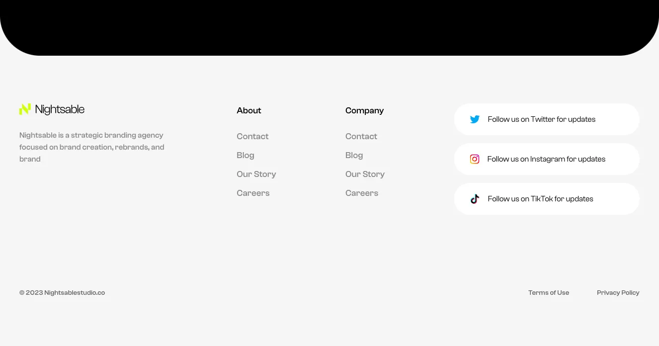
A light-background website footer for the Nightsable branding agency, showing a logo and tagline, About and Company link columns, three white pill-shaped social follow cards for Twitter, Instagram, and TikTok, and a copyright line with Terms of Use and Privacy Policy links at the bottom. The black rounded shape at the top is a separate section above the footer.

Create a free account to copy production-ready code from every component in the library.
Free account · No credit card · No password needed
Already have an account? Sign in
A centered dark contact card featuring a circular profile photo overlapping the top edge, a name heading, a date line, and phone and email contact rows with lime-green line icons. The rounded outlined container has a subtle glow at its bottom edge.

Create a free account to copy production-ready code from every component in the library.
Free account · No credit card · No password needed
Already have an account? Sign in
A horizontal row of three large white statistic figures ($1.5B+, 100+, 75%) on a near-black background, each with a small descriptive caption below and thin vertical dividers between them. It functions as a marketing social-proof section highlighting company scale.

Create a free account to copy production-ready code from every component in the library.
Free account · No credit card · No password needed
Already have an account? Sign in
A centered contact section on a near-black background with a small green eyebrow label, a large headline inviting partnership, a short descriptive paragraph, and a two-column form with name, email, company, and location fields. A full-width lime submit button and a small privacy notice appear below the form.

Create a free account to copy production-ready code from every component in the library.
Free account · No credit card · No password needed
Already have an account? Sign in
A dark testimonial section titled 'What people are saying' featuring a single customer quote from Wade Warren, CEO of GTIS Partners, beside a photo portrait. Previous and next circular arrow buttons sit at the lower right for navigating between testimonials.

Create a free account to copy production-ready code from every component in the library.
Free account · No credit card · No password needed
Already have an account? Sign in
A dark-themed pricing section titled "Compare our plans" with a monthly/annual billing switch and two side-by-side plan cards showing price per month, included features with checkmarks, and a lime "Start now" button. The layout is a centered heading followed by a two-column grid of plan cards.

Create a free account to copy production-ready code from every component in the library.
Free account · No credit card · No password needed
Already have an account? Sign in
A dark-themed team section with a small lime eyebrow label, large 'Our Team' heading, and a row of four circular portrait cards showing name and role. A lime circular next arrow button overlays the fourth card, indicating a horizontal carousel.

Create a free account to copy production-ready code from every component in the library.
Free account · No credit card · No password needed
Already have an account? Sign in
A dark-themed careers section titled "Open positions" with horizontal department filter tabs above a table listing position, department pill badges, commitment, and location. A lime-green full-width button below the table links to all positions.

Create a free account to copy production-ready code from every component in the library.
Free account · No credit card · No password needed
Already have an account? Sign in
A single-line notification with an exclamation icon and message asking the user to confirm their email address before viewing content. It uses a rounded gray pill container on a dark background, with light text and no visible action buttons.

Build websites faster with an AI Visual Editor


© 2026 Shuffle. All rights reserved.
See what you're getting before you commit.
Bring your designs to life with smooth, looping background videos. In the Multi-AI Designer, click "Add media" and create a video from your own image or one generated by AI, then mark where your text goes so it stays easy to read. Watch the video to see how it works.
Switch the editor to Grid and every page of your project appears side by side on one canvas. Arrange them freely, zoom in and out, and add as many new pages as you need in a few clicks.
Describe what you need in one chat and the Agent does the rest: it adds new sections, edits copy and styles, moves blocks around or removes them across your whole page. No modes, no switching, just tell it what to change.






















