<section class="wave-top wave-bottom bg-white">
  <div class="wave wave-top w-full text-coolGray-50">
    <svg viewbox="0 0 1440 116" fill="none" xmlns="http://www.w3.org/2000/svg">
      <path d="M1440 64.5909H1090.08C833.336 64.5909 580.229 -7.62939e-06 360 -7.62939e-06C139.771 -7.62939e-06 0 64.5909 0 64.5909V116H1440V64.5909Z" fill="currentColor"></path>
    </svg>
  </div>
  <div class="py-24 md:pb-32 bg-coolGray-50" style="background-image: url('flex-ui-assets/elements/pattern-light-big.svg'); background-position: center;">
    <div class="container px-4 mx-auto">
      <div class="md:max-w-4xl mb-12 mx-auto text-center">
        <span class="inline-block py-px px-2 mb-4 text-xs leading-5 text-green-500 bg-green-100 font-medium uppercase rounded-full shadow-sm">Features</span>
        <h1 class="mb-4 text-3xl md:text-4xl leading-tight font-bold tracking-tighter">Gain more insight into how people use your</h1>
        <p class="text-lg md:text-xl text-coolGray-500 font-medium">With our integrated CRM, project management, collaboration and invoicing capabilities, you can manage every aspect of your business in one secure platform.</p>
      </div>
      <div class="flex flex-wrap -mx-4">
        <div class="w-full md:w-1/2 lg:w-1/3 px-4">
          <div class="h-full p-8 text-center hover:bg-white rounded-md hover:shadow-xl transition duration-200">
            <div class="inline-flex h-16 w-16 mb-6 mx-auto items-center justify-center text-white bg-green-500 rounded-lg">
              <svg width="24" height="21" viewbox="0 0 24 21" fill="none" xmlns="http://www.w3.org/2000/svg">
                <path d="M17 18.63H5C4.20435 18.63 3.44129 18.3139 2.87868 17.7513C2.31607 17.1887 2 16.4257 2 15.63V7.63C2 7.36479 1.89464 7.11043 1.70711 6.9229C1.51957 6.73536 1.26522 6.63 1 6.63C0.734784 6.63 0.48043 6.73536 0.292893 6.9229C0.105357 7.11043 0 7.36479 0 7.63L0 15.63C0 16.9561 0.526784 18.2279 1.46447 19.1655C2.40215 20.1032 3.67392 20.63 5 20.63H17C17.2652 20.63 17.5196 20.5246 17.7071 20.3371C17.8946 20.1496 18 19.8952 18 19.63C18 19.3648 17.8946 19.1104 17.7071 18.9229C17.5196 18.7354 17.2652 18.63 17 18.63ZM21 0.630005H7C6.20435 0.630005 5.44129 0.946075 4.87868 1.50868C4.31607 2.07129 4 2.83436 4 3.63V13.63C4 14.4257 4.31607 15.1887 4.87868 15.7513C5.44129 16.3139 6.20435 16.63 7 16.63H21C21.7956 16.63 22.5587 16.3139 23.1213 15.7513C23.6839 15.1887 24 14.4257 24 13.63V3.63C24 2.83436 23.6839 2.07129 23.1213 1.50868C22.5587 0.946075 21.7956 0.630005 21 0.630005ZM20.59 2.63L14.71 8.51C14.617 8.60373 14.5064 8.67813 14.3846 8.7289C14.2627 8.77966 14.132 8.8058 14 8.8058C13.868 8.8058 13.7373 8.77966 13.6154 8.7289C13.4936 8.67813 13.383 8.60373 13.29 8.51L7.41 2.63H20.59ZM22 13.63C22 13.8952 21.8946 14.1496 21.7071 14.3371C21.5196 14.5246 21.2652 14.63 21 14.63H7C6.73478 14.63 6.48043 14.5246 6.29289 14.3371C6.10536 14.1496 6 13.8952 6 13.63V4L11.88 9.88C12.4425 10.4418 13.205 10.7574 14 10.7574C14.795 10.7574 15.5575 10.4418 16.12 9.88L22 4V13.63Z" fill="currentColor"></path>
              </svg>
            </div>
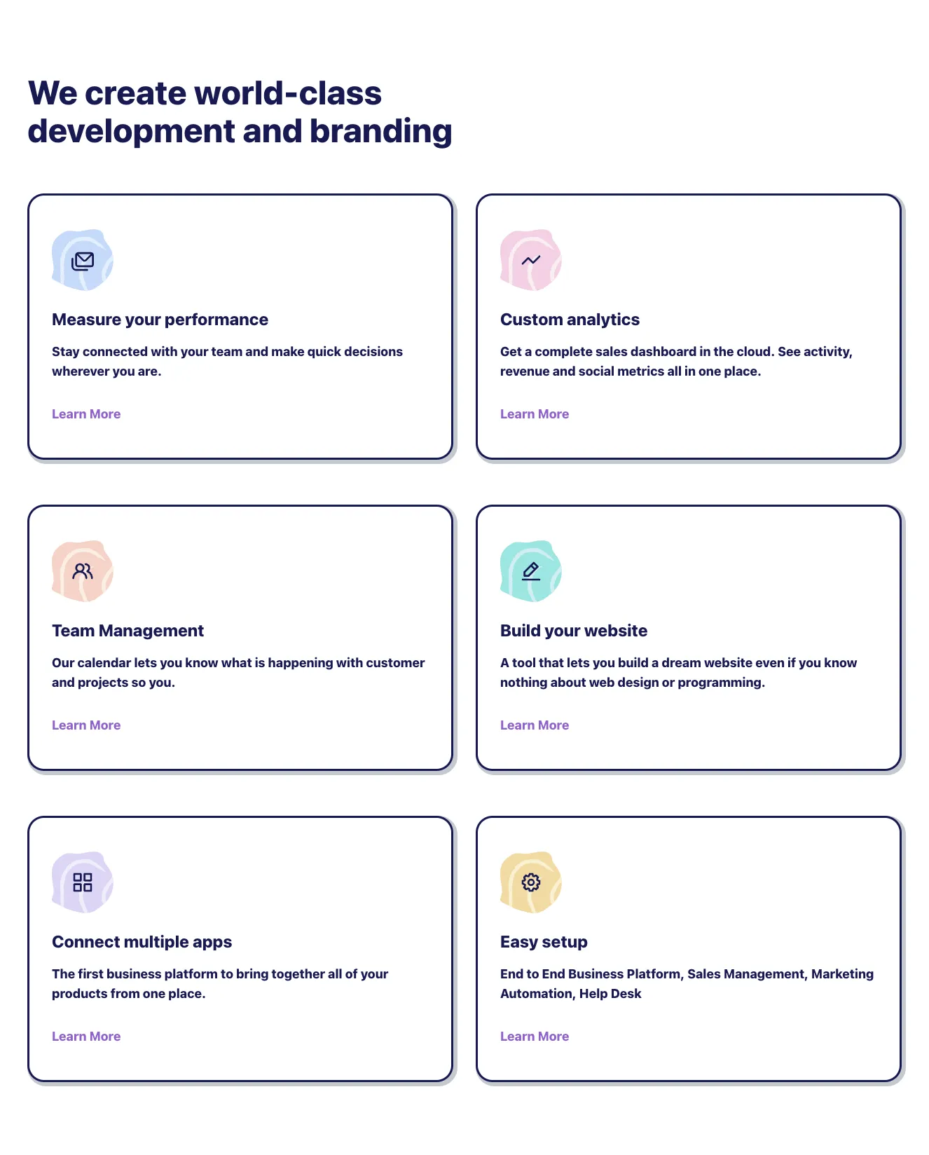
            <h3 class="mb-4 text-xl md:text-2xl leading-tight font-bold">Measure your performance</h3>
            <p class="text-coolGray-500 font-medium">Stay connected with your team and make quick decisions wherever you are.</p>
          </div>
        </div>
        <div class="w-full md:w-1/2 lg:w-1/3 px-4">
          <div class="h-full p-8 text-center hover:bg-white rounded-md hover:shadow-xl transition duration-200">
            <div class="inline-flex h-16 w-16 mb-6 mx-auto items-center justify-center text-white bg-green-500 rounded-lg">
              <svg width="22" height="12" viewbox="0 0 22 12" fill="none" xmlns="http://www.w3.org/2000/svg">
                <path d="M20.71 1.29C20.617 1.19627 20.5064 1.12188 20.3846 1.07111C20.2627 1.02034 20.132 0.994202 20 0.994202C19.868 0.994202 19.7373 1.02034 19.6154 1.07111C19.4936 1.12188 19.383 1.19627 19.29 1.29L13 7.59L8.71 3.29C8.61704 3.19627 8.50644 3.12188 8.38458 3.07111C8.26272 3.02034 8.13201 2.9942 8 2.9942C7.86799 2.9942 7.73728 3.02034 7.61542 3.07111C7.49356 3.12188 7.38296 3.19627 7.29 3.29L1.29 9.29C1.19627 9.38296 1.12188 9.49356 1.07111 9.61542C1.02034 9.73728 0.994202 9.86799 0.994202 10C0.994202 10.132 1.02034 10.2627 1.07111 10.3846C1.12188 10.5064 1.19627 10.617 1.29 10.71C1.38296 10.8037 1.49356 10.8781 1.61542 10.9289C1.73728 10.9797 1.86799 11.0058 2 11.0058C2.13201 11.0058 2.26272 10.9797 2.38458 10.9289C2.50644 10.8781 2.61704 10.8037 2.71 10.71L8 5.41L12.29 9.71C12.383 9.80373 12.4936 9.87812 12.6154 9.92889C12.7373 9.97966 12.868 10.0058 13 10.0058C13.132 10.0058 13.2627 9.97966 13.3846 9.92889C13.5064 9.87812 13.617 9.80373 13.71 9.71L20.71 2.71C20.8037 2.61704 20.8781 2.50644 20.9289 2.38458C20.9797 2.26272 21.0058 2.13201 21.0058 2C21.0058 1.86799 20.9797 1.73728 20.9289 1.61542C20.8781 1.49356 20.8037 1.38296 20.71 1.29Z" fill="currentColor"></path>
              </svg>
            </div>
            <h3 class="mb-4 text-xl md:text-2xl leading-tight font-bold">Custom analytics</h3>
            <p class="text-coolGray-500 font-medium">Get a complete sales dashboard in the cloud. See activity, revenue and social metrics all in one place.</p>
          </div>
        </div>
        <div class="w-full md:w-1/2 lg:w-1/3 px-4">
          <div class="h-full p-8 text-center hover:bg-white rounded-md hover:shadow-xl transition duration-200">
            <div class="inline-flex h-16 w-16 mb-6 mx-auto items-center justify-center text-white bg-green-500 rounded-lg">
              <svg width="22" height="18" viewbox="0 0 22 18" fill="none" xmlns="http://www.w3.org/2000/svg">
                <path d="M11.3 9.22C11.8336 8.75813 12.2616 8.18688 12.5549 7.54502C12.8482 6.90316 13 6.20571 13 5.5C13 4.17392 12.4732 2.90215 11.5355 1.96447C10.5979 1.02678 9.32608 0.5 8 0.5C6.67392 0.5 5.40215 1.02678 4.46447 1.96447C3.52678 2.90215 3 4.17392 3 5.5C2.99999 6.20571 3.1518 6.90316 3.44513 7.54502C3.73845 8.18688 4.16642 8.75813 4.7 9.22C3.30014 9.85388 2.11247 10.8775 1.27898 12.1685C0.445495 13.4596 0.00147185 14.9633 0 16.5C0 16.7652 0.105357 17.0196 0.292893 17.2071C0.48043 17.3946 0.734784 17.5 1 17.5C1.26522 17.5 1.51957 17.3946 1.70711 17.2071C1.89464 17.0196 2 16.7652 2 16.5C2 14.9087 2.63214 13.3826 3.75736 12.2574C4.88258 11.1321 6.4087 10.5 8 10.5C9.5913 10.5 11.1174 11.1321 12.2426 12.2574C13.3679 13.3826 14 14.9087 14 16.5C14 16.7652 14.1054 17.0196 14.2929 17.2071C14.4804 17.3946 14.7348 17.5 15 17.5C15.2652 17.5 15.5196 17.3946 15.7071 17.2071C15.8946 17.0196 16 16.7652 16 16.5C15.9985 14.9633 15.5545 13.4596 14.721 12.1685C13.8875 10.8775 12.6999 9.85388 11.3 9.22ZM8 8.5C7.40666 8.5 6.82664 8.32405 6.33329 7.99441C5.83994 7.66476 5.45542 7.19623 5.22836 6.64805C5.0013 6.09987 4.94189 5.49667 5.05764 4.91473C5.1734 4.33279 5.45912 3.79824 5.87868 3.37868C6.29824 2.95912 6.83279 2.6734 7.41473 2.55764C7.99667 2.44189 8.59987 2.5013 9.14805 2.72836C9.69623 2.95542 10.1648 3.33994 10.4944 3.83329C10.8241 4.32664 11 4.90666 11 5.5C11 6.29565 10.6839 7.05871 10.1213 7.62132C9.55871 8.18393 8.79565 8.5 8 8.5ZM17.74 8.82C18.38 8.09933 18.798 7.20905 18.9438 6.25634C19.0896 5.30362 18.9569 4.32907 18.5618 3.45C18.1666 2.57093 17.5258 1.8248 16.7165 1.30142C15.9071 0.77805 14.9638 0.499742 14 0.5C13.7348 0.5 13.4804 0.605357 13.2929 0.792893C13.1054 0.98043 13 1.23478 13 1.5C13 1.76522 13.1054 2.01957 13.2929 2.20711C13.4804 2.39464 13.7348 2.5 14 2.5C14.7956 2.5 15.5587 2.81607 16.1213 3.37868C16.6839 3.94129 17 4.70435 17 5.5C16.9986 6.02524 16.8593 6.5409 16.5961 6.99542C16.3328 7.44994 15.9549 7.82738 15.5 8.09C15.3517 8.17552 15.2279 8.29766 15.1404 8.44474C15.0528 8.59182 15.0045 8.7589 15 8.93C14.9958 9.09976 15.0349 9.2678 15.1137 9.41826C15.1924 9.56872 15.3081 9.69665 15.45 9.79L15.84 10.05L15.97 10.12C17.1754 10.6917 18.1923 11.596 18.901 12.7263C19.6096 13.8566 19.9805 15.1659 19.97 16.5C19.97 16.7652 20.0754 17.0196 20.2629 17.2071C20.4504 17.3946 20.7048 17.5 20.97 17.5C21.2352 17.5 21.4896 17.3946 21.6771 17.2071C21.8646 17.0196 21.97 16.7652 21.97 16.5C21.9782 14.9654 21.5938 13.4543 20.8535 12.1101C20.1131 10.7659 19.0413 9.63331 17.74 8.82Z" fill="currentColor"></path>
              </svg>
            </div>
            <h3 class="mb-4 text-xl md:text-2xl leading-tight font-bold">Team Management</h3>
            <p class="text-coolGray-500 font-medium">Our calendar lets you know what is happening with customer and projects so you</p>
          </div>
        </div>
        <div class="w-full md:w-1/2 lg:w-1/3 px-4">
          <div class="h-full p-8 text-center hover:bg-white rounded-md hover:shadow-xl transition duration-200">
            <div class="inline-flex h-16 w-16 mb-6 mx-auto items-center justify-center text-white bg-green-500 rounded-lg">
              <svg width="24" height="24" viewbox="0 0 24 24" fill="none" xmlns="http://www.w3.org/2000/svg">
                <path d="M5 18H9.24C9.37161 18.0008 9.50207 17.9755 9.62391 17.9258C9.74574 17.876 9.85656 17.8027 9.95 17.71L16.87 10.78L19.71 8C19.8037 7.90704 19.8781 7.79644 19.9289 7.67458C19.9797 7.55272 20.0058 7.42201 20.0058 7.29C20.0058 7.15799 19.9797 7.02728 19.9289 6.90542C19.8781 6.78356 19.8037 6.67296 19.71 6.58L15.47 2.29C15.377 2.19627 15.2664 2.12188 15.1446 2.07111C15.0227 2.02034 14.892 1.9942 14.76 1.9942C14.628 1.9942 14.4973 2.02034 14.3754 2.07111C14.2536 2.12188 14.143 2.19627 14.05 2.29L11.23 5.12L4.29 12.05C4.19732 12.1434 4.12399 12.2543 4.07423 12.3761C4.02446 12.4979 3.99924 12.6284 4 12.76V17C4 17.2652 4.10536 17.5196 4.29289 17.7071C4.48043 17.8946 4.73478 18 5 18ZM14.76 4.41L17.59 7.24L16.17 8.66L13.34 5.83L14.76 4.41ZM6 13.17L11.93 7.24L14.76 10.07L8.83 16H6V13.17ZM21 20H3C2.73478 20 2.48043 20.1054 2.29289 20.2929C2.10536 20.4804 2 20.7348 2 21C2 21.2652 2.10536 21.5196 2.29289 21.7071C2.48043 21.8946 2.73478 22 3 22H21C21.2652 22 21.5196 21.8946 21.7071 21.7071C21.8946 21.5196 22 21.2652 22 21C22 20.7348 21.8946 20.4804 21.7071 20.2929C21.5196 20.1054 21.2652 20 21 20Z" fill="currentColor"></path>
              </svg>
            </div>
            <h3 class="mb-4 text-xl md:text-2xl leading-tight font-bold">Build your website</h3>
            <p class="text-coolGray-500 font-medium">A tool that lets you build a dream website even if you know nothing about web design or programming.</p>
          </div>
        </div>
        <div class="w-full md:w-1/2 lg:w-1/3 px-4">
          <div class="h-full p-8 text-center hover:bg-white rounded-md hover:shadow-xl transition duration-200">
            <div class="inline-flex h-16 w-16 mb-6 mx-auto items-center justify-center text-white bg-green-500 rounded-lg">
              <svg width="20" height="20" viewbox="0 0 20 20" fill="none" xmlns="http://www.w3.org/2000/svg">
                <path d="M8 11H1C0.734784 11 0.48043 11.1054 0.292893 11.2929C0.105357 11.4804 0 11.7348 0 12V19C0 19.2652 0.105357 19.5196 0.292893 19.7071C0.48043 19.8946 0.734784 20 1 20H8C8.26522 20 8.51957 19.8946 8.70711 19.7071C8.89464 19.5196 9 19.2652 9 19V12C9 11.7348 8.89464 11.4804 8.70711 11.2929C8.51957 11.1054 8.26522 11 8 11ZM7 18H2V13H7V18ZM19 0H12C11.7348 0 11.4804 0.105357 11.2929 0.292893C11.1054 0.48043 11 0.734784 11 1V8C11 8.26522 11.1054 8.51957 11.2929 8.70711C11.4804 8.89464 11.7348 9 12 9H19C19.2652 9 19.5196 8.89464 19.7071 8.70711C19.8946 8.51957 20 8.26522 20 8V1C20 0.734784 19.8946 0.48043 19.7071 0.292893C19.5196 0.105357 19.2652 0 19 0ZM18 7H13V2H18V7ZM19 11H12C11.7348 11 11.4804 11.1054 11.2929 11.2929C11.1054 11.4804 11 11.7348 11 12V19C11 19.2652 11.1054 19.5196 11.2929 19.7071C11.4804 19.8946 11.7348 20 12 20H19C19.2652 20 19.5196 19.8946 19.7071 19.7071C19.8946 19.5196 20 19.2652 20 19V12C20 11.7348 19.8946 11.4804 19.7071 11.2929C19.5196 11.1054 19.2652 11 19 11ZM18 18H13V13H18V18ZM8 0H1C0.734784 0 0.48043 0.105357 0.292893 0.292893C0.105357 0.48043 0 0.734784 0 1V8C0 8.26522 0.105357 8.51957 0.292893 8.70711C0.48043 8.89464 0.734784 9 1 9H8C8.26522 9 8.51957 8.89464 8.70711 8.70711C8.89464 8.51957 9 8.26522 9 8V1C9 0.734784 8.89464 0.48043 8.70711 0.292893C8.51957 0.105357 8.26522 0 8 0ZM7 7H2V2H7V7Z" fill="currentColor"></path>
              </svg>
            </div>
            <h3 class="mb-4 text-xl md:text-2xl leading-tight font-bold">Connect multiple apps</h3>
            <p class="text-coolGray-500 font-medium">The first business platform to bring together all of your products from one place.</p>
          </div>
        </div>
        <div class="w-full md:w-1/2 lg:w-1/3 px-4">
          <div class="h-full p-8 text-center hover:bg-white rounded-md hover:shadow-xl transition duration-200">
            <div class="inline-flex h-16 w-16 mb-6 mx-auto items-center justify-center text-white bg-green-500 rounded-lg">
              <svg width="20" height="20" viewbox="0 0 20 20" fill="none" xmlns="http://www.w3.org/2000/svg">
                <path d="M19.32 7.55L17.43 6.92L18.32 5.14C18.4102 4.95369 18.4404 4.74397 18.4064 4.53978C18.3723 4.33558 18.2758 4.14699 18.13 4L16 1.87C15.8522 1.72209 15.6618 1.62421 15.4555 1.59013C15.2493 1.55605 15.0375 1.58748 14.85 1.68L13.07 2.57L12.44 0.680003C12.3735 0.482996 12.2472 0.311629 12.0787 0.189751C11.9102 0.0678737 11.7079 0.00154767 11.5 3.33354e-06H8.5C8.29036 -0.000537828 8.08585 0.0648223 7.91537 0.186845C7.7449 0.308868 7.61709 0.481382 7.55 0.680003L6.92 2.57L5.14 1.68C4.95369 1.58978 4.74397 1.55961 4.53978 1.59364C4.33558 1.62767 4.14699 1.72423 4 1.87L1.87 4C1.72209 4.14777 1.62421 4.33818 1.59013 4.54446C1.55605 4.75074 1.58748 4.96251 1.68 5.15L2.57 6.93L0.680003 7.56C0.482996 7.62654 0.311629 7.75283 0.189751 7.92131C0.0678737 8.08979 0.00154767 8.29207 3.33354e-06 8.5V11.5C-0.000537828 11.7096 0.0648223 11.9142 0.186845 12.0846C0.308868 12.2551 0.481382 12.3829 0.680003 12.45L2.57 13.08L1.68 14.86C1.58978 15.0463 1.55961 15.256 1.59364 15.4602C1.62767 15.6644 1.72423 15.853 1.87 16L4 18.13C4.14777 18.2779 4.33818 18.3758 4.54446 18.4099C4.75074 18.444 4.96251 18.4125 5.15 18.32L6.93 17.43L7.56 19.32C7.62709 19.5186 7.7549 19.6911 7.92537 19.8132C8.09585 19.9352 8.30036 20.0005 8.51 20H11.51C11.7196 20.0005 11.9242 19.9352 12.0946 19.8132C12.2651 19.6911 12.3929 19.5186 12.46 19.32L13.09 17.43L14.87 18.32C15.0551 18.4079 15.2628 18.4369 15.4649 18.4029C15.667 18.3689 15.8538 18.2737 16 18.13L18.13 16C18.2779 15.8522 18.3758 15.6618 18.4099 15.4555C18.444 15.2493 18.4125 15.0375 18.32 14.85L17.43 13.07L19.32 12.44C19.517 12.3735 19.6884 12.2472 19.8103 12.0787C19.9321 11.9102 19.9985 11.7079 20 11.5V8.5C20.0005 8.29036 19.9352 8.08585 19.8132 7.91537C19.6911 7.7449 19.5186 7.61709 19.32 7.55ZM18 10.78L16.8 11.18C16.5241 11.2695 16.2709 11.418 16.0581 11.6151C15.8452 11.8122 15.6778 12.0533 15.5675 12.3216C15.4571 12.5899 15.4064 12.879 15.419 13.1688C15.4315 13.4586 15.5069 13.7422 15.64 14L16.21 15.14L15.11 16.24L14 15.64C13.7436 15.5122 13.4627 15.4411 13.1763 15.4313C12.89 15.4215 12.6049 15.4734 12.3403 15.5834C12.0758 15.6934 11.8379 15.8589 11.6429 16.0688C11.4479 16.2787 11.3003 16.5281 11.21 16.8L10.81 18H9.22L8.82 16.8C8.73049 16.5241 8.58203 16.2709 8.3849 16.0581C8.18778 15.8452 7.94671 15.6778 7.67842 15.5675C7.41014 15.4571 7.12105 15.4064 6.83123 15.419C6.5414 15.4315 6.25777 15.5069 6 15.64L4.86 16.21L3.76 15.11L4.36 14C4.4931 13.7422 4.56852 13.4586 4.58105 13.1688C4.59358 12.879 4.5429 12.5899 4.43254 12.3216C4.32218 12.0533 4.15478 11.8122 3.94195 11.6151C3.72912 11.418 3.47595 11.2695 3.2 11.18L2 10.78V9.22L3.2 8.82C3.47595 8.73049 3.72912 8.58203 3.94195 8.3849C4.15478 8.18778 4.32218 7.94671 4.43254 7.67842C4.5429 7.41014 4.59358 7.12105 4.58105 6.83123C4.56852 6.5414 4.4931 6.25777 4.36 6L3.79 4.89L4.89 3.79L6 4.36C6.25777 4.4931 6.5414 4.56852 6.83123 4.58105C7.12105 4.59358 7.41014 4.5429 7.67842 4.43254C7.94671 4.32218 8.18778 4.15478 8.3849 3.94195C8.58203 3.72912 8.73049 3.47595 8.82 3.2L9.22 2H10.78L11.18 3.2C11.2695 3.47595 11.418 3.72912 11.6151 3.94195C11.8122 4.15478 12.0533 4.32218 12.3216 4.43254C12.5899 4.5429 12.879 4.59358 13.1688 4.58105C13.4586 4.56852 13.7422 4.4931 14 4.36L15.14 3.79L16.24 4.89L15.64 6C15.5122 6.25645 15.4411 6.53735 15.4313 6.82369C15.4215 7.11003 15.4734 7.39513 15.5834 7.65969C15.6934 7.92424 15.8589 8.16207 16.0688 8.35708C16.2787 8.5521 16.5281 8.69973 16.8 8.79L18 9.19V10.78ZM10 6C9.20888 6 8.43552 6.2346 7.77772 6.67413C7.11993 7.11365 6.60724 7.73836 6.30448 8.46927C6.00173 9.20017 5.92252 10.0044 6.07686 10.7804C6.2312 11.5563 6.61217 12.269 7.17158 12.8284C7.73099 13.3878 8.44372 13.7688 9.21964 13.9231C9.99557 14.0775 10.7998 13.9983 11.5307 13.6955C12.2616 13.3928 12.8864 12.8801 13.3259 12.2223C13.7654 11.5645 14 10.7911 14 10C14 8.93914 13.5786 7.92172 12.8284 7.17158C12.0783 6.42143 11.0609 6 10 6ZM10 12C9.60444 12 9.21776 11.8827 8.88886 11.6629C8.55996 11.4432 8.30362 11.1308 8.15224 10.7654C8.00087 10.3999 7.96126 9.99778 8.03843 9.60982C8.1156 9.22186 8.30608 8.86549 8.58579 8.58579C8.86549 8.30608 9.22186 8.1156 9.60982 8.03843C9.99778 7.96126 10.3999 8.00087 10.7654 8.15224C11.1308 8.30362 11.4432 8.55996 11.6629 8.88886C11.8827 9.21776 12 9.60444 12 10C12 10.5304 11.7893 11.0391 11.4142 11.4142C11.0391 11.7893 10.5304 12 10 12Z" fill="currentColor"></path>
              </svg>
            </div>
            <h3 class="mb-4 text-xl md:text-2xl leading-tight font-bold">Easy setup</h3>
            <p class="text-coolGray-500 font-medium">End to End Business Platform, Sales Management, Marketing Automation, Help Desk</p>
          </div>
        </div>
      </div>
    </div>
  </div>
  <div class="wave wave-bottom w-full text-coolGray-50">
    <svg viewbox="0 0 1440 116" fill="none" xmlns="http://www.w3.org/2000/svg">
      <path d="M0 51.4091H349.922C606.664 51.4091 859.771 116 1080 116C1300.23 116 1440 51.4091 1440 51.4091V0H0V51.4091Z" fill="currentColor"></path>
    </svg>
  </div>
</section>