Browse 212 beautiful UI components — complete with full source code, visual editing, AI assistance, and more.
 Tailwind CSS


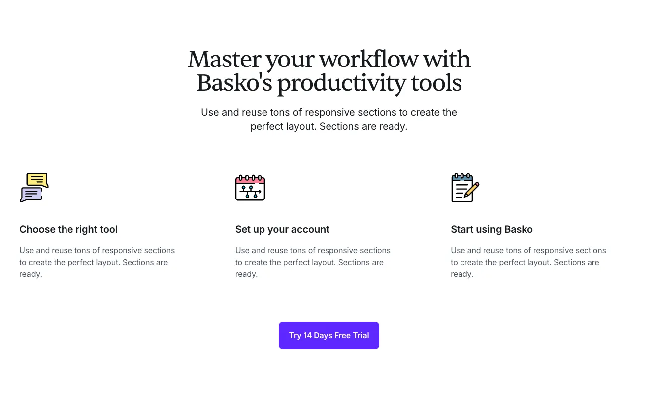
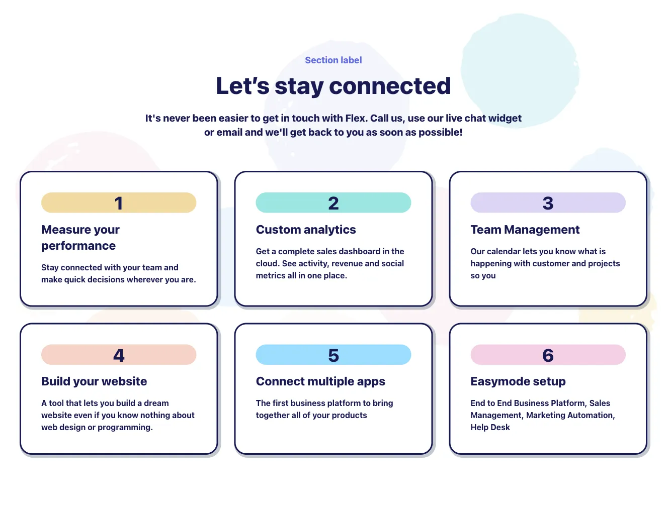
Show your workflow and the way you operate with Tailwind how it works components. This will help you explain the important steps of the company or department process.
Choose from many variations of Tailwind components how it works section. Presented here are variants available in various UI libraries. You will also find many other types of components that will be in the same style. This will allow you to build a comprehensive Tailwind website template. Each library has been designed by a professional designer and coded by our team of developers.
Get access to all Tailwind components how it works sections, code and our editor. Try the demo for free.
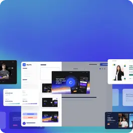
Build websites faster with an AI Visual Editor
© 2026 Shuffle. All rights reserved.


