Browse 224 ready-made Tailwind CSS content components from multiple UI libraries. Every variant is fully responsive – copy the code or customize it in the visual editor and export clean code.
<section class="py-20 lg:py-24">
  <div class="px-4">
    <div class="flex flex-wrap -mx-4">
      <div class="relative w-full lg:w-1/2 px-4 mb-12 lg:mb-0 lg:pr-24 xl:pr-40">
        <div class="max-w-md md:max-w-lg mx-auto lg:mr-0 mb-12 md:mb-20">
          <span class="inline-block py-1 px-3 mb-4 text-xs font-semibold text-orange-900 bg-orange-50 rounded-full">RICH TEXT MODULE</span>
          <h1 class="font-heading text-5xl xs:text-6xl md:text-7xl font-bold text-gray-900">
            <span class="block">Saturn</span>
            <span>is a beautiful</span>
            <span class="block font-serif italic">UI Library</span>
          </h1>
        </div>
        <img class="block w-full" src="saturn-assets/images/content/image-big-article.png" alt="">
      </div>
      <div class="w-full lg:w-1/2 px-4">
        <div class="max-w-md md:max-w-lg xl:max-w-2xl mx-auto lg:mx-0">
          <p class="text-2xl text-gray-800 mb-8">Arcu ultrices sit non magna enim id semper quam venenatis. Mi quisque ultrices hendrerit nec aliquet integer mollis faucibus morbi. Augue justo at convallis vitae nunc maecenas est. Viverra duis feugiat posuere vitae tincidunt. Sed tristique sit faucibus nisi rutrum lacus. Sollicitudin non pretium commodo ut fermentum.</p>
          <p class="text-lg font-semibold text-gray-800 mb-8">Pellentesque ipsum nulla in eget interdum a. Neque pellentesque pulvinar mauris pulvinar diam.</p>
          <p class="text-lg text-gray-700 mb-8">Egestas interdum elit integer nec pharetra eget blandit dolor purus. A sed nisi congue morbi fermentum blandit. Turpis pretium dignissim risus ultrices purus et amet netus nibh.</p>
          <p class="text-lg text-gray-700 mb-8">Vestibulum est ante in congue a fusce nunc. At tristique donec nisi viverra vulputate blandit orci at lectus. Morbi cras urna congue ornare. Mi magna vestibulum tortor id nec tortor non. Enim orci lorem egestas sed morbi dui mauris etiam nulla. Euismod cursus viverra ut ac eu sit quam amet tempor. Id in suspendisse nam sit vitae ullamcorper mollis et ut.</p>
          <p class="text-lg text-gray-700">Egestas interdum elit integer nec pharetra eget blandit dolor purus. A sed nisi congue morbi fermentum blandit. Turpis pretium dignissim risus ultrices purus et amet netus nibh. Vestibulum est ante in congue a fusce nunc. At tristique donec nisi viverra vulputate blandit orci at lectus.</p>
        </div>
      </div>
    </div>
Get the code for 13,400+ components
Create a free account to copy production-ready code from every component in the library.
Free account · No credit card · No password needed
Components are just the start. See how a project goes from prompt to production‑ready code with Shuffle.
Rich Text Feature Section with Headline and Illustration
A two-column content section with a small orange 'Rich Text Module' label, a large mixed-weight headline, and a textured orange character illustration on the left, paired with multiple paragraphs of body text on the right. The layout is a split screen with no navigation, forms, or interactive controls visible.
Split-screen rich text module with serif accent heading and checklist
A two-column marketing content module with a large display heading, gray lead paragraphs on the left, and a bold lead line, checkmark feature list, body copy, and an illustrative image on the right. It presents editorial text and a feature list with no visible interactive controls.
Components are just the start. See how a project goes from prompt to production‑ready code with Shuffle.
Dark blog article header with breadcrumb, author byline, hero code image, and body text
A dark-themed blog article page showing a breadcrumb trail, large centered headline, author avatar with name and date, a wide framed hero photo of code on a monitor, and a single-column body text block. The layout is a centered stack with no interactive controls visible.
Dark Blog Article Header with Breadcrumbs, Author, and Hero Image
A dark-themed blog article layout showing breadcrumb navigation, a large serif-free heading, author avatar with name and date, a laptop code-editor hero image on the right, and a centered body text column. The layout places title and author on the left beside a bordered image panel, followed by readable paragraphs.
Components are just the start. See how a project goes from prompt to production‑ready code with Shuffle.
Blog Article Page with Hero Image and Newsletter Signup
A single blog post layout with a back link, full-width hero photo, centered date and read time, large article title, and multi-section body text. It ends with a newsletter subscription callout and an author byline with a share button.
Blog Article Page with Hero Image, Author Byline, and Newsletter CTA
A long-form blog article page with a back link, large centered headline, full-width hero photo, author byline with avatar and tags, multiple body sections, a newsletter subscription callout, and like and comment counters. The layout is a single centered text column beneath the hero image on a light background.
Components are just the start. See how a project goes from prompt to production‑ready code with Shuffle.
Blog article page with interview content and From the blog card grid
A dark-themed blog article layout showing an interview header, hero image, body text with headings, a blockquote, inline image, share buttons, and a three-card 'From the blog' grid below. The outer component is a blog post page with a footer-style related posts section.
Dark Blog Article Page with Table of Contents and Blog Card Grid
A dark-themed long-form blog article page with a hero image and headline, a left-side table of contents with share controls, a main article body with quote, images and headings, and a 'From the blog' card grid of three related posts at the bottom.
Components are just the start. See how a project goes from prompt to production‑ready code with Shuffle.
Blog Article Header with Author and Hero Image
A centered blog article header showing breadcrumb navigation, a two-line bold heading, an author avatar with name and date, followed by a full-width photographic hero image. Decorative blue and yellow icon circles and dashed line swirls flank the heading area.
Blog article header with centered title, author byline, and hero photo
A centered article header showing breadcrumb navigation, a large two-line heading, an author avatar with name and date, and a full-width photograph of a person working on a laptop below. Decorative blue and yellow icon badges and dashed lines frame the heading area.
Components are just the start. See how a project goes from prompt to production‑ready code with Shuffle.
Project Card Grid with Avatars and Progress Bars
A 4-column grid of white project cards, each showing a colored folder icon, project name, location, client name, overlapping avatars with a +3 count, a colored progress bar, and a phase badge with status text. The layout repeats identical cards across two rows on a light gray background.
Project Card Grid with Pagination
A grid of nine project cards, each showing a Spotify logo, Pending status badge, final date, budget, avatar stack, and a progress bar, with a footer showing page-size selector and numbered pagination controls. The layout uses three columns of white cards on a light background.
Components are just the start. See how a project goes from prompt to production‑ready code with Shuffle.
Dark Split-Layout Hero with Feature List and Photo Collage
A marketing hero section on a dark background with a large two-line-plus heading, short supporting text, a three-item feature list with dot bullets, and a purple call-to-action button. Photographs are arranged in a collage at the left, top right, and right edges.
Dark Hero Section with Heading, CTA, and Overlapping Photos
A dark-background hero section with a large sans-serif heading, supporting text, a purple "Discover Now" call-to-action button, and two overlapping portrait photographs on the right. The layout is a split screen with text on the left and imagery on the right.
Components are just the start. See how a project goes from prompt to production‑ready code with Shuffle.
Dark split-screen hero with heading and founder story link
A dark promotional hero section with a large centered-left heading "We're Zospace - Founded in London", a short supporting sentence, a small lightbulb icon, and a "Learn our story" text link with an arrow. A photograph of a smiling woman in sunlit street occupies the right half, with a smaller portrait overlapping the lower-left corner.
Dark Blog Post Feature Section with Alternating Image Layout
A dark-themed section showing two alternating blog post previews, each pairing a category label, a bold heading, and an author avatar with date beside a large photo. The layout alternates image and text sides to present featured articles.
<section class="py-16 md:py-24 bg-white" style="background-image: url('flex-ui-assets/elements/pattern-white.svg'); background-position: center top;">
<div class="container px-4 mx-auto">
<div class="md:max-w-2xl mx-auto mb-12 text-center">
<div class="flex items-center justify-center">
<p class="inline-block text-green-500 font-medium">John Doe</p>
<span class="mx-1 text-green-500">•</span>
<p class="inline-block text-green-500 font-medium">19 Jan 2022</p>
</div>
<h2 class="mb-4 text-3xl md:text-5xl leading-tight text-darkCoolGray-900 font-bold tracking-tighter">Lorem ipsum dolor sit amet</h2>
<p class="mb-6 text-lg md:text-xl font-medium text-coolGray-500">Lorem ipsum dolor sit amet, consectetur adipiscing elit.</p>
<div class="inline-block py-1 px-3 text-xs leading-5 text-green-500 font-medium uppercase bg-green-100 rounded-full shadow-sm">Technology</div>
</div>
<div class="mb-10 mx-auto max-w-max overflow-hidden rounded-lg">
<img src="flex-ui-assets/images/blog-content/content-photo1.jpg" alt="">
</div>
<div class="md:max-w-3xl mx-auto">
<p class="mb-8 pb-10 text-lg md:text-xl font-medium text-coolGray-500 border-b border-coolGray-100">Lorem ipsum dolor sit amet, consectetur adipiscing elit. Donec ullamcorper mattis lorem non. Ultrices praesent amet ipsum justo massa. Eu dolor aliquet risus gravida nunc at feugiat consequat purus. Non massa enim vitae duis mattis. Vel in ultricies vel fringilla.</p>
<h3 class="mb-4 text-2xl md:text-3xl font-semibold text-coolGray-800">Header 1</h3>
<p class="mb-4 text-base md:text-lg text-coolGray-500">Lorem ipsum dolor sit amet, consectetur adipiscing elit. Donec ullamcorper mattis lorem non. Ultrices praesent amet ipsum justo massa. Eu dolor aliquet risus gravida nunc at feugiat consequat purus. Non massa enim vitae duis mattis. Vel in ultricies vel fringilla.</p>
<div class="mb-6 p-6 border-l-2 border-green-500">
<p class="mb-4 text-xl md:text-2xl leading-tight font-medium text-coolGray-800">Lorem ipsum dolor sit amet, consectetur adipiscing elit. Donec ullamcorper mattis lorem non. Ultrices praesent amet ipsum justo massa. Eu dolor aliquet risus gravida nunc at feugiat consequat purus.</p>
<span class="text-base md:text-lg text-coolGray-400 font-medium">— John Doe, CEO & Founder</span>
</div>
<p class="mb-6 text-base md:text-lg text-coolGray-500">Lorem ipsum dolor sit amet, consectetur adipiscing elit. Donec ullamcorper mattis lorem non. Ultrices praesent amet ipsum justo massa. Eu dolor aliquet risus gravida nunc at feugiat consequat purus. Non massa enim vitae duis mattis. Vel in ultricies vel fringilla.</p>
Get the code for 13,400+ components
Create a free account to copy production-ready code from every component in the library.
Free account · No credit card · No password needed
Components are just the start. See how a project goes from prompt to production‑ready code with Shuffle.
Blog Article Layout with Hero Image, Pull Quote, and Share Links
A long-form article page with a centered byline, title, subtitle, category tag, full-width hero photo, body text with headings, a green-bordered pull quote, an inline image with caption, and a footer with copy link and social share buttons. The content is stacked vertically in a narrow centered column.
Blog Article Layout with Hero Image, Pull Quote, and Share Links
A long-form article page with a centered byline, title, subtitle, category tag, full-width hero photo, and body text. It includes a green-bordered pull quote, an inline image with caption, section headers, lists, a text link, and a bottom row with a Copy Link button and social share icons.
Components are just the start. See how a project goes from prompt to production‑ready code with Shuffle.
Split-screen feature section with prototype illustration and heading
A marketing feature section headed "Free your ideas" with a centered intro, followed by a split layout: a light gray panel showing an illustrative prototype card and a blue "1.3k Templates" tile on the left, and an orange icon, large heading, supporting text, and green "Official website" text link on the right.
Blog Article Hero with Collaborative Canvas Illustration
A light editorial header presenting an eyebrow label, a large centered headline, and author byline with avatar and date, followed by a wide pale-blue panel showing an abstract illustration of a collaborative design canvas with cursors and labeled elements. Below, a long-form article section displays a subheading and body paragraphs in a single left-aligned column.
<section class="relative pt-20 md:pt-32 pb-20 bg-blue-800 overflow-x-hidden">
  <img class="absolute top-0 left-0 w-full max-h-32" src="yofte-assets/elements/line-content.svg" alt="">
  <div class="container mx-auto px-4">
    <span class="text-white font-bold font-heading">Online shopping</span>
    <h2 class="mt-4 mb-16 text-6xl md:text-7xl font-bold font-heading text-white">How to improve online store?</h2>
    <div class="relative h-96 -mx-6 mb-20">
      <div class="absolute top-1/2 transform -translate-y-1/2 left-0 right-0 h-80 w-full bg-blue-300"></div>
      <img class="relative w-full h-96 px-6 object-cover" src="yofte-assets/images/placeholder-banner.png" alt="">
    </div>
    <div class="max-w-3xl mx-auto">
      <h3 class="mb-12 text-3xl text-white">This morning, platea dictumst nec nunc. In hac habitasse, general, dignissim accumsan just. Suspendisse vitae ligula convallis, porta tortor et, finibus neque.</h3>
      <p class="mb-10 text-xl text-gray-400">Lorem ipsum dolor sit amet, consectetur adipiscing elit. Proin consequat nisl quis justo egestas, nec eleifend erat egestas. Curabitur purus neque, tincidunt ac malesuada nec, ornare non odio. Nulla nec lorem sed purus semper porta vel sit amet sem. Nunc placerat non turpis eu molestie. Nam consectetur lacus ut lacus elementum dapibus. Etiam vehicula ipsum ac dolor tristique placerat. In hac habitasse platea dictumst.</p>
      <p class="text-xl text-gray-400">Orci varius natoque penatibus et magnis dis parturient montes, nascetur ridiculus mus. Aliquam venenatis est quis venenatis dignissim. Maecenas a sem eros. Quisque hendrerit vitae libero non porta. Maecenas quis sem et nulla pellentesque accumsan. Proin blandit bibendum orci, a aliquam augue sagittis sed. Quisque pharetra ut quam eget varius. Morbi nisi nunc, ultricies id ligula id, feugiat eleifend est. Etiam metus sem, ornare vitae porta vel, porta a mauris. Fusce dapibus egestas lorem eu tincidunt. Quisque lobortis placerat placerat. Donec eget lectus blandit ex pellentesque iaculis. Proin aliquam vulputate arcu et blandit. Duis sed lobortis mauris, vel porttitor lectus. Pellentesque vel ultrices odio.</p>
    </div>
  </div>
</section>
Get the code for 13,400+ components
Create a free account to copy production-ready code from every component in the library.
Free account · No credit card · No password needed
Components are just the start. See how a project goes from prompt to production‑ready code with Shuffle.
Dark Blog Article Header with Hero Image and Body Text
A dark-background editorial article layout with a small eyebrow label, large bold heading, a wide photo banner with blue accent bars, and a centered text column with a lead paragraph and body copy. It reads as a blog or content post rather than a product marketing section.
Dark blog article header with hero image, title, author byline and body text
A dark-themed blog article layout showing a full-width photo banner, a large centered headline, an author avatar with name and date, a lead paragraph, and body text in a narrow centered column. Decorative arcs and blue accent bars frame the hero image.
<section class="py-26 bg-white">
<div class="container px-4 mx-auto">
<div class="max-w-4xl mx-auto mb-12 text-center">
<p class="text-xl font-bold text-pink-400 mb-2">John Doe • 19 Jan 2022</p>
<h1 class="text-3xl md:text-4xl font-extrabold font-heading mb-4">Lorem ipsum dolor sit amet</h1>
<p class="text-xl font-extrabold leading-8 mb-6">Lorem ipsum dolor sit amet, consectetur adipiscing elit.</p>
<span class="inline-flex h-6 items-center justify-center text-xs font-extrabold px-2 text-indigo-900 rounded border border-indigo-900 bg-green-200 uppercase">Technology</span>
</div>
<img class="block w-full mb-12 h-112 lg:h-140 object-cover border-3 border-indigo-900 rounded-2xl shadow-lg" src="https://images.unsplash.com/photo-1486312338219-ce68d2c6f44d?ixlib=rb-1.2.1&ixid=MnwxMjA3fDB8MHxwaG90by1wYWdlfHx8fGVufDB8fHx8&auto=format&fit=crop&w=2072&q=80" alt="">
<div class="max-w-4xl mx-auto">
<p class="text-xl font-extrabold leading-7 pb-12 mb-12 border-b-3 border-indigo-900">Lorem ipsum dolor sit amet, consectetur adipiscing elit. Donec ullamcorper mattis lorem non. Ultrices praesent amet ipsum justo massa. Eu dolor aliquet risus gravida nunc at feugiat consequat purus. Non massa enim vitae duis mattis. Vel in ultricies vel fringilla.</p>
<h3 class="text-2xl font-extrabold mb-4">Header 1</h3>
<p class="text-xl font-extrabold leading-7 mb-10">Lorem ipsum dolor sit amet, consectetur adipiscing elit. Donec ullamcorper mattis lorem non. Ultrices praesent amet ipsum justo massa. Eu dolor aliquet risus gravida nunc at feugiat consequat purus. Non massa enim vitae duis mattis. Vel in ultricies vel fringilla.</p>
<div class="mb-10 p-8 border-l-3 border-indigo-500">
<p class="text-2xl font-extrabold leading-8 mb-4">Lorem ipsum dolor sit amet, consectetur adipiscing elit. Donec ullamcorper mattis lorem non. Ultrices praesent amet ipsum justo massa. Eu dolor aliquet risus gravida nunc at feugiat consequat purus.</p>
<span class="text-xl text-pink-400 font-extrabold leading-7">— John Doe, CEO & Founder</span>
</div>
<p class="text-xl font-extrabold leading-7 mb-12">Lorem ipsum dolor sit amet, consectetur adipiscing elit. Donec ullamcorper mattis lorem non. Ultrices praesent amet ipsum justo massa. Eu dolor aliquet risus gravida nunc at feugiat consequat purus. Non massa enim vitae duis mattis. Vel in ultricies vel fringilla.</p>
<img class="block mb-6 w-full h-112 object-cover border-3 border-indigo-900 rounded-2xl shadow-lg" src="https://images.unsplash.com/photo-1486312338219-ce68d2c6f44d?ixlib=rb-1.2.1&ixid=MnwxMjA3fDB8MHxwaG90by1wYWdlfHx8fGVufDB8fHx8&auto=format&fit=crop&w=2072&q=80" alt="">
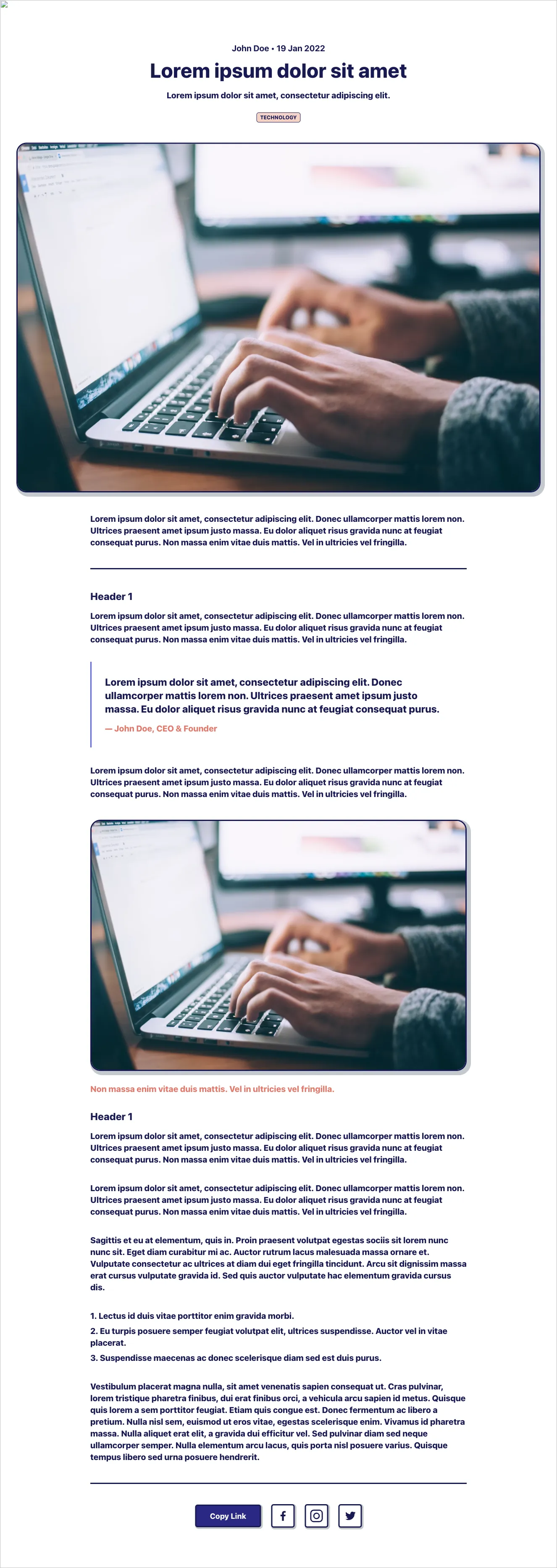
<p class="text-xl font-extrabold text-pink-400 mb-8">Non massa enim vitae duis mattis. Vel in ultricies vel fringilla.</p>
<h3 class="text-2xl font-extrabold mb-4">Header 1</h3>
<p class="text-xl font-extrabold leading-7 mb-10">Lorem ipsum dolor sit amet, consectetur adipiscing elit. Donec ullamcorper mattis lorem non. Ultrices praesent amet ipsum justo massa. Eu dolor aliquet risus gravida nunc at feugiat consequat purus. Non massa enim vitae duis mattis. Vel in ultricies vel fringilla.</p>
<p class="text-xl font-extrabold leading-7 mb-10">Lorem ipsum dolor sit amet, consectetur adipiscing elit. Donec ullamcorper mattis lorem non. Ultrices praesent amet ipsum justo massa. Eu dolor aliquet risus gravida nunc at feugiat consequat purus. Non massa enim vitae duis mattis. Vel in ultricies vel fringilla.</p>
<p class="text-xl font-extrabold leading-7 mb-10">Sagittis et eu at elementum, quis in. Proin praesent volutpat egestas sociis sit lorem nunc nunc sit. Eget diam curabitur mi ac. Auctor rutrum lacus malesuada massa ornare et. Vulputate consectetur ac ultrices at diam dui eget fringilla tincidunt. Arcu sit dignissim massa erat cursus vulputate gravida id. Sed quis auctor vulputate hac elementum gravida cursus dis.</p>
Get the code for 13,400+ components
Create a free account to copy production-ready code from every component in the library.
Free account · No credit card · No password needed
Components are just the start. See how a project goes from prompt to production‑ready code with Shuffle.
Blog article layout with hero image, pull quote, and share footer
A long-form blog article page showing a centered header with date, title, subtitle, and category tag, followed by a hero photo, body text sections, a blockquote attributed to an author, a repeated image with caption, and a footer with a Copy Link button and social icons. Content is arranged in a single centered column with a dark navy and pink accent palette.
Blog Article Layout with Hero Image, Pull Quote, and Share Footer
A long-form article template showing a centered header with date, title, subtitle, and category tag, followed by full-width and inline images, body paragraphs, section headers, a blockquote with attribution, a numbered list, and a Copy Link button with social icons at the bottom.
<section class="py-24">
<div class="container px-4 mx-auto">
<div class="max-w-4xl mb-12"><span class="text-indigo-300" >Published 02 September 2022</span>
<h2 class="text-4xl md:text-5xl font-heading mt-4 mb-6" >Lorem ipsum dolor sit amet consectutar domor at elis</h2>
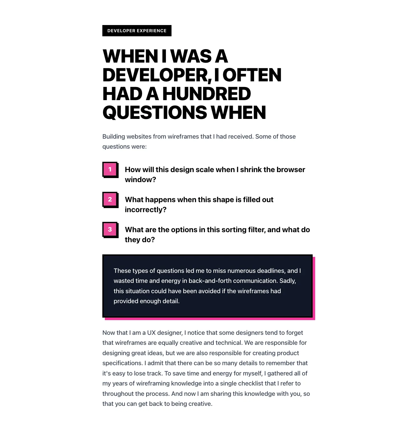
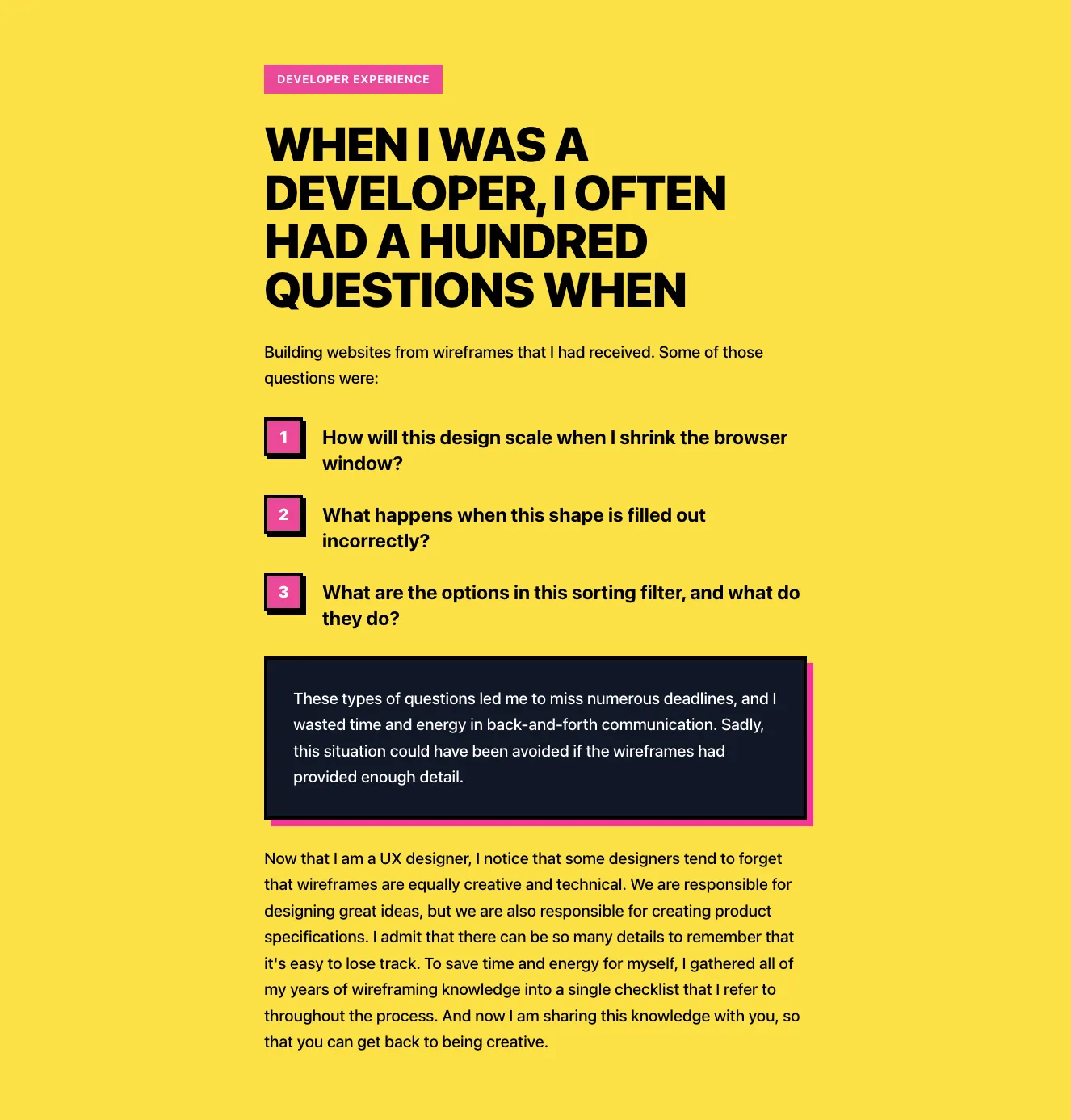
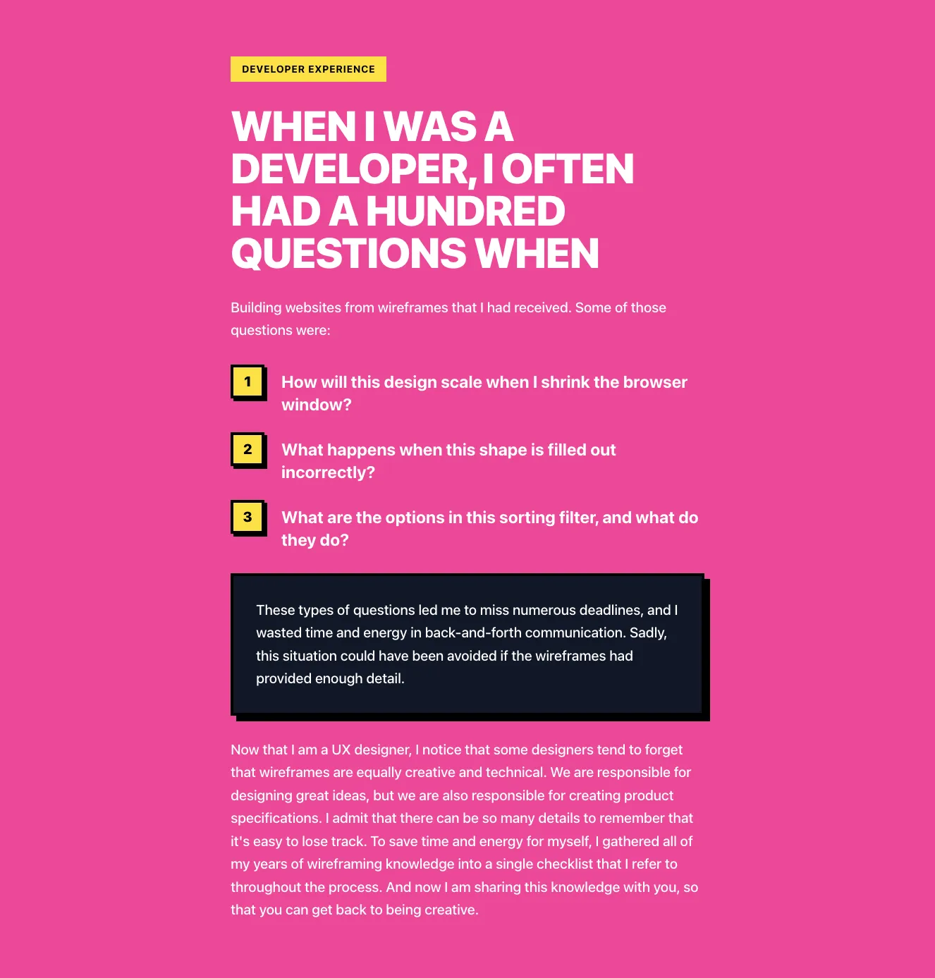
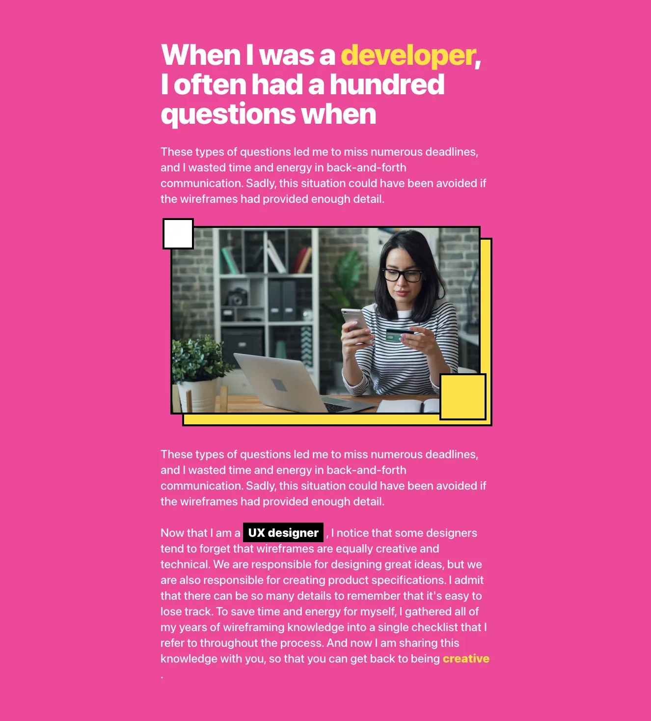
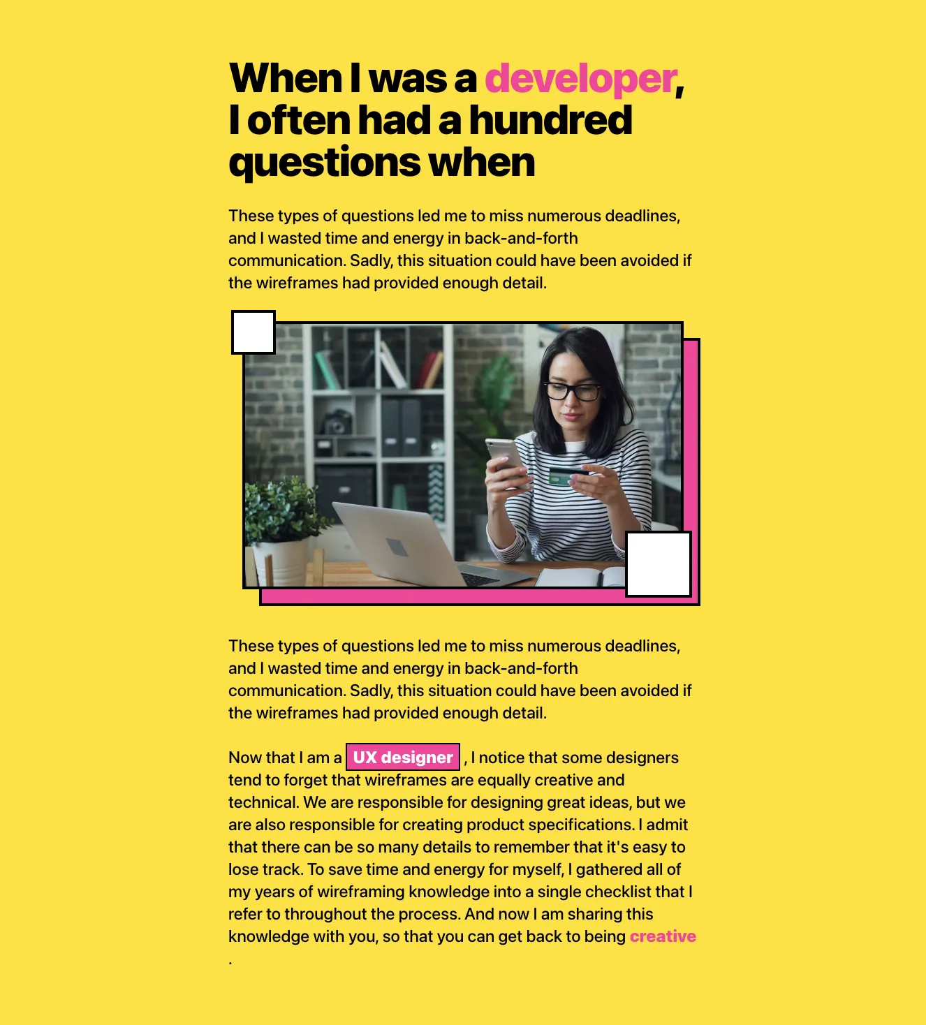
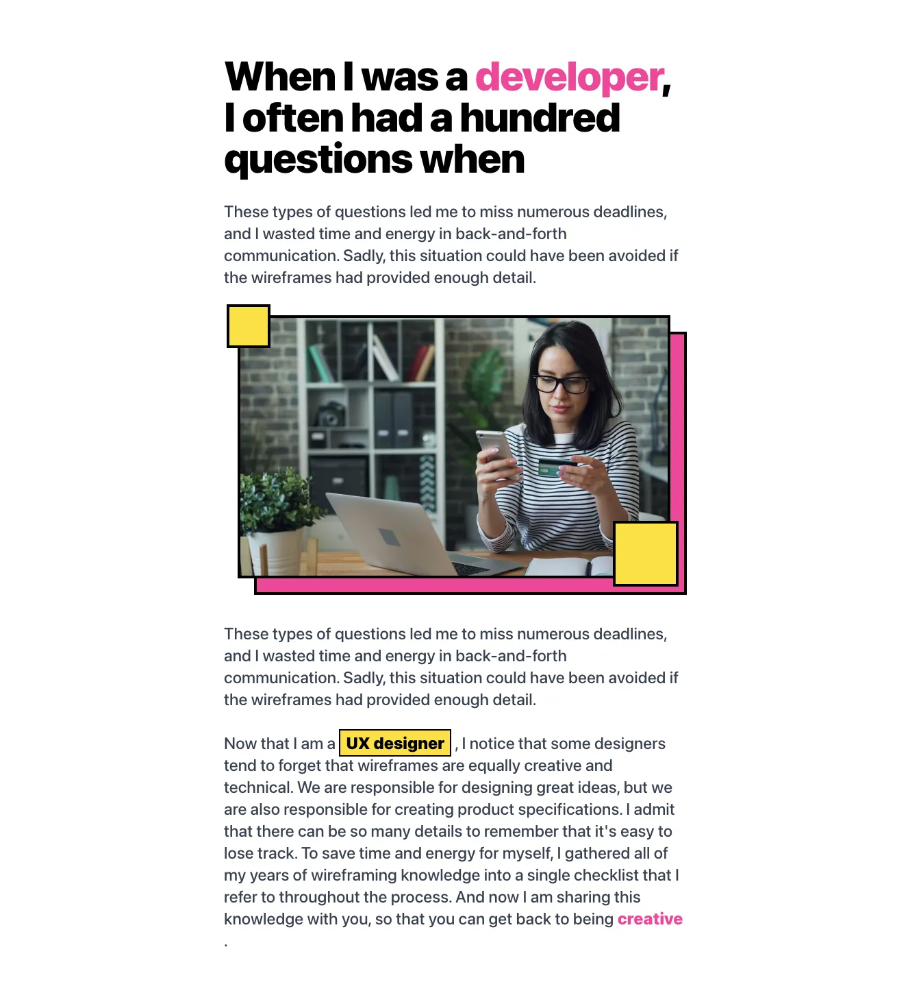
<p class="leading-8" >These types of questions led me to miss numerous deadlines, and I wasted time and energy in back-and-forth communication. Sadly, this situation could have been avoided if the wireframes had provided enough detail.</p>
</div><img class="block w-full mb-12" src="https://images.unsplash.com/photo-1494500764479-0c8f2919a3d8?ixid=MnwxMjA3fDB8MHxwaG90by1wYWdlfHx8fGVufDB8fHx8&ixlib=rb-1.2.1&auto=format&fit=crop&w=870&q=80" alt="" >
<div class="max-w-xl mx-auto">
<p class="leading-8 mb-8 pb-8 border-b" >Lorem ipsum dolor sit amet, consectetur adipiscing elit. Donec ullamcorper mattis lorem non. Ultrices praesent amet ipsum justo massa. Eu dolor aliquet risus gravida nunc at feugiat consequat purus. Non massa enim vitae duis mattis. Vel in ultricies vel fringilla.</p>
<h2 class="text-4xl font-heading mb-6" >Lorem ipsum</h2>
<p class="leading-8 mb-6" >Lorem ipsum dolor sit amet, consectetur adipiscing elit. Donec ullamcorper mattis lorem non. Ultrices praesent amet ipsum justo massa. Eu dolor aliquet risus gravida nunc at feugiat consequat purus. Non massa enim vitae duis mattis. Vel in ultricies vel fringilla.</p><img class="block w-full mb-4" src="https://images.unsplash.com/photo-1532274402911-5a369e4c4bb5?ixid=MnwxMjA3fDB8MHxwaG90by1wYWdlfHx8fGVufDB8fHx8&ixlib=rb-1.2.1&auto=format&fit=crop&w=870&q=80" alt="" >
<p class="text-sm mb-6"><span >Brown wooden dock by Mark Harpur via</span> <a class="text-indigo-500 hover:text-indigo-600 underline hover:no-underline" href="#" >Unsplash</a></p>
<p class="leading-8 mb-6" >Lorem ipsum dolor sit amet, consectetur adipiscing elit. Nam auctor commodo arcu id ullamcorper. Aliquam vestibulum lobortis venenatis. Aenean in pharetra risus, id iaculis leo. Proin id risus sit amet mauris hendrerit tincidunt. Vestibulum pulvinar nec leo nec sagittis. Duis vestibulum sit amet odio sodales consequat. Nam eget elit tempus, cursus lorem vel, sollicitudin massa. Sed varius condimentum massa, et volutpat ante eleifend a. Praesent purus justo, finibus eu suscipit in, vulputate quis est. Vestibulum ante ipsum primis in faucibus orci luctus et ultrices posuere cubilia curae; Proin euismod tellus quam, eget interdum diam consectetur eget. Phasellus felis quam, iaculis at malesuada nec, varius nec massa. Integer rhoncus sapien faucibus turpis bibendum, quis maximus magna vehicula. Quisque pharetra, tortor sit amet vestibulum tincidunt, tortor lectus pretium ipsum, a elementum risus libero id diam. Morbi ut sem elementum, blandit augue eu, vehicula nunc. Ut et pellentesque mauris.</p>
<ul class="mb-6 list-decimal list-inside">
<li class="leading-8 mb-2" >Pellentesque in elit nec velit suscipit tincidunt sit amet sed augue. Proin augue justo, imperdiet nec ultrices non, dapibus sit amet risus. Nunc pellentesque nisl at neque pulvinar ornare.</li>
<li class="leading-8 mb-2" >Nullam euismod, turpis a fermentum malesuada, lectus ante consectetur sem, ac eleifend ipsum diam vitae nisi. Pellentesque feugiat, nibh ut hendrerit porta, erat lectus aliquet libero, vitae vulputate leo neque id sapien.</li>
<li class="leading-8" >Praesent a consequat velit, a tincidunt est. Proin eu facilisis lacus. Fusce orci elit, pharetra at orci at, sagittis sollicitudin ex. Duis vitae nunc mollis, ultrices risus vel, consequat erat. Nam vel diam risus. Ut sed sagittis nibh, sed bibendum eros.</li>
</ul>
<div class="flex mb-6 bg-indigo-100 relative">
<div class="absolute top-0 left-0 px-1 h-full bg-indigo-200"></div>
<div class="pl-14 py-10 pr-10">
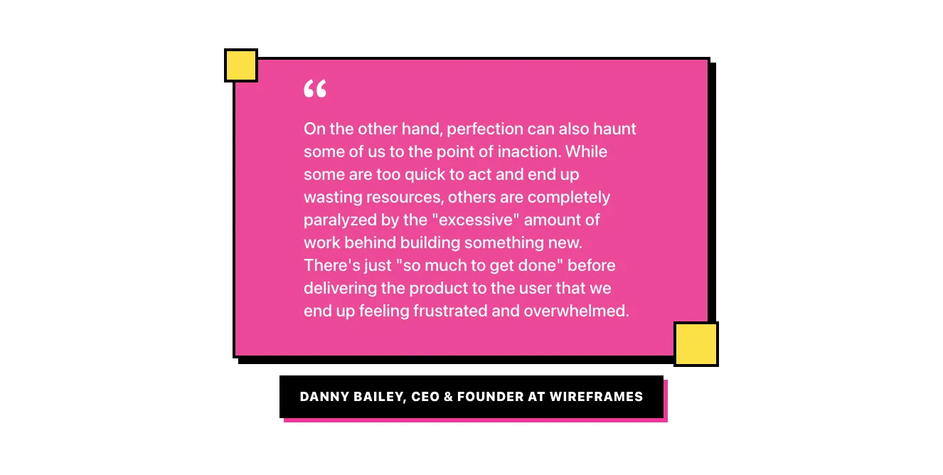
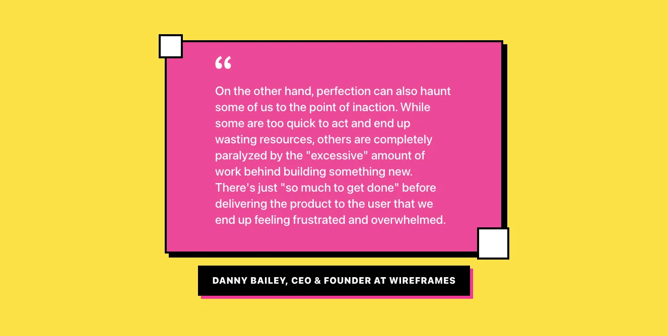
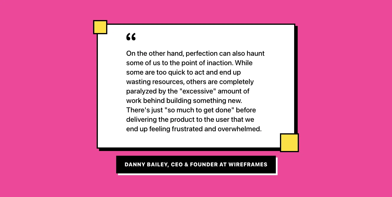
<h2 class="text-4xl font-heading" >“On the other hand, perfection can also haunt some of us to the point of inaction.”</h2>
</div>
Get the code for 13,400+ components
Create a free account to copy production-ready code from every component in the library.
Free account · No credit card · No password needed
Components are just the start. See how a project goes from prompt to production‑ready code with Shuffle.
Blog article layout with hero image, serif headings, pull quote, and body text
A long-form blog article page showing a published date, large serif headline, intro paragraph, full-width hero photo, and body sections with an inline image, numbered list, and styled pull quote. The content is centered in a narrow reading column with generous whitespace and a light background.
Long-form Blog Article with Hero Image and Pull Quote
A single-column editorial blog post layout featuring a full-width hero photo, a centered publication date, serif headings, body text with an embedded image and caption, a numbered list, and a lavender-accented pull quote with attribution. The layout is minimal and spacious, focused on readable article content.
Components are just the start. See how a project goes from prompt to production‑ready code with Shuffle.
Dark Blog Article Header with Author Byline and Split Photo
A dark-themed blog article layout with breadcrumbs, a bold uppercase headline, an author avatar with name and role, and body text on the left, paired with a full-height portrait photo on the right. A top-right panel shows a 'Read next article' link with a yellow arrow.
Dark Blog Article Layout with Author Byline and Next Article Link
A dark-themed blog article page with breadcrumb navigation, a bold uppercase headline, author avatar and name, body text in two paragraphs, and a 'Read next article' link in a right-side panel. A full-width photograph appears below the article content.
Components are just the start. See how a project goes from prompt to production‑ready code with Shuffle.
Blog Article Header and Body Layout
A blog article page with breadcrumb navigation, a teal hashtag tag, a serif headline, author and date metadata, a full-width photo, and a centered body text column. It is a content reading layout rather than a marketing section or application UI.
Blog article header with breadcrumb, tag, title, author meta, and hero image
A blog article header showing breadcrumb navigation, a teal #family tag, a serif headline, author and date metadata, and a large photo on the right, followed by article body text. The layout is a split-screen with text on the left and image on the right.
Components are just the start. See how a project goes from prompt to production‑ready code with Shuffle.
Blog article header with hero image, breadcrumbs, title, author byline, and body text
A blog article page layout featuring a full-width skateboarding photo at top, followed by breadcrumb navigation, a bold centered serif-free headline, an author avatar with name and date, and a narrow column of body paragraphs. It presents editorial article content rather than interactive controls.
Blog article hero with triangular white overlay and author byline
A blog article header featuring a full-width photograph with a white triangular cutout containing breadcrumbs, a bold blue serif-free heading, an author avatar with name and date, followed by body paragraphs. The layout is centered with the text block stacked vertically beneath the hero image.
Components are just the start. See how a project goes from prompt to production‑ready code with Shuffle.
Blog article header with breadcrumb, headline, author byline, and image placeholder
A centered article header showing a breadcrumb trail (Home, Blog, Article), a bold two-line headline, an author avatar with name and date, followed by a full-width gray image placeholder block. The layout is a simple centered stack on a white background.
Blog Article Header with Breadcrumb, Heading, Author, and Image Placeholder
A split-screen article header showing a breadcrumb trail, a large bold headline, author avatar with name and date on the left, and a gray rounded image placeholder on the right. It is a content header for a blog article rather than a promotional hero.
Components are just the start. See how a project goes from prompt to production‑ready code with Shuffle.
Blog article header with breadcrumb, author byline, and hero landscape image
A centered blog article page header showing breadcrumb navigation (Home, Blog, Article), a bold serif-style heading, an author avatar with name and date, and a full-width green hillside photo with decorative colored squares, followed by body paragraphs in a narrow centered column.
Centered Blog Article Header with Author and Body Text
A centered blog article layout showing breadcrumb navigation, a large serif-less bold heading, author avatar with name and date, and multi-paragraph body text. Decorative colored squares appear in the corners as background accents.
Components are just the start. See how a project goes from prompt to production‑ready code with Shuffle.
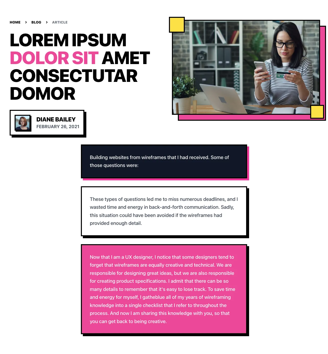
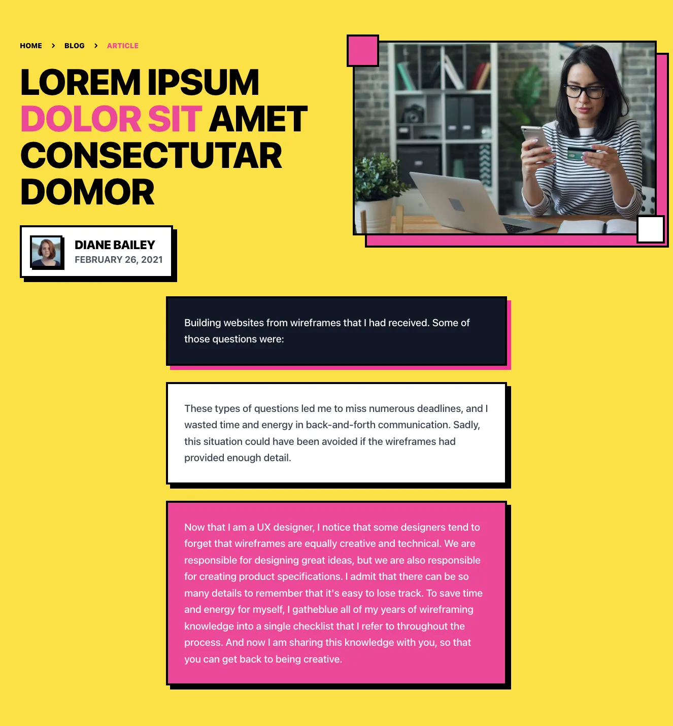
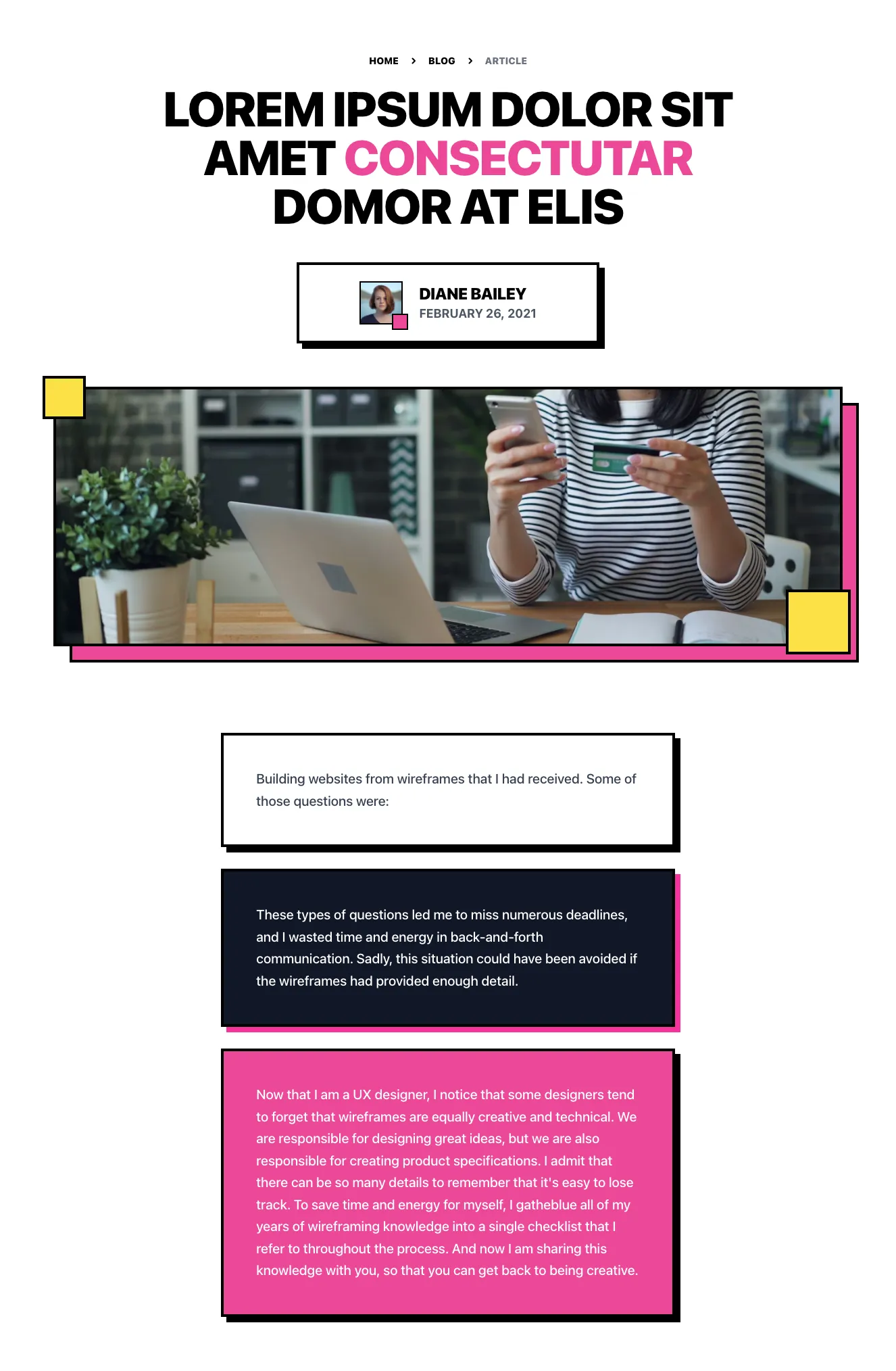
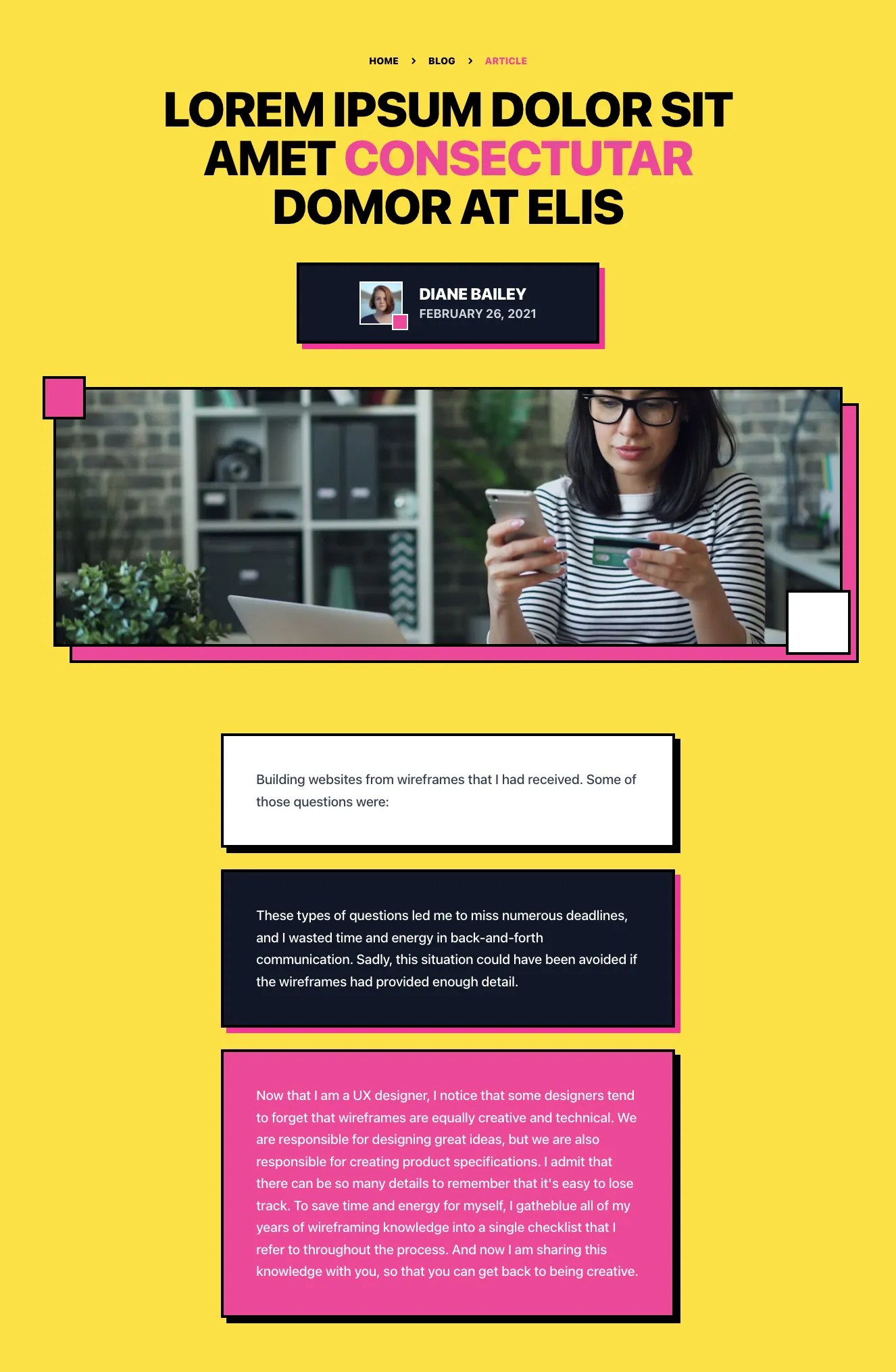
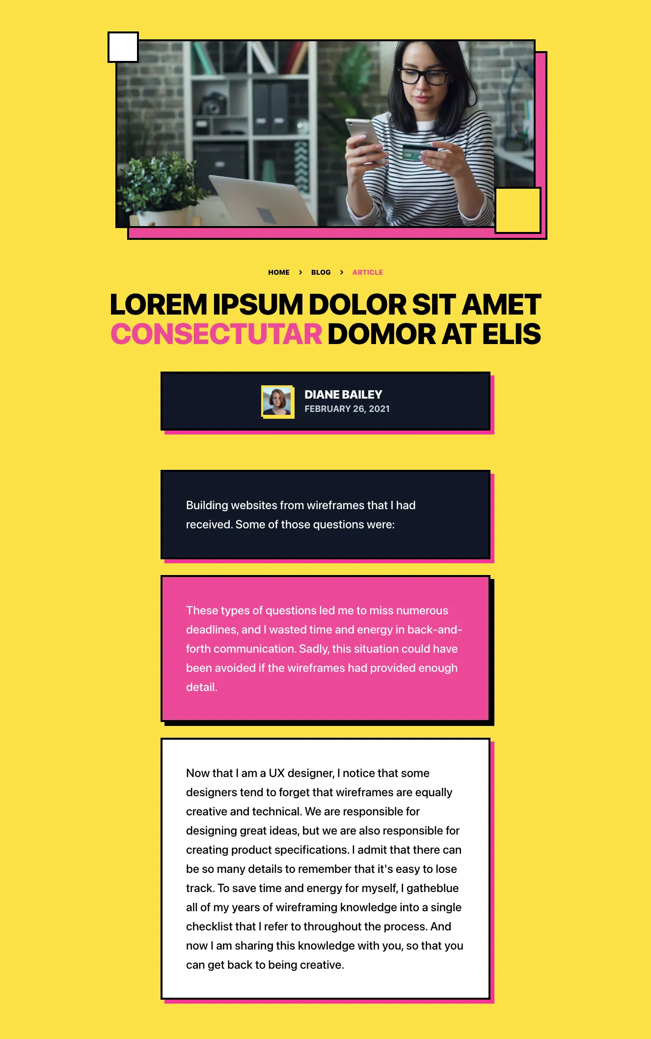
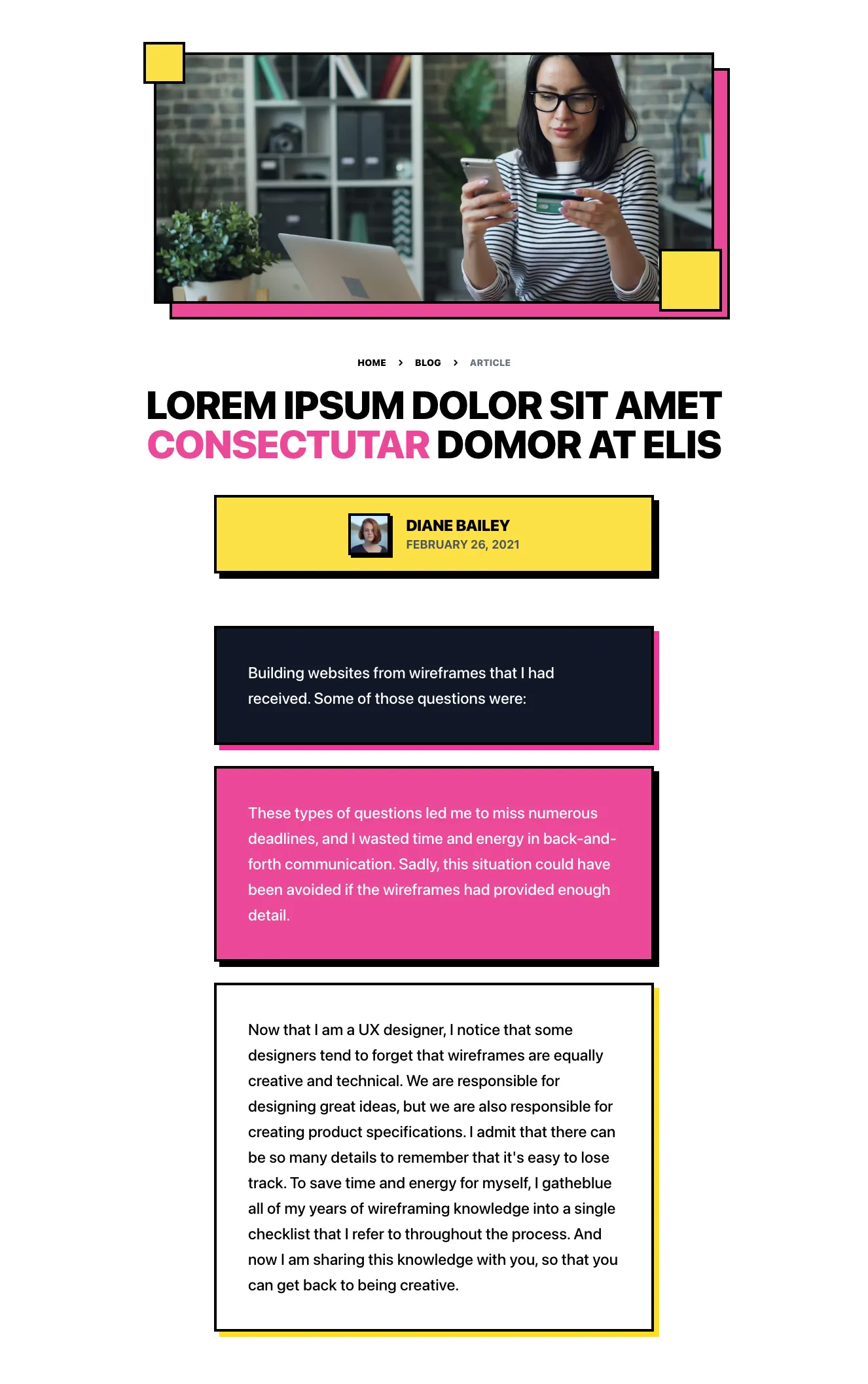
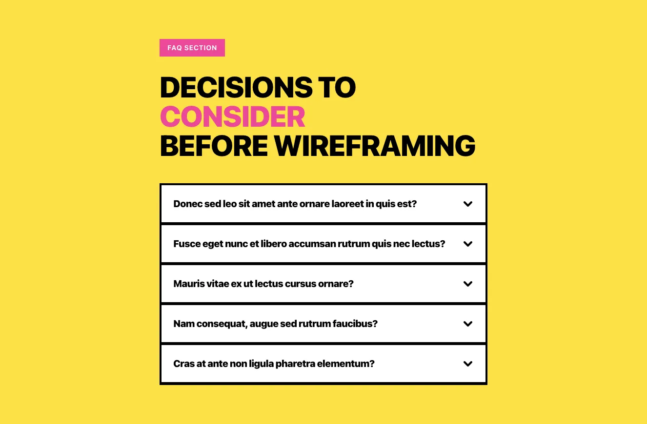
Blog Article Header with Hero Image and Quote Blocks
A yellow-background blog article layout showing breadcrumbs, a bold multi-line headline with a pink accent word, author byline with avatar and date, a framed hero photo with pink offset border, and stacked text callout blocks in pink, dark, and light styles. Content is arranged in a centered vertical stack with neo-brutalist hard black shadows and borders.
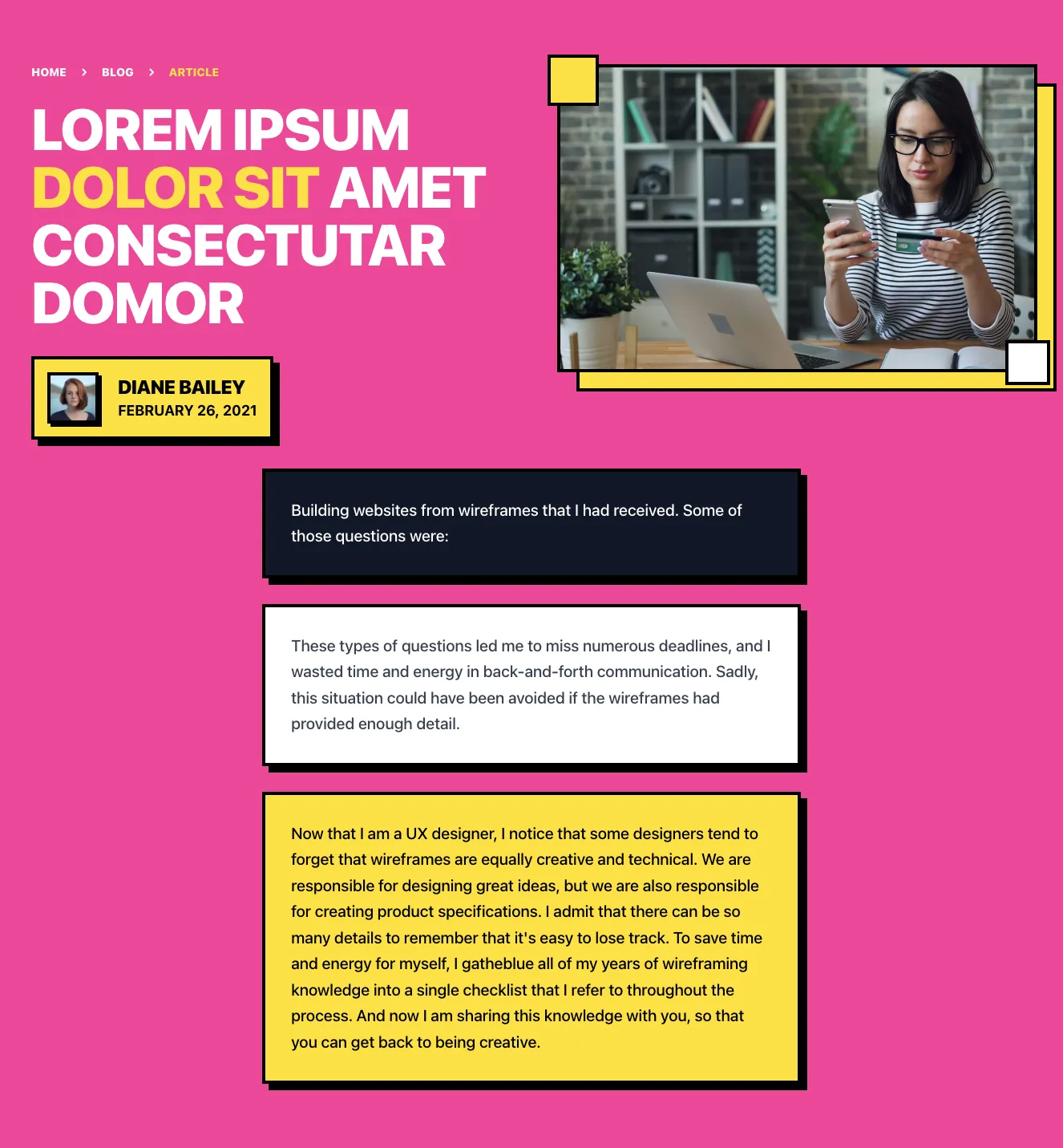
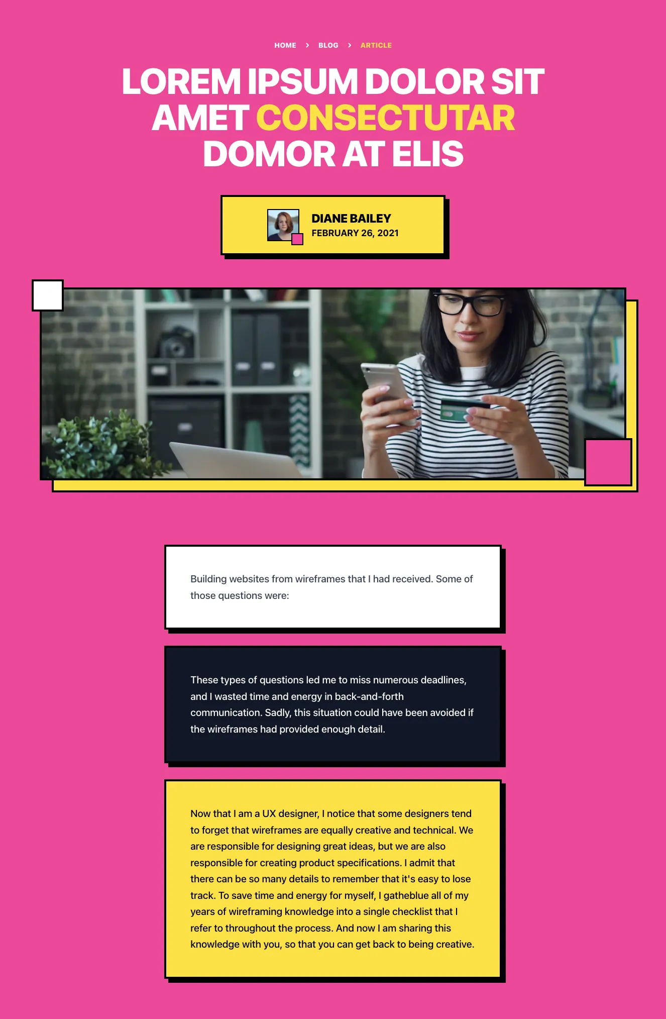
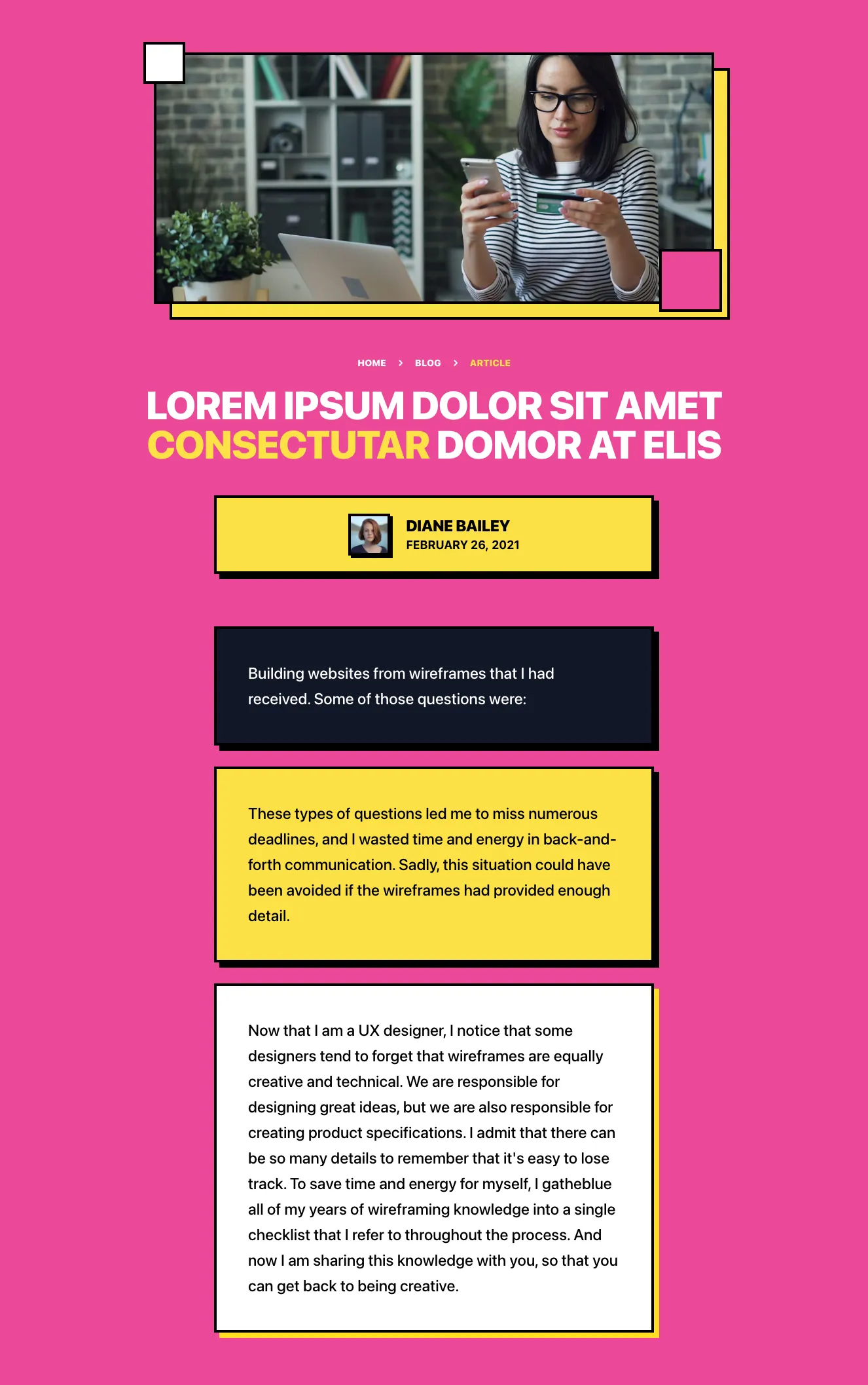
Pink Blog Article Header with Author and Hero Image
A blog article layout on a bold pink background with breadcrumb navigation, a large three-line heading with yellow accent word, author avatar and date, a framed hero photo with decorative offset borders, and stacked text callout blocks in yellow, dark, and light cards.
<section class="relative py-12 md:py-24 bg-body overflow-hidden">
  <div class="relative container mx-auto px-4">
    <div class="absolute top-0 left-0 -ml-60 -mt-96 w-186 h-186 bg-gradient-to-t from-purple-600 via-darkBlue-900 to-transparent rounded-full filter blur-4xl"></div>
    <div class="relative flex flex-wrap -mx-4">
      <div class="w-full lg:w-1/2 px-4 mb-16 lg:mb-0">
        <div class="max-w-2xl mx-auto lg:mx-0 lg:max-w-md xl:max-w-lg">
          <h2 class="font-heading text-4xl xs:text-5xl sm:text-6xl xl:text-7xl font-medium text-white tracking-tight mb-6">
            <span class="block">Casper</span>
            <span>is an awesome UI Library</span>
          </h2>
          <p class="text-3xl font-medium text-gray-600 mb-4">Arcu ultrices sit non magna enim id semper quam venenatis. Mi quisque ultrices hendrerit nec aliquet integer mollis faucibus morbi.</p>
          <p class="text-3xl font-medium text-gray-600">Augue justo at convallis vitae nunc maecenas est. Viverra duis feugiat posuere vitae tincidunt.</p>
        </div>
      </div>
      <div class="w-full lg:w-1/2 px-4">
        <div class="max-w-2xl mx-auto lg:mx-0 lg:max-w-md xl:max-w-xl">
          <h3 class="text-2xl text-gray-50 font-medium mb-8">Mi quisque ultrices hendrerit nec aliquet integer mollis faucibus morbi.</h3>
          <p class="text-lg tracking-tight text-gray-200 mb-4">Pellentesque ipsum nulla in eget interdum a. Neque pellentesque pulvinar mauris pulvinar diam. Turpis aliquet pellentesque velit vitae nisi sed morbi ultrices sed. Egestas interdum elit integer nec pharetra eget blandit dolor purus. A sed nisi congue morbi fermentum blandit. Turpis pretium dignissim risus ultrices purus et amet netus nibh.</p>
          <p class="text-lg tracking-tight text-gray-200 mb-10">Vestibulum est ante in congue a fusce nunc. At tristique donec nisi viverra vulputate blandit orci at lectus. Morbi cras urna congue ornare. Mi magna vestibulum tortor id nec tortor non. Enim orci lorem egestas sed morbi dui mauris etiam nulla. Euismod cursus viverra ut ac eu sit quam amet tempor. Id in suspendisse nam sit vitae ullamcorper mollis et ut.</p>
          <img class="block w-full" src="casper-assets/content/image-robot.png" alt="">
        </div>
      </div>
    </div>
  </div>
Get the code for 13,400+ components
Create a free account to copy production-ready code from every component in the library.
Free account · No credit card · No password needed
Components are just the start. See how a project goes from prompt to production‑ready code with Shuffle.
Dark Split-Screen Hero with Headline and Space Illustration
A dark promotional section with a large headline and muted supporting text on the left, and a subheading, body paragraphs, and a 3D space illustration of a robot on the right. It introduces a UI library with a split-screen layout and no visible navigation or form controls.
Dark Blog Article Header with Hero Image and Body Text
A dark-themed blog article layout showing a category label, large serif-like display heading, a full-width 3D illustration of a robot in space, a subheading, and two paragraphs of body text in a centered single column.
Content makes the page. In our Tailwind content components, we provide you with many possible variations of content presentation. Regardless of its type and length, you'll find a way to show what's important to your audience.
Browse the Tailwind navigation component variants available in our editor. Under each of them is clear code that you can easily edit. Components are sorted by UI libraries, which consist of many other elements in the same style. Each of these libraries was created by our talented designers to allow you to create diverse and pretty pages.
See all variations of Tailwind navigation components and the code underneath them in Shuffle Editor.
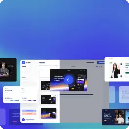
Switch the editor to Grid and every page of your project appears side by side on one canvas. Arrange them freely, zoom in and out, and add as many new pages as you need in a few clicks.
The AI Agent just got a lot more powerful
Describe what you need in one chat and the Agent does the rest: it adds new sections, edits copy and styles, moves blocks around or removes them across your whole page. No modes, no switching, just tell it what to change.
Multi-AI Designer can now regenerate designs
Not quite there yet? Ask for tweaks like missing assets, your logo or other details, and regenerate the design without starting from scratch.





























 Next.js
 Astro
 HTML
 WordPress
 Laravel


