Choose from 80+ professionally designed UI libraries and build stunning, responsive websites faster and more effortlessly than ever before.
Explore UI Libraries ↓ Open in Editor
Create your design from scratch with AI. Ideal if you prefer not to use Shuffle’s component libraries and want to build something completely new.
Framework

Usage
 Open in Editor
A dynamic and versatile UI library that adds color to your designs, making your user experience truly out of this world!
 Open in Editor
DarkPro is a sleek UI library with a dark, luxurious aesthetic accented with rich purple tones for an elegant and modern UI.
 Open in Editor
Flaro uses fantastic glassmorphism elements to make your website shine!
 Open in Editor
Blurs and gradients will delight you in a modern and vibrant UI library.
 Open in Editor
Solstice has a modern web design layout featuring a bold color scheme with a mix of sharp and rounded geometric shapes.
 Open in Editor
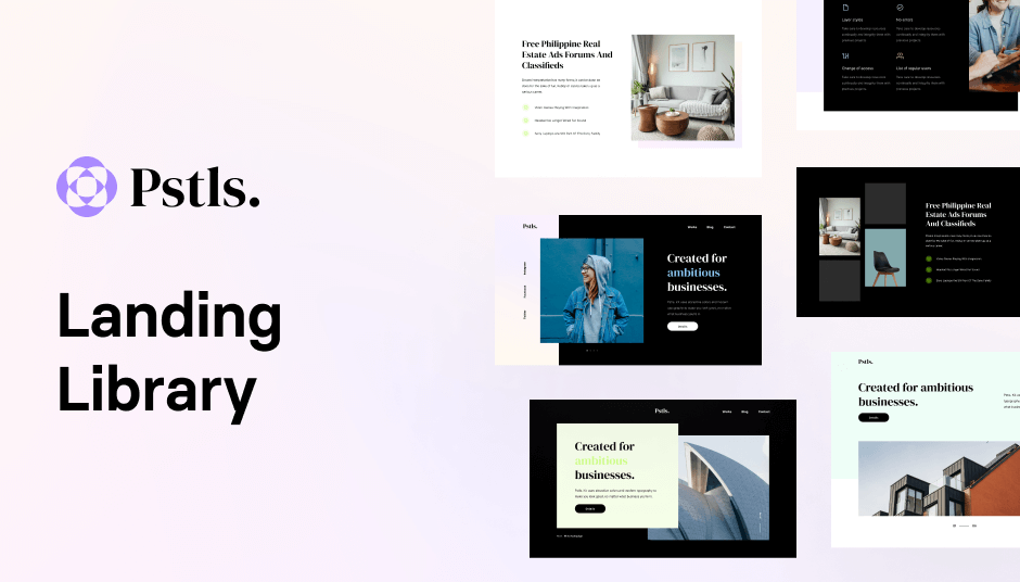
A delightful UI library that brings the soothing beauty of pastel gradients to your projects.
 Open in Editor
Clean esthetics, creative patterns, and a lot of UI components included!
 Open in Editor
Accelerate your workflow with cutting-edge neon and modern styles.
 Open in Editor
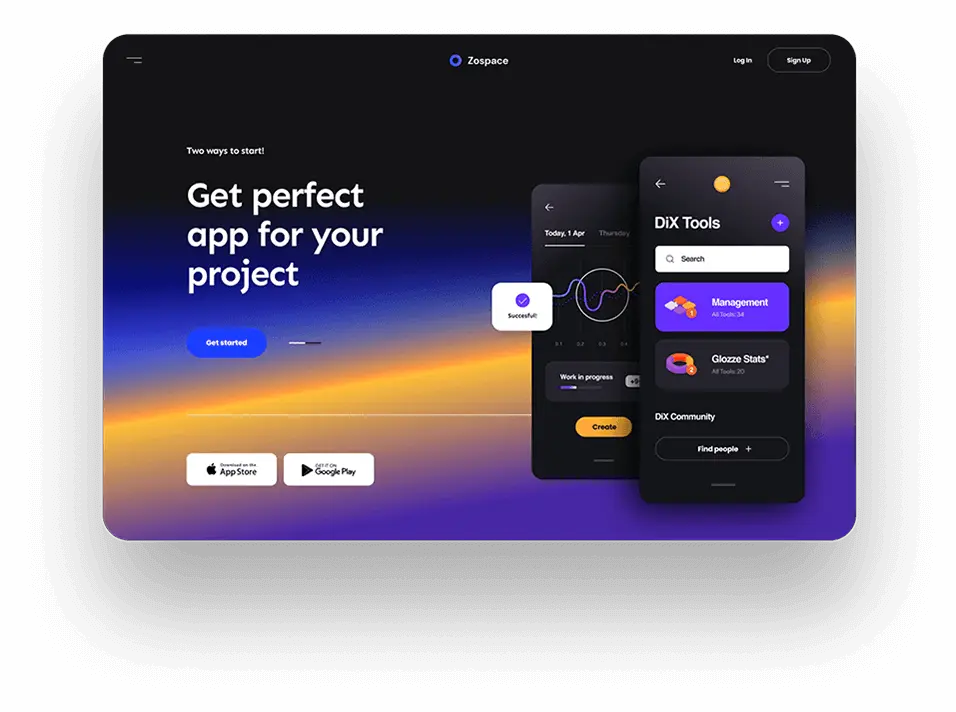
You can find here modern components built with colorful aesthetics and eye-catching details that will delight you.
 Open in Editor
Artemis is designed to present key content easily. Control metrics and respond to changes! (learn more)
 Open in Editor
We created Trizzle specifically for admin panels and dashboards focused on presenting data.
 Open in Editor
If you are looking for a combination of cosmic depth and professionalism, this new UI Library is a must-see! (learn more)
 Open in Editor
Wrexa UI combines modern components with curved lines and unusual shapes. All dipped in purple details.
 Open in Editor
The largest set of UI components will allow you to find the right design for any purpose.
 Open in Editor
Uinel's design is composed of calm tones, broken by a splash of intense colors.
 Open in Editor
Shopal is a UI library created especially for e-commerce. Beautiful eye-catching colors and patterns are included.
 Open in Editor
Create best-selling stores using the Yofte E-commerce UI Kit.
 Open in Editor
Our newest library, Nigodo, flirts with brutalist motifs while creating a cohesive and enjoyable composition.
 Open in Editor
It is a theme with different color variations that will make your website look neat and modern without extra effort.
 Open in Editor
BoldUI is a daring design that will win the attention of even the most demanding audience.
 Open in Editor
The tactfully arranged colors and logical layout of each section make Acros UI captivating at first sight.
 Open in Editor
The library dips into soft, balanced colors, allowing you to vary the pages you create.
 Open in Editor
We have prepared Bendis library to bring your site to life and add a little fire to your projects. (learn more)
 Open in Editor
If you want your website to look professional, no matter what brand it will represent, this is a library for you.
 Open in Editor
If you want to take care of the design and details yourself, you can use Shuffle UX to set the site's basic structure.
 Open in Editor
Cronos UI library is the perfect combination of luxury and nature.
 Open in Editor
This theme is an extension for React components based on Material-UI 4.11.0.
 Open in Editor
The most requested UI library is now available in Shuffle!
 Open in Editor
The sunny colors give the overall aesthetic a warm and welcoming feel.
 Open in Editor
Vendia is an elegant design with a touch of color to create an exclusive look for your e-commerce.
 Open in Editor
A library designed for e-commerce websites, featuring a collection of components with a soothing pastel color palette.
 Open in Editor
Consulty is a versatile business template designed for consulting firms and professional services.
 Open in Editor
Sirius will give your dashboards the clarity and crispness you need when working with data.
 Open in Editor
Colorful style with a modern touch, enlivened with creative and innovative visual elements.
 Open in Editor
Mirga is ideal for modern projects. Its large typography and expressive shapes will make your project stand out.
 Open in Editor
Intuitive UI library meticulously crafted to elevate your app design experience.
 Open in Editor
A minimalist design featuring a dominant color scheme of black and white for a sophisticated and timeless aesthetic.
 Open in Editor
Dashy for Tailwind CSS is designed to help you create aesthetically pleasing dashboards.
 Open in Editor
Aurora offers a collection of components in 5 styles, including dark, green-gradient, green, light, and white.
 Open in Editor
Flow is a vibrant green UI library tailored for environment-related applications.
 Open in Editor
Set of beautifully designed UI components for creating visually appealing landing pages with a dark-themed aesthetic.
 Open in Editor
Discover a library that combines stunning typography and consistent design principles.
The libraries listed below use the default styles provided by CSS frameworks.
 Open in Editor
Create your projects with neat components build with standard (plain) Bulma v0.9.3.
Framework

Usage
Open in Editor
If you want to take care of the design and details yourself, you can use Shuffle UX to set the site's basic structure.
Framework
Usage
 Open in Editor
This is a plain Bootstrap v5. It doesn't have custom styles and is a good choice for building your theme from scratch.
Framework
Usage
 Open in Editor
React components for your projects created with default Material-UI.
Framework

Usage
Build websites faster with an AI Visual Editor
© 2026 Shuffle. All rights reserved.


 Start Creating
