Explore 13,600+ free, copy-paste website components for Tailwind CSS, Bootstrap, Material UI and shadcn/ui – from hero sections and navbars to pricing tables and footers. Customize any block in the visual editor and export clean, responsive code.
Full Shuffle Editor access for just $10
Great for quick projects and for testing everything Shuffle can do. One-time payment, not a subscription.
Get 7-Day PassNew to Shuffle? Try our tools:

Create a free account to copy production-ready code from every component in the library.
Free account · No credit card · No password needed
Already have an account? Sign in
A light-themed marketing hero section for a tech startup, featuring a large two-line heading with an italic serif accent word, a short mission statement, an orange call-to-action button, a trusted-by logo row, and a stats card beside a decorative robotic hand illustration.


Create a free account to copy production-ready code from every component in the library.
Free account · No credit card · No password needed
Already have an account? Sign in
A dark-themed landing page hero with a navigation bar, a large two-line headline, supporting paragraph, primary and secondary call-to-action buttons, and a trusted-by avatar row on the left. A rounded photograph of people working at computers sits on the right, serving as a promotional visual for a software product.




Create a free account to copy production-ready code from every component in the library.
Free account · No credit card · No password needed
Already have an account? Sign in
A landing page hero section for a mentoring platform, featuring a navigation bar, a bold two-line headline, a subheading, primary and secondary call-to-action buttons, and a trusted-by logo row. On the right, floating mentor profile cards with avatars, names, roles, and session prices overlay a gradient circle graphic.


Create a free account to copy production-ready code from every component in the library.
Free account · No credit card · No password needed
Already have an account? Sign in
A dark gradient hero section for a remote team management product, featuring a bold headline, two CTA buttons, a testimonial quote, and a scattered grid of team member profile cards showing names, roles, and locations on the right.


Create a free account to copy production-ready code from every component in the library.
Free account · No credit card · No password needed
Already have an account? Sign in
A landing page hero with a top navigation bar, a centered bold headline 'Unlock collective knowledge', supporting text, and an orange call-to-action button, followed by three illustrative UI preview cards showing a note, a Pomodoro timer, and a todo list with avatars.


Create a free account to copy production-ready code from every component in the library.
Free account · No credit card · No password needed
Already have an account? Sign in
A dark marketing hero section for the Basko brand-building tool, featuring a navigation bar, a serif headline, primary and secondary call-to-action buttons, social proof avatars, and a framed dashboard screenshot on a gradient border. The two-column layout places text on the left and the illustrative app preview on the right.


Create a free account to copy production-ready code from every component in the library.
Free account · No credit card · No password needed
Already have an account? Sign in
A hero section with a navigation bar at top, a tablet photograph on the left, and a centered headline, supporting paragraph, and two call-to-action buttons on the right. The light background and split two-column layout distinguish it as a marketing introduction for a product.


Create a free account to copy production-ready code from every component in the library.
Free account · No credit card · No password needed
Already have an account? Sign in
A dark full-width hero section with a top navigation bar, a large left-aligned headline about credit history, short supporting text, and a lime call-to-action button. A decorative gradient credit card illustration sits on the right side as an illustrative visual.


Create a free account to copy production-ready code from every component in the library.
Free account · No credit card · No password needed
Already have an account? Sign in
A light-themed marketing hero section for the Zeus brand with a top navigation bar, a large bold headline about performance, supporting paragraph text, and a primary pink button alongside an outlined secondary button. The right side displays a decorative illustration of a smiling woman with floating yellow and blue icon badges on pale blue shapes.


Create a free account to copy production-ready code from every component in the library.
Free account · No credit card · No password needed
Already have an account? Sign in
A horizontal page header for a dashboard showing a blue icon tile, bold title, muted subtitle, and three action buttons on the right: Download, Settings, and Report. The light background and simple row layout make it a compact header bar for an application dashboard view.


Create a free account to copy production-ready code from every component in the library.
Free account · No credit card · No password needed
Already have an account? Sign in
A split-screen hero section with a photo of two people on the left and a dark panel on the right containing a large heading "Find your editor and create your home." A purple Discover Now button and a floating white product card for the Kirk Oak armchair overlap the image.


Create a free account to copy production-ready code from every component in the library.
Free account · No credit card · No password needed
Already have an account? Sign in
A dark, full-width marketing hero for the Zospace app, featuring a large left-aligned headline, a subheading, and a blue Get started button. Two tilted phone mockups on the right display app screens, and a simple navigation bar sits at the top.


Create a free account to copy production-ready code from every component in the library.
Free account · No credit card · No password needed
Already have an account? Sign in
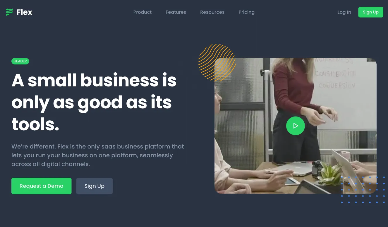
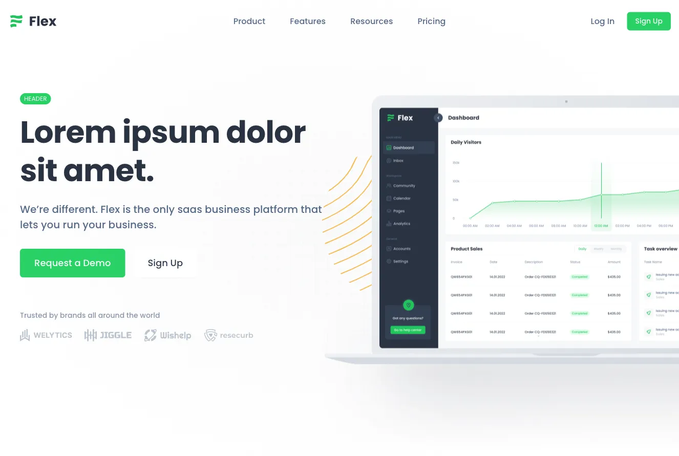
A dark-themed hero section for the Flex SaaS business platform, with a top navigation bar, a large two-line headline, a supporting paragraph, and Request a Demo and Sign Up buttons on the left, paired with an office photograph and decorative gold and blue accents on the right.






Create a free account to copy production-ready code from every component in the library.
Free account · No credit card · No password needed
Already have an account? Sign in
A marketing hero section for the Uinel product with a top navigation bar, a headline reading "A thousand tools for design", an email signup field with a Get started button, and an illustrated composition of floating tool badges, a task card with tabs, and a blue team card.


Create a free account to copy production-ready code from every component in the library.
Free account · No credit card · No password needed
Already have an account? Sign in
A full-width storefront hero section with a top navigation bar containing logo, search, category links, and cart, followed by a bold discount headline, a call-to-action button, and a product image with a floating product card. A row of partner brand logos appears at the bottom.


Create a free account to copy production-ready code from every component in the library.
Free account · No credit card · No password needed
Already have an account? Sign in
A light hero section for the Shopal storefront featuring a bold centered headline, supporting text, and two call-to-action buttons, flanked by product photographs of a mouse, phone, headphones, and keyboard on blue decorative panels. The layout uses a centered stack with a top navigation bar and carousel dots below.


Create a free account to copy production-ready code from every component in the library.
Free account · No credit card · No password needed
Already have an account? Sign in
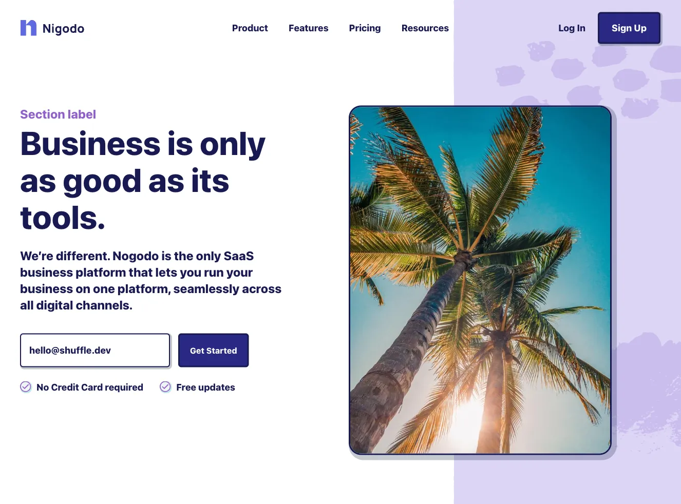
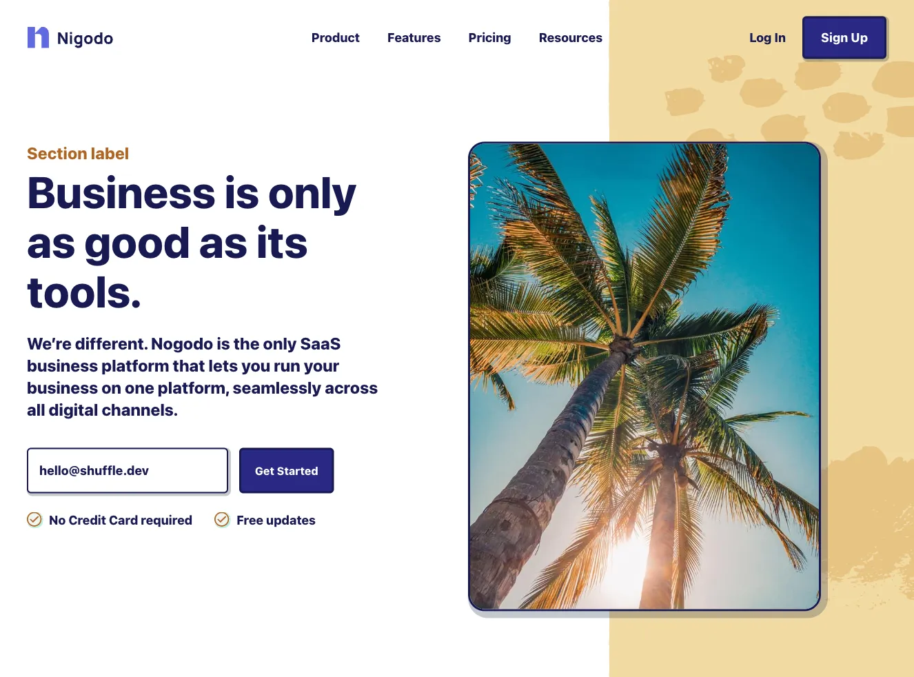
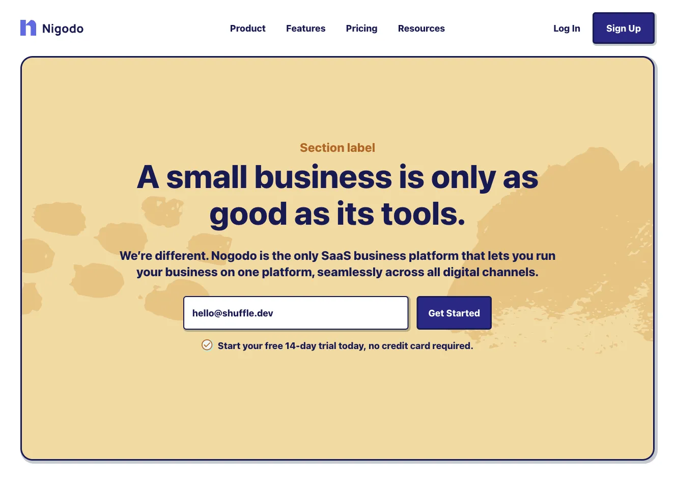
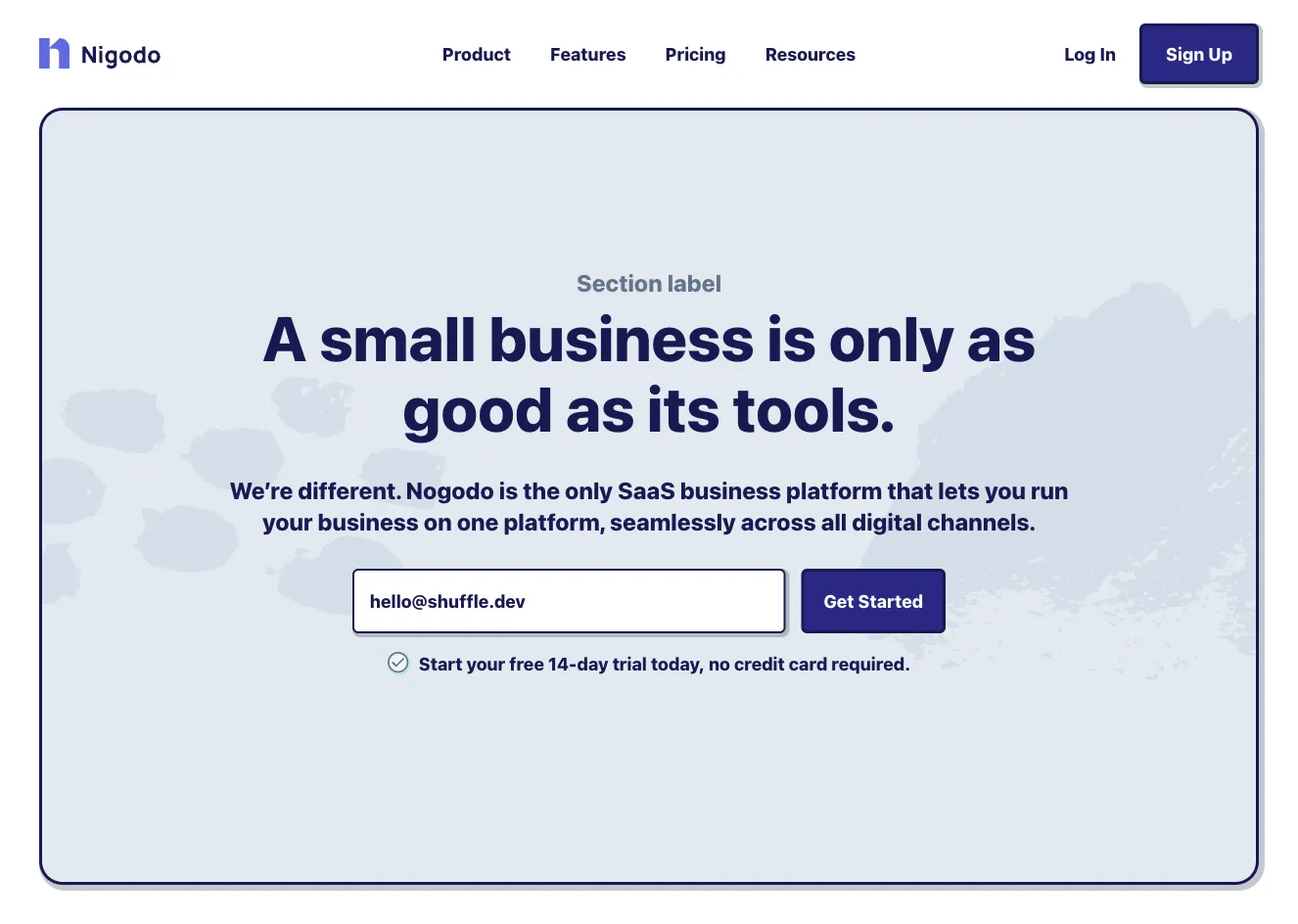
A marketing hero section for the Nigodo SaaS platform featuring a top navigation bar, a bold headline with supporting text, an email input with a Get Started button, and a rounded palm tree photograph on a teal background. The layout splits content into a left text column and a right image panel.










Create a free account to copy production-ready code from every component in the library.
Free account · No credit card · No password needed
Already have an account? Sign in
A landing page hero with a navigation bar at the top, a bold two-line headline with green accent text, supporting paragraph, and primary and secondary call-to-action buttons on the left. A large rounded photograph of a conference room sits on the right with decorative green shapes and dot patterns.


Create a free account to copy production-ready code from every component in the library.
Free account · No credit card · No password needed
Already have an account? Sign in
A marketing hero section with a top navigation bar, a large serif headline with a lavender accent word, a short paragraph, a black Details button, and a photo of a smiling person on the left. Social links are placed vertically on the left edge and carousel-style pagination dots appear below the image.


Create a free account to copy production-ready code from every component in the library.
Free account · No credit card · No password needed
Already have an account? Sign in
A dark landing-page hero with a large uppercase headline, a yellow "Start for free" call-to-action button, and a circular-masked portrait photo on the right. A logo row of brand names along the bottom suggests social proof.




Choose from 13615 of ready-made UI components available in Shuffle Editor. They are divided into 20+ UI libraries created by experienced designers. Each of them presents a unique style that will allow you to build a fantastic website.
By subscribing to the editor, you get access to all of them.
The UI libraries are available in four frameworks - Tailwind CSS, Bootstrap, Bulma, and Material-UI (React). We divided them into components, under which there is clear code. In Shuffle Editor, you can build whole templates from them, editing styles, texts, images, and other features. You can also export them as code and work in your favorite IDE.

Build websites faster with an AI Visual Editor



© 2026 Shuffle. All rights reserved.
See what you're getting before you commit.
Switch the editor to Grid and every page of your project appears side by side on one canvas. Arrange them freely, zoom in and out, and add as many new pages as you need in a few clicks.
Describe what you need in one chat and the Agent does the rest: it adds new sections, edits copy and styles, moves blocks around or removes them across your whole page. No modes, no switching, just tell it what to change.
Not quite there yet? Ask for tweaks like missing assets, your logo or other details, and regenerate the design without starting from scratch.


























