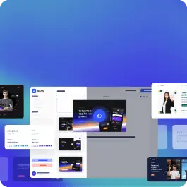
Browse 383 ready-made alert components from multiple UI libraries. Every variant is fully responsive – copy the code or customize it in the visual editor and export clean code.
Full Shuffle Editor access for just $10
Great for quick projects and for testing everything Shuffle can do. One-time payment, not a subscription.
Get 7-Day PassNew to Shuffle? Try our tools:

Create a free account to copy production-ready code from every component in the library.
Free account · No credit card · No password needed
Already have an account? Sign in
A horizontal notification banner with a blue background displaying an info icon, the message "This is an Info alert — check it out!", and a close (X) button on the right. It conveys a neutral informational status message across the full width of the container.


Create a free account to copy production-ready code from every component in the library.
Free account · No credit card · No password needed
Already have an account? Sign in
A single-line notification banner with a light peach background, orange left accent border, short text message, and a close (X) icon on the right. It conveys a status or informational message and can be dismissed.


Create a free account to copy production-ready code from every component in the library.
Free account · No credit card · No password needed
Already have an account? Sign in


Create a free account to copy production-ready code from every component in the library.
Free account · No credit card · No password needed
Already have an account? Sign in


Create a free account to copy production-ready code from every component in the library.
Free account · No credit card · No password needed
Already have an account? Sign in


Create a free account to copy production-ready code from every component in the library.
Free account · No credit card · No password needed
Already have an account? Sign in
A full-width yellow-toned alert banner displaying a bold heading 'Attention alert example', supporting body text, a warning triangle icon, and a close (X) control at the right edge. It conveys a cautionary status message in a single horizontal row.


Create a free account to copy production-ready code from every component in the library.
Free account · No credit card · No password needed
Already have an account? Sign in
A single-line notification banner on a light background with an info icon, a gradient-colored promotional message about September office hours and WME updates, and a close button on the right. It conveys a status or announcement message in a contained card.


Create a free account to copy production-ready code from every component in the library.
Free account · No credit card · No password needed
Already have an account? Sign in
A full-width horizontal announcement bar with a yellow-to-blue gradient background, centered message text, and a black pill-shaped Dismiss button on the right. It is used to inform visitors of a site-wide message and can be closed.


Create a free account to copy production-ready code from every component in the library.
Free account · No credit card · No password needed
Already have an account? Sign in
A full-width orange top banner displaying a short announcement message with an underlined inline link and a dismiss (close) icon on the right. The banner uses a subtle patterned background and sits above a plain light gray content area.


Create a free account to copy production-ready code from every component in the library.
Free account · No credit card · No password needed
Already have an account? Sign in


Create a free account to copy production-ready code from every component in the library.
Free account · No credit card · No password needed
Already have an account? Sign in


Create a free account to copy production-ready code from every component in the library.
Free account · No credit card · No password needed
Already have an account? Sign in


Create a free account to copy production-ready code from every component in the library.
Free account · No credit card · No password needed
Already have an account? Sign in


Create a free account to copy production-ready code from every component in the library.
Free account · No credit card · No password needed
Already have an account? Sign in
A full-width blue notification banner that informs visitors about functional and analytical cookie usage, with a privacy policy link, a dismiss close icon, and two action buttons for managing preferences or accepting cookies.


Create a free account to copy production-ready code from every component in the library.
Free account · No credit card · No password needed
Already have an account? Sign in


Choose from 383 variations of Alert UI components. Presented here are variants available in various UI libraries.
Get access to all UI components, code, and our visual editor. Try the demo for free!

Build websites faster with an AI Visual Editor


© 2026 Shuffle. All rights reserved.
See what you're getting before you commit.
Switch the editor to Grid and every page of your project appears side by side on one canvas. Arrange them freely, zoom in and out, and add as many new pages as you need in a few clicks.
Describe what you need in one chat and the Agent does the rest: it adds new sections, edits copy and styles, moves blocks around or removes them across your whole page. No modes, no switching, just tell it what to change.
Not quite there yet? Ask for tweaks like missing assets, your logo or other details, and regenerate the design without starting from scratch.