Browse 512 beautiful UI components — complete with full source code, visual editing, AI assistance, and more.


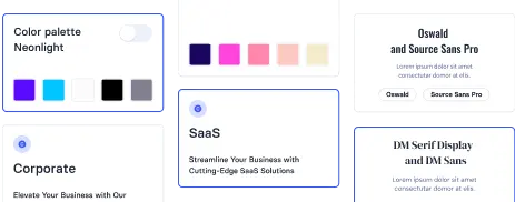
Choose from 512 variations of Blog UI components. Presented here are variants available in various UI libraries.
Get access to all UI components, code, and our visual editor. Try the demo for free!
Build websites faster with an AI Visual Editor
© 2026 Shuffle. All rights reserved.


