Can't find the right component?
Describe it and Shuffle AI builds it in seconds, ready to edit and export.
Browse 237 ready-made Tailwind CSS navbar components from multiple UI libraries. Every variant is fully responsive – copy the code or customize it in the visual editor and export clean code.
Create a free account to copy production-ready code from every component in the library.
Free account · No credit card · No password needed
Already have an account? Sign in
Components are just the start. See how a project goes from prompt to production‑ready code with Shuffle.
A dark-themed section header showing a bold white heading "Section header" with a smaller gray subtitle line below and a thin divider beneath. It is a simple text-only heading block used to introduce a content section.
Create a free account to copy production-ready code from every component in the library.
Free account · No credit card · No password needed
Already have an account? Sign in
Components are just the start. See how a project goes from prompt to production‑ready code with Shuffle.
A horizontal application header bar showing a breadcrumb trail (Start > Main Tasks) on the left and search, messages, notification icons, and a user profile with avatar, name Thomas Brown, and role Developer on the right. It is a navigation bar for an internal dashboard-style app.
Create a free account to copy production-ready code from every component in the library.
Free account · No credit card · No password needed
Already have an account? Sign in
Components are just the start. See how a project goes from prompt to production‑ready code with Shuffle.
A page header row showing a bold heading and short supporting text on the left, with three action buttons on the right: an outlined button, a green filled button, and a dark icon-only plus button. Simple, horizontal layout suited to dashboard or admin page headers.
Create a free account to copy production-ready code from every component in the library.
Free account · No credit card · No password needed
Already have an account? Sign in
Components are just the start. See how a project goes from prompt to production‑ready code with Shuffle.
A horizontal page header on a light blue background showing the bold heading "Product analysis," a gray subtitle beneath it, and two rounded action buttons labeled "All" and "Settings" aligned to the right.
Create a free account to copy production-ready code from every component in the library.
Free account · No credit card · No password needed
Already have an account? Sign in
Components are just the start. See how a project goes from prompt to production‑ready code with Shuffle.
A simple page header showing a bold greeting 'Welcome John' with a waving hand emoji, followed by a muted subtitle prompting the user to check today's sales report. It has no other controls, cards, or navigation visible, so it reads as a minimal dashboard greeting banner.
Create a free account to copy production-ready code from every component in the library.
Free account · No credit card · No password needed
Already have an account? Sign in
Components are just the start. See how a project goes from prompt to production‑ready code with Shuffle.
A slim, mostly empty top bar with a rounded outlined hamburger menu button on the left and a circular user avatar on the right. No logo, title, or navigation links are visible, so it reads as a bare application header or navbar shell.
Tailwind navbar component serves to orient users on the website. It is a group of the most important links that will allow users to find information that is important to them. The success of a good navbar component lies in the right balance between simplicity and clarity. It must be comprehensible at a glance and at the same time consist of a small number of short elements.
Choose from many variants of Tailwind navbar components. The variants shown here are available in various UI libraries in the Shuffle editor. You will also find many other types of components that will follow the same style. This will allow you to build a comprehensive Tailwind website template. Each library is designed by a professional designer and coded by our team of developers.
Get access to all Tailwind component navbar sections, code and our editor. Try the demo for free.
How you’ll build with Shuffle.
© 2026 Shuffle. All rights reserved.
See what you're getting before you commit.
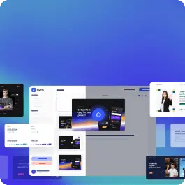
Switch the editor to Grid and every page of your project appears side by side on one canvas. Arrange them freely, zoom in and out, and add as many new pages as you need in a few clicks.
Describe what you need in one chat and the Agent does the rest: it adds new sections, edits copy and styles, moves blocks around or removes them across your whole page. No modes, no switching, just tell it what to change.
Not quite there yet? Ask for tweaks like missing assets, your logo or other details, and regenerate the design without starting from scratch.