Browse 263 ready-made Tailwind CSS blog components from multiple UI libraries. Every variant is fully responsive – copy the code or customize it in the visual editor and export clean code.
 Tailwind CSS
Full Shuffle Editor access for just $10
Great for quick projects and for testing everything Shuffle can do. One-time payment, not a subscription.
Get 7-Day PassNew to Shuffle? Try our tools:

Create a free account to copy production-ready code from every component in the library.
Free account · No credit card · No password needed
Already have an account? Sign in
A blog section with an eyebrow label, a large mixed sans and italic serif heading, and a vertical list of three article rows, each with a thumbnail, date, title, and orange Read link. A See More Articles button appears below the list.


Create a free account to copy production-ready code from every component in the library.
Free account · No credit card · No password needed
Already have an account? Sign in
A dark-themed section with a centered eyebrow label, large heading, and intro paragraph above a grid of image cards. Each card shows a photo, date, title, excerpt, and a 'Read more' link, arranged as one wide card and one tall card in the top row followed by three cards in the second row.


Create a free account to copy production-ready code from every component in the library.
Free account · No credit card · No password needed
Already have an account? Sign in
A centered section with a bold heading and intro text above a two-column grid of blog article entries, each with a thumbnail image, category label, headline, and author avatar with name. Light background with spacious layout and minimal decoration.


Create a free account to copy production-ready code from every component in the library.
Free account · No credit card · No password needed
Already have an account? Sign in
A dark-themed section with a centered heading and subtitle above a four-column grid of image cards. Each card shows a category label, read time, and headline over a translucent overlay on a photograph.


Create a free account to copy production-ready code from every component in the library.
Free account · No credit card · No password needed
Already have an account? Sign in
A blog listing page with an orange hero heading, a featured article card with image, a "Latest articles" section divider, a three-column grid of article cards with tags, titles, excerpts and metadata, and Prev/Next pagination controls. Content is organized in a clean, light-background layout beneath the orange header.


Create a free account to copy production-ready code from every component in the library.
Free account · No credit card · No password needed
Already have an account? Sign in
A marketing-style section with a serif "New Articles" heading above two side-by-side article cards, each with an image, purple Insights category label, date, bold title, and short excerpt. Cards are arranged in a simple two-column grid with generous whitespace.


Create a free account to copy production-ready code from every component in the library.
Free account · No credit card · No password needed
Already have an account? Sign in
A light-background blog preview section with a small blue eyebrow label, a bold centered heading, a short intro paragraph, three article cards with photos, titles, and category/read-time metadata, and a dark pill-shaped call-to-action button below.


Create a free account to copy production-ready code from every component in the library.
Free account · No credit card · No password needed
Already have an account? Sign in
A dark-themed blog section with a centered eyebrow label and 'Blog' heading above a horizontal row of article cards, each showing a photo, title, excerpt, author avatar, name, and read time. Cards extend past the viewport edges, suggesting a horizontally scrolling carousel.


Create a free account to copy production-ready code from every component in the library.
Free account · No credit card · No password needed
Already have an account? Sign in
A section with a centered eyebrow label, large heading, and intro paragraph above a mixed grid of six blog-style cards, each with a photo, timestamp, title, excerpt, and red Read more link. The layout uses a large wide card in the top row and three columns in the bottom row, with decorative dashed curves and colored icon circles.


Create a free account to copy production-ready code from every component in the library.
Free account · No credit card · No password needed
Already have an account? Sign in
A light-background blog feature section labeled "07 Our Blog" with a decorative grid of purple circles (Furniture, Interior Design, Product) on the left and a news-tagged article headline, excerpt, hashtags, and a Learn More button on the right. Split layout pairs a visual motif with editorial text content.


Create a free account to copy production-ready code from every component in the library.
Free account · No credit card · No password needed
Already have an account? Sign in
A dark-themed blog section with an eyebrow label, centered heading, and three staggered article cards, each with a photo, date badge, and title. A blue pill 'See all' button sits below the grid.


Create a free account to copy production-ready code from every component in the library.
Free account · No credit card · No password needed
Already have an account? Sign in
A blog index section with a centered heading, subtitle, search input, and category tabs above a two-column grid of article cards, each showing an image, category badge, author and date, title, excerpt, and a Read Post link. A View more button sits below the grid.


Create a free account to copy production-ready code from every component in the library.
Free account · No credit card · No password needed
Already have an account? Sign in
A blog section with an eyebrow label and large "Latest blog" heading above a horizontal row of staggered image cards, each with a category tag, date, and headline. A circular right-arrow button sits at the bottom right to advance the carousel.


Create a free account to copy production-ready code from every component in the library.
Free account · No credit card · No password needed
Already have an account? Sign in
A horizontal carousel of blog post cards under a "Latest Blog" heading, each with a photo, category tag, bold headline, and date. Previous/next arrow buttons, a progress bar, and a "Show More" button sit below the cards.


Create a free account to copy production-ready code from every component in the library.
Free account · No credit card · No password needed
Already have an account? Sign in
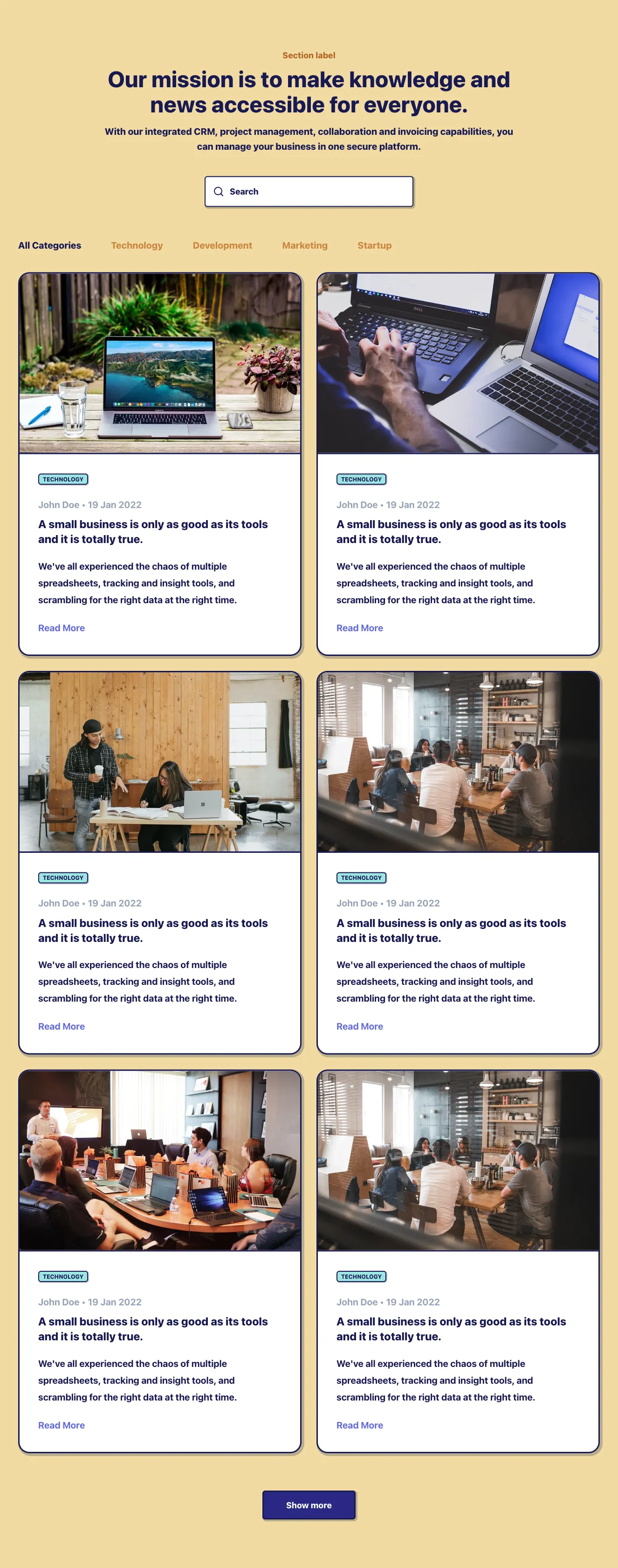
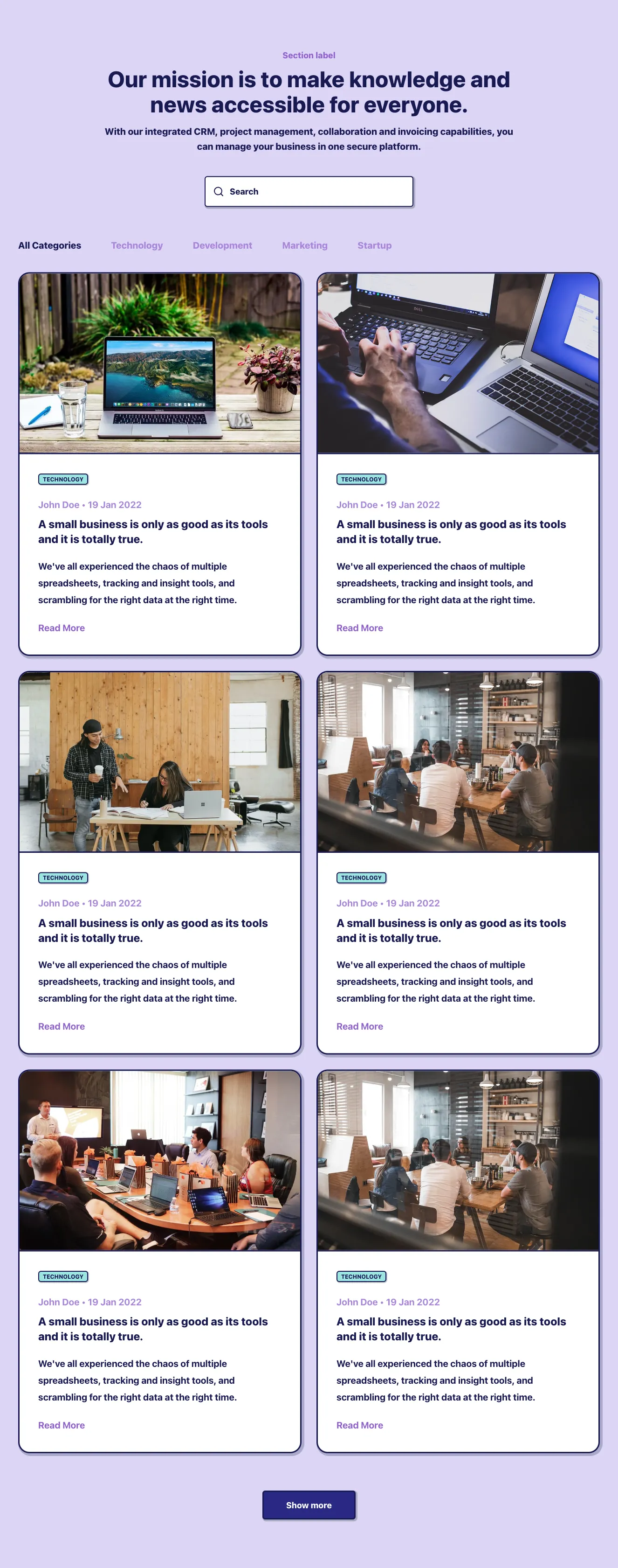
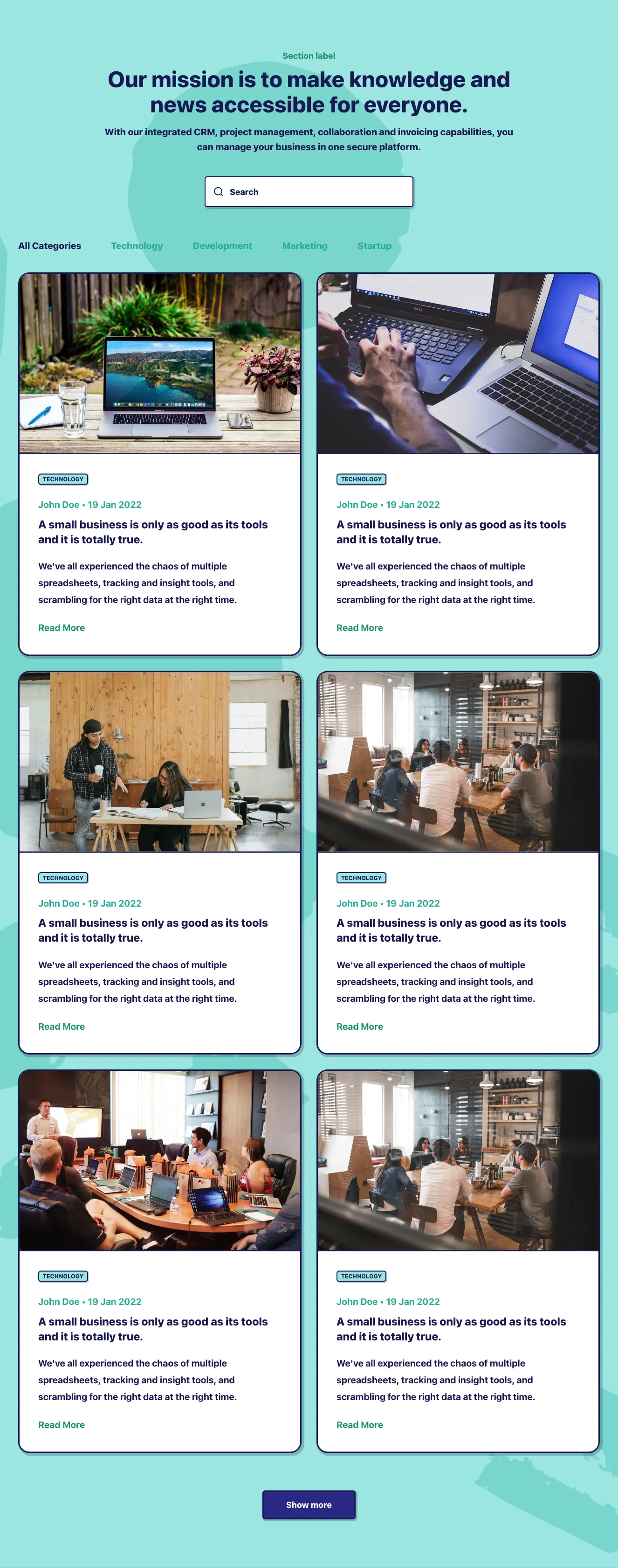
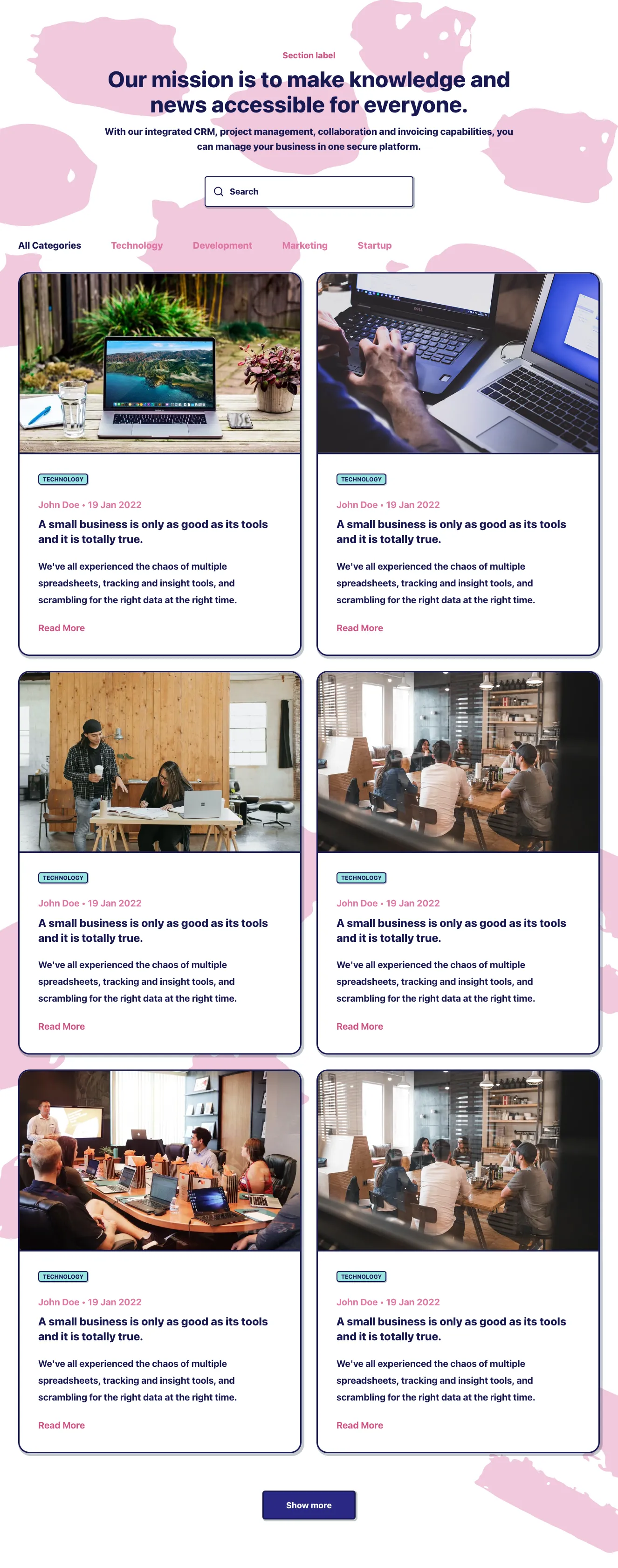
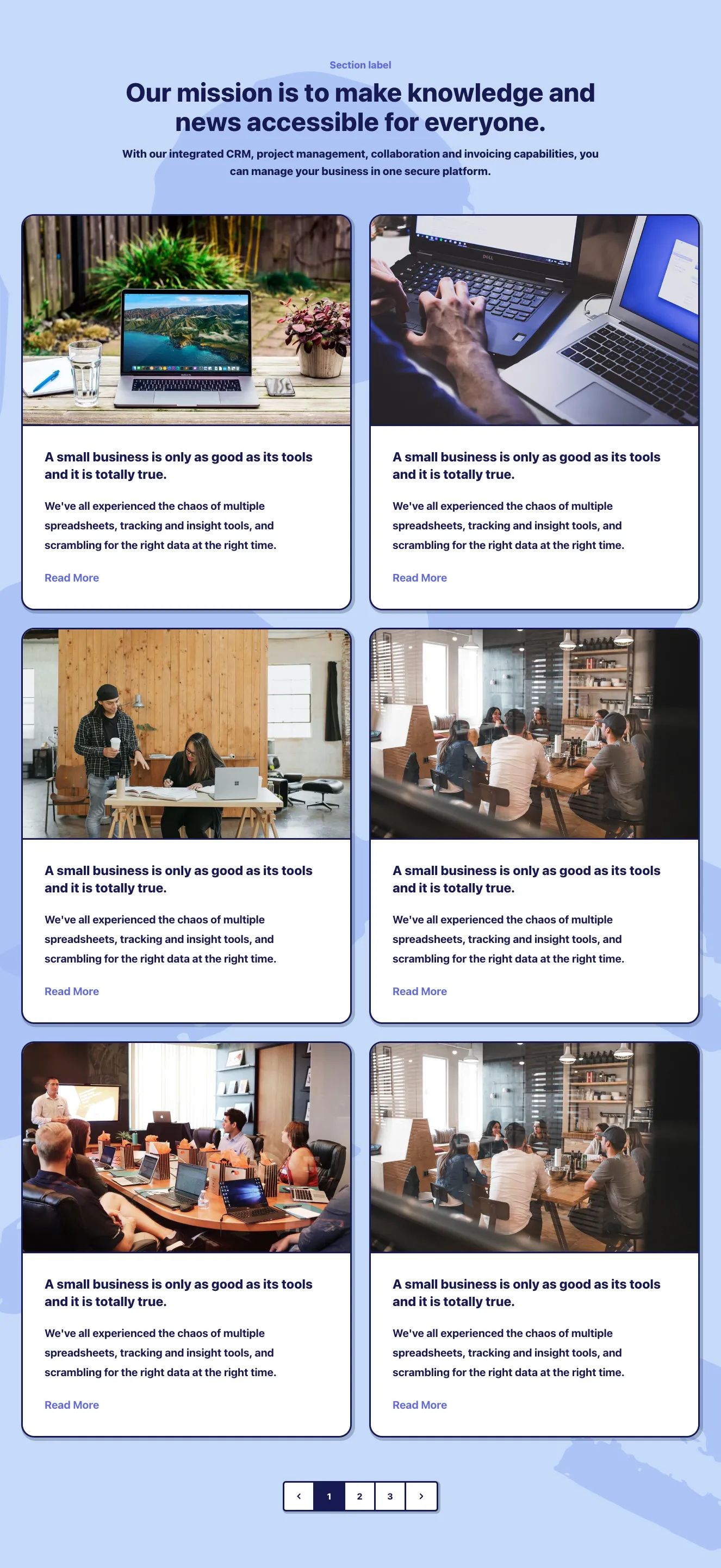
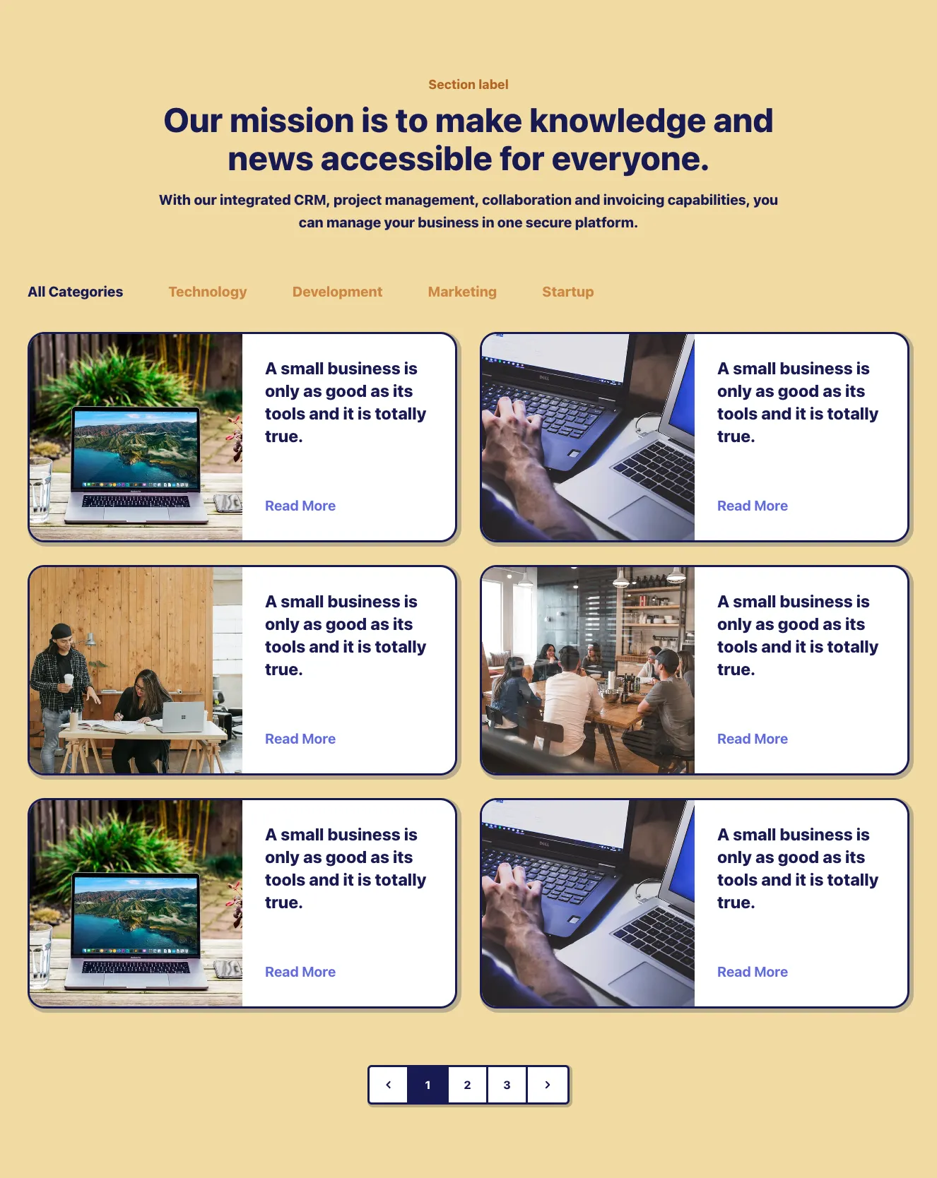
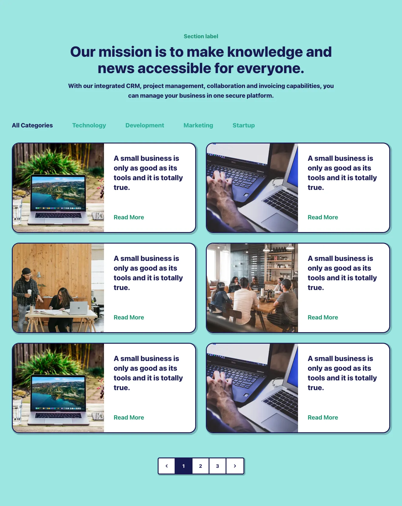
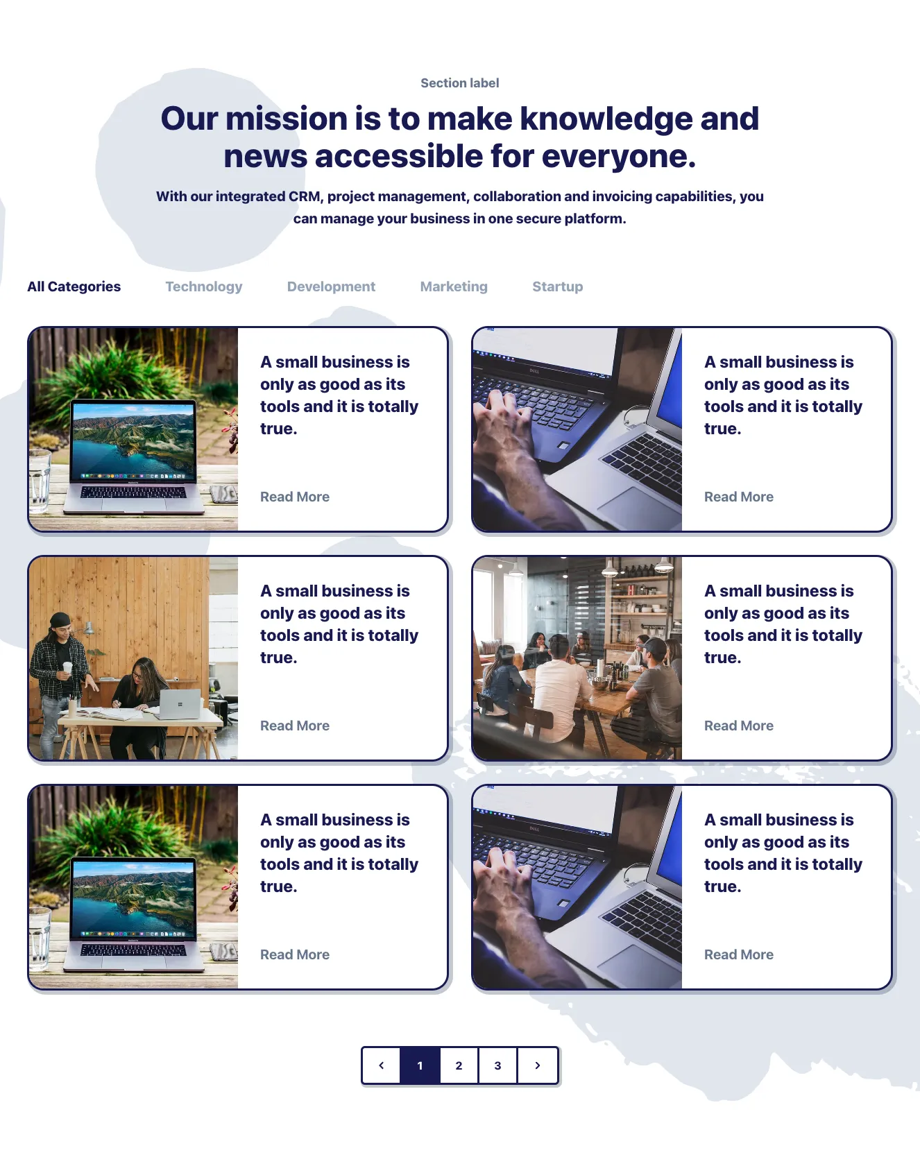
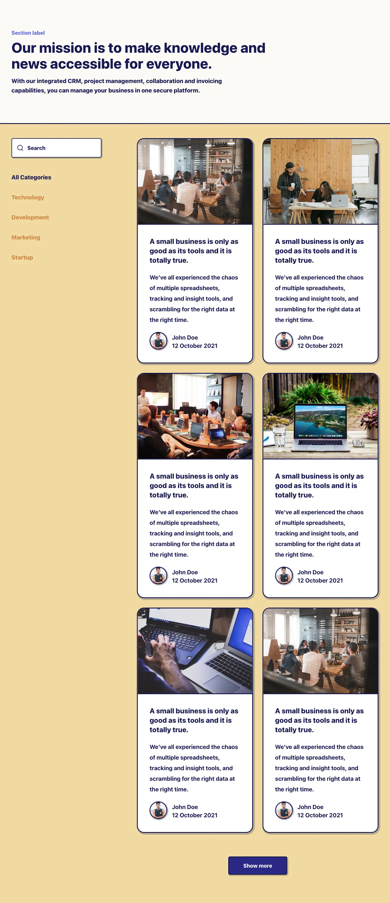
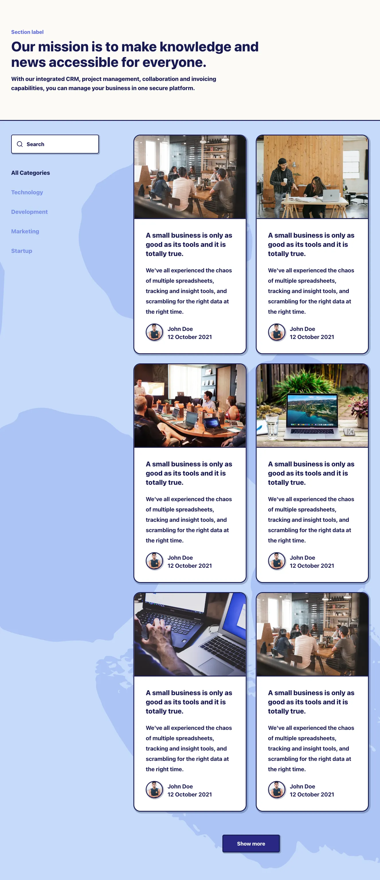
A news/blog listing section with a centered heading, search input, category tabs, a two-column grid of article cards with images, category tags, metadata, and read-more links, and a Show more button. Cards use dark navy outlines and offset shadows.






















Create a free account to copy production-ready code from every component in the library.
Free account · No credit card · No password needed
Already have an account? Sign in
A blog section titled "Our Blog" showing five image-overlay article cards in a mixed-size grid, each with a green TRAVEL badge, date, and headline, followed by a green "View More Articles" button. The layout uses a light background with white text placed over darkened landscape photographs.


Create a free account to copy production-ready code from every component in the library.
Free account · No credit card · No password needed
Already have an account? Sign in
A marketing section headed by a large serif title and intro paragraph, followed by three blog article cards arranged in a horizontal grid. Each card shows a colored category tag, serif headline, read time and date, excerpt, and author avatar with name, ending in a centered black "View more articles" button.


Create a free account to copy production-ready code from every component in the library.
Free account · No credit card · No password needed
Already have an account? Sign in
A full-width hero with a large background photo, date, headline, and yellow 'Read article' button, followed by a three-column grid of photo cards with dates and centered headlines on black overlay shapes. Used to present blog or news article teasers.


Create a free account to copy production-ready code from every component in the library.
Free account · No credit card · No password needed
Already have an account? Sign in
A blog preview section with a heading, a secondary outlined "Check all posts" button, and a grid of three image-backed post cards with hashtag tags, titles, and Read more links. The large card spans the left column while two smaller cards stack on the right.


Create a free account to copy production-ready code from every component in the library.
Free account · No credit card · No password needed
Already have an account? Sign in
A light-themed section with an eyebrow label, centered heading, and intro paragraph above a grid of image-led article cards. Each card shows a photo with a date/time tag, a bold blue title, body text, and a read-more link in the first card.


Having a blog is one of the most commonly chosen SEO strategies. However, for a blog to fulfill this role, it should be well designed and attractive to the audience. Our selection of Tailwind blog components will help you achieve this effect.
Choose from many variations of Tailwind blog posts components. Presented here are variants available in various UI libraries. You will also find many other types of components that will be in the same style. Each library has been designed by a professional designer and coded by our team of developers.
Get access to all Tailwind blog posts components, code and our editor. Try the demo for free.

Build websites faster with an AI Visual Editor


© 2026 Shuffle. All rights reserved.
See what you're getting before you commit.
Switch the editor to Grid and every page of your project appears side by side on one canvas. Arrange them freely, zoom in and out, and add as many new pages as you need in a few clicks.
Describe what you need in one chat and the Agent does the rest: it adds new sections, edits copy and styles, moves blocks around or removes them across your whole page. No modes, no switching, just tell it what to change.
Not quite there yet? Ask for tweaks like missing assets, your logo or other details, and regenerate the design without starting from scratch.