Can't find the right component?
Describe it and Shuffle AI builds it in seconds, ready to edit and export.
Browse 227 ready-made Tailwind CSS contact components from multiple UI libraries. Every variant is fully responsive – copy the code or customize it in the visual editor and export clean code.
Create a free account to copy production-ready code from every component in the library.
Free account · No credit card · No password needed
Already have an account? Sign in
Components are just the start. See how a project goes from prompt to production‑ready code with Shuffle.
A centered support section with a pill label, a serif-accented heading, and two outlined cards offering email contact and phone customer service, each with an orange call-to-action button. The layout is a two-column grid of cards on a light background with decorative dot patterns at the sides.
Create a free account to copy production-ready code from every component in the library.
Free account · No credit card · No password needed
Already have an account? Sign in
Components are just the start. See how a project goes from prompt to production‑ready code with Shuffle.
A dark-themed contact section with a large two-line heading on the left and labeled Address and Contacts details on the right, followed by a full-width rounded map panel showing the San Francisco Bay Area. The layout separates introductory text from contact information above a wide map embed.
Create a free account to copy production-ready code from every component in the library.
Free account · No credit card · No password needed
Already have an account? Sign in
Components are just the start. See how a project goes from prompt to production‑ready code with Shuffle.
A light-themed contact section with a bold centered heading and three equal cards presenting email, phone, and address details, each with a line icon at top. The first icon is filled in purple while the others are outlined, and the cards use soft shadows on a white background.
Create a free account to copy production-ready code from every component in the library.
Free account · No credit card · No password needed
Already have an account? Sign in
Components are just the start. See how a project goes from prompt to production‑ready code with Shuffle.
A dark full-width contact section with a large heading and supporting paragraph on the left, and a right column listing an email address and social media links such as Facebook, Twitter, Linkedin, Instagram, and Pinterest. It uses a purple-blue gradient glow in the top-left corner and a split-screen arrangement.
Create a free account to copy production-ready code from every component in the library.
Free account · No credit card · No password needed
Already have an account? Sign in
Components are just the start. See how a project goes from prompt to production‑ready code with Shuffle.
A two-column contact support section with a heading and supporting text on the left, a dark maroon incident report call-to-action card below it, and a contact form on the right with name, email, phone, message fields and an orange Submit button.
Create a free account to copy production-ready code from every component in the library.
Free account · No credit card · No password needed
Already have an account? Sign in
Components are just the start. See how a project goes from prompt to production‑ready code with Shuffle.
A two-column section with a customer testimonial and logo on the left and a free trial signup form on the right. The form includes first name, last name, email, phone, optional company fields, and a purple full-width call-to-action button.
Create a free account to copy production-ready code from every component in the library.
Free account · No credit card · No password needed
Already have an account? Sign in
Components are just the start. See how a project goes from prompt to production‑ready code with Shuffle.
A light-themed contact section with a centered eyebrow label, bold heading, and supporting text above a row of three rounded gray cards showing email, phone, and address details each with a small blue icon. It is a marketing-style content block rather than a form or interactive contact widget.
Create a free account to copy production-ready code from every component in the library.
Free account · No credit card · No password needed
Already have an account? Sign in
Components are just the start. See how a project goes from prompt to production‑ready code with Shuffle.
A centered contact section on a near-black background with a small green eyebrow label, a large headline inviting partnership, a short descriptive paragraph, and a two-column form with name, email, company, and location fields. A full-width lime submit button and a small privacy notice appear below the form.
Create a free account to copy production-ready code from every component in the library.
Free account · No credit card · No password needed
Already have an account? Sign in
Components are just the start. See how a project goes from prompt to production‑ready code with Shuffle.
A light-background contact section with a large navy heading on the left and address and email contact details on the right, followed by a full-width gray map with a yellow location pin. The layout uses a split top row above a wide map band.
Create a free account to copy production-ready code from every component in the library.
Free account · No credit card · No password needed
Already have an account? Sign in
Components are just the start. See how a project goes from prompt to production‑ready code with Shuffle.
A dark-themed contact section with a heading, a dark map with an Office pin, a photo card with a message call-to-action, and stacked cards showing phone, email, and address details. The layout combines a two-column arrangement with a left image-and-form card and right contact info cards.
Create a free account to copy production-ready code from every component in the library.
Free account · No credit card · No password needed
Already have an account? Sign in
Components are just the start. See how a project goes from prompt to production‑ready code with Shuffle.
A split-screen contact section with a large "Contact" heading, a subheading inviting text messages, business hours, a hotline number, Messenger and Snapchat handles, and CTA buttons for sending a message or starting live chat. A right-side photo of a woman with a laptop includes overlapping chat-bubble graphics reading "Good morning!" and "Seen".
Create a free account to copy production-ready code from every component in the library.
Free account · No credit card · No password needed
Already have an account? Sign in
Components are just the start. See how a project goes from prompt to production‑ready code with Shuffle.
A horizontal row of three centered contact items (Email, Phone, Office), each with a green circular icon, bold heading, gray supporting text, and green contact details on a light background with a faint grid texture. It presents contact channels in a simple informational layout without form inputs or buttons.
Create a free account to copy production-ready code from every component in the library.
Free account · No credit card · No password needed
Already have an account? Sign in
Components are just the start. See how a project goes from prompt to production‑ready code with Shuffle.
A contact-focused hero section with a left-aligned heading, supporting text, and Call and More buttons, paired with a video call screenshot showing a chat card and call controls. The layout is a split screen with a light lavender background and rounded container.
Create a free account to copy production-ready code from every component in the library.
Free account · No credit card · No password needed
Already have an account? Sign in
Components are just the start. See how a project goes from prompt to production‑ready code with Shuffle.
A row of three outlined cards, each with a circular icon at the top edge, a bold heading (Email, Phone, Office), supporting text, and a coral contact detail. The layout is a horizontal row of equal-width cards on a light background, used to present contact channels.
Create a free account to copy production-ready code from every component in the library.
Free account · No credit card · No password needed
Already have an account? Sign in
Components are just the start. See how a project goes from prompt to production‑ready code with Shuffle.
A contact section on a solid purple background with a heading, office address, email, social icons, and a form with department radio options, subject, name, email, message fields, a terms checkbox, and a pink Get Started button. Contact information sits in a left column and the form in a right column.
Create a free account to copy production-ready code from every component in the library.
Free account · No credit card · No password needed
Already have an account? Sign in
Components are just the start. See how a project goes from prompt to production‑ready code with Shuffle.
A light contact section with a serif "Contact" heading, email, phone, and social links on the left, and a card-style form with name, surname, email, phone, topic, message, file attachment, and a Send Now button on the right.
Create a free account to copy production-ready code from every component in the library.
Free account · No credit card · No password needed
Already have an account? Sign in
Components are just the start. See how a project goes from prompt to production‑ready code with Shuffle.
A dark contact section with a heading, short intro text, a yellow Activate demo call-to-action and a Share with friends link, plus an ellipse overlay showing an address and email over a dark map image. The layout stacks text and actions on the left with contact details on the right.
Create a free account to copy production-ready code from every component in the library.
Free account · No credit card · No password needed
Already have an account? Sign in
Components are just the start. See how a project goes from prompt to production‑ready code with Shuffle.
A contact section with a white rounded card on the left containing a 'Say Hello' heading, short body text, and address and contact info with teal icons, placed over a full-bleed city map with a red location pin on the right.
Create a free account to copy production-ready code from every component in the library.
Free account · No credit card · No password needed
Already have an account? Sign in
Components are just the start. See how a project goes from prompt to production‑ready code with Shuffle.
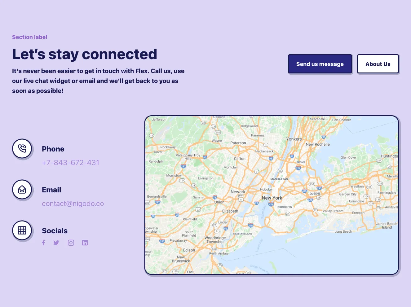
A white card overlaid on a blue header and a Google-style map of the San Francisco Bay Area, containing a bold heading encouraging quick action and address and contact email details in a two-column layout.
Create a free account to copy production-ready code from every component in the library.
Free account · No credit card · No password needed
Already have an account? Sign in
Components are just the start. See how a project goes from prompt to production‑ready code with Shuffle.
A two-column contact section with a heading and phone, email, and address details on the left, and a form with department radio options, subject, name, email, message fields, a terms checkbox, and a blue Submit button on the right.
A clear contact path is a key component of a successful website. The contact form or address data should be clearly highlighted on it.
Choose from many variations of the Tailwind components contacts. The variants shown here are available in various UI libraries in the Shuffle editor. You will also find many other types of components that will be in the same style. This will allow you to build a comprehensive Tailwind website template. Each library is designed by a professional designer and coded by our team of developers.
Get access to all sections of the Tailwind components contacts, code and our editor. Try the demo for free.
How you’ll build with Shuffle.
© 2026 Shuffle. All rights reserved.
See what you're getting before you commit.
Switch the editor to Grid and every page of your project appears side by side on one canvas. Arrange them freely, zoom in and out, and add as many new pages as you need in a few clicks.
Describe what you need in one chat and the Agent does the rest: it adds new sections, edits copy and styles, moves blocks around or removes them across your whole page. No modes, no switching, just tell it what to change.
Not quite there yet? Ask for tweaks like missing assets, your logo or other details, and regenerate the design without starting from scratch.