Redirecting to PayPal

Tailwind CSS Components – Uinel Library

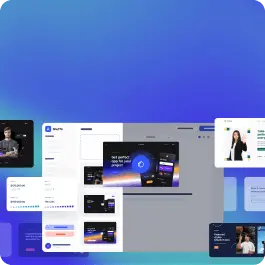
Browse 285 ready-made Tailwind CSS components from the Uinel UI library. Every variant is fully responsive – copy the code or customize it in the visual editor and export clean code.

Tailwind Component #1

Tailwind Component

Uinel Hero Section with Header and Product Showcase

A marketing hero section for the Uinel product with a top navigation bar, a headline reading "A thousand tools for design", an email signup field with a Get started button, and an illustrated composition of floating tool badges, a task card with tabs, and a blue team card.

Tailwind Component #2

Tailwind Component

Page header with title, subtitle, and action buttons

A horizontal page header on a light blue background showing the bold heading "Product analysis," a gray subtitle beneath it, and two rounded action buttons labeled "All" and "Settings" aligned to the right.

Tailwind Component #3

Tailwind Component

Ecommerce Hero with Top Navigation and Tablet Product Mockups

A light-blue hero section for the Uistore ecommerce brand with a top announcement bar, a navigation header with search, cart, and account controls, a large headline, a Shop now button, a promotional headphones card, and tablet device mockups on the right.

Tailwind Component #4

Tailwind Component

Product analysis page header with icon and action buttons

A horizontal header row on a light background showing a circular gradient icon, a bold 'Product analysis' heading, a muted subtitle, and two rounded action buttons labeled 'All' and 'Settings' on the right.

Tailwind Component #5

Tailwind Component

Tailwind Component #6

Tailwind Component

Tailwind Component #7

Tailwind Component

Tailwind Component #8

Tailwind Component

Tailwind Component #9

Tailwind Component

Tailwind Component #10

Tailwind Component

Tailwind Component #11

Tailwind Component

Tailwind Component #12

Tailwind Component

Tailwind Component #13

Tailwind Component

Tailwind Component #14

Tailwind Component

Tailwind Component #15

Tailwind Component

Tailwind Component #16

Tailwind Component

Tailwind Component #17

Tailwind Component

Tailwind Component #18

Tailwind Component

Tailwind Component #19

Tailwind Component

Split-screen feature section with prototype illustration and heading

A marketing feature section headed "Free your ideas" with a centered intro, followed by a split layout: a light gray panel showing an illustrative prototype card and a blue "1.3k Templates" tile on the left, and an orange icon, large heading, supporting text, and green "Official website" text link on the right.

Tailwind Component #20

Tailwind Component

Pricing Plan Comparison Table with Feature Checkmarks

A tabular pricing comparison with a header row of plan features and rows of plan attributes, using checkboxes, numeric values, checkmarks, and colored percentage change badges. It sits beneath a section label and large 'Workable' heading, under a purple accent bar along the top edge.

Tailwind Components by Shuffle

Browse 285 of ready-made components in Tailwind and Uinel library. They are divided into UI libraries that our professional designers designed. Each of them has a resource of many variations of different types of components. Under each of them, there is a clear code created by our team of developers.

All elements available in the editor are fully responsive. You will get full access to them by subscribing to our drag and drop editor.

Try the demo for free!

The easiest way to create beautiful websites

The selected plan includes lifetime access to Shuffle Editor.

Lifetime License

Create an account

OR USE EMAIL

VAT included where applicable. Invoices provided.

Why creators choose Shuffle

From idea to beautiful design in minutes.

Shuffle pairs an AI visual editor with 80+ UI libraries, so you can design, build and export production‑ready code without starting from scratch.

  • An AI Agent that builds with you Describe a page, watch it come to life, then fine-tune it visually or with a prompt.
  • Pick the best model for every task GPT-6 Astra, Claude Opus 5.5 and Gemini 4 Argon in one place.
  • 13,400+ professionally designed components Prefer building by hand? Drag in pixel-perfect sections crafted by professional designers.
  • Export to the stack you love Next.js, Astro, Laravel, WordPress, Shopify, static HTML and beyond.
“Its AI-powered features have transformed how I work! Designing and building websites has become faster, easier, and far more efficient.”
Est. 2019
Helping web builders ship since 2019 7 years of steady development.

Make it yours with AI

Start with this component. Tell AI what to change.

Original
Preview the original component.
Your Version
Available when your generation is complete.
Code
Available when your generation is complete.
Original component

Add images & videos

Upload an asset, then tell AI how to use it.

How it works

Your uploaded file will be added directly to the generated component. After uploading, you can guide the AI on where exactly to use it, e.g. as a logo or as a section image.

© 2026 Shuffle. All rights reserved.