Can't find the right component?
Describe it and Shuffle AI builds it in seconds, ready to edit and export.
Browse 207 ready-made Tailwind CSS components from the Bendis UI library. Every variant is fully responsive – copy the code or customize it in the visual editor and export clean code.
Create a free account to copy production-ready code from every component in the library.
Free account · No credit card · No password needed
Already have an account? Sign in
Components are just the start. See how a project goes from prompt to production‑ready code with Shuffle.
A full-width landing page hero with a blue top navigation bar (logo, About, Company, Services, Testimonials, Sign in, Sign Up), a red abstract marbled background, a large centered headline, a yellow Get Started Free call-to-action button, and a white strip of client logos below. The header and hero are the outer component visible in the screenshot.
Create a free account to copy production-ready code from every component in the library.
Free account · No credit card · No password needed
Already have an account? Sign in
Components are just the start. See how a project goes from prompt to production‑ready code with Shuffle.
A full-width marketing hero with a large white headline, supporting text, and an email input paired with a yellow "Get Started Free" button on a blue background. The right side shows a diagonal split with a red abstract textured image and a small logo and menu icon in the header.
Create a free account to copy production-ready code from every component in the library.
Free account · No credit card · No password needed
Already have an account? Sign in
Components are just the start. See how a project goes from prompt to production‑ready code with Shuffle.
Create a free account to copy production-ready code from every component in the library.
Free account · No credit card · No password needed
Already have an account? Sign in
Components are just the start. See how a project goes from prompt to production‑ready code with Shuffle.
Create a free account to copy production-ready code from every component in the library.
Free account · No credit card · No password needed
Already have an account? Sign in
Components are just the start. See how a project goes from prompt to production‑ready code with Shuffle.
Create a free account to copy production-ready code from every component in the library.
Free account · No credit card · No password needed
Already have an account? Sign in
Components are just the start. See how a project goes from prompt to production‑ready code with Shuffle.
Create a free account to copy production-ready code from every component in the library.
Free account · No credit card · No password needed
Already have an account? Sign in
Components are just the start. See how a project goes from prompt to production‑ready code with Shuffle.
Create a free account to copy production-ready code from every component in the library.
Free account · No credit card · No password needed
Already have an account? Sign in
Components are just the start. See how a project goes from prompt to production‑ready code with Shuffle.
A light-themed section with an eyebrow label, centered heading, and intro paragraph above a grid of image-led article cards. Each card shows a photo with a date/time tag, a bold blue title, body text, and a read-more link in the first card.
Create a free account to copy production-ready code from every component in the library.
Free account · No credit card · No password needed
Already have an account? Sign in
Components are just the start. See how a project goes from prompt to production‑ready code with Shuffle.
A pricing section with a centered heading, supporting text, and a Active demo / Normal Tab toggle above three plan cards (Starter, Pro, Premium), each showing a large price per month, a feature checklist, and a Try It Now button. The Pro card is visually emphasized with a brighter blue background and a yellow call-to-action button.
Create a free account to copy production-ready code from every component in the library.
Free account · No credit card · No password needed
Already have an account? Sign in
Components are just the start. See how a project goes from prompt to production‑ready code with Shuffle.
A white horizontal section displaying four key metrics, each with a blue line icon, a large bold blue number, and a short uppercase caption. Items are evenly spaced in a single row on a light gray background.
Create a free account to copy production-ready code from every component in the library.
Free account · No credit card · No password needed
Already have an account? Sign in
Components are just the start. See how a project goes from prompt to production‑ready code with Shuffle.
A centered marketing feature section with a small eyebrow label, bold blue heading, supporting paragraph, a four-item segmented tab bar, and a white panel of five collapsible question rows with chevron icons. The layout is a vertically stacked, centered column.
Create a free account to copy production-ready code from every component in the library.
Free account · No credit card · No password needed
Already have an account? Sign in
Components are just the start. See how a project goes from prompt to production‑ready code with Shuffle.
A horizontal navigation bar on a solid blue background with the Bendis logo and wordmark on the left, centered links for About, Company, Services, and Testimonials, and Sign in and Sign up links on the right. It is a single-row header with no visible search, avatars, or dropdown indicators.
Create a free account to copy production-ready code from every component in the library.
Free account · No credit card · No password needed
Already have an account? Sign in
Components are just the start. See how a project goes from prompt to production‑ready code with Shuffle.
The image shows only a thin horizontal blue line spanning the full width on a white background, likely a divider or border element. No broader component content is visible to classify further.
Create a free account to copy production-ready code from every component in the library.
Free account · No credit card · No password needed
Already have an account? Sign in
Components are just the start. See how a project goes from prompt to production‑ready code with Shuffle.
A centered promotional section with a small eyebrow label, bold blue heading, gray supporting paragraph, and two call-to-action buttons: a solid yellow primary button and an outlined secondary button. It uses a light background with a vertically stacked, minimal layout.
Create a free account to copy production-ready code from every component in the library.
Free account · No credit card · No password needed
Already have an account? Sign in
Components are just the start. See how a project goes from prompt to production‑ready code with Shuffle.
A blog article page layout featuring a full-width skateboarding photo at top, followed by breadcrumb navigation, a bold centered serif-free headline, an author avatar with name and date, and a narrow column of body paragraphs. It presents editorial article content rather than interactive controls.
Create a free account to copy production-ready code from every component in the library.
Free account · No credit card · No password needed
Already have an account? Sign in
Components are just the start. See how a project goes from prompt to production‑ready code with Shuffle.
A horizontal newsletter subscription banner on a blue background, with a bold heading and supporting text on the left and an email input paired with a yellow Sign Up button on the right. The light card-like panel contains the form and promotional copy in a single row.
Create a free account to copy production-ready code from every component in the library.
Free account · No credit card · No password needed
Already have an account? Sign in
Components are just the start. See how a project goes from prompt to production‑ready code with Shuffle.
A full-width dark blue website footer containing a brand logo with tagline, social media icon buttons, four labeled link columns (Company, Pages, Legal, Resources), and a divider with a copyright line below. The layout is a horizontal row of columns with the brand block on the left.
Create a free account to copy production-ready code from every component in the library.
Free account · No credit card · No password needed
Already have an account? Sign in
Components are just the start. See how a project goes from prompt to production‑ready code with Shuffle.
A grid of five abstract paint images on a solid blue background, with two wide images on top and three narrower images below. The component displays artwork only, with no visible text, navigation, or interactive controls.
Create a free account to copy production-ready code from every component in the library.
Free account · No credit card · No password needed
Already have an account? Sign in
Components are just the start. See how a project goes from prompt to production‑ready code with Shuffle.
A two-by-two grid of team member cards, each showing a name, role, short lorem ipsum bio, and a slanted-edge portrait photo on a light background. A centered eyebrow label and bold heading with supporting paragraph introduce the section.
Create a free account to copy production-ready code from every component in the library.
Free account · No credit card · No password needed
Already have an account? Sign in
Components are just the start. See how a project goes from prompt to production‑ready code with Shuffle.
A horizontal row of four brand logos on a white background, used as social proof on a marketing page. The logos are spaced evenly and are not interactive in the visible image.
Browse 207 of ready-made components in Tailwind and Bendis library. They are divided into UI libraries that our professional designers designed. Each of them has a resource of many variations of different types of components. Under each of them, there is a clear code created by our team of developers.
All elements available in the editor are fully responsive. You will get full access to them by subscribing to our drag and drop editor.
How you’ll build with Shuffle.
© 2026 Shuffle. All rights reserved.
See what you're getting before you commit.
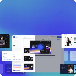
Switch the editor to Grid and every page of your project appears side by side on one canvas. Arrange them freely, zoom in and out, and add as many new pages as you need in a few clicks.
Describe what you need in one chat and the Agent does the rest: it adds new sections, edits copy and styles, moves blocks around or removes them across your whole page. No modes, no switching, just tell it what to change.
Not quite there yet? Ask for tweaks like missing assets, your logo or other details, and regenerate the design without starting from scratch.