Browse 113 ready-made Tailwind CSS components from the Flaro UI library. Every variant is fully responsive – copy the code or customize it in the visual editor and export clean code.
 Tailwind CSS
 Flaro
Flaro
Full Shuffle Editor access for just $10
Great for quick projects and for testing everything Shuffle can do. One-time payment, not a subscription.
Get 7-Day PassNew to Shuffle? Try our tools:

Create a free account to copy production-ready code from every component in the library.
Free account · No credit card · No password needed
Already have an account? Sign in
A landing page hero section for a mentoring platform, featuring a navigation bar, a bold two-line headline, a subheading, primary and secondary call-to-action buttons, and a trusted-by logo row. On the right, floating mentor profile cards with avatars, names, roles, and session prices overlay a gradient circle graphic.

Create a free account to copy production-ready code from every component in the library.
Free account · No credit card · No password needed
Already have an account? Sign in
A light-background marketing hero with a large bold headline, subtext, a primary call-to-action button, and social proof showing a 4.2/5 rating from 45k reviews. On the right, a staggered collage of portrait photos and a video play overlay illustrates community members.


Create a free account to copy production-ready code from every component in the library.
Free account · No credit card · No password needed
Already have an account? Sign in

Create a free account to copy production-ready code from every component in the library.
Free account · No credit card · No password needed
Already have an account? Sign in

Create a free account to copy production-ready code from every component in the library.
Free account · No credit card · No password needed
Already have an account? Sign in

Create a free account to copy production-ready code from every component in the library.
Free account · No credit card · No password needed
Already have an account? Sign in
A split-screen pricing section with a bold "Pick a plan" heading and supporting text on the left, and a white pricing card on the right listing features, the Pro package at $49/mo billed annually, and a purple "Start 14 days free trial" button. The soft pastel gradient background frames the card.

Create a free account to copy production-ready code from every component in the library.
Free account · No credit card · No password needed
Already have an account? Sign in
A centered marketing hero section introducing a collaboration product with a large bold heading, a short supporting line, an indigo call-to-action button, and a row of small user avatars with a text note about startup founders. The layout is a simple vertically stacked composition on a white background.

Create a free account to copy production-ready code from every component in the library.
Free account · No credit card · No password needed
Already have an account? Sign in
A centered FAQ section with an eyebrow label, large bold heading, and four stacked expandable question rows with chevron indicators. A small contact prompt with a purple link sits below the list.

Create a free account to copy production-ready code from every component in the library.
Free account · No credit card · No password needed
Already have an account? Sign in
A social proof section with a small uppercase heading above a 4x2 grid of white rounded cards, each containing a placeholder company logo. The layout is centered and uses a light gradient background to present customer or partner logos.

Create a free account to copy production-ready code from every component in the library.
Free account · No credit card · No password needed
Already have an account? Sign in
A horizontal row of three tall rounded cards: a solid indigo intro card titled 'Who We Are' with body text and a white call-to-action button, followed by two photo cards showing team members Leslie Alexander and Jenny Wilson with their names and 'Co-Founder, CEO' roles overlaid on gradient fades.

Create a free account to copy production-ready code from every component in the library.
Free account · No credit card · No password needed
Already have an account? Sign in
A split-screen 404 error section with a large purple 404 heading, a short error message, and a 'Go Back to Homepage' text link on the left, paired with an illustration of legs sticking out of a hole on the right. It is used to inform users that a requested page does not exist and offer a route back to the homepage.

Create a free account to copy production-ready code from every component in the library.
Free account · No credit card · No password needed
Already have an account? Sign in
A two-column authentication screen with a marketing panel on the left featuring a heading and feature bullets, and a sign-in form on the right with email, password, remember-me, forgot-password link, primary Sign In button, and Google and Facebook social login options.

Create a free account to copy production-ready code from every component in the library.
Free account · No credit card · No password needed
Already have an account? Sign in
A centered section with a bold heading and intro text above a two-column grid of blog article entries, each with a thumbnail image, category label, headline, and author avatar with name. Light background with spacious layout and minimal decoration.

Create a free account to copy production-ready code from every component in the library.
Free account · No credit card · No password needed
Already have an account? Sign in
A light-themed testimonials section headed "Don't just take our word for it" with six review cards arranged in a three-column grid. Each card shows an avatar, name, handle, quoted feedback, and a timestamp.

Create a free account to copy production-ready code from every component in the library.
Free account · No credit card · No password needed
Already have an account? Sign in
A split-layout hero section with a bold two-line heading and short paragraph on the left, and a stacked illustrative card listing recent users, companies, and amounts on the right. The layout is a marketing introduction for the Flaro product with a light, gradient-tinted background.

Create a free account to copy production-ready code from every component in the library.
Free account · No credit card · No password needed
Already have an account? Sign in
A centered newsletter subscription section with an envelope icon, bold heading, supporting text, name and email inputs, and a purple Subscribe Now button. A small privacy note appears beneath the button.

Create a free account to copy production-ready code from every component in the library.
Free account · No credit card · No password needed
Already have an account? Sign in
A horizontal top navigation bar showing the Flaro logo on the left, text links for Features, Solutions, Resources, and Pricing in the center-right, and a purple call-to-action button reading "Try 14 Days Free Trial" on the right. The white background and single horizontal row distinguish it as a site header.

Create a free account to copy production-ready code from every component in the library.
Free account · No credit card · No password needed
Already have an account? Sign in
A split-screen registration component with a branded marketing panel on the left featuring a heading and value bullets, and a sign-up form on the right with name, email, password fields, a terms checkbox, a primary Sign Up button, and Google and Facebook sign-in options.

Create a free account to copy production-ready code from every component in the library.
Free account · No credit card · No password needed
Already have an account? Sign in
A light-themed section with a centered bold heading, short intro text, and a 3x2 grid of job cards showing job titles, employment type, location, and company logos. A centered text link below the grid invites users to see all 8,849 jobs.

Create a free account to copy production-ready code from every component in the library.
Free account · No credit card · No password needed
Already have an account? Sign in
A light-themed contact section with a bold centered heading and three equal cards presenting email, phone, and address details, each with a line icon at top. The first icon is filled in purple while the others are outlined, and the cards use soft shadows on a white background.


Browse 113 of ready-made components in Tailwind and Flaro library. They are divided into UI libraries that our professional designers designed. Each of them has a resource of many variations of different types of components. Under each of them, there is a clear code created by our team of developers.
All elements available in the editor are fully responsive. You will get full access to them by subscribing to our drag and drop editor.

Build websites faster with an AI Visual Editor



© 2026 Shuffle. All rights reserved.
See what you're getting before you commit. We ship new updates every day.
Describe what you need in one chat and the Agent does the rest: it adds new sections, edits copy and styles, moves blocks around or removes them across your whole page. No modes, no switching, just tell it what to change.
Not quite there yet? Ask for tweaks like missing assets, your logo or other details, and regenerate the design without starting from scratch.
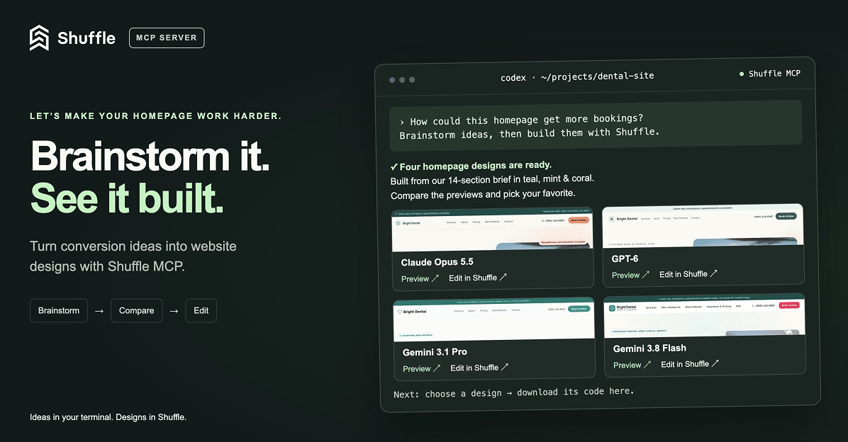
Ask Codex or Claude in your project, “How can I make the homepage convert better?”, then brainstorm, generate new designs with Shuffle right from your terminal, compare previews and bring the code you like straight into your project. (Read more)
























