Browse 113 ready-made Tailwind CSS components from the Flaro UI library. Every variant is fully responsive – copy the code or customize it in the visual editor and export clean code.
 Tailwind CSS
 Flaro
Flaro
Full Shuffle Editor access for just $10
Great for quick projects and for testing everything Shuffle can do. One-time payment, not a subscription.
Get 7-Day PassNew to Shuffle? Try our tools:

Create a free account to copy production-ready code from every component in the library.
Free account · No credit card · No password needed
Already have an account? Sign in
A light marketing section with a bold heading and a horizontal row of four numbered steps connected by thin lines, each with brief supporting text. Step 2 is highlighted with a purple gradient circle while the others use pale lavender.

Create a free account to copy production-ready code from every component in the library.
Free account · No credit card · No password needed
Already have an account? Sign in
A marketing hero section with an eyebrow label, bold headline, body text, App Store download button, and social proof rating on the left, paired with an angled phone mockup showing an email inbox on the right. The layout is a split screen on a light background with a subtle green gradient glow.


Create a free account to copy production-ready code from every component in the library.
Free account · No credit card · No password needed
Already have an account? Sign in
A centered hero section with a bold heading, supporting paragraph, and a white stats card showing two metrics (Monthly Users and Active Users) with their growth percentages. The layout is a vertically stacked, light-themed marketing block with a subtle shadow on the card.

Create a free account to copy production-ready code from every component in the library.
Free account · No credit card · No password needed
Already have an account? Sign in
A light-themed website footer arranged as a horizontal row of link columns (Company, Pages, Legal, Resources) and a Subscribe column with an email input and purple button, followed by a divider with the Flaro logo, copyright text, and social icons.

Create a free account to copy production-ready code from every component in the library.
Free account · No credit card · No password needed
Already have an account? Sign in

Create a free account to copy production-ready code from every component in the library.
Free account · No credit card · No password needed
Already have an account? Sign in
A dark-themed site footer showing the flaro logo with a short text blurb and social icons on the left, three columns of navigation links (Products, Important Links, Company), and a centered copyright line below a divider. The layout is a horizontal row with columns aligned to the right of the brand block.

Create a free account to copy production-ready code from every component in the library.
Free account · No credit card · No password needed
Already have an account? Sign in
A two-column FAQ section with a bold "Frequently Asked Questions" heading, supporting text, and a purple CTA button on the left, and a stacked list of expandable questions with plus icons and dividers on the right.

Create a free account to copy production-ready code from every component in the library.
Free account · No credit card · No password needed
Already have an account? Sign in
A full-width promotional call-to-action section with a bold white heading, supporting paragraph, and two buttons on the right: a primary white 'Start 14 days free trial' button and an outlined 'Book a call' button. The content is arranged in a horizontal split between left text and right actions on a purple-to-violet gradient background.

Create a free account to copy production-ready code from every component in the library.
Free account · No credit card · No password needed
Already have an account? Sign in
A content section with a bold heading and intro text on the left and two article cards on the right, each with a photo, category tag, title, and excerpt. A purple 'See all articles' link sits below the intro text.

Create a free account to copy production-ready code from every component in the library.
Free account · No credit card · No password needed
Already have an account? Sign in
A horizontal row of three feature callouts, each pairing a light lavender circular icon badge with a bold two-line text statement about a product benefit. The layout is minimal with generous whitespace on a white background, suited to summarizing product value propositions.

Create a free account to copy production-ready code from every component in the library.
Free account · No credit card · No password needed
Already have an account? Sign in
A pricing section with a centered heading and two side-by-side plan cards, Standard and Pro, each listing feature checkmarks, a starting monthly price, and a 14-day free trial button. The cards sit over a split background of white above and solid indigo below.

Create a free account to copy production-ready code from every component in the library.
Free account · No credit card · No password needed
Already have an account? Sign in
A contact section with a bold heading and short intro text above three columns, each showing an icon with a label (Phone, Email, Address) and its details. A gray map placeholder area spans the bottom of the section.

Create a free account to copy production-ready code from every component in the library.
Free account · No credit card · No password needed
Already have an account? Sign in
A light-background section with a centered bold heading, short supporting paragraph, an eight-logo grid of placeholder brand marks in two rows, and a purple 'See all 125 brands' text link. It uses social proof to build trust without device mockups or pricing content.

Create a free account to copy production-ready code from every component in the library.
Free account · No credit card · No password needed
Already have an account? Sign in
A dark full-width error page section showing a 3D illustrated character with question marks beside a bold 'Page Not Found' heading, explanatory text, and a single outlined 'Go Back to Homepage' button. The content is split with the illustration on the left and centered text on the right.

Create a free account to copy production-ready code from every component in the library.
Free account · No credit card · No password needed
Already have an account? Sign in
A marketing section pairing a phone mockup displaying an app dashboard with a large heading and a numbered three-step list (Connect, Store, Ship) connected by a dotted line. The phone mockup is illustrative content inside the outer marketing component.

Create a free account to copy production-ready code from every component in the library.
Free account · No credit card · No password needed
Already have an account? Sign in
A split-layout section with a bold heading, supporting text, and an email subscription form with a purple Subscribe Now button on the left, and two light stat cards on the right showing 47k+ designers, developers and marketers and 12 hand-made reports per week. It is a marketing block for collecting email subscriptions.

Create a free account to copy production-ready code from every component in the library.
Free account · No credit card · No password needed
Already have an account? Sign in

Create a free account to copy production-ready code from every component in the library.
Free account · No credit card · No password needed
Already have an account? Sign in
A centered marketing hero with a bold heading, a phone device mockup showing a subscription pricing screen, and App Store and Google Play download badges. Faded portrait photo grid forms the background.

Create a free account to copy production-ready code from every component in the library.
Free account · No credit card · No password needed
Already have an account? Sign in
A horizontal top navigation bar with the Flaro logo on the left, four centered text links (Features, Solutions, Resources, Pricing), and an outlined Create Free Account button on the right. The bar uses a light background with minimal styling.

Create a free account to copy production-ready code from every component in the library.
Free account · No credit card · No password needed
Already have an account? Sign in
A light split-screen profile section showing a portrait photo with a row of Twitter, Facebook, and Instagram social icons on the left, and an eyebrow label, bold name heading, and bio text on the right. It introduces a team member on a marketing or about page.

Build websites faster with an AI Visual Editor



© 2026 Shuffle. All rights reserved.
See what you're getting before you commit. We ship new updates every day.
Describe what you need in one chat and the Agent does the rest: it adds new sections, edits copy and styles, moves blocks around or removes them across your whole page. No modes, no switching, just tell it what to change.
Not quite there yet? Ask for tweaks like missing assets, your logo or other details, and regenerate the design without starting from scratch.
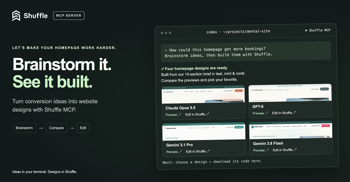
Ask Codex or Claude in your project, “How can I make the homepage convert better?”, then brainstorm, generate new designs with Shuffle right from your terminal, compare previews and bring the code you like straight into your project. (Read more)























