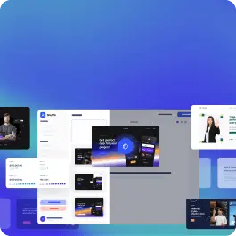
Browse 149 ready-made Tailwind CSS components from the Pstls UI library. Every variant is fully responsive – copy the code or customize it in the visual editor and export clean code.
Hero Section with Serif Headline, Photo, and Details CTA
A marketing hero section with a top navigation bar, a large serif headline with a lavender accent word, a short paragraph, a black Details button, and a photo of a smiling person on the left. Social links are placed vertically on the left edge and carousel-style pagination dots appear below the image.
Hero Section with Serif Headline, Details CTA, and Building Image
A landing page hero section with a navigation bar, large serif headline "Created for ambitious businesses.", supporting paragraph, black Details button, and a wide architectural photograph below with a 01–06 slide pagination indicator. The layout is a split top row with headline on the left and body text on the right, on a mint-green background.
Dark Hero Section with Serif Headline and Dual CTA Buttons
A centered promotional hero on a black panel with a small 'NEW FEATURE' eyebrow label, a large serif headline with a lavender highlighted phrase, short supporting text, and two buttons: a filled lavender 'Activate Demo' and an outlined 'Share with friends'. Decorative pale lavender and cream blocks sit behind the panel on a white background.
Cookies settings banner with Accept and Show more actions
A white cookie consent panel with a serif heading, explanatory body text, a solid black Accept button, and a gray Show more link arranged side by side. It is a compact notification-style component for managing cookie consent.
Positive Success Notification Modal with Homepage Button
A centered white dialog over a gray backdrop showing a teal outlined checkmark icon, a serif heading, body text, and a black button linking back to the homepage. It communicates a success message with a single call to action.
Light footer with logo, navigation links, social icons, and copyright
A minimal light-background website footer showing a Pstls. logo on the left, four horizontal text links in the center, purple social media icons on the right, and a centered copyright line below. A thin blue rule runs along the bottom edge.
404 Error Page with Serif Heading and Homepage Button
A centered error message on a soft white-to-pink gradient background, showing a lavender 'Error 404' label, a large serif heading apologizing that the page cannot be found, and a black button linking back to the homepage. It has no navigation bar, search input, or illustrative imagery.
A light-themed comparison table with rows of plan features such as team members, users, projects, video chat, real-time collaboration, and support across five columns labeled Feature 1 through Feature 5. Checkmarks and dashes indicate feature availability, with alternating row shading for readability.
<section class="py-24" x-data="{ showContent: false }">
  <div class="container px-4 mx-auto">
    <div class="flex flex-wrap -mx-4 mb-20 items-center">
      <div class="w-full lg:w-1/2 px-4 mb-6">
        <h2 class="text-5xl md:text-6xl font-heading" >Recent articles</h2>
      </div>
      <div class="w-full lg:w-1/2 px-4">
        <p class="max-w-lg leading-8" >If you have ever wondered how to develop your brand, this is the place for you. Take a big step forward in growing your business.</p>
      </div>
    </div>
    <div class="flex flex-wrap -mx-4 mb-16">

      <div class="w-full lg:w-1/3 px-4 mb-12">
        <div class="lg:max-w-sm lg:mx-auto"><a class="inline-block mb-6 px-2 py-1 text-xs bg-indigo-200 text-dark uppercase" href="#"><span >Category</span></a><a class="block mb-6" href="#">
            <h2 class="text-4xl font-heading mb-4" >Lorem ipsum random blog article</h2>
            <div class="mb-4 text-indigo-200"><span >6 min read</span><span class="mx-2">•</span><span >10 July 2022</span></div>
            <p class="leading-8" >If you have ever wondered how to develop your brand, this is the place for you. Take a big step forward in growing your business.</p></a><a class="inline-flex items-center" href="#">
            <div class="mr-3"><img src="pstls-assets/images/blog/men-avatar.png" alt="" ></div>
            <div>
              <p class="text-gray-400">Published by</p>
              <p  >John Doe</p>
            </div></a></div>
      </div>
Get the code for 13,400+ components
Create a free account to copy production-ready code from every component in the library.
Free account · No credit card · No password needed
Recent articles blog card grid with category tags and author bylines
A marketing section headed by a large serif title and intro paragraph, followed by three blog article cards arranged in a horizontal grid. Each card shows a colored category tag, serif headline, read time and date, excerpt, and author avatar with name, ending in a centered black "View more articles" button.
<section class="py-24">
<div class="container px-4 mx-auto">
<div class="max-w-4xl mb-12"><span class="text-indigo-300" >Published 02 September 2022</span>
<h2 class="text-4xl md:text-5xl font-heading mt-4 mb-6" >Lorem ipsum dolor sit amet consectutar domor at elis</h2>
<p class="leading-8" >These types of questions led me to miss numerous deadlines, and I wasted time and energy in back-and-forth communication. Sadly, this situation could have been avoided if the wireframes had provided enough detail.</p>
</div><img class="block w-full mb-12" src="https://images.unsplash.com/photo-1494500764479-0c8f2919a3d8?ixid=MnwxMjA3fDB8MHxwaG90by1wYWdlfHx8fGVufDB8fHx8&ixlib=rb-1.2.1&auto=format&fit=crop&w=870&q=80" alt="" >
<div class="max-w-xl mx-auto">
<p class="leading-8 mb-8 pb-8 border-b" >Lorem ipsum dolor sit amet, consectetur adipiscing elit. Donec ullamcorper mattis lorem non. Ultrices praesent amet ipsum justo massa. Eu dolor aliquet risus gravida nunc at feugiat consequat purus. Non massa enim vitae duis mattis. Vel in ultricies vel fringilla.</p>
<h2 class="text-4xl font-heading mb-6" >Lorem ipsum</h2>
<p class="leading-8 mb-6" >Lorem ipsum dolor sit amet, consectetur adipiscing elit. Donec ullamcorper mattis lorem non. Ultrices praesent amet ipsum justo massa. Eu dolor aliquet risus gravida nunc at feugiat consequat purus. Non massa enim vitae duis mattis. Vel in ultricies vel fringilla.</p><img class="block w-full mb-4" src="https://images.unsplash.com/photo-1532274402911-5a369e4c4bb5?ixid=MnwxMjA3fDB8MHxwaG90by1wYWdlfHx8fGVufDB8fHx8&ixlib=rb-1.2.1&auto=format&fit=crop&w=870&q=80" alt="" >
<p class="text-sm mb-6"><span >Brown wooden dock by Mark Harpur via</span> <a class="text-indigo-500 hover:text-indigo-600 underline hover:no-underline" href="#" >Unsplash</a></p>
<p class="leading-8 mb-6" >Lorem ipsum dolor sit amet, consectetur adipiscing elit. Nam auctor commodo arcu id ullamcorper. Aliquam vestibulum lobortis venenatis. Aenean in pharetra risus, id iaculis leo. Proin id risus sit amet mauris hendrerit tincidunt. Vestibulum pulvinar nec leo nec sagittis. Duis vestibulum sit amet odio sodales consequat. Nam eget elit tempus, cursus lorem vel, sollicitudin massa. Sed varius condimentum massa, et volutpat ante eleifend a. Praesent purus justo, finibus eu suscipit in, vulputate quis est. Vestibulum ante ipsum primis in faucibus orci luctus et ultrices posuere cubilia curae; Proin euismod tellus quam, eget interdum diam consectetur eget. Phasellus felis quam, iaculis at malesuada nec, varius nec massa. Integer rhoncus sapien faucibus turpis bibendum, quis maximus magna vehicula. Quisque pharetra, tortor sit amet vestibulum tincidunt, tortor lectus pretium ipsum, a elementum risus libero id diam. Morbi ut sem elementum, blandit augue eu, vehicula nunc. Ut et pellentesque mauris.</p>
<ul class="mb-6 list-decimal list-inside">
<li class="leading-8 mb-2" >Pellentesque in elit nec velit suscipit tincidunt sit amet sed augue. Proin augue justo, imperdiet nec ultrices non, dapibus sit amet risus. Nunc pellentesque nisl at neque pulvinar ornare.</li>
<li class="leading-8 mb-2" >Nullam euismod, turpis a fermentum malesuada, lectus ante consectetur sem, ac eleifend ipsum diam vitae nisi. Pellentesque feugiat, nibh ut hendrerit porta, erat lectus aliquet libero, vitae vulputate leo neque id sapien.</li>
<li class="leading-8" >Praesent a consequat velit, a tincidunt est. Proin eu facilisis lacus. Fusce orci elit, pharetra at orci at, sagittis sollicitudin ex. Duis vitae nunc mollis, ultrices risus vel, consequat erat. Nam vel diam risus. Ut sed sagittis nibh, sed bibendum eros.</li>
</ul>
<div class="flex mb-6 bg-indigo-100 relative">
<div class="absolute top-0 left-0 px-1 h-full bg-indigo-200"></div>
<div class="pl-14 py-10 pr-10">
<h2 class="text-4xl font-heading" >“On the other hand, perfection can also haunt some of us to the point of inaction.”</h2>
</div>
Get the code for 13,400+ components
Create a free account to copy production-ready code from every component in the library.
Free account · No credit card · No password needed
Blog article layout with hero image, serif headings, pull quote, and body text
A long-form blog article page showing a published date, large serif headline, intro paragraph, full-width hero photo, and body sections with an inline image, numbered list, and styled pull quote. The content is centered in a narrow reading column with generous whitespace and a light background.
Three-Tier Pricing Plans Section with Highlighted Premium Plan
A pricing section titled "Choose a plan" comparing Free, Basic, and Premium subscription tiers side by side, each with a price, feature checklist, and call-to-action button. The center Premium card is emphasized with a black background and purple button, while the outer cards use light lavender backgrounds.
Tailwind Components by Shuffle
Browse 149 of ready-made components in Tailwind and Pstls library. They are divided into UI libraries that our professional designers designed. Each of them has a resource of many variations of different types of components. Under each of them, there is a clear code created by our team of developers.
All elements available in the editor are fully responsive. You will get full access to them by subscribing to our drag and drop editor.
Switch the editor to Grid and every page of your project appears side by side on one canvas. Arrange them freely, zoom in and out, and add as many new pages as you need in a few clicks.
The AI Agent just got a lot more powerful
Describe what you need in one chat and the Agent does the rest: it adds new sections, edits copy and styles, moves blocks around or removes them across your whole page. No modes, no switching, just tell it what to change.
Multi-AI Designer can now regenerate designs
Not quite there yet? Ask for tweaks like missing assets, your logo or other details, and regenerate the design without starting from scratch.