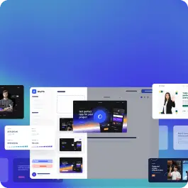
<section class="relative bg-coolGray-900 overflow-hidden" style="background-image: url('flex-ui-assets/elements/pattern-dark2.svg'); background-position: center;">
<div class="bg-transparent">
<nav class="flex justify-between p-6 px-4">
<div class="flex justify-between items-center w-full">
<div class="w-1/2 xl:w-1/3">
<a class="block max-w-max" href="#">
<img class="h-8" src="flex-ui-assets/logos/flex-ui-green.svg" alt="">
</a>
</div>
<div class="w-1/2 xl:w-1/3">
<ul class="hidden xl:flex xl:justify-center">
<li class="mr-12"><a class="text-coolGray-400 hover:text-coolGray-50 font-medium" href="#">Product</a></li>
<li class="mr-12"><a class="text-coolGray-400 hover:text-coolGray-50 font-medium" href="#">Features</a></li>
<li class="mr-12"><a class="text-coolGray-400 hover:text-coolGray-50 font-medium" href="#">Resources</a></li>
<li><a class="text-coolGray-400 hover:text-coolGray-50 font-medium" href="#">Pricing</a></li>
</ul>
</div>
<div class="w-1/2 xl:w-1/3">
<div class="hidden xl:flex items-center justify-end"><a class="inline-block py-2 px-4 mr-2 leading-5 text-coolGray-400 hover:text-coolGray-50 bg-transparent font-medium rounded-md" href="#">Log In</a><a class="inline-block py-2 px-4 text-sm leading-5 text-green-50 bg-green-500 hover:bg-green-600 font-medium focus:ring-2 focus:ring-green-500 focus:ring-opacity-50 rounded-md" href="#">Sign Up</a></div>
</div>
</div>
<button class="navbar-burger self-center xl:hidden">
<svg width="35" height="35" viewbox="0 0 32 32" fill="none" xmlns="http://www.w3.org/2000/svg">
<rect class="text-coolGray-800" width="32" height="32" rx="6" fill="currentColor"></rect>
<path class="text-coolGray-400" d="M7 12H25C25.2652 12 25.5196 11.8946 25.7071 11.7071C25.8946 11.5196 26 11.2652 26 11C26 10.7348 25.8946 10.4804 25.7071 10.2929C25.5196 10.1054 25.2652 10 25 10H7C6.73478 10 6.48043 10.1054 6.29289 10.2929C6.10536 10.4804 6 10.7348 6 11C6 11.2652 6.10536 11.5196 6.29289 11.7071C6.48043 11.8946 6.73478 12 7 12ZM25 15H7C6.73478 15 6.48043 15.1054 6.29289 15.2929C6.10536 15.4804 6 15.7348 6 16C6 16.2652 6.10536 16.5196 6.29289 16.7071C6.48043 16.8946 6.73478 17 7 17H25C25.2652 17 25.5196 16.8946 25.7071 16.7071C25.8946 16.5196 26 16.2652 26 16C26 15.7348 25.8946 15.4804 25.7071 15.2929C25.5196 15.1054 25.2652 15 25 15ZM25 20H7C6.73478 20 6.48043 20.1054 6.29289 20.2929C6.10536 20.4804 6 20.7348 6 21C6 21.2652 6.10536 21.5196 6.29289 21.7071C6.48043 21.8946 6.73478 22 7 22H25C25.2652 22 25.5196 21.8946 25.7071 21.7071C25.8946 21.5196 26 21.2652 26 21C26 20.7348 25.8946 20.4804 25.7071 20.2929C25.5196 20.1054 25.2652 20 25 20Z" fill="currentColor"></path>
</svg>
</button>
</nav>
<div class="navbar-menu hidden fixed top-0 z-50 left-0 w-full h-full bg-coolGray-900 bg-opacity-50">
<div class="fixed top-0 left-0 bottom-0 w-full w-4/6 max-w-xs bg-coolGray-900">
<nav class="relative p-6 h-full overflow-y-auto">
<div class="flex flex-col justify-between h-full">
<a class="inline-block" href="#">
<img class="h-8" src="flex-ui-assets/logos/flex-ui-green.svg" alt="">
</a>
<ul class="py-6">
<li><a class="block py-3 px-4 text-coolGray-400 hover:text-white font-medium hover:bg-coolGray-800 rounded-md" href="#">Product</a></li>
<li><a class="block py-3 px-4 text-coolGray-400 hover:text-white font-medium hover:bg-coolGray-800 rounded-md" href="#">Features</a></li>
<li><a class="block py-3 px-4 text-coolGray-400 hover:text-white font-medium hover:bg-coolGray-800 rounded-md" href="#">Pricing</a></li>
<li><a class="block py-3 px-4 text-coolGray-400 hover:text-white font-medium hover:bg-coolGray-800 rounded-md" href="#">Resources</a></li>
</ul>
<div class="flex flex-wrap">
<div class="w-full mb-2"><a class="inline-block py-2 px-4 w-full text-sm leading-5 text-coolGray-400 hover:text-white bg-transparent font-medium text-center rounded-md" href="#">Log In</a></div>
<div class="w-full"><a class="inline-block py-2 px-4 w-full text-sm leading-5 text-white bg-green-500 hover:bg-green-600 font-medium text-center focus:ring-2 focus:ring-green-500 focus:ring-opacity-50 rounded-md" href="#">Sign Up</a></div>
</div>
</div>
</nav>
<a class="navbar-close absolute top-5 p-4 right-3" href="#">
<svg width="12" height="12" viewbox="0 0 12 12" fill="none" xmlns="http://www.w3.org/2000/svg">
<path d="M6.94004 5.99988L11.14 1.80655C11.2656 1.68101 11.3361 1.51075 11.3361 1.33321C11.3361 1.15568 11.2656 0.985415 11.14 0.859879C11.0145 0.734344 10.8442 0.663818 10.6667 0.663818C10.4892 0.663818 10.3189 0.734344 10.1934 0.859879L6.00004 5.05988L1.80671 0.859879C1.68117 0.734344 1.51091 0.663819 1.33337 0.663819C1.15584 0.663819 0.985576 0.734344 0.860041 0.859879C0.734505 0.985415 0.66398 1.15568 0.66398 1.33321C0.66398 1.51075 0.734505 1.68101 0.860041 1.80655L5.06004 5.99988L0.860041 10.1932C0.797555 10.2552 0.747959 10.3289 0.714113 10.4102C0.680267 10.4914 0.662842 10.5785 0.662842 10.6665C0.662842 10.7546 0.680267 10.8417 0.714113 10.9229C0.747959 11.0042 0.797555 11.0779 0.860041 11.1399C0.922016 11.2024 0.99575 11.252 1.07699 11.2858C1.15823 11.3197 1.24537 11.3371 1.33337 11.3371C1.42138 11.3371 1.50852 11.3197 1.58976 11.2858C1.671 11.252 1.74473 11.2024 1.80671 11.1399L6.00004 6.93988L10.1934 11.1399C10.2554 11.2024 10.3291 11.252 10.4103 11.2858C10.4916 11.3197 10.5787 11.3371 10.6667 11.3371C10.7547 11.3371 10.8419 11.3197 10.9231 11.2858C11.0043 11.252 11.0781 11.2024 11.14 11.1399C11.2025 11.0779 11.2521 11.0042 11.286 10.9229C11.3198 10.8417 11.3372 10.7546 11.3372 10.6665C11.3372 10.5785 11.3198 10.4914 11.286 10.4102C11.2521 10.3289 11.2025 10.2552 11.14 10.1932L6.94004 5.99988Z" fill="#8896AB"></path>
</svg>
</a>
</div>
</div>
</div>
<div class="py-20 md:py-28">
<div class="container px-4 mx-auto">
<div class="flex flex-wrap xl:items-center -mx-4">
<div class="w-full md:w-1/2 px-4 mb-16 md:mb-0">
<span class="inline-block py-px px-2 mb-4 text-xs leading-5 text-white bg-green-500 uppercase rounded-9xl">Header</span>
<h1 class="mb-6 text-3xl md:text-5xl lg:text-6xl leading-tight text-white font-bold tracking-tight">A small business is only as good as its tools.</h1>
<p class="mb-8 text-lg md:text-xl text-coolGray-400 font-medium">We’re different. Flex is the only saas business platform that lets you run your business on one platform, seamlessly across all digital channels.</p>
<div class="flex flex-wrap">
<div class="w-full md:w-auto py-1 md:py-0 md:mr-4"><a class="inline-block py-5 px-7 w-full text-base md:text-lg leading-4 text-green-50 bg-green-500 hover:bg-green-600 font-medium text-center focus:ring-2 focus:ring-green-500 focus:ring-opacity-50 rounded-md shadow-sm" href="#">Request a Demo</a></div>
<div class="w-full md:w-auto py-1 md:py-0"><a class="inline-block py-5 px-7 w-full text-base md:text-lg leading-4 text-coolGray-100 bg-coolGray-700 hover:bg-coolGray-800 font-medium text-center focus:ring-2 focus:ring-coolGray-700 focus:ring-opacity-50 rounded-md shadow-sm" href="#">Sign Up</a></div>
</div>
</div>
<div class="w-full md:w-1/2 px-4">
<div class="relative mx-auto md:mr-0 max-w-max">
<img class="absolute z-10 -left-14 -top-12 w-28 md:w-auto text-yellow-400" src="flex-ui-assets/elements/circle3-yellow.svg" alt="">
<img class="absolute z-10 -right-7 -bottom-8 w-28 md:w-auto text-blue-500" src="flex-ui-assets/elements/dots3-blue.svg" alt="">
<img class="relative rounded-7xl" src="flex-ui-assets/images/headers/header.jpg" alt="">
</div>
</div>
</div>
</div>
</div>
</section>