Redirecting to PayPal

Tailwind CSS Stats Components

Browse 285 ready-made Tailwind CSS stats components from multiple UI libraries. Every variant is fully responsive – copy the code or customize it in the visual editor and export clean code.

Stats from Saturn

Tailwind Stats Component

Split-screen hero with product headline and stat cards

A marketing hero section introducing the Saturn UI Library, with a badge, large serif-italic headline, and supporting paragraph on the left. The right side shows a gradient abstract image overlaid with an earnings card and a stats card showing downloads and deals, illustrating the product.

Stats component #1
Stats component #2
Stats component #3
Stats component #4
Stats component #5
Stats component #6
Stats component #7

Stats from DarkPro

Tailwind Stats Component

Four-column dark stats row with circular icons

A dark-themed horizontal row of four stat items, each with a circular outlined icon, a large numeric value, and a short caption. Items are evenly spaced and centered, with no visible buttons or interactive controls.

Stats component #1
Stats component #2
Stats component #3

Stats from Flaro

Tailwind Stats Component

Centered Hero with Two-Metric Stats Card

A centered hero section with a bold heading, supporting paragraph, and a white stats card showing two metrics (Monthly Users and Active Users) with their growth percentages. The layout is a vertically stacked, light-themed marketing block with a subtle shadow on the card.

Stats component #1
Stats component #2
Stats component #3
Stats component #4
Stats component #5

Your next website starts here

Design with AI and generate multiple website concepts in minutes. Make it yours with Shuffle: tweak every detail in a visual editor.

EXPORT CODE TO THE TECH YOU LOVE

Stats from Gradia

Tailwind Stats Component

Three-column statistics row with gradient highlighted metrics

A light-background horizontal row of three short statistic statements, each pairing a sentence with a gradient-colored percentage or count to emphasize key results. It functions as a stats or proof-point section without images, buttons, or cards.

Stats component #1
Stats component #2
Stats component #3
Stats component #4
Stats component #5

Stats from Solstice

Tailwind Stats Component

Three-column statistics row with orange accent bars

A horizontal row of three statistic blocks, each with an orange top rule, a large bold numeric value, and a small gray caption beneath. Used to display key metrics such as user counts on a light background with minimal styling.

Stats component #1
Stats component #2
Stats component #3
Stats component #4
Stats component #5
Stats component #6
Stats component #7
Stats component #8
Stats component #9
Stats component #10
Stats component #11
Stats component #12
Stats component #13
Stats component #14
Stats component #15
Stats component #16
Stats component #17
Stats component #18
Stats component #19
Stats component #20
Stats component #21
Stats component #22
Stats component #23
Stats component #24
Stats component #25

Stats from Basko

Tailwind Stats Component

Split-Screen Statistics Feature Section with Photo and Gradient Numbers

A dark-background marketing section with a serif heading and two large gradient statistic figures (55% and 43%) beside a vertical photo with a pink-to-purple gradient overlay. The two-column split layout pairs the image on the left with the heading and stats on the right.

Stats component #1
Stats component #2
Stats component #3
Stats component #4
Stats component #5
Stats component #6
Stats component #7

Stats from Zanrly

Tailwind Stats Component

Dark Three-Card Stats Row with Highlighted Metrics

A horizontal row of three rounded dark cards on a dark textured background, each containing a short statement with a large highlighted metric (16,200, 117%, 82%) in teal, pink, and cyan. The cards appear to lack imagery in their upper areas, with text anchored to the lower half, suggesting a results or social proof section.

Stats component #1
Stats component #2
Stats component #3
Stats component #4
Stats component #5
Stats component #6
Stats component #7
Stats component #8
Stats component #9
Stats component #10
Stats component #11
Stats component #12
Stats component #13
Stats component #14
Stats component #15
Stats component #16
Stats component #17
Stats component #18
Stats component #19
Stats component #20
Stats component #21
Stats component #22
Stats component #23
Stats component #24
Stats component #25
Stats component #26
Stats component #27
Stats component #28
Stats component #29
Stats component #30
Stats component #31
Stats component #32
Stats component #33
Stats component #34
Stats component #35
Stats component #36
Stats component #37
Stats component #38
Stats component #39
Stats component #40

Stats from Nightsable

Tailwind Stats Component

Dark Stats Row with Three Large Metrics and Vertical Dividers

A horizontal row of three large white statistic figures ($1.5B+, 100+, 75%) on a near-black background, each with a small descriptive caption below and thin vertical dividers between them. It functions as a marketing social-proof section highlighting company scale.

Stats component #1
Stats component #2
Stats component #3
Stats component #4
Stats component #5

Stats from Zeus

Tailwind Stats Component

Four-column stats row with colored icon circles

A horizontal row of four equal columns, each with a colored circular icon above a bold numeric value and a gray supporting caption. The layout is a simple feature or statistics strip on a white background.

Stats component #1
Stats component #2
Stats component #3

Stats from Trizzle

Tailwind Stats Component

Dark Account Balance Summary Cards

A row of three dark-themed cards showing account names, balances, and small decorative bar charts with blue icons. The cards are arranged horizontally and display Main account, Taxes, and Savings balances for a finance dashboard.

Stats component #1
Stats component #2
Stats component #3
Stats component #4
Stats component #5

Stats from Artemis Dashboard

Tailwind Stats Component

Four-Up KPI Stat Card Row with 30-Day Trends

A horizontal row of four white metric cards on a pale blue background, each showing a labeled statistic (Responses, Projects, Reports, Users), a 30 Days badge, a large bold value, and a colored up or down trend indicator. The layout is a single row of equal-width cards for dashboard-style summary metrics.

Stats component #1
Stats component #2
Stats component #3
Stats component #4
Stats component #5
Stats component #6
Stats component #7
Stats component #8
Stats component #9
Stats component #10
Stats component #11
Stats component #12
Stats component #13
Stats component #14
Stats component #15
Stats component #16

Stats from Wrexa

Tailwind Stats Component

Three-column dark statistics feature section with purple icons

A dark-themed three-column section presenting three metric highlights (89%, 75%, 14 days), each with a purple icon, a short label, and a gray paragraph of supporting text. The layout is a horizontal row of evenly spaced columns with no buttons or interactive controls visible.

Stats component #1
Stats component #2
Stats component #3
Stats component #4
Stats component #5

Stats from Zospace

Tailwind Stats Component

Dark four-column progress stat row with circular gauges

A dark-background horizontal row of four equal columns, each showing a circular progress ring with a numeric value, a divider line, a bold label, and short gray body text. The rings use different accent colors (blue, purple, green, magenta) to distinguish categories.

Stats component #1
Stats component #2
Stats component #3
Stats component #4
Stats component #5

Stats from Flex

Tailwind Stats Component

Four-Up Summary Metric Cards with Status Badges

A horizontal row of four white metric cards showing a label, a large centered number, and a colored status pill for each, such as Summary 21 Due Tasks and Overdue 17 Tasks. The cards use a light background with subtle shadows and ellipsis menu icons in their top-right corners, suited to a dashboard overview.

Stats component #1
Stats component #2
Stats component #3
Stats component #4
Stats component #5
Stats component #6
Stats component #7
Stats component #8
Stats component #9
Stats component #10
Stats component #11
Stats component #12
Stats component #13
Stats component #14
Stats component #15
Stats component #16
Stats component #17
Stats component #18
Stats component #19
Stats component #20
Stats component #21
Stats component #22
Stats component #23
Stats component #24
Stats component #25
Stats component #26
Stats component #27
Stats component #28
Stats component #29
Stats component #30
Stats component #31
Stats component #32
Stats component #33
Stats component #34
Stats component #35
Stats component #36
Stats component #37
Stats component #38
Stats component #39
Stats component #40
Stats component #41
Stats component #42
Stats component #43
Stats component #44
Stats component #45
Stats component #46
Stats component #47
Stats component #48
Stats component #49
Stats component #50
Stats component #51
Stats component #52
Stats component #53
Stats component #54
Stats component #55
Stats component #56
Stats component #57
Stats component #58
Stats component #59
Stats component #60
Stats component #61

Stats from Uinel

Tailwind Stats Component

Event Card Grid with Avatars, Tags, and Phase Badges

A grid of eight light-themed event cards, each showing a circular illustration, event title, meeting and platform labels, overlapping participant avatars with a +3 counter, a Phase 2 badge, and an Implementation label. The repeated items arranged in rows and columns suggest a scheduling or project overview.

Stats component #1
Stats component #2
Stats component #3
Stats component #4
Stats component #5
Stats component #6
Stats component #7
Stats component #8
Stats component #9
Stats component #10
Stats component #11
Stats component #12
Stats component #13
Stats component #14
Stats component #15
Stats component #16
Stats component #17
Stats component #18
Stats component #19
Stats component #20
Stats component #21
Stats component #22
Stats component #23
Stats component #24
Stats component #25
Stats component #26
Stats component #27
Stats component #28
Stats component #29
Stats component #30
Stats component #31
Stats component #32
Stats component #33
Stats component #34
Stats component #35
Stats component #36
Stats component #37
Stats component #38

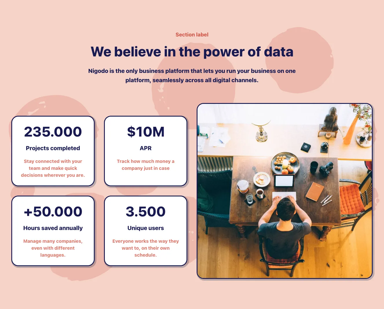
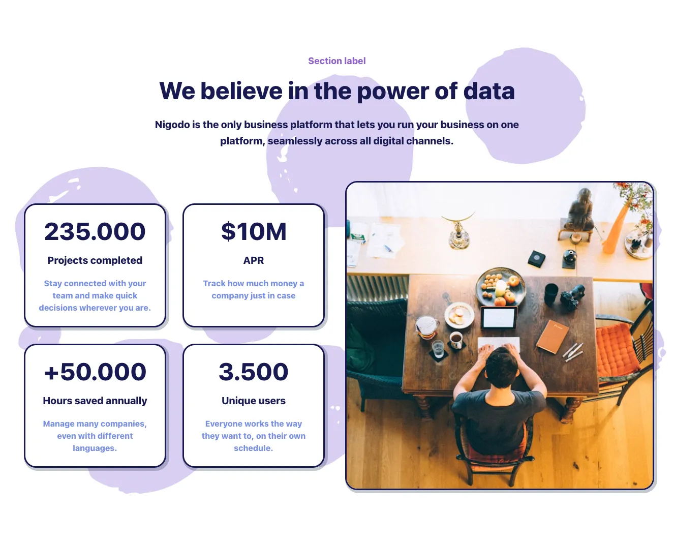
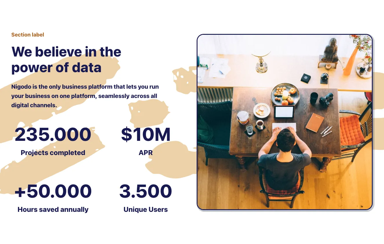
Stats from Nigodo

Tailwind Stats Component

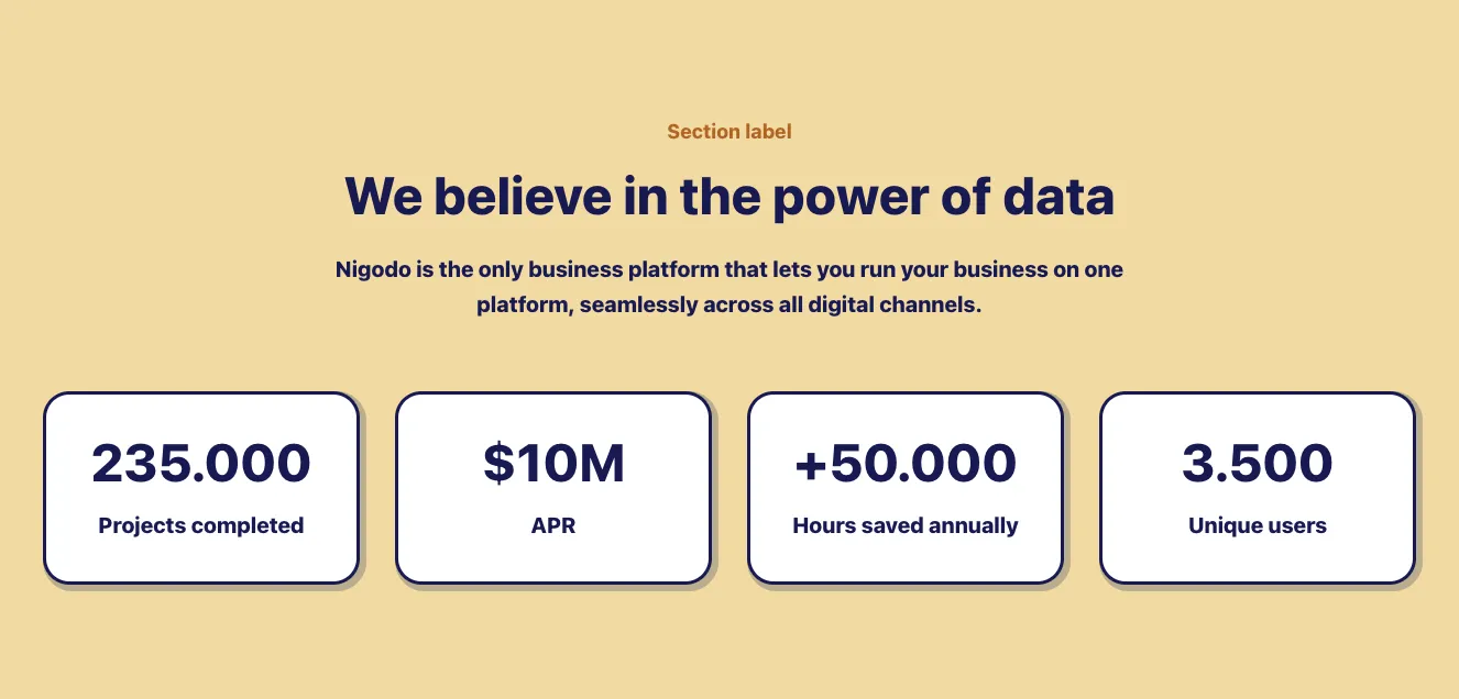
Four-Column Stats Card Row with Navy Outlines

A horizontal row of four outlined cards, each showing a large bold navy figure with a short label beneath, such as project counts, APR, hours saved, and unique users. The cards have rounded corners, navy borders, and a gray drop shadow on a white background, presenting key metrics in a simple, evenly spaced layout.

Stats component #1
Stats component #2
Stats component #3
Stats component #4
Stats component #5
Stats component #6
Stats component #7
Stats component #8
Stats component #9
Stats component #10
Stats component #11
Stats component #12
Stats component #13
Stats component #14
Stats component #15
Stats component #16
Stats component #17
Stats component #18
Stats component #19
Stats component #20
Stats component #21
Stats component #22
Stats component #23
Stats component #24
Stats component #25
Stats component #26
Stats component #27
Stats component #28
Stats component #29
Stats component #30
Stats component #31
Stats component #32
Stats component #33
Stats component #34
Stats component #35
Stats component #36
Stats component #37
Stats component #38
Stats component #39
Stats component #40
Stats component #41
Stats component #42
Stats component #43
Stats component #44
Stats component #45
Stats component #46
Stats component #47
Stats component #48
Stats component #49
Stats component #50
Stats component #51
Stats component #52
Stats component #53
Stats component #54
Stats component #55
Stats component #56
Stats component #57
Stats component #58
Stats component #59
Stats component #60
Stats component #61
Stats component #62
Stats component #63
Stats component #64
Stats component #65
Stats component #66
Stats component #67
Stats component #68
Stats component #69
Stats component #70
Stats component #71
Stats component #72
Stats component #73
Stats component #74
Stats component #75
Stats component #76
Stats component #77
Stats component #78
Stats component #79
Stats component #80
Stats component #81
Stats component #82
Stats component #83
Stats component #84
Stats component #85
Stats component #86
Stats component #87
Stats component #88
Stats component #89
Stats component #90
Stats component #91
Stats component #92
Stats component #93
Stats component #94
Stats component #95
Stats component #96
Stats component #97
Stats component #98
Stats component #99
Stats component #100
Stats component #101
Stats component #102
Stats component #103
Stats component #104
Stats component #105
Stats component #106
Stats component #107
Stats component #108
Stats component #109
Stats component #110
Stats component #111
Stats component #112
Stats component #113
Stats component #114
Stats component #115
Stats component #116
Stats component #117
Stats component #118
Stats component #119
Stats component #120
Stats component #121
Stats component #122
Stats component #123
Stats component #124
Stats component #125
Stats component #126
Stats component #127
Stats component #128

Stats from Atis

Tailwind Stats Component

Four-Column Stats Row with Green Icon Tiles

A horizontal row of four statistic items, each with a green icon in a mint square tile, a bold numeric value, and a gray label beneath. The layout is a light-background, evenly spaced row used to summarize key metrics.

Stats component #1
Stats component #2
Stats component #3
Stats component #4
Stats component #5
Stats component #6

Stats from Pstls.

Tailwind Stats Component

Three-Column Stat Cards with Serif Numerals

A horizontal row of three white stat cards with soft shadows, each showing a small gray label above a large bold serif number (Subscribers, Projects, Tasks). The layout is minimal and spacious, presenting key metrics without charts or interactive controls.

Stats component #1
Stats component #2
Stats component #3
Stats component #4
Stats component #5
Stats component #6
Stats component #7
Stats component #8

Stats from BoldUI

Tailwind Stats Component

Dark Stats Section with Heading and Demo CTA

A centered dark marketing section with a small blue eyebrow label, a bold uppercase heading, four large blue statistic numbers with muted captions, and a yellow pill call-to-action button labeled Activte demo. The stats sit in an evenly spaced horizontal row above the button.

Stats component #1
Stats component #2
Stats component #3
Stats component #4

Stats from Acros

Tailwind Stats Component

Stats Section with Headline and Four Metric Cards

A marketing stats section with a small eyebrow label, a serif headline on the left, and four staggered white cards on the right showing metrics (65K+, 250K+, 500K+, 1.5M+) each with a teal icon and caption. The cards are arranged in two offset columns for a visual stagger.

Stats component #1
Stats component #2
Stats component #3

In presenting data, it is important not to bore your audience. When showing larger data sets, it's a good idea to vary the presentation to keep users' attention. You can achieve this with a variety of ways to show data through our Tailwind component stats. Highlight the most important data and choose the right presentation for each data type!


Choose from many variations of the Tailwind components stats. The variants shown here are available in various UI libraries in the Shuffle editor. You will also find many other types of components that will be in the same style. This will allow you to build a comprehensive Tailwind website template. Each library is designed by a professional designer and coded by our team of developers.
 

Get access to all sections of the Tailwind components stats, code and our editor. Try the demo for free.

The easiest way to create beautiful websites

Lifetime License

Create an account

OR USE EMAIL

We issue VAT invoices. Already have an account? Sign in

Why creators choose Shuffle

From idea to beautiful design in minutes.

Shuffle pairs an AI visual editor with 80+ UI libraries, so you can design, build and export production‑ready code without starting from scratch.

  • An AI Agent that builds with you Describe a page, watch it come to life, then fine-tune it visually or with a prompt.
  • Pick the best model for every task GPT-6 Astra, Claude Opus 5.5 and Gemini 3.8 in one place.
  • 13,400+ professionally designed components Prefer building by hand? Drag in pixel-perfect sections crafted by professional designers.
  • Export to the stack you love Tailwind CSS, Bootstrap, Next.js, Laravel, WordPress and beyond.
“Its AI-powered features have transformed how I work! Designing and building websites has become faster, easier, and far more efficient.”
Est. 2019
Helping web builders ship since 2019 7 years of steady development.

Make it yours with AI

Start with this component. Tell AI what to change.

Original
Preview the original component.
Your Version
Available when your generation is complete.
Code
Available when your generation is complete.
Original component

Add images & videos

Upload an asset, then tell AI how to use it.

How it works

Your uploaded file will be added directly to the generated component. After uploading, you can guide the AI on where exactly to use it, e.g. as a logo or as a section image.

© 2026 Shuffle. All rights reserved.