Redirecting to PayPal

Tailwind CSS Sign in / Sign up Components

Browse 408 ready-made Tailwind CSS sign in / sign up components from multiple UI libraries. Every variant is fully responsive – copy the code or customize it in the visual editor and export clean code.

Sign in / Sign up from Saturn

Tailwind Sign in / Sign up Component

Split-screen sign-in form with testimonial panel

A two-column authentication screen with a sign-in form on the right featuring social login buttons, email and password fields, a remember-me checkbox, and an orange login button. The left column shows a 3D character image with a translucent testimonial card overlaid.

Sign in / Sign up component #1
Sign in / Sign up component #2
Sign in / Sign up component #3
Sign in / Sign up component #4
Sign in / Sign up component #5
Sign in / Sign up component #6
Sign in / Sign up component #7
Sign in / Sign up component #8
Sign in / Sign up component #9
Sign in / Sign up component #10
Sign in / Sign up component #11
Sign in / Sign up component #12

Sign in / Sign up from DarkPro

Tailwind Sign in / Sign up Component

Split-Screen Sign-Up Form with Purple Hero Panel

A split-screen section with a purple gradient marketing panel on the left containing a heading and body text, and a dark sign-up card on the right with email, password, repeat password fields, a terms checkbox, and a white Get Started button.

Sign in / Sign up component #1
Sign in / Sign up component #2
Sign in / Sign up component #3
Sign in / Sign up component #4
Sign in / Sign up component #5
Sign in / Sign up component #6
Sign in / Sign up component #7
Sign in / Sign up component #8

Sign in / Sign up from Flaro

Tailwind Sign in / Sign up Component

Split-screen sign-in page with brand hero and login form

A two-column authentication screen with a marketing panel on the left featuring a heading and feature bullets, and a sign-in form on the right with email, password, remember-me, forgot-password link, primary Sign In button, and Google and Facebook social login options.

Sign in / Sign up component #1
Sign in / Sign up component #2
Sign in / Sign up component #3
Sign in / Sign up component #4
Sign in / Sign up component #5
Sign in / Sign up component #6
Sign in / Sign up component #7
Sign in / Sign up component #8

Your next website starts here

Design with AI and generate multiple website concepts in minutes. Make it yours with Shuffle: tweak every detail in a visual editor.

EXPORT CODE TO THE TECH YOU LOVE

Sign in / Sign up from Gradia

Tailwind Sign in / Sign up Component

Split-screen signup form with testimonials

A two-column signup section with a heading, intro text, first name, last name, email, and website fields, a terms checkbox, and a gradient sign-up button on the left. The right column shows two testimonial quotes with avatars, names, and job titles.

Sign in / Sign up component #1
Sign in / Sign up component #2
Sign in / Sign up component #3
Sign in / Sign up component #4
Sign in / Sign up component #5
Sign in / Sign up component #6

Sign in / Sign up from Solstice

Tailwind Sign in / Sign up Component

Split-screen sign up form with email, password, and Google sign-up

A two-column sign up page with a left-side form containing email and password fields, an orange primary Sign Up button, and a Google sign-up option, plus a light gray right panel displaying a white decorative logo mark. The form is aligned to the left column and includes a link to log in for existing users.

Sign in / Sign up component #1
Sign in / Sign up component #2
Sign in / Sign up component #3
Sign in / Sign up component #4
Sign in / Sign up component #5
Sign in / Sign up component #6
Sign in / Sign up component #7
Sign in / Sign up component #8
Sign in / Sign up component #9
Sign in / Sign up component #10
Sign in / Sign up component #11
Sign in / Sign up component #12
Sign in / Sign up component #13
Sign in / Sign up component #14
Sign in / Sign up component #15
Sign in / Sign up component #16
Sign in / Sign up component #17
Sign in / Sign up component #18
Sign in / Sign up component #19
Sign in / Sign up component #20
Sign in / Sign up component #21
Sign in / Sign up component #22
Sign in / Sign up component #23
Sign in / Sign up component #24
Sign in / Sign up component #25
Sign in / Sign up component #26
Sign in / Sign up component #27
Sign in / Sign up component #28
Sign in / Sign up component #29
Sign in / Sign up component #30
Sign in / Sign up component #31
Sign in / Sign up component #32
Sign in / Sign up component #33
Sign in / Sign up component #34
Sign in / Sign up component #35
Sign in / Sign up component #36
Sign in / Sign up component #37
Sign in / Sign up component #38
Sign in / Sign up component #39
Sign in / Sign up component #40
Sign in / Sign up component #41
Sign in / Sign up component #42
Sign in / Sign up component #43
Sign in / Sign up component #44
Sign in / Sign up component #45
Sign in / Sign up component #46
Sign in / Sign up component #47
Sign in / Sign up component #48
Sign in / Sign up component #49
Sign in / Sign up component #50

Sign in / Sign up from Basko

Tailwind Sign in / Sign up Component

Dark Sign-In Form with Welcome Heading

A centered dark-background sign-in form with a serif "Welcome Back!" heading, a supporting paragraph, email and password fields side by side, a Remember Me checkbox with a Forgot Password link, and a full-width purple Sign In button.

Sign in / Sign up component #1
Sign in / Sign up component #2
Sign in / Sign up component #3
Sign in / Sign up component #4
Sign in / Sign up component #5
Sign in / Sign up component #6
Sign in / Sign up component #7
Sign in / Sign up component #8

Sign in / Sign up from Zanrly

Tailwind Sign in / Sign up Component

Dark Split-Screen Sign-Up Form with Benefits Panel

A dark split-screen registration component with a left promotional panel showing a logo, headline, and benefit checklist, and a right form with full name, email, and password fields, a terms checkbox, a primary Sign Up button, and Google and Twitter social sign-in options.

Sign in / Sign up component #1
Sign in / Sign up component #2
Sign in / Sign up component #3
Sign in / Sign up component #4
Sign in / Sign up component #5
Sign in / Sign up component #6
Sign in / Sign up component #7
Sign in / Sign up component #8
Sign in / Sign up component #9
Sign in / Sign up component #10
Sign in / Sign up component #11
Sign in / Sign up component #12
Sign in / Sign up component #13
Sign in / Sign up component #14
Sign in / Sign up component #15
Sign in / Sign up component #16
Sign in / Sign up component #17
Sign in / Sign up component #18
Sign in / Sign up component #19
Sign in / Sign up component #20
Sign in / Sign up component #21
Sign in / Sign up component #22
Sign in / Sign up component #23
Sign in / Sign up component #24
Sign in / Sign up component #25
Sign in / Sign up component #26
Sign in / Sign up component #27
Sign in / Sign up component #28
Sign in / Sign up component #29
Sign in / Sign up component #30
Sign in / Sign up component #31
Sign in / Sign up component #32
Sign in / Sign up component #33
Sign in / Sign up component #34
Sign in / Sign up component #35
Sign in / Sign up component #36
Sign in / Sign up component #37
Sign in / Sign up component #38
Sign in / Sign up component #39
Sign in / Sign up component #40
Sign in / Sign up component #41
Sign in / Sign up component #42
Sign in / Sign up component #43
Sign in / Sign up component #44
Sign in / Sign up component #45
Sign in / Sign up component #46
Sign in / Sign up component #47
Sign in / Sign up component #48
Sign in / Sign up component #49
Sign in / Sign up component #50
Sign in / Sign up component #51
Sign in / Sign up component #52
Sign in / Sign up component #53
Sign in / Sign up component #54
Sign in / Sign up component #55
Sign in / Sign up component #56
Sign in / Sign up component #57
Sign in / Sign up component #58
Sign in / Sign up component #59
Sign in / Sign up component #60
Sign in / Sign up component #61
Sign in / Sign up component #62
Sign in / Sign up component #63
Sign in / Sign up component #64
Sign in / Sign up component #65
Sign in / Sign up component #66
Sign in / Sign up component #67
Sign in / Sign up component #68
Sign in / Sign up component #69
Sign in / Sign up component #70
Sign in / Sign up component #71
Sign in / Sign up component #72
Sign in / Sign up component #73
Sign in / Sign up component #74
Sign in / Sign up component #75
Sign in / Sign up component #76
Sign in / Sign up component #77
Sign in / Sign up component #78
Sign in / Sign up component #79
Sign in / Sign up component #80
Sign in / Sign up component #81
Sign in / Sign up component #82
Sign in / Sign up component #83
Sign in / Sign up component #84
Sign in / Sign up component #85
Sign in / Sign up component #86
Sign in / Sign up component #87
Sign in / Sign up component #88
Sign in / Sign up component #89
Sign in / Sign up component #90
Sign in / Sign up component #91
Sign in / Sign up component #92
Sign in / Sign up component #93
Sign in / Sign up component #94
Sign in / Sign up component #95
Sign in / Sign up component #96
Sign in / Sign up component #97
Sign in / Sign up component #98
Sign in / Sign up component #99
Sign in / Sign up component #100
Sign in / Sign up component #101
Sign in / Sign up component #102
Sign in / Sign up component #103
Sign in / Sign up component #104
Sign in / Sign up component #105
Sign in / Sign up component #106
Sign in / Sign up component #107
Sign in / Sign up component #108
Sign in / Sign up component #109
Sign in / Sign up component #110
Sign in / Sign up component #111
Sign in / Sign up component #112
Sign in / Sign up component #113
Sign in / Sign up component #114
Sign in / Sign up component #115
Sign in / Sign up component #116
Sign in / Sign up component #117
Sign in / Sign up component #118
Sign in / Sign up component #119
Sign in / Sign up component #120

Sign in / Sign up from Nightsable

Tailwind Sign in / Sign up Component

Split-Screen Dark Login Form with Social Sign-In and Portfolio Preview

A split-screen authentication page with a dark background. The left column contains a login heading, Google and Apple sign-in buttons, an email field, a lime Log in button, and a sign-up link; the right column shows an illustrative portfolio card and trusted-by brand logos.

Sign in / Sign up component #1
Sign in / Sign up component #2
Sign in / Sign up component #3
Sign in / Sign up component #4
Sign in / Sign up component #5
Sign in / Sign up component #6
Sign in / Sign up component #7
Sign in / Sign up component #8
Sign in / Sign up component #9
Sign in / Sign up component #10

Sign in / Sign up from Zeus

Tailwind Sign in / Sign up Component

Split-Screen Sign Up Form with Marketing Panel

A two-column sign-up section with a light blue marketing panel containing a heading and body copy on the left, and a white registration card on the right with email, password, repeat password fields, a terms checkbox, and a coral Get Started button.

Sign in / Sign up component #1
Sign in / Sign up component #2
Sign in / Sign up component #3
Sign in / Sign up component #4
Sign in / Sign up component #5
Sign in / Sign up component #6
Sign in / Sign up component #7
Sign in / Sign up component #8
Sign in / Sign up component #9
Sign in / Sign up component #10
Sign in / Sign up component #11
Sign in / Sign up component #12

Sign in / Sign up from Trizzle

Tailwind Sign in / Sign up Component

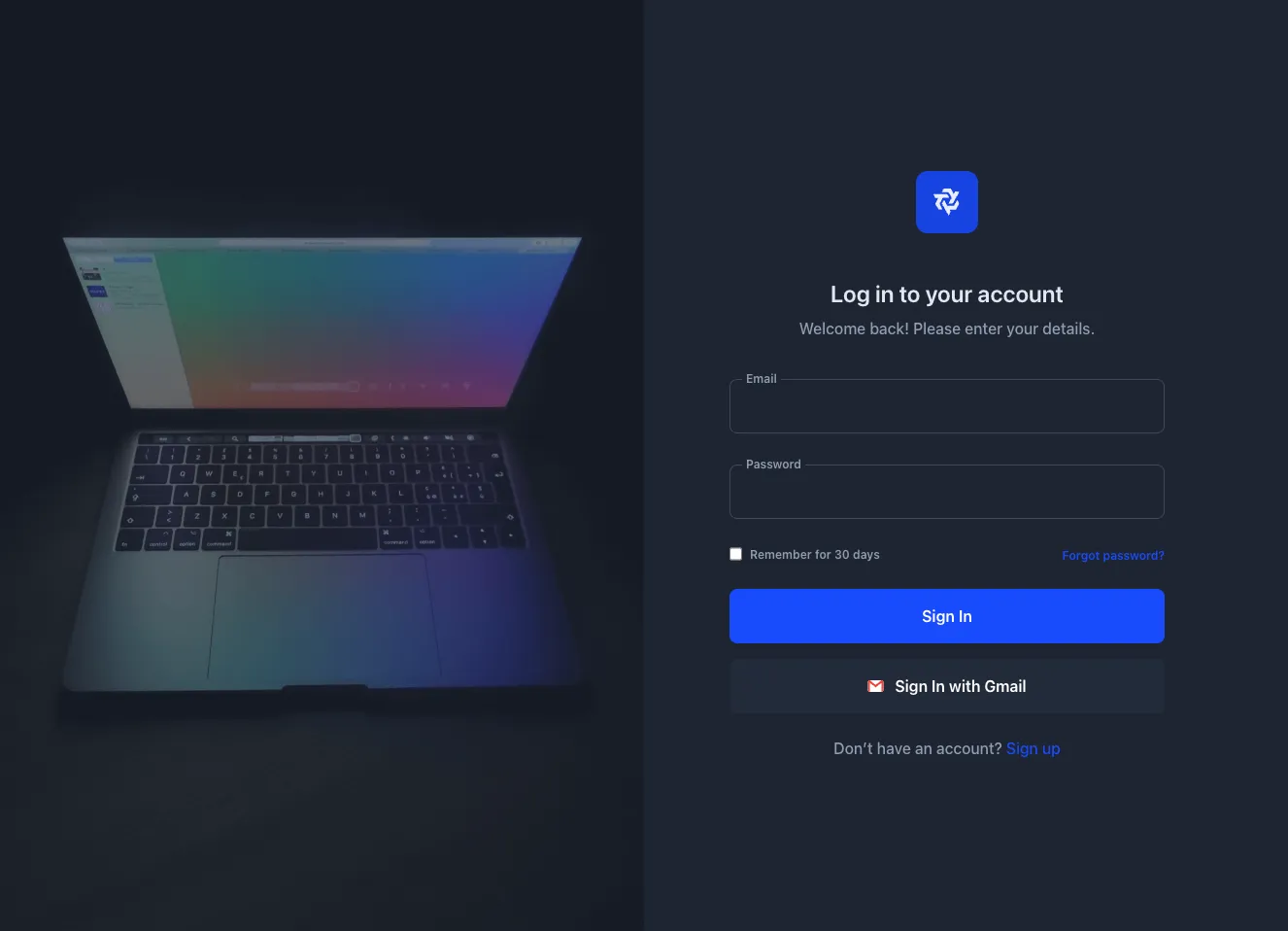
Dark Login Form Card with Email, Password, and Gmail Sign-In

A centered dark authentication card with a logo badge, heading, email and password fields, a remember-me checkbox, a forgot password link, a primary Sign In button, a Gmail sign-in option, and a sign-up link. The layout is a single vertical stack optimized for account login.

Sign in / Sign up component #1
Sign in / Sign up component #2
Sign in / Sign up component #3
Sign in / Sign up component #4
Sign in / Sign up component #5
Sign in / Sign up component #6
Sign in / Sign up component #7
Sign in / Sign up component #8

Sign in / Sign up from Wrexa

Tailwind Sign in / Sign up Component

Sign-up form with email fields, social sign-up buttons, and create account CTA

A light-themed sign-up card titled 'Sign up to Wrexa' with a sign-in link at top right, two email input fields, Google and Facebook sign-up options, and a purple Create Account button. The layout is a centered vertical stack within a white rounded container.

Sign in / Sign up component #1
Sign in / Sign up component #2
Sign in / Sign up component #3
Sign in / Sign up component #4
Sign in / Sign up component #5

Sign in / Sign up from Zospace

Tailwind Sign in / Sign up Component

Dark Split-Screen Register Account Form with Marketing Hero

A dark split-screen registration section with a left-side promotional heading and body text, and a right-side card containing an email field, password fields, a terms checkbox, and a blue Get started button. The form card is the primary interactive element for collecting account information.

Sign in / Sign up component #1
Sign in / Sign up component #2
Sign in / Sign up component #3
Sign in / Sign up component #4
Sign in / Sign up component #5

Sign in / Sign up from Flex

Tailwind Sign in / Sign up Component

Dark Sign-In Form with Email, Password, and Remember Me

A centered dark-themed sign-in card with a logo, heading, email and password fields, a remember-me checkbox, forgot password link, green primary Sign In button, and sign-up prompt. Designed for account authentication with a minimal, spacious layout.

Sign in / Sign up component #1
Sign in / Sign up component #2
Sign in / Sign up component #3
Sign in / Sign up component #4
Sign in / Sign up component #5
Sign in / Sign up component #6
Sign in / Sign up component #7
Sign in / Sign up component #8
Sign in / Sign up component #9
Sign in / Sign up component #10
Sign in / Sign up component #11
Sign in / Sign up component #12
Sign in / Sign up component #13
Sign in / Sign up component #14
Sign in / Sign up component #15
Sign in / Sign up component #16
Sign in / Sign up component #17
Sign in / Sign up component #18
Sign in / Sign up component #19
Sign in / Sign up component #20
Sign in / Sign up component #21
Sign in / Sign up component #22

Sign in / Sign up from Uinel

Tailwind Sign in / Sign up Component

Dark Navy Account Registration Hero with Inline Sign-Up Form

A dark navy centered registration section with a pill badge, large two-line heading, and an inline row of email, password, and confirm password fields with a blue Register now button. A terms agreement checkbox line appears below the form.

Sign in / Sign up component #1
Sign in / Sign up component #2
Sign in / Sign up component #3
Sign in / Sign up component #4
Sign in / Sign up component #5

Sign in / Sign up from Yofte

Tailwind Sign in / Sign up Component

Centered Sign-Up Form with Email and Password Fields

A centered sign-up card with a logo, heading, supporting line, email and two password inputs, a terms agreement checkbox, and a dark primary submit button. The card sits on a light background with a blue offset accent behind it.

Sign in / Sign up component #1
Sign in / Sign up component #2
Sign in / Sign up component #3
Sign in / Sign up component #4
Sign in / Sign up component #5

Sign in / Sign up from Shopal

Tailwind Sign in / Sign up Component

Split-screen sign-up form with lime card

A split-screen sign-up section with a dark left panel containing placeholder heading and body text, and a lime green card on the right with a sign-up form for email, password, and repeated password, a terms checkbox, and a Get Started button.

Sign in / Sign up component #1
Sign in / Sign up component #2
Sign in / Sign up component #3
Sign in / Sign up component #4
Sign in / Sign up component #5
Sign in / Sign up component #6
Sign in / Sign up component #7
Sign in / Sign up component #8
Sign in / Sign up component #9
Sign in / Sign up component #10

Sign in / Sign up from Nigodo

Tailwind Sign in / Sign up Component

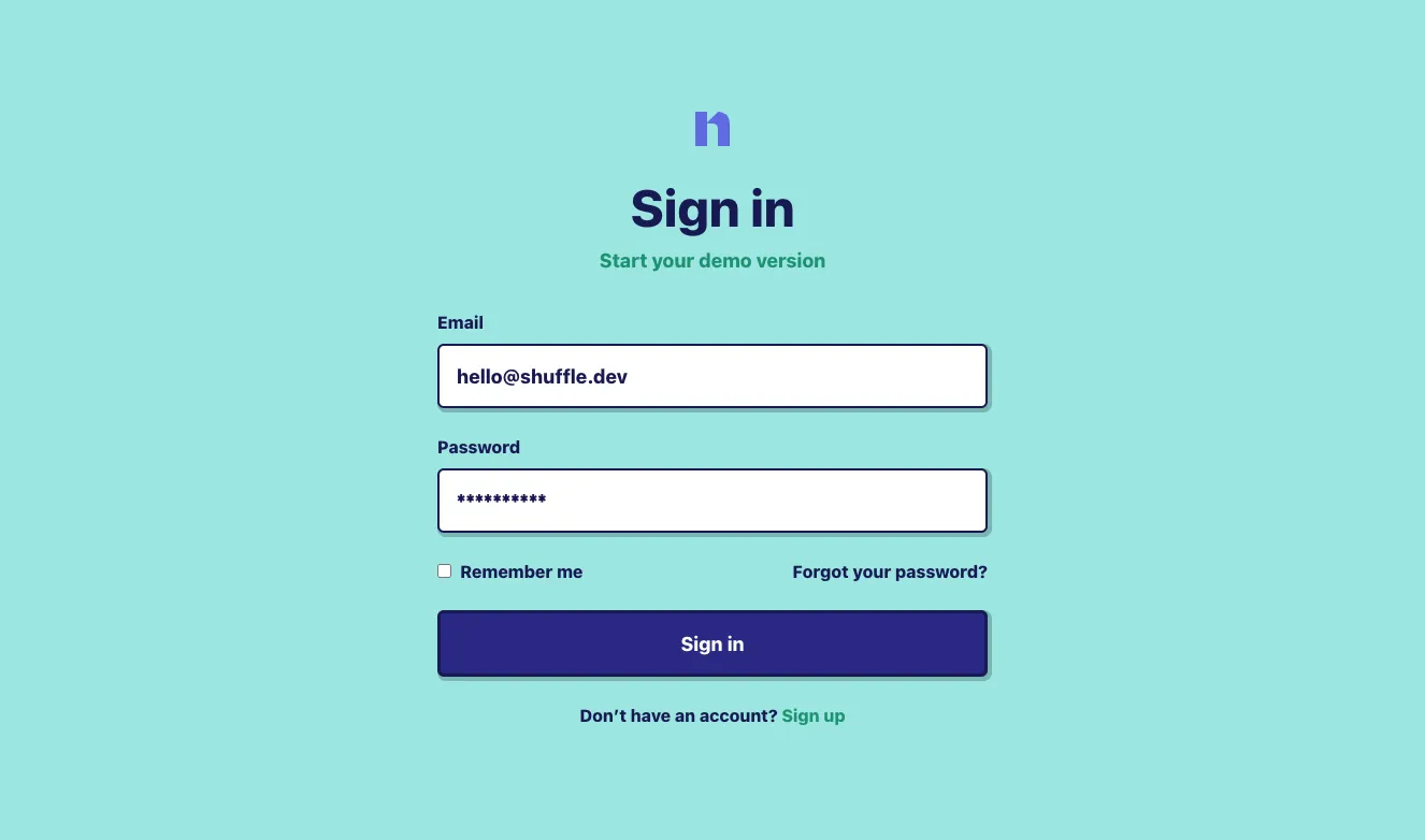
Centered sign-in form with email, password, and remember me

A centered authentication form with a logo, 'Sign in' heading, email and password fields, a remember me checkbox, forgot password link, primary sign-in button, and sign-up link. Uses a light background with a dark navy and teal accent palette.

Sign in / Sign up component #1
Sign in / Sign up component #2
Sign in / Sign up component #3
Sign in / Sign up component #4
Sign in / Sign up component #5
Sign in / Sign up component #6
Sign in / Sign up component #7
Sign in / Sign up component #8
Sign in / Sign up component #9
Sign in / Sign up component #10
Sign in / Sign up component #11
Sign in / Sign up component #12
Sign in / Sign up component #13
Sign in / Sign up component #14
Sign in / Sign up component #15
Sign in / Sign up component #16
Sign in / Sign up component #17
Sign in / Sign up component #18
Sign in / Sign up component #19
Sign in / Sign up component #20
Sign in / Sign up component #21
Sign in / Sign up component #22
Sign in / Sign up component #23
Sign in / Sign up component #24
Sign in / Sign up component #25
Sign in / Sign up component #26
Sign in / Sign up component #27
Sign in / Sign up component #28
Sign in / Sign up component #29
Sign in / Sign up component #30
Sign in / Sign up component #31
Sign in / Sign up component #32
Sign in / Sign up component #33
Sign in / Sign up component #34
Sign in / Sign up component #35
Sign in / Sign up component #36
Sign in / Sign up component #37
Sign in / Sign up component #38
Sign in / Sign up component #39
Sign in / Sign up component #40
Sign in / Sign up component #41
Sign in / Sign up component #42
Sign in / Sign up component #43
Sign in / Sign up component #44
Sign in / Sign up component #45
Sign in / Sign up component #46
Sign in / Sign up component #47
Sign in / Sign up component #48
Sign in / Sign up component #49
Sign in / Sign up component #50
Sign in / Sign up component #51
Sign in / Sign up component #52
Sign in / Sign up component #53
Sign in / Sign up component #54
Sign in / Sign up component #55
Sign in / Sign up component #56
Sign in / Sign up component #57
Sign in / Sign up component #58
Sign in / Sign up component #59
Sign in / Sign up component #60
Sign in / Sign up component #61
Sign in / Sign up component #62
Sign in / Sign up component #63
Sign in / Sign up component #64
Sign in / Sign up component #65
Sign in / Sign up component #66
Sign in / Sign up component #67
Sign in / Sign up component #68
Sign in / Sign up component #69
Sign in / Sign up component #70
Sign in / Sign up component #71
Sign in / Sign up component #72
Sign in / Sign up component #73
Sign in / Sign up component #74
Sign in / Sign up component #75
Sign in / Sign up component #76
Sign in / Sign up component #77
Sign in / Sign up component #78
Sign in / Sign up component #79
Sign in / Sign up component #80
Sign in / Sign up component #81
Sign in / Sign up component #82
Sign in / Sign up component #83
Sign in / Sign up component #84
Sign in / Sign up component #85
Sign in / Sign up component #86
Sign in / Sign up component #87
Sign in / Sign up component #88
Sign in / Sign up component #89
Sign in / Sign up component #90
Sign in / Sign up component #91
Sign in / Sign up component #92
Sign in / Sign up component #93
Sign in / Sign up component #94
Sign in / Sign up component #95
Sign in / Sign up component #96
Sign in / Sign up component #97
Sign in / Sign up component #98
Sign in / Sign up component #99
Sign in / Sign up component #100
Sign in / Sign up component #101
Sign in / Sign up component #102
Sign in / Sign up component #103
Sign in / Sign up component #104
Sign in / Sign up component #105
Sign in / Sign up component #106
Sign in / Sign up component #107
Sign in / Sign up component #108
Sign in / Sign up component #109
Sign in / Sign up component #110
Sign in / Sign up component #111
Sign in / Sign up component #112
Sign in / Sign up component #113
Sign in / Sign up component #114
Sign in / Sign up component #115
Sign in / Sign up component #116
Sign in / Sign up component #117
Sign in / Sign up component #118
Sign in / Sign up component #119
Sign in / Sign up component #120
Sign in / Sign up component #121
Sign in / Sign up component #122
Sign in / Sign up component #123
Sign in / Sign up component #124
Sign in / Sign up component #125
Sign in / Sign up component #126
Sign in / Sign up component #127
Sign in / Sign up component #128
Sign in / Sign up component #129
Sign in / Sign up component #130
Sign in / Sign up component #131
Sign in / Sign up component #132
Sign in / Sign up component #133
Sign in / Sign up component #134
Sign in / Sign up component #135
Sign in / Sign up component #136
Sign in / Sign up component #137
Sign in / Sign up component #138
Sign in / Sign up component #139
Sign in / Sign up component #140
Sign in / Sign up component #141
Sign in / Sign up component #142
Sign in / Sign up component #143
Sign in / Sign up component #144
Sign in / Sign up component #145
Sign in / Sign up component #146
Sign in / Sign up component #147
Sign in / Sign up component #148
Sign in / Sign up component #149
Sign in / Sign up component #150

Sign in / Sign up from Atis

Tailwind Sign in / Sign up Component

Split-screen sign up form with analytics promo panel

A split-screen account registration page with a white left panel containing a sign up form (first name, last name, email, password, and a pink Sign Up button) and a right panel with a darkened photo, promotional heading, and Get Started button. The form and promo panel together form the outer component.

Sign in / Sign up component #1
Sign in / Sign up component #2
Sign in / Sign up component #3
Sign in / Sign up component #4
Sign in / Sign up component #5
Sign in / Sign up component #6
Sign in / Sign up component #7
Sign in / Sign up component #8
Sign in / Sign up component #9
Sign in / Sign up component #10
Sign in / Sign up component #11
Sign in / Sign up component #12
Sign in / Sign up component #13
Sign in / Sign up component #14
Sign in / Sign up component #15
Sign in / Sign up component #16
Sign in / Sign up component #17
Sign in / Sign up component #18
Sign in / Sign up component #19
Sign in / Sign up component #20
Sign in / Sign up component #21
Sign in / Sign up component #22
Sign in / Sign up component #23

Sign in / Sign up from Pstls.

Tailwind Sign in / Sign up Component

Centered login form with email, password, and Google sign-in

A centered authentication card with a logo, serif heading "Log in to your account," email and password fields, a terms checkbox, a black Sign In button, a Google sign-in button, and a sign-up link. The layout is a vertically stacked form on a faint pastel gradient background.

Sign in / Sign up component #1
Sign in / Sign up component #2
Sign in / Sign up component #3
Sign in / Sign up component #4
Sign in / Sign up component #5
Sign in / Sign up component #6
Sign in / Sign up component #7
Sign in / Sign up component #8
Sign in / Sign up component #9
Sign in / Sign up component #10
Sign in / Sign up component #11
Sign in / Sign up component #12

Sign in / Sign up from BoldUI

Tailwind Sign in / Sign up Component

Dark Create Account Sign-up Form with Photo Background

A dark-themed account creation form with a heading, email and password inputs, a terms agreement checkbox, and a yellow "Try demo" call-to-action button, layered over a dimmed portrait photograph. The form is left-aligned on the left side of the frame with the photo filling the background.

Sign in / Sign up component #1
Sign in / Sign up component #2
Sign in / Sign up component #3
Sign in / Sign up component #4

Login and registration is a sensitive part of any site. When designing this type of component, one should think very carefully about the amount of data to be obtained, their order and importance.  Acquiring new users and maintaining ties with registered users keeps the site alive. That's why Tailwind Sign in and Sing up components collected in Shuffle Editor are refined to a pixel perfect state. When choosing the right version for your project, you certainly won't run out of options! 


Choose from many variations of Tailwind sign in and sign up components. Presented here are variants available in various UI libraries. You will also find many other types of components that will be in the same style. Each library has been designed by a professional designer and coded by our team of developers.


Get access to all Tailwind sign in/sign up components, code and our editor. Try the demo for free.

The easiest way to create beautiful websites

Lifetime License

Create an account

OR USE EMAIL

We issue VAT invoices. Already have an account? Sign in

Why creators choose Shuffle

From idea to beautiful design in minutes.

Shuffle pairs an AI visual editor with 80+ UI libraries, so you can design, build and export production‑ready code without starting from scratch.

  • An AI Agent that builds with you Describe a page, watch it come to life, then fine-tune it visually or with a prompt.
  • Pick the best model for every task GPT-6 Astra, Claude Opus 5.5 and Gemini 3.8 in one place.
  • 13,400+ professionally designed components Prefer building by hand? Drag in pixel-perfect sections crafted by professional designers.
  • Export to the stack you love Tailwind CSS, Bootstrap, Next.js, Laravel, WordPress and beyond.
“Its AI-powered features have transformed how I work! Designing and building websites has become faster, easier, and far more efficient.”
Est. 2019
Helping web builders ship since 2019 7 years of steady development.

Make it yours with AI

Start with this component. Tell AI what to change.

Original
Preview the original component.
Your Version
Available when your generation is complete.
Code
Available when your generation is complete.
Original component

Add images & videos

Upload an asset, then tell AI how to use it.

How it works

Your uploaded file will be added directly to the generated component. After uploading, you can guide the AI on where exactly to use it, e.g. as a logo or as a section image.

© 2026 Shuffle. All rights reserved.