Browse 353 ready-made Tailwind CSS call to action components from multiple UI libraries. Every variant is fully responsive – copy the code or customize it in the visual editor and export clean code.
 Tailwind CSS
Full Shuffle Editor access for just $10
Great for quick projects and for testing everything Shuffle can do. One-time payment, not a subscription.
Get 7-Day PassNew to Shuffle? Try our tools:

Create a free account to copy production-ready code from every component in the library.
Free account · No credit card · No password needed
Already have an account? Sign in
A light-background marketing hero section with a large bold heading that includes an italic serif word, a gray supporting paragraph, an orange rounded Learn More button, and a small teal rounded image with a caption. The content is left-aligned with generous whitespace and a soft peach gradient on the right.


Create a free account to copy production-ready code from every component in the library.
Free account · No credit card · No password needed
Already have an account? Sign in
A centered hero section on a dark background with a small eyebrow label, a large two-line headline, a supporting paragraph, and a pair of call-to-action buttons. The primary white pill button and secondary outlined pill button are placed side by side beneath the text.


Create a free account to copy production-ready code from every component in the library.
Free account · No credit card · No password needed
Already have an account? Sign in
A centered marketing hero section introducing a collaboration product with a large bold heading, a short supporting line, an indigo call-to-action button, and a row of small user avatars with a text note about startup founders. The layout is a simple vertically stacked composition on a white background.


Create a free account to copy production-ready code from every component in the library.
Free account · No credit card · No password needed
Already have an account? Sign in
A dark hero section with a large two-line white heading, supporting text, a blue "Connect Now" button, and checkmark feature bullets on the left. A cropped light-themed analytics dashboard screenshot appears on the right as an illustrative product preview.


Create a free account to copy production-ready code from every component in the library.
Free account · No credit card · No password needed
Already have an account? Sign in
A centered marketing call-to-action section with a bold two-line heading inviting visitors to join and learn together, a single orange Sign Up Now button, and four rounded portrait photo cards placed at the corners. The light background and sparse arrangement give it a minimal, spacious appearance.


Create a free account to copy production-ready code from every component in the library.
Free account · No credit card · No password needed
Already have an account? Sign in
A split-screen promotional hero section with a yellow product photo and video play button on the left, and a dark panel on the right with a serif heading, purple call-to-action button, and free trial note. The layout pairs a video entry point with marketing copy for a traffic-focused product.


Create a free account to copy production-ready code from every component in the library.
Free account · No credit card · No password needed
Already have an account? Sign in
A dark promotional hero section with a large two-line heading, body text, and a blue Get Started button on the left, paired with a laptop-on-desk photo on the right. A rounded feature strip below presents three icon-led items with headings and short supporting text.


Create a free account to copy production-ready code from every component in the library.
Free account · No credit card · No password needed
Already have an account? Sign in
A light-background promotional section with a large dark navy headline inviting contact, supporting gray text below, and a coral-red sign up button aligned to the right. The layout is a simple horizontal arrangement of heading and call to action.


Create a free account to copy production-ready code from every component in the library.
Free account · No credit card · No password needed
Already have an account? Sign in
A dark full-width hero section with a large three-line headline, a small underlined subtext link with an arrow icon, and a purple Get Started call-to-action button. Content is left-aligned on a near-black background beneath a white top strip.


Create a free account to copy production-ready code from every component in the library.
Free account · No credit card · No password needed
Already have an account? Sign in
A dark-themed centered hero section with a small blue eyebrow label, a large bold two-line headline, a muted supporting paragraph, and a filled primary button beside an outlined secondary button. Decorative faint circles and white sparkle shapes sit in the background.


Create a free account to copy production-ready code from every component in the library.
Free account · No credit card · No password needed
Already have an account? Sign in
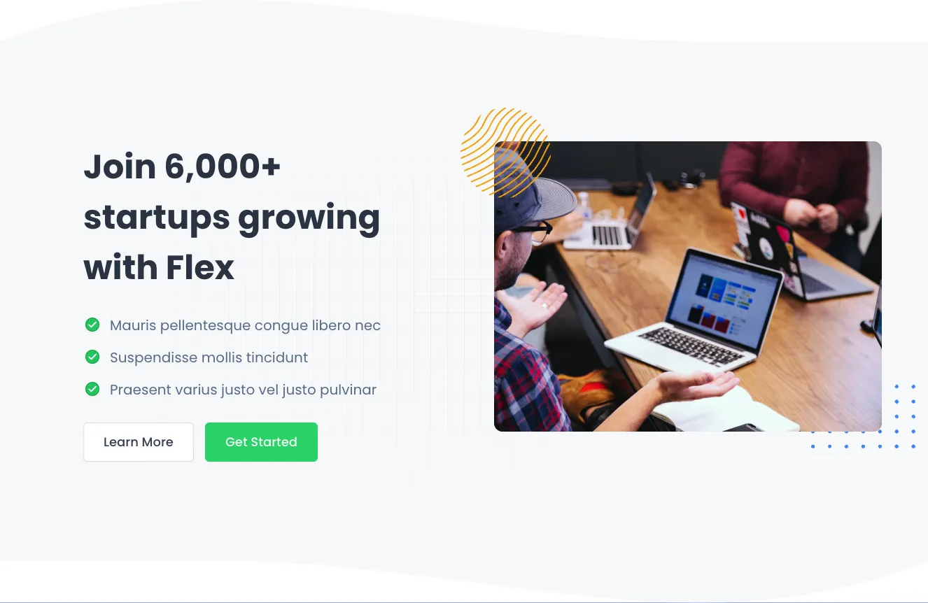
A landing page hero section with a bold multi-line heading, three green-checked feature bullets, and Learn More and Get Started buttons on the left, paired with a photograph of people working around a laptop on the right. Decorative yellow line-art and blue dot accents frame the image on a light gray background.


Create a free account to copy production-ready code from every component in the library.
Free account · No credit card · No password needed
Already have an account? Sign in
A dark navy promotional hero section with a large two-line heading, a pill-shaped eyebrow label, and a blue Join now call-to-action on the left. On the right, overlapping illustrative UI cards show a profile card with Open/Resolved tabs and a Your Team card, presented as product preview content.


Create a free account to copy production-ready code from every component in the library.
Free account · No credit card · No password needed
Already have an account? Sign in
A horizontal promotional banner with a bold blue left panel containing the eyebrow text 'New Products', the heading 'Check our new collection', and an orange MORE button, paired with a photograph of a woman in a yoga pose on the right. Decorative arc lines appear in the blue panel corners.


Create a free account to copy production-ready code from every component in the library.
Free account · No credit card · No password needed
Already have an account? Sign in
A centered hero section on a white background with a purple section label, a large bold navy headline, two lines of supporting body text, and a single dark navy Get Started call-to-action button with a subtle offset shadow. The layout is a simple vertically stacked, minimal composition.


Create a free account to copy production-ready code from every component in the library.
Free account · No credit card · No password needed
Already have an account? Sign in
A centered hero section on a skewed purple background with a multicolor logo mark, a large white two-line headline about business analytics, short lorem ipsum body text, and a white Get Started button. The angled, rounded shape distinguishes it from standard rectangular hero banners.


Create a free account to copy production-ready code from every component in the library.
Free account · No credit card · No password needed
Already have an account? Sign in
A centered promotional hero on a black panel with a small 'NEW FEATURE' eyebrow label, a large serif headline with a lavender highlighted phrase, short supporting text, and two buttons: a filled lavender 'Activate Demo' and an outlined 'Share with friends'. Decorative pale lavender and cream blocks sit behind the panel on a white background.


Create a free account to copy production-ready code from every component in the library.
Free account · No credit card · No password needed
Already have an account? Sign in
A black full-width promotional section with a bold uppercase heading on the left and a gray supporting paragraph on the right, with a yellow pill-shaped 'Activate demo' call-to-action button below. A thin outlined ellipse decorates the left side behind the heading.


Create a free account to copy production-ready code from every component in the library.
Free account · No credit card · No password needed
Already have an account? Sign in
A centered promotional hero section on a solid teal background with a small 'NEW FEATURE' eyebrow label, a large serif heading, supporting text, and a filled primary button alongside an outlined secondary button. Decorative translucent circles are scattered across the background.


Create a free account to copy production-ready code from every component in the library.
Free account · No credit card · No password needed
Already have an account? Sign in
A centered promotional section with a small eyebrow label, bold blue heading, gray supporting paragraph, and two call-to-action buttons: a solid yellow primary button and an outlined secondary button. It uses a light background with a vertically stacked, minimal layout.


Create a free account to copy production-ready code from every component in the library.
Free account · No credit card · No password needed
Already have an account? Sign in
A centered, light-background hero section with a small blue pill badge, a large bold two-line heading, gray supporting text, and a primary filled button paired with a secondary outlined button. The stacked layout and minimal styling make it suited to marketing landing pages.


Effectively collecting contacts is the goal of most sites. A well thought out Tailwind call to action component section must clearly define the path objective and the data collection goal.
Choose from many variations of Tailwind components call to action. Presented here are variants available in various UI libraries. You will also find many other types of components that will be in the same style. Each library has been designed by a professional designer and coded by our team of developers.
Get access to all Tailwind components call to action, code and our editor. Try the demo for free.

Build websites faster with an AI Visual Editor


© 2026 Shuffle. All rights reserved.
See what you're getting before you commit.
Switch the editor to Grid and every page of your project appears side by side on one canvas. Arrange them freely, zoom in and out, and add as many new pages as you need in a few clicks.
Describe what you need in one chat and the Agent does the rest: it adds new sections, edits copy and styles, moves blocks around or removes them across your whole page. No modes, no switching, just tell it what to change.
Not quite there yet? Ask for tweaks like missing assets, your logo or other details, and regenerate the design without starting from scratch.