Browse 353 ready-made Tailwind CSS call to action components from multiple UI libraries. Every variant is fully responsive – copy the code or customize it in the visual editor and export clean code.
 Tailwind CSS
Full Shuffle Editor access for just $10
Great for quick projects and for testing everything Shuffle can do. One-time payment, not a subscription.
Get 7-Day PassNew to Shuffle? Try our tools:

Create a free account to copy production-ready code from every component in the library.
Free account · No credit card · No password needed
Already have an account? Sign in
A centered hero section on a white background with a small eyebrow label, a bold multi-line heading, a gray supporting paragraph, and two side-by-side buttons: a filled slate primary button and an outlined secondary button. It introduces a feature with no imagery or navigation.


Create a free account to copy production-ready code from every component in the library.
Free account · No credit card · No password needed
Already have an account? Sign in
A centered hero section with a small 'New feature' badge, a large bold headline, supporting paragraph text, and two side-by-side call-to-action buttons. It promotes a feature or demo with a vertical centered stack on a white background.


Create a free account to copy production-ready code from every component in the library.
Free account · No credit card · No password needed
Already have an account? Sign in
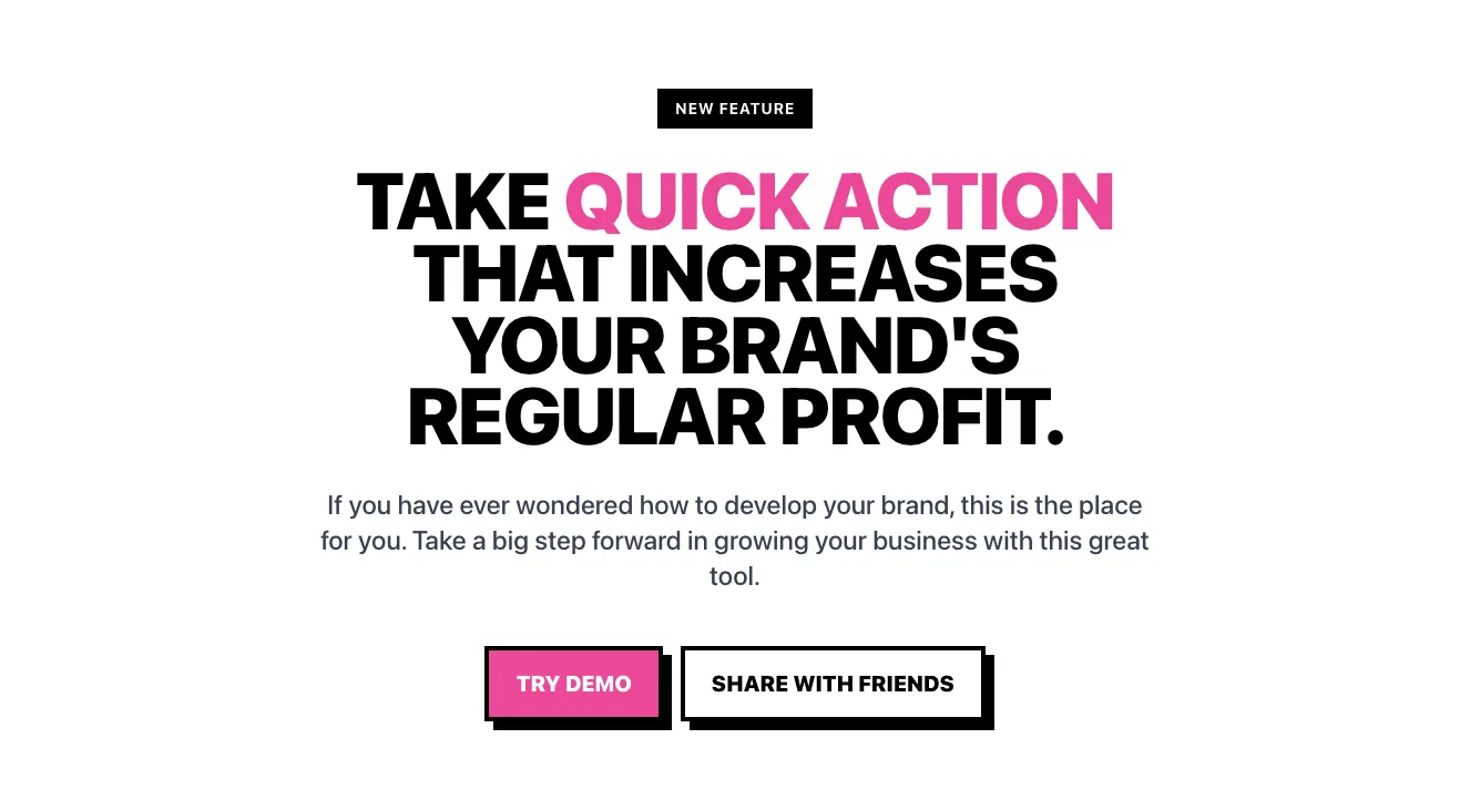
A centered promotional hero section with a small "NEW FEATURE" badge, a large bold heading with pink highlighted text, a supporting paragraph, and two call-to-action buttons: a filled pink "TRY DEMO" button and an outlined "SHARE WITH FRIENDS" button, both with hard offset shadows.


Create a free account to copy production-ready code from every component in the library.
Free account · No credit card · No password needed
Already have an account? Sign in
A dark-themed marketing feature section with a large heading, a 3D robot illustration in a rounded image card, a subheading, supporting paragraph, and a purple Contact Us call-to-action button. The two-column split layout pairs the illustration on the left with the text block on the right.


Create a free account to copy production-ready code from every component in the library.
Free account · No credit card · No password needed
Already have an account? Sign in
A centered hero section on a warm peach-to-coral gradient background, with a small eyebrow label, a large two-line headline, and a single dark Sign up call-to-action button. The layout is a simple vertical stack intended to introduce an offering and prompt sign-up.


Create a free account to copy production-ready code from every component in the library.
Free account · No credit card · No password needed
Already have an account? Sign in
A light-background marketing hero with a large centered headline about green energy, a dark pill-shaped 'Get in touch' button, and a horizontal row of rounded photo cards showing wind turbines, an EV charger, and a hydro dam. The layout stacks text and button centrally above a scrolling strip of images.


Create a free account to copy production-ready code from every component in the library.
Free account · No credit card · No password needed
Already have an account? Sign in
A centered hero section with a bold white heading, supporting subtitle, and a pink pill-shaped Get Started call-to-action button over a pink-to-dark gradient background. A large outlined decorative lettering is partially visible at the bottom, cropped by the frame.


Create a free account to copy production-ready code from every component in the library.
Free account · No credit card · No password needed
Already have an account? Sign in
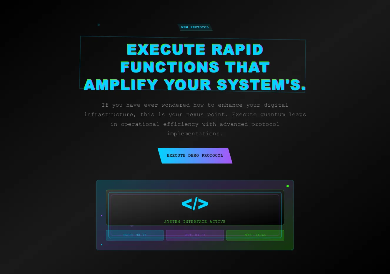
A centered dark hero section with a small "New Protocol" tag, a large cyan headline with magenta offset shadow, a monospace body paragraph, and two call-to-action buttons: a cyan-to-purple gradient button and an outlined green button. The layout is a vertically stacked, centered introduction with a thin bordered frame behind the headline.


Create a free account to copy production-ready code from every component in the library.
Free account · No credit card · No password needed
Already have an account? Sign in
A centered, full-width promotional hero on a black background with a large white heading, short supporting paragraph, and two buttons: a bright yellow-green primary button and a dark secondary button. It promotes a discount offer with a clear call to action.


Create a free account to copy production-ready code from every component in the library.
Free account · No credit card · No password needed
Already have an account? Sign in
A centered dark hero section with a small pill badge, a large bold two-line heading, and a bright lime-green call-to-action button reading "Start your 14-day trial" with an arrow. A subtle glowing gradient and thin horizontal line sit beneath the content, promoting a trial signup.


Create a free account to copy production-ready code from every component in the library.
Free account · No credit card · No password needed
Already have an account? Sign in
A dark navy promotional hero banner with a small eyebrow label, a bold multi-line headline highlighting a 60% discount, two call-to-action buttons, and a model photo on a yellow circular backdrop. The text is left-aligned with the image on the right, forming a split-layout sale announcement.


Create a free account to copy production-ready code from every component in the library.
Free account · No credit card · No password needed
Already have an account? Sign in
A light-background hero section with a small eyebrow label, a large two-line headline with the phrase 'friends & family' in gray and underlined, and two side-by-side 'Get consulation' buttons (one filled blue, one outlined). A photo of a smiling woman in glasses and a denim jacket sits on the right, with the content arranged in a split-screen layout.


Create a free account to copy production-ready code from every component in the library.
Free account · No credit card · No password needed
Already have an account? Sign in
A marketing hero section with a large two-line headline, short supporting paragraph, black pill call-to-action button, and a "159%" average revenue statistic on the left, paired with a rounded portrait photograph on the right. The layout is a clean split-screen on a white background.


Create a free account to copy production-ready code from every component in the library.
Free account · No credit card · No password needed
Already have an account? Sign in
A hero section with a large serif headline reading "Create now. Wherever you are", a short supporting line, and a white outlined "Learn More" button on the left, paired with a portrait photograph of a smiling young woman on a gray background at the right. The layout is a split-screen with text on one side and imagery on the other.


Effectively collecting contacts is the goal of most sites. A well thought out Tailwind call to action component section must clearly define the path objective and the data collection goal.
Choose from many variations of Tailwind components call to action. Presented here are variants available in various UI libraries. You will also find many other types of components that will be in the same style. Each library has been designed by a professional designer and coded by our team of developers.
Get access to all Tailwind components call to action, code and our editor. Try the demo for free.

Build websites faster with an AI Visual Editor


© 2026 Shuffle. All rights reserved.
See what you're getting before you commit.
Switch the editor to Grid and every page of your project appears side by side on one canvas. Arrange them freely, zoom in and out, and add as many new pages as you need in a few clicks.
Describe what you need in one chat and the Agent does the rest: it adds new sections, edits copy and styles, moves blocks around or removes them across your whole page. No modes, no switching, just tell it what to change.
Not quite there yet? Ask for tweaks like missing assets, your logo or other details, and regenerate the design without starting from scratch.