



















Waiting
Customize and export code (opens in a new tab)Compare designs
Each model builds its own version. Pick your favorite and customize it.
Desktop preview
See how each design looks on a full-width desktop screen. Mobile preview
Check how each design adapts to a small phone screen.
See how each design looks on a full-width desktop screen. Mobile preview
Check how each design adapts to a small phone screen.
How to create best call to action components?
Choose one next step. Tell the AI whether visitors should book a demo, start a trial, request a quote, or take another specific action. Provide the headline, supporting offer, and exact button wording.
Give the action context. Explain where the component appears and what visitors already know at that point. Specify whether it needs a secondary link, a short reassurance, or a supporting visual.
Check focus and contrast. Compare how strongly each design emphasizes the primary action. Remove competing messages and make sure the button remains readable and easy to reach on mobile.
Examples of call to action components

Shuffle UX
Centered Hero with Eyebrow Label, Headline, CTA, and Media Placeholder
A centered introductory section with a small eyebrow label, a bold two-line headline, supporting paragraph, a Try Demo call-to-action button, and a large gray media placeholder below. The layout is a vertically stacked, centered arrangement on a white background.

Basko
Split-screen marketing hero with video thumbnail and free trial CTA
A split-screen promotional hero section with a yellow product photo and video play button on the left, and a dark panel on the right with a serif heading, purple call-to-action button, and free trial note. The layout pairs a video entry point with marketing copy for a traffic-focused product.

Pstls.
Dark Hero Section with Serif Headline and Dual CTA Buttons
A centered promotional hero on a black panel with a small 'NEW FEATURE' eyebrow label, a large serif headline with a lavender highlighted phrase, short supporting text, and two buttons: a filled lavender 'Activate Demo' and an outlined 'Share with friends'. Decorative pale lavender and cream blocks sit behind the panel on a white background.
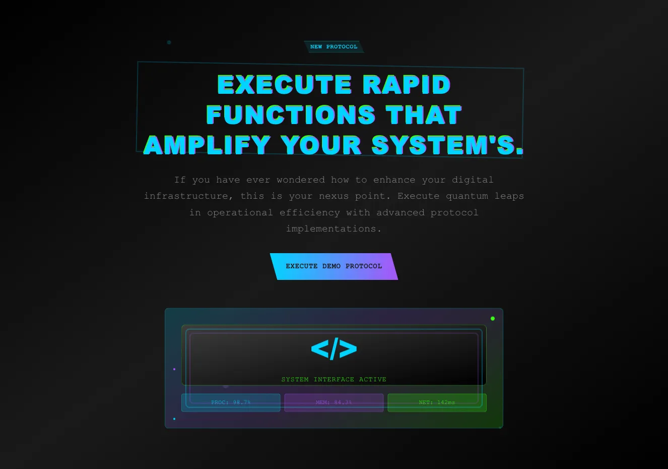
Cyber
Dark Neon Hero Section with Glitch Heading and Demo CTA
A centered dark hero section with a small 'NEW PROTOCOL' badge, a large cyan-glitch uppercase heading inside an angled outline frame, monospace body text, and a gradient cyan-to-purple call-to-action button. A decorative code-interface panel with status metrics sits below the call to action.
Explore component generators
Generate any section of your website with the same multi-model workflow.
No categories match your search.



