



















Waiting
Customize and export code (opens in a new tab)Compare designs
Each model builds its own version. Pick your favorite and customize it.
Desktop preview
See how each design looks on a full-width desktop screen. Mobile preview
Check how each design adapts to a small phone screen.
See how each design looks on a full-width desktop screen. Mobile preview
Check how each design adapts to a small phone screen.
How to create best team components?
Introduce real people. Provide names, roles, photos, and short biographies or areas of expertise. Tell the AI whether the component introduces the full team or highlights a few key people.
Describe the level of detail. Ask for a photo-led grid, a compact roster, or a more editorial presentation. Specify which profile links or contact details belong with each person.
Check the presentation. Compare different photo crops and biography lengths. Verify names and roles, and ensure that each portrait remains clearly connected to the right details on mobile.
Examples of team components

Metis
Team Section with Heading and Member Avatar Grid
A split-layout team section with a pill label, large heading, and supporting paragraph on the left, and a two-column grid of circular avatar photos with names and job titles on the right. The design is light and minimal with generous whitespace and no interactive controls visible.
Nigodo
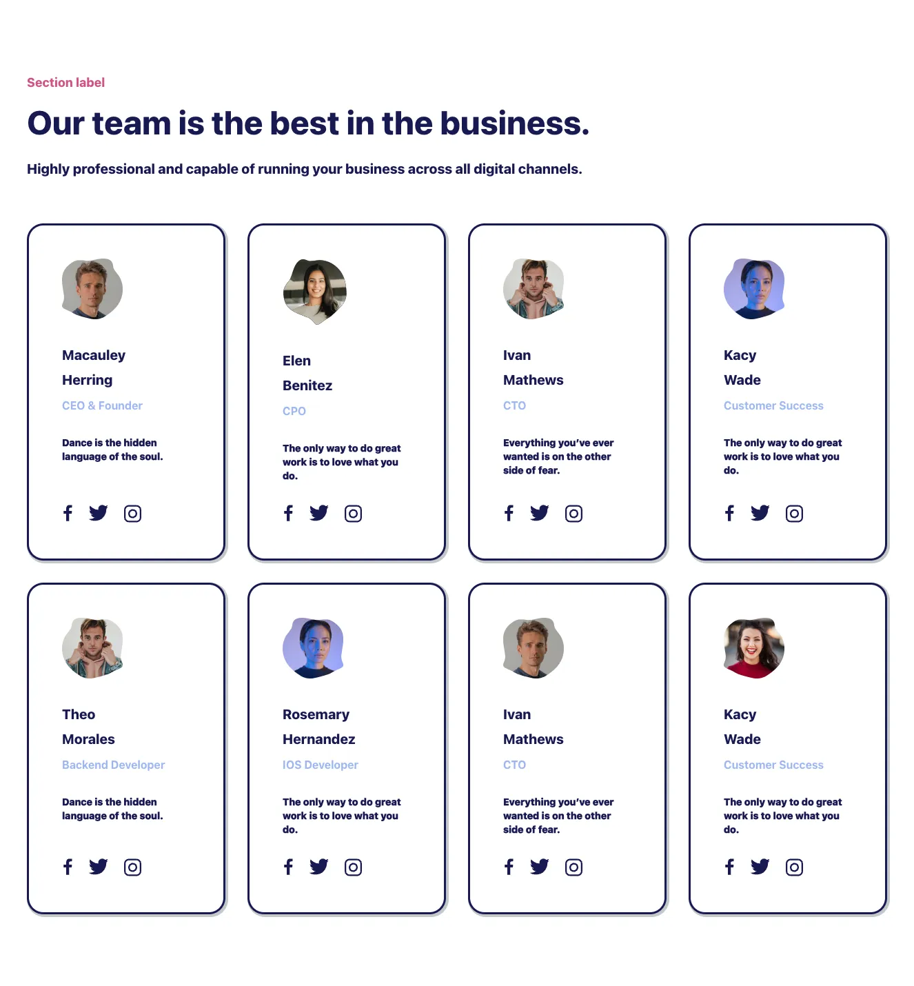
Team Member Card Grid with Headline and Social Links
A marketing team section with a small pink section label, large heading, and subheading above an 8-card grid in a 4-column layout. Each card shows an avatar, name, role, quote, and social icons inside outlined navy borders with offset shadows.

Suncealand
Split-screen team introduction hero with team member cards
A marketing hero section introducing a team, with a "TEAM" pill, serif heading, supporting text, and an ALL TEAMATES call-to-action on the left. The right side shows team member photos with initials badges and name/role cards over a yellow panel.

Shuffle UX
Team Member Card Grid with Centered Heading
A section with a centered eyebrow label, bold two-line heading, and paragraph intro above a 3x2 grid of light blue team member cards. Each card shows a gray placeholder avatar, a bold name, and a muted job title.
Explore component generators
Generate any section of your website with the same multi-model workflow.
No categories match your search.



