



















Waiting
Customize and export code (opens in a new tab)Compare designs
Each model builds its own version. Pick your favorite and customize it.
Desktop preview
See how each design looks on a full-width desktop screen. Mobile preview
Check how each design adapts to a small phone screen.
See how each design looks on a full-width desktop screen. Mobile preview
Check how each design adapts to a small phone screen.
How to create best card components?
Define what the card represents. Specify whether you need a product, article, profile, or service card. Provide example content and identify the image, title, metadata, and action that each card requires.
Describe reusable rules. Ask for consistent image proportions, spacing, and treatment of optional information. Explain whether the whole card or only a specific link should act as the main destination.
Test uneven content. Compare cards with different title lengths and missing images. Choose a design that remains balanced in a collection and readable when shown as a single column.
Examples of cards components
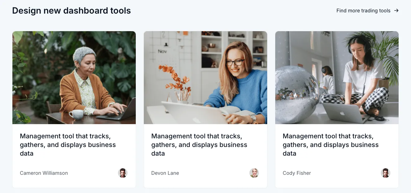
Dashy
Dashboard tools card grid with photos and author avatars
A section headed 'Design new dashboard tools' with a 'Find more trading tools' link, followed by three equal cards each showing a stock-style photo, a 'Management tool that tracks, gathers, and displays business data' description, and an author name with avatar. The layout is a horizontal row of cards with rounded corners on a light background.

Nightsable
Dark Profile Contact Card with Circular Avatar
A centered dark contact card featuring a circular profile photo overlapping the top edge, a name heading, a date line, and phone and email contact rows with lime-green line icons. The rounded outlined container has a subtle glow at its bottom edge.

Flex
Card with heading title and placeholder content area
A single white rounded card with a bold heading 'Card heading title', a three-dot overflow menu at top right, a thin divider, and a large light gray placeholder block below. The layout is a single vertical stack with minimal styling.

Trizzle
Dark Job Listing Card with Apply Now Button
A dark-themed single card displaying a job posting with a purple company logo, a bold 'Front-End Developer' heading, truncated supporting text, overlapping team avatars with a '+2' count, and a full-width blue 'Apply Now' call-to-action button. The layout is vertically stacked with a three-dot overflow menu in the top right corner.
Explore component generators
Generate any section of your website with the same multi-model workflow.
No categories match your search.



