





















Waiting
Customize and export code (opens in a new tab)Compare designs
Each model builds its own version. Pick your favorite and customize it.
Desktop preview
See how each design looks on a full-width desktop screen. Mobile preview
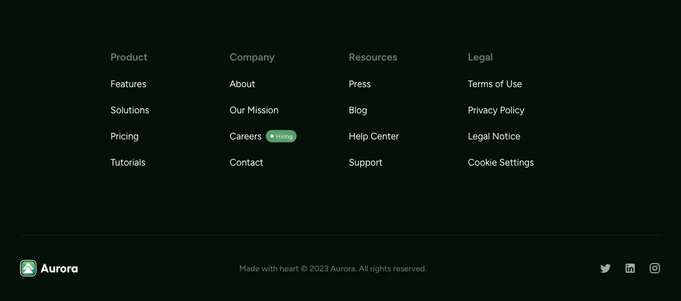
Check how each design adapts to a small phone screen.
See how each design looks on a full-width desktop screen. Mobile preview
Check how each design adapts to a small phone screen.
How to create best footer components?
Organize your important links. Provide your navigation groups, company details, social destinations, and any supporting links. Tell the AI which information belongs in the footer and which can be omitted.
Describe the footer structure. Ask for a compact bar, a multi-column layout, or a larger branded footer. Specify how the logo, optional signup, and secondary information should share the space.
Check the final scan. Compare link grouping, contrast, and spacing with realistic labels. Make sure the columns collapse sensibly and that every destination is correct before publishing.
Examples of footers components

Shuffle UX
Multi-column site footer with logo, social icons, and link groups
A light-background website footer showing a brand logo and short tagline with social media icons on the left, and four link columns (Company, Pages, Legal, Resources) on the right. A thin divider separates the links from a centered copyright line at the bottom.

Vendia
Dark Site Footer with Logo, Link Columns, and Payment Badges
A dark footer section with the vendia logo and a short lorem ipsum paragraph on the left, three link columns labeled Company, Help, and Resources, and a bottom bar with copyright text and payment method badges for Mastercard, Visa, American Express, and PayPal.

Acros
Dark Site Footer with Brand, Contact, Pages, and Social Links
A dark-background website footer showing the Acros logo and copyright, legal links (Terms, Privacy), a contact block with phone, email, and address, a Pages link list, and a Follow us row of circular social icons. Content is arranged in four columns with teal accent icons.

Atis
Dark Footer with Brand, Office Address, Contacts, and Social Icons
A dark-themed website footer showing the Atis logo with a short tagline, office address and email contact columns, a copyright line, and purple social media icons. Content is arranged in a horizontal row with the brand block on the left and contact details on the right.
Explore component generators
Generate any section of your website with the same multi-model workflow.
No categories match your search.



