






















Waiting
Customize and export code (opens in a new tab)Compare designs
Each model builds its own version. Pick your favorite and customize it.
Desktop preview
See how each design looks on a full-width desktop screen. Mobile preview
Check how each design adapts to a small phone screen.
See how each design looks on a full-width desktop screen. Mobile preview
Check how each design adapts to a small phone screen.
How to create best content components?
Start with the actual message. Give the AI your headings, paragraphs, and media descriptions. Explain the purpose of the section and what readers should understand after viewing it.
Describe the reading structure. Ask for a specific arrangement such as text beside an image, a short editorial block, or a sequence of supporting points. Set a comfortable text width and a clear heading hierarchy.
Review rhythm and readability. Compare paragraph spacing, line lengths, and image placement. Check the mobile order so that the visuals support the explanation at the right moment.
Examples of content components

Saturn
Split-screen rich text module with serif accent heading and checklist
A two-column marketing content module with a large display heading, gray lead paragraphs on the left, and a bold lead line, checkmark feature list, body copy, and an illustrative image on the right. It presents editorial text and a feature list with no visible interactive controls.

Solstice
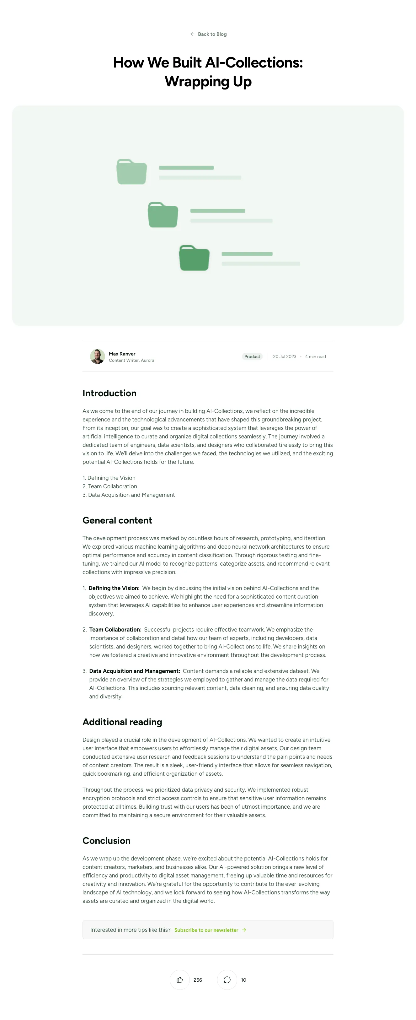
Blog Article Page with Hero Image, Author Byline, and Newsletter CTA
A long-form blog article page with a back link, large centered headline, full-width hero photo, author byline with avatar and tags, multiple body sections, a newsletter subscription callout, and like and comment counters. The layout is a single centered text column beneath the hero image on a light background.

Casper
Dark Split-Screen Hero with Headline and Space Illustration
A dark promotional section with a large headline and muted supporting text on the left, and a subheading, body paragraphs, and a 3D space illustration of a robot on the right. It introduces a UI library with a split-screen layout and no visible navigation or form controls.

Vista
Dark Blog Article Layout with Table of Contents and Continue Reading Cards
A dark-themed long-form blog article page with a header featuring category tag, date, title, and gradient hero image, followed by a sticky-style left sidebar containing table of contents, author byline, and share icons beside the main article body. A Continue Reading section at the bottom displays three related article cards with image placeholders and titles.
Explore component generators
Generate any section of your website with the same multi-model workflow.
No categories match your search.



