






















Waiting
Customize and export code (opens in a new tab)Compare designs
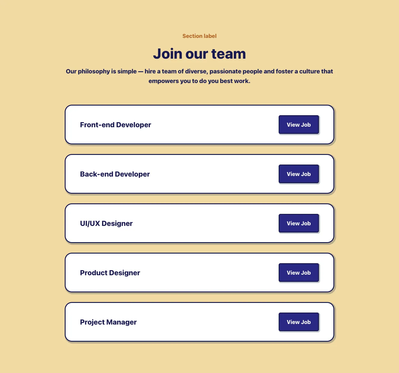
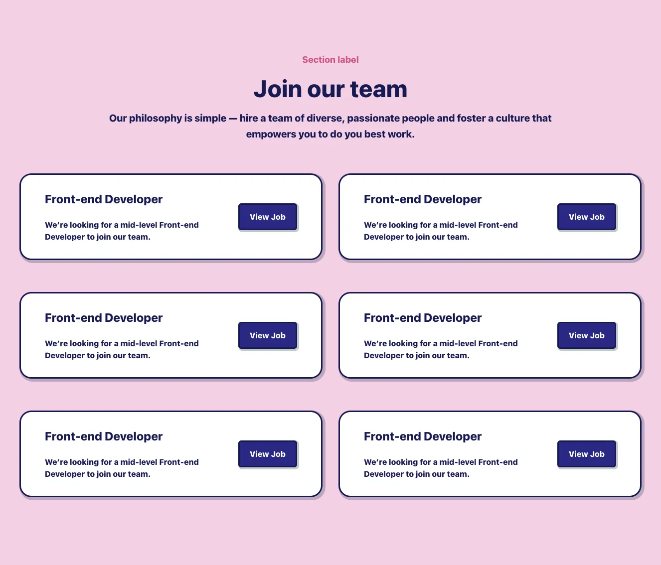
Each model builds its own version. Pick your favorite and customize it.
Desktop preview
See how each design looks on a full-width desktop screen. Mobile preview
Check how each design adapts to a small phone screen.
See how each design looks on a full-width desktop screen. Mobile preview
Check how each design adapts to a small phone screen.
How to create best careers components?
Use real hiring information. Provide job titles, locations, employment types, and the company details you want candidates to see. Tell the AI whether the component should emphasize open roles or introduce your workplace first.
Make roles easy to scan. Specify the details candidates need before opening a job description. Ask for clear role groupings and a visible application or role-details action.
Review the candidate journey. Check that remote status, location, and role names remain clear on mobile. Remove unsupported culture claims and make every opening easy to distinguish from the next.
Examples of careers components
asitrastudio
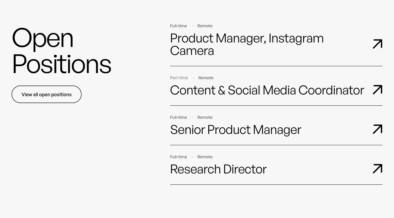
Open Positions Job Listing with Arrow Links
A two-column careers section with a large heading and outlined button on the left, and a vertical list of job postings on the right, each showing employment type, location, role title, a divider line, and an arrow link. Minimal light background with generous whitespace.

Flaro
Open positions job listing with stacked role cards
A light-background section headed "Open positions" with a small purple eyebrow label "WE ARE HIRING" above it. Below, five vertically stacked job cards each show a role title, location and employment type icons, and a purple "See Details" link with an arrow on the right.

Flow
Careers Hero with Open Positions Job Listings
A careers page section with a large heading and subtitle, a grid of circular team portraits on lime and dark green tiles, filter dropdowns for department and location, and grouped job listing cards showing role title, location, employment type, and an Apply link.

Mirga
Careers Open Positions List with More Buttons
A careers section showing a large heading and a vertical list of open job positions, each card displaying the job title, location, and a More button, followed by a full-width Show more control. The light gray background and white rounded cards give it a clean, minimal listing layout.
Explore component generators
Generate any section of your website with the same multi-model workflow.
No categories match your search.



