























Waiting
Customize and export code (opens in a new tab)Compare designs
Each model builds its own version. Pick your favorite and customize it.
Desktop preview
See how each design looks on a full-width desktop screen. Mobile preview
Check how each design adapts to a small phone screen.
See how each design looks on a full-width desktop screen. Mobile preview
Check how each design adapts to a small phone screen.
How to create best portfolio components?
Select the work to feature. Provide a few project names, images, and short explanations of your role or contribution. Tell the AI which project should lead and who you want the portfolio to appeal to.
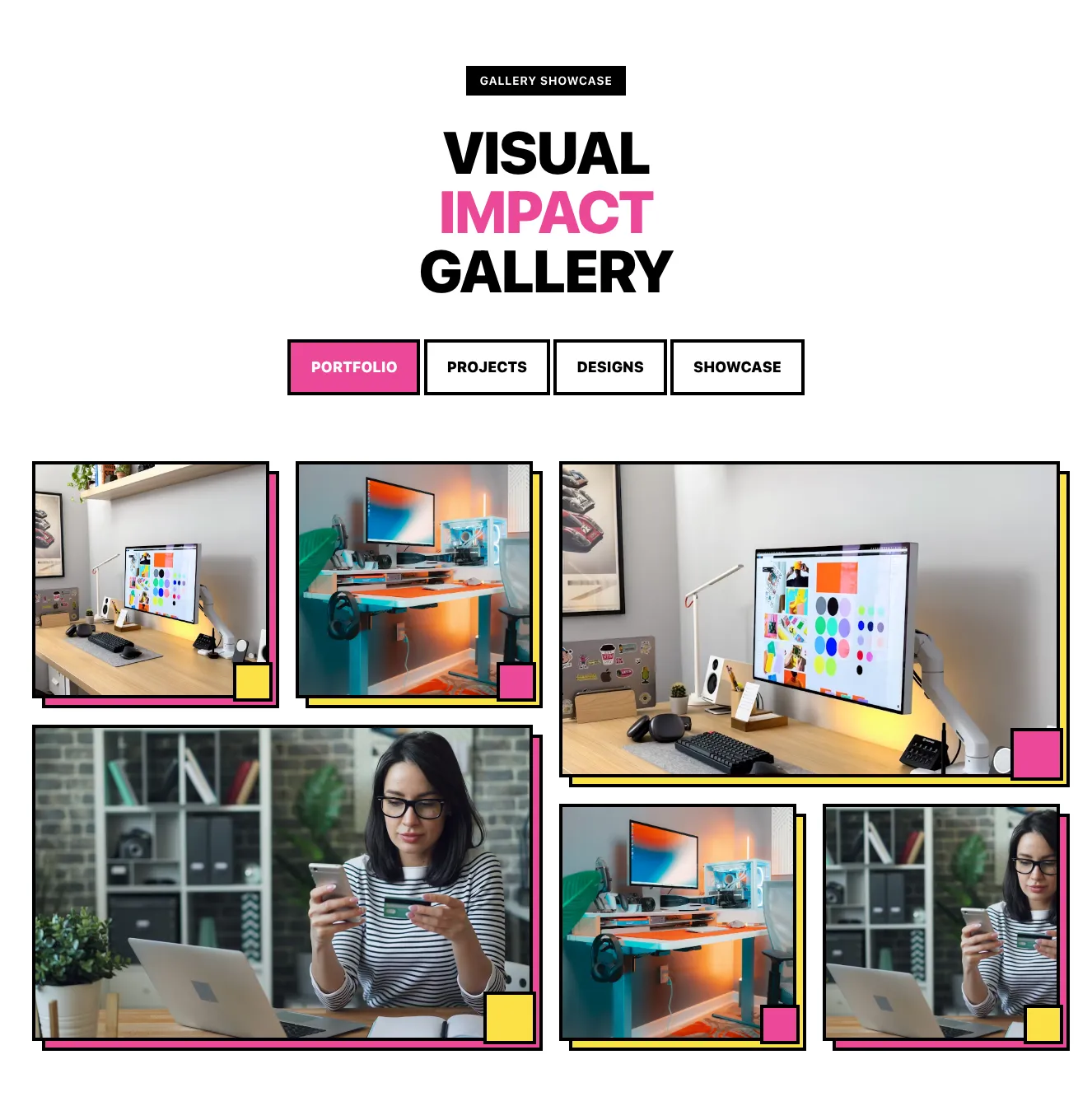
Give the work a clear frame. Ask for an image-led grid, an editorial list, or another deliberate structure. Specify whether categories, project summaries, or case-study links belong alongside the visuals.
Review the project story. Compare how each layout balances imagery and context. Check that titles remain readable and that each project has a clear path to further details.
Examples of portfolio components

Zospace
Dark Carousel Section with Heading, Slide Image, Caption Card, and Blue Arrow Controls
A dark-themed carousel showcase under an 'Our Works' eyebrow and large heading, with a centered gradient 3D image slide flanked by partial adjacent slides, a rounded caption card containing a title and subtitle, and circular blue previous/next navigation buttons.

Casper
Projects Launched Portfolio Grid with Category Filter
A dark-themed portfolio section with a centered heading, subtitle, and pill-shaped category filter tabs above a three-column masonry grid of 3D illustrated project cards. One featured card overlays a gradient content panel with a logo, title, and short body text.

Cronos
Five-Photo Collage Grid with Yellow and Green Accent Blocks
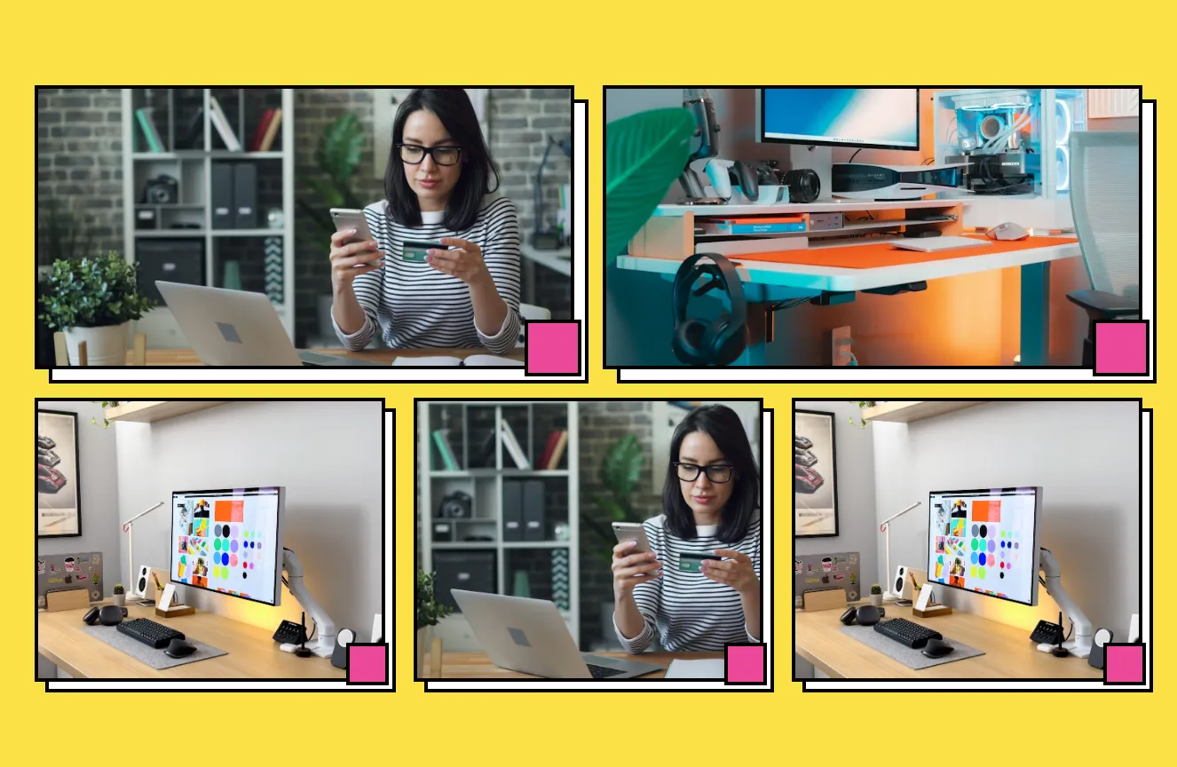
A grid of five photographs showing office workspaces, a person using a smartphone, hands typing on a laptop, a person working by a window, and a group of people standing against a wall. Yellow and dark green square accents overlap the image corners, and the layout is a loose two-row arrangement with no visible text or interactive controls.

Suncealand
Dark testimonials section with serif heading and image-text cards
A dark-background testimonials section with a large serif heading and a short subheading, followed by a staggered arrangement of image cards paired with dated quote text. Each entry pairs a photo or abstract image with a right- or left-aligned caption block.
Explore component generators
Generate any section of your website with the same multi-model workflow.
No categories match your search.



