




















Waiting
Customize and export code (opens in a new tab)Compare designs
Each model builds its own version. Pick your favorite and customize it.
Desktop preview
See how each design looks on a full-width desktop screen. Mobile preview
Check how each design adapts to a small phone screen.
See how each design looks on a full-width desktop screen. Mobile preview
Check how each design adapts to a small phone screen.
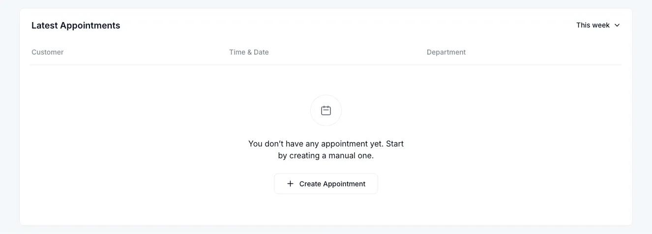
How to create best empty state components?
Explain why the space is empty. Tell the AI whether this is a new account, an empty collection, or a search with no results. Provide a short message that reflects that specific situation.
Offer a useful next action. Specify what users can do, such as adding an item, adjusting a filter, or exploring a guide. Describe any illustration style and keep it secondary to the explanation.
Check the tone. Compare how clearly each design explains the situation without blaming the user. Make sure the next step remains visible and fits the surrounding interface.
Examples of empty components

Dashy
Centered Text Block with Dual CTA Buttons
A centered introductory text block with two lines of supporting copy followed by a gradient primary button labeled Invite Team Members and an outlined secondary button labeled Learn How It Works. The layout is a simple vertical stack on a white background, suited to a hero or call-to-action section.
Explore component generators
Generate any section of your website with the same multi-model workflow.
No categories match your search.



