





















Waiting
Customize and export code (opens in a new tab)Compare designs
Each model builds its own version. Pick your favorite and customize it.
Desktop preview
See how each design looks on a full-width desktop screen. Mobile preview
Check how each design adapts to a small phone screen.
See how each design looks on a full-width desktop screen. Mobile preview
Check how each design adapts to a small phone screen.
How to create best product components?
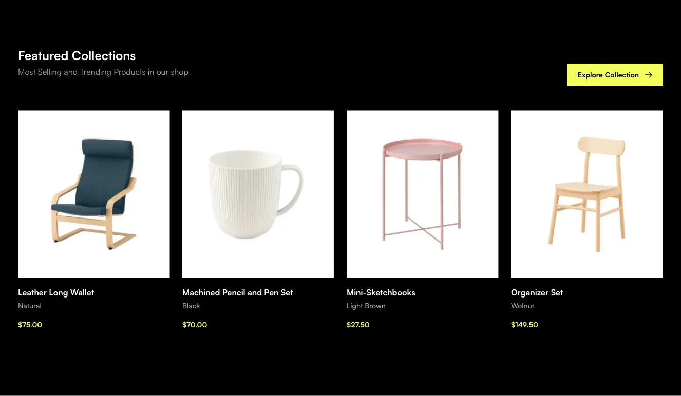
Define the product details. Provide the product name, imagery, price, variants, and availability information. Explain whether you want a catalog card or a focused product presentation.
Set the shopping priority. Tell the AI which details affect the purchase decision and name the primary action. Specify how options, badges, and secondary information should relate to the image and price.
Try content variations. Review a long product name, a sale price, and an unavailable option. Check image proportions and confirm that price and purchase controls stay readable on small screens.
Examples of e-commerce (products) components

Shopal
New arrivals product listing grid with price and Show more button
A dark-themed product listing section titled 'New arrivals' showing eight product cards in a four-column grid, each with an image, placeholder title, and green price. A purple 'Show more' button below the grid loads additional items.

Vendia
Dark Product Listing Grid with Filter Sidebar and Pagination
A dark-themed ecommerce product listing with sort, category, and size dropdowns above a 3-column grid of product cards showing price, title, star ratings, and review counts. A left sidebar provides checkbox filters for average rating, category, brand, and free shipping, with numbered pagination below.

Uinel
Product listing grid with filters and load-more button
A ecommerce product listing page titled "New in" showing a filter bar (Category, Size, Colors, Price, Brand), a 4-column grid of product cards with images, names, and blue prices, and a "More products" button at the bottom. Light background with minimal white cards.

FilyTreck
Dark Categories Feature Grid with Icon Cards and Show More Button
A dark-themed section with a centered heading, subtitle, and a 3x2 grid of rounded feature cards, each pairing a colored circular icon with a label. A centered outlined "Show more" button sits below the grid.
Explore component generators
Generate any section of your website with the same multi-model workflow.
No categories match your search.



