



















Waiting
Customize and export code (opens in a new tab)Compare designs
Each model builds its own version. Pick your favorite and customize it.
Desktop preview
See how each design looks on a full-width desktop screen. Mobile preview
Check how each design adapts to a small phone screen.
See how each design looks on a full-width desktop screen. Mobile preview
Check how each design adapts to a small phone screen.
How to create best vertical navigation components?
Group destinations by purpose. Provide section headings, link labels, and optional account or workspace actions. Tell the AI which page is active and whether your sidebar needs nested navigation.
Describe the sidebar layout. Specify the width, icon treatment, and any collapsed or mobile variation. Explain which controls belong at the top and which should stay separate near the bottom.
Test a fuller menu. Compare several groups and long labels. Check active-state clarity, scrolling, and whether users can still identify destinations when space is limited.
Examples of navigation (vertical) components

Trizzle
Dark dashboard sidebar navigation with Trizzle logo
A vertical dark sidebar containing the Trizzle logo and icon-labeled navigation links for Overview, Analytics, Products, Orders, Customers, Settings, and Log Out. The active Overview item is highlighted in bright blue, and Orders shows a blue count badge.

Sirius Dashboard
Dark Sidebar Navigation with Workspace Switcher and Badges
A dark vertical sidebar for an app named Sirius, featuring a workspace selector for Twitch, a list of navigation links (Home, News, People, Analytics, Inbox, Settings, Support), notification count badges, and a Hide menu control. The main content area to the right is blank white.
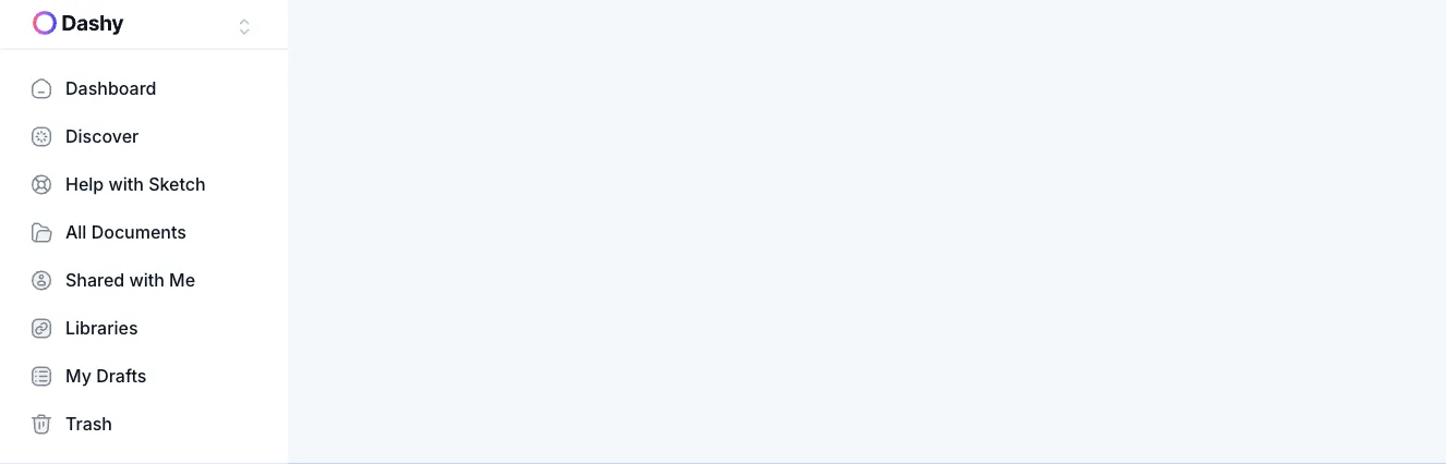
Dashy
Dashy App Sidebar Navigation with Workspace Switcher
A vertical sidebar navigation panel with a Dashy workspace selector at the top and a list of icon-labeled links including Dashboard, Discover, Help with Sketch, All Documents, Shared with Me, Libraries, My Drafts, and Trash. The panel sits beside a large empty light gray main content area.

Artemis Dashboard
Artemis Dashboard Sidebar Navigation
A vertical sidebar navigation panel with the Artemis logo, grouped Main and Secondary menu sections, expandable items with chevrons, an active highlighted Dashboard item, and a notification count badge. The sidebar sits beside an empty light blue main content area.
Explore component generators
Generate any section of your website with the same multi-model workflow.
No categories match your search.



