Can't find the right component?
Describe it and Shuffle AI builds it in seconds, ready to edit and export.
Browse 216 ready-made Tailwind CSS http codes components from multiple UI libraries. Every variant is fully responsive – copy the code or customize it in the visual editor and export clean code.
Create a free account to copy production-ready code from every component in the library.
Free account · No credit card · No password needed
Already have an account? Sign in
Components are just the start. See how a project goes from prompt to production‑ready code with Shuffle.
A split-screen 404 error page with a left text panel showing a large 404 heading, "Oops! Can't Find That Page" message, supporting text, and an orange "Take me home" button. The right side displays a 3D illustration of a smiling cartoon UFO on an orange background.
Create a free account to copy production-ready code from every component in the library.
Free account · No credit card · No password needed
Already have an account? Sign in
Components are just the start. See how a project goes from prompt to production‑ready code with Shuffle.
A dark 404 error component with a puzzle-piece photograph on the left and a centered error message on the right. It shows an "Error 404" label, a "Page not found" heading, supporting text, and two buttons: a primary "Return to homepage" and a secondary "Try Again".
Create a free account to copy production-ready code from every component in the library.
Free account · No credit card · No password needed
Already have an account? Sign in
Components are just the start. See how a project goes from prompt to production‑ready code with Shuffle.
A split-screen 404 error section with a large purple 404 heading, a short error message, and a 'Go Back to Homepage' text link on the left, paired with an illustration of legs sticking out of a hole on the right. It is used to inform users that a requested page does not exist and offer a route back to the homepage.
Create a free account to copy production-ready code from every component in the library.
Free account · No credit card · No password needed
Already have an account? Sign in
Components are just the start. See how a project goes from prompt to production‑ready code with Shuffle.
A full-page error state for a missing page, showing a gradient 404 number, a 'Nothing found' label, a bold heading, supporting text, and a dark button linking back to the homepage. Content is left-aligned on a light background with a soft gradient glow and a Gradia logo at the top.
Create a free account to copy production-ready code from every component in the library.
Free account · No credit card · No password needed
Already have an account? Sign in
Components are just the start. See how a project goes from prompt to production‑ready code with Shuffle.
A 404 'page not found' message centered over a faded grid of placeholder cards, with a short explanatory paragraph and an orange 'Back to Home' call-to-action button. The layout is a centered stack overlaying a four-column grid on a light background.
Create a free account to copy production-ready code from every component in the library.
Free account · No credit card · No password needed
Already have an account? Sign in
Components are just the start. See how a project goes from prompt to production‑ready code with Shuffle.
A left-aligned error page with a Zanrly logo, a blue 404 label, a large 'Page not found' heading, a short apology message, and two actions: a filled blue 'Go back to Homepage' button and a secondary 'Try Again' button. The layout is a minimal centered-stack style on a white background with no imagery or navigation.
Create a free account to copy production-ready code from every component in the library.
Free account · No credit card · No password needed
Already have an account? Sign in
Components are just the start. See how a project goes from prompt to production‑ready code with Shuffle.
A split-screen error page showing an "Error 404" label, a "Page not found" heading, and two buttons for returning home or retrying. The left half displays a photo of a person holding a camera against a tan background, while the right half contains the centered error content on white.
Create a free account to copy production-ready code from every component in the library.
Free account · No credit card · No password needed
Already have an account? Sign in
Components are just the start. See how a project goes from prompt to production‑ready code with Shuffle.
A full-width dark 404 error screen showing a bold 'Sorry, we can't find that page' heading, a muted 'Go back or try here' line, and a blue 'Start again' pill button. Decorative blue and purple arcs, faint outlined circles, and white sparkle shapes frame the left and right sides.
Create a free account to copy production-ready code from every component in the library.
Free account · No credit card · No password needed
Already have an account? Sign in
Components are just the start. See how a project goes from prompt to production‑ready code with Shuffle.
A full-width purple hero section displaying a large white heading 'Something has gone wrong.' with a supporting line of text, a back-to-home link, and a purple Homepage call-to-action button. The layout is left-aligned and stacked vertically, with thin rules beneath the heading lines.
Create a free account to copy production-ready code from every component in the library.
Free account · No credit card · No password needed
Already have an account? Sign in
Components are just the start. See how a project goes from prompt to production‑ready code with Shuffle.
A full-screen dark error state showing an 'Error 404' badge, a 'Page not found' heading, a brief apology message, and two buttons to return home or retry. Decorative colored line and dot patterns frame the corners.
Create a free account to copy production-ready code from every component in the library.
Free account · No credit card · No password needed
Already have an account? Sign in
Components are just the start. See how a project goes from prompt to production‑ready code with Shuffle.
A centered white card on a decorative gradient background displaying a 404 error heading, a short explanatory message, and a green 'Back to home' text link with an arrow. Floating colored name tags (Padma, Tosh) decorate the edges of the card.
Create a free account to copy production-ready code from every component in the library.
Free account · No credit card · No password needed
Already have an account? Sign in
Components are just the start. See how a project goes from prompt to production‑ready code with Shuffle.
A minimal not-found error page with a small Yofte logo at top, a large bold heading stating the page could not be found, a short line of supporting text, and an orange HOMEPAGE call-to-action button. Decorative curved purple, blue, and orange arcs frame the left and top of a light background.
Create a free account to copy production-ready code from every component in the library.
Free account · No credit card · No password needed
Already have an account? Sign in
Components are just the start. See how a project goes from prompt to production‑ready code with Shuffle.
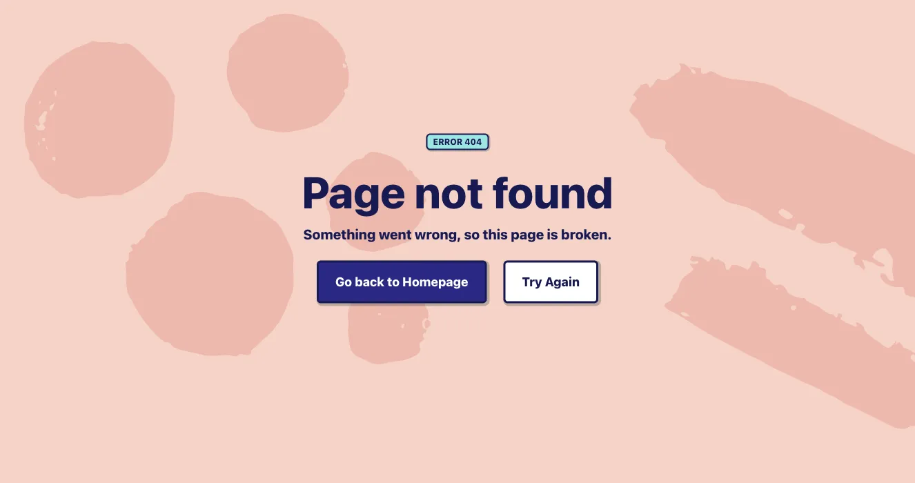
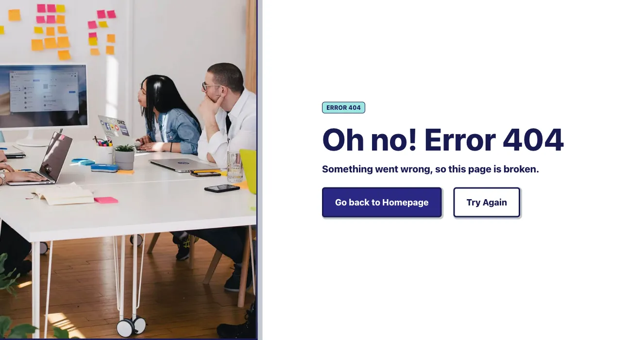
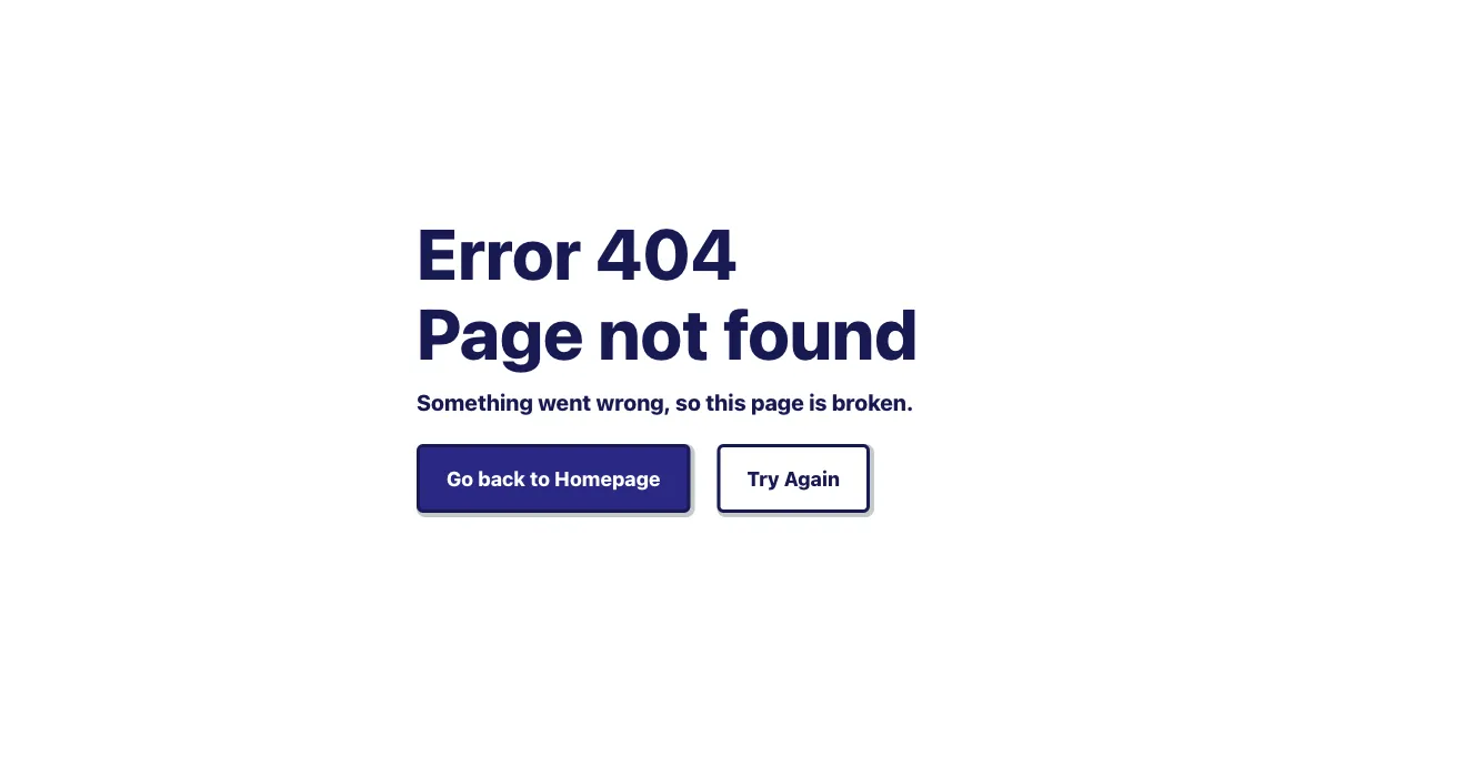
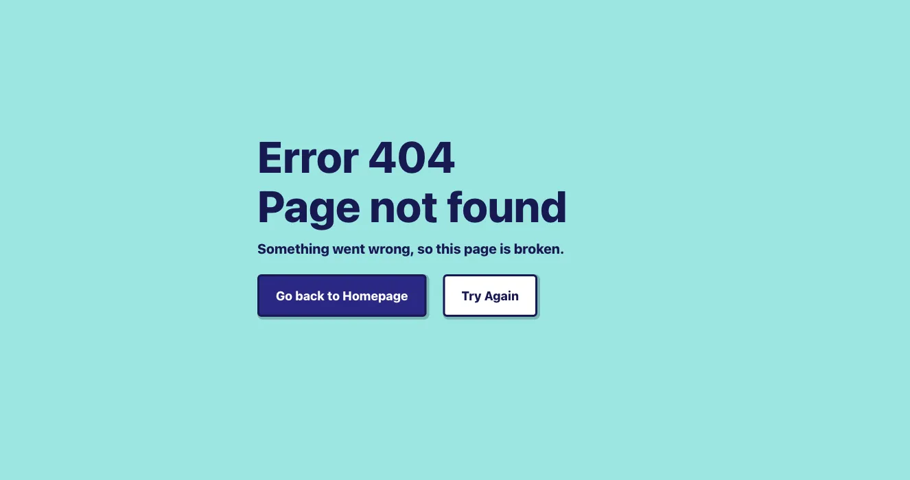
A centered error state displaying an ERROR 404 badge, a bold 'Page not found' heading, a short explanatory line, and two action buttons: a filled 'Go back to Homepage' button and an outlined 'Try Again' button. The layout is a vertically stacked, centered block on a white background with navy text and a teal badge accent.
Create a free account to copy production-ready code from every component in the library.
Free account · No credit card · No password needed
Already have an account? Sign in
Components are just the start. See how a project goes from prompt to production‑ready code with Shuffle.
A centered error state page showing a large green 404 illustration with a figure beside a cracked vase, followed by a green "Whoops!" heading, error message, and two buttons to return home or try again. It uses a light background and a green accent throughout.
Create a free account to copy production-ready code from every component in the library.
Free account · No credit card · No password needed
Already have an account? Sign in
Components are just the start. See how a project goes from prompt to production‑ready code with Shuffle.
A centered error message on a soft white-to-pink gradient background, showing a lavender 'Error 404' label, a large serif heading apologizing that the page cannot be found, and a black button linking back to the homepage. It has no navigation bar, search input, or illustrative imagery.
Create a free account to copy production-ready code from every component in the library.
Free account · No credit card · No password needed
Already have an account? Sign in
Components are just the start. See how a project goes from prompt to production‑ready code with Shuffle.
A full-screen dark 404 error page featuring an outlined oversized "404" numeral with a tilted elliptical eye photograph overlaid, a BoldUI logo at top, and a yellow "Back to home" button alongside a "Try again" text link. The centered stack layout uses a blue glow in the background for emphasis.
Create a free account to copy production-ready code from every component in the library.
Free account · No credit card · No password needed
Already have an account? Sign in
Components are just the start. See how a project goes from prompt to production‑ready code with Shuffle.
A split-screen error page showing a teal 'ERROR 404' label, serif 'Page not found' heading, short apology text, and two buttons for returning home or retrying. A robot illustration with a light bulb sits on the right side against a light background.
Create a free account to copy production-ready code from every component in the library.
Free account · No credit card · No password needed
Already have an account? Sign in
Components are just the start. See how a project goes from prompt to production‑ready code with Shuffle.
A split-screen error page with an abstract painting on the left and a light panel on the right showing a bold 'Page not found' heading, apology text, and two buttons to return to the homepage or try again. The angled divider between image and text panel gives it a distinctive layout.
Create a free account to copy production-ready code from every component in the library.
Free account · No credit card · No password needed
Already have an account? Sign in
Components are just the start. See how a project goes from prompt to production‑ready code with Shuffle.
A centered error state page showing a 404 illustration of a person at a desk with a monitor, followed by the heading 'Whoops!' and 'Something went wrong!', a short apology line, and two buttons to return to the homepage or try again.
Create a free account to copy production-ready code from every component in the library.
Free account · No credit card · No password needed
Already have an account? Sign in
Components are just the start. See how a project goes from prompt to production‑ready code with Shuffle.
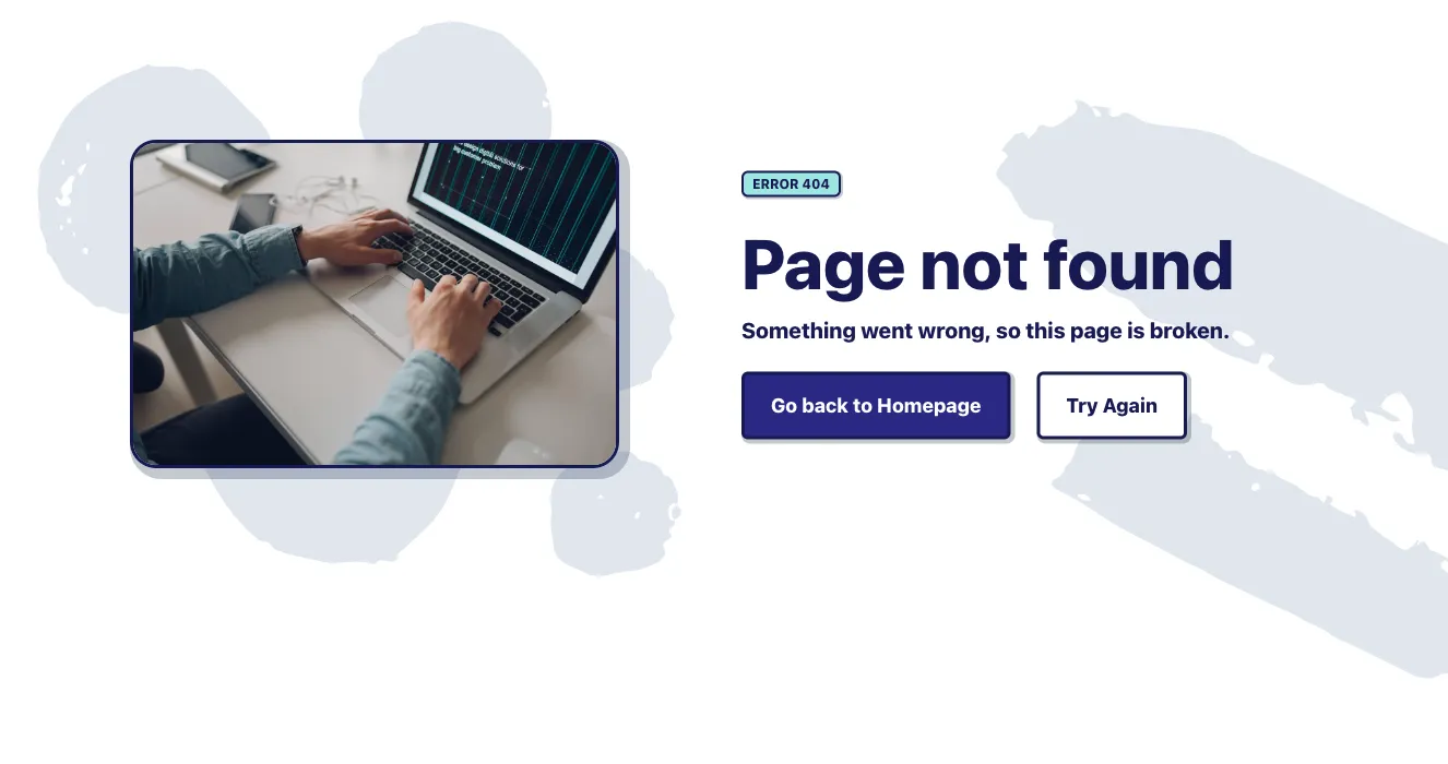
A split-screen error state with a slate placeholder panel containing an image icon on the left and a centered 'Page not found' message on the right. It offers two actions: a filled 'Go back to Homepage' button and an outlined 'Try Again' button.
Address errors will happen, so it's a good idea to have a page prepared for the occasion. Here you will find examples of each type of error and information for Tailwind components HTTP codes.
Choose from many variations of the Tailwind components HTTP codes. The variants shown here are available in various UI libraries in the Shuffle editor. You will also find many other types of components that will be in the same style. This will allow you to build a comprehensive Tailwind website template. Each library is designed by a professional designer and coded by our team of developers.
Get access to all sections of the Tailwind components HTTP codes, html, sass, pug files and our drag and drop editor to change them. Try the demo for free.
How you’ll build with Shuffle.
© 2026 Shuffle. All rights reserved.
See what you're getting before you commit.
Switch the editor to Grid and every page of your project appears side by side on one canvas. Arrange them freely, zoom in and out, and add as many new pages as you need in a few clicks.
Describe what you need in one chat and the Agent does the rest: it adds new sections, edits copy and styles, moves blocks around or removes them across your whole page. No modes, no switching, just tell it what to change.
Not quite there yet? Ask for tweaks like missing assets, your logo or other details, and regenerate the design without starting from scratch.