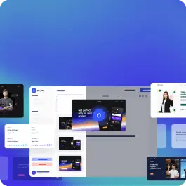
Can't find the right component?
Describe it and Shuffle AI builds it in seconds, ready to edit and export.
Browse 27 ready-made Tailwind CSS services components from multiple UI libraries. Every variant is fully responsive – copy the code or customize it in the visual editor and export clean code.
Create a free account to copy production-ready code from every component in the library.
Free account · No credit card · No password needed
Already have an account? Sign in
Components are just the start. See how a project goes from prompt to production‑ready code with Shuffle.
A dark gradient feature section titled "Casper Services" with a short intro line and three equal columns, each showing a colored circular icon, a heading, a divider, and body text. The layout is a horizontal row of three text columns with no buttons or interactive controls visible.
Create a free account to copy production-ready code from every component in the library.
Free account · No credit card · No password needed
Already have an account? Sign in
Components are just the start. See how a project goes from prompt to production‑ready code with Shuffle.
A light marketing hero introducing a community and digital services, with a large two-line headline highlighting "the future," a subtitle, a wide photo of a smiling woman waving, a row of three service cards, and a dark "All services" call-to-action button below.
Create a free account to copy production-ready code from every component in the library.
Free account · No credit card · No password needed
Already have an account? Sign in
Components are just the start. See how a project goes from prompt to production‑ready code with Shuffle.
A light-background services section with a large 'Services' heading and three numbered rows, each pairing a large title with right-aligned descriptive text and an arrow icon, separated by horizontal rules. A faded architectural floor plan image overlaps the first row, giving it an editorial, minimal layout.
Create a free account to copy production-ready code from every component in the library.
Free account · No credit card · No password needed
Already have an account? Sign in
Components are just the start. See how a project goes from prompt to production‑ready code with Shuffle.
A dark marketing section titled "Vision & direction" with a short paragraph and an outlined "Explore All Services" button on the left, and a rounded photo of a woman placing a sticky note on a whiteboard on the right. A black cutout overlay displays the numbered label "01 Strategy" and an arrow icon.
Choose from 27 variations of Tailwind application components. Presented here are variants available in various UI libraries.
Get access to all Tailwind application components, code and our visual editor. Try the demo for free!
How you’ll build with Shuffle.
© 2026 Shuffle. All rights reserved.
See what you're getting before you commit.
Switch the editor to Grid and every page of your project appears side by side on one canvas. Arrange them freely, zoom in and out, and add as many new pages as you need in a few clicks.
Describe what you need in one chat and the Agent does the rest: it adds new sections, edits copy and styles, moves blocks around or removes them across your whole page. No modes, no switching, just tell it what to change.
Not quite there yet? Ask for tweaks like missing assets, your logo or other details, and regenerate the design without starting from scratch.