Redirecting to PayPal

Tailwind CSS Contact Components

Browse 227 ready-made Tailwind CSS contact components from multiple UI libraries. Every variant is fully responsive – copy the code or customize it in the visual editor and export clean code.

Contact from Saturn

Tailwind Contact Component

Support Contact Options with Two Cards and Orange CTAs

A centered support section with a pill label, a serif-accented heading, and two outlined cards offering email contact and phone customer service, each with an orange call-to-action button. The layout is a two-column grid of cards on a light background with decorative dot patterns at the sides.

Contact component #1
Contact component #2
Contact component #3
Contact component #4
Contact component #5
Contact component #6

Contact from DarkPro

Tailwind Contact Component

Dark Contact Section with Heading, Address, and Embedded Map

A dark-themed contact section with a large two-line heading on the left and labeled Address and Contacts details on the right, followed by a full-width rounded map panel showing the San Francisco Bay Area. The layout separates introductory text from contact information above a wide map embed.

Contact component #1
Contact component #2
Contact component #3
Contact component #4
Contact component #5

Contact from Flaro

Tailwind Contact Component

Get Connected Contact Info Card Grid

A light-themed contact section with a bold centered heading and three equal cards presenting email, phone, and address details, each with a line icon at top. The first icon is filled in purple while the others are outlined, and the cards use soft shadows on a white background.

Contact component #1
Contact component #2
Contact component #3
Contact component #4
Contact component #5

Your next website starts here

Design with AI and generate multiple website concepts in minutes. Make it yours with Shuffle: tweak every detail in a visual editor.

EXPORT CODE TO THE TECH YOU LOVE

Contact from Gradia

Tailwind Contact Component

Dark Contact Section with Email and Social Links

A dark full-width contact section with a large heading and supporting paragraph on the left, and a right column listing an email address and social media links such as Facebook, Twitter, Linkedin, Instagram, and Pinterest. It uses a purple-blue gradient glow in the top-left corner and a split-screen arrangement.

Contact component #1
Contact component #2
Contact component #3
Contact component #4
Contact component #5

Contact from Solstice

Tailwind Contact Component

Contact Support Split-Screen Form with Incident Report Panel

A two-column contact support section with a heading and supporting text on the left, a dark maroon incident report call-to-action card below it, and a contact form on the right with name, email, phone, message fields and an orange Submit button.

Contact component #1
Contact component #2
Contact component #3
Contact component #4
Contact component #5
Contact component #6
Contact component #7
Contact component #8
Contact component #9
Contact component #10
Contact component #11
Contact component #12
Contact component #13
Contact component #14
Contact component #15
Contact component #16
Contact component #17
Contact component #18
Contact component #19
Contact component #20
Contact component #21
Contact component #22
Contact component #23
Contact component #24
Contact component #25

Contact from Basko

Tailwind Contact Component

Split-Screen Testimonial and Trial Signup Form

A two-column section with a customer testimonial and logo on the left and a free trial signup form on the right. The form includes first name, last name, email, phone, optional company fields, and a purple full-width call-to-action button.

Contact component #1
Contact component #2
Contact component #3
Contact component #4
Contact component #5

Contact from Zanrly

Tailwind Contact Component

Contact Us Section with Three Contact Info Cards

A light-themed contact section with a centered eyebrow label, bold heading, and supporting text above a row of three rounded gray cards showing email, phone, and address details each with a small blue icon. It is a marketing-style content block rather than a form or interactive contact widget.

Contact component #1
Contact component #2
Contact component #3
Contact component #4
Contact component #5
Contact component #6
Contact component #7
Contact component #8
Contact component #9
Contact component #10
Contact component #11
Contact component #12
Contact component #13
Contact component #14
Contact component #15
Contact component #16
Contact component #17
Contact component #18
Contact component #19
Contact component #20
Contact component #21
Contact component #22
Contact component #23
Contact component #24
Contact component #25
Contact component #26
Contact component #27
Contact component #28
Contact component #29
Contact component #30
Contact component #31
Contact component #32
Contact component #33
Contact component #34
Contact component #35
Contact component #36
Contact component #37
Contact component #38
Contact component #39
Contact component #40
Contact component #41
Contact component #42
Contact component #43
Contact component #44
Contact component #45
Contact component #46
Contact component #47
Contact component #48

Contact from Nightsable

Tailwind Contact Component

Dark Branding Agency Contact Form with Heading and Lime Submit Button

A centered contact section on a near-black background with a small green eyebrow label, a large headline inviting partnership, a short descriptive paragraph, and a two-column form with name, email, company, and location fields. A full-width lime submit button and a small privacy notice appear below the form.

Contact component #1
Contact component #2
Contact component #3
Contact component #4
Contact component #5

Contact from Zeus

Tailwind Contact Component

Contact Section with Heading, Address, and Map

A light-background contact section with a large navy heading on the left and address and email contact details on the right, followed by a full-width gray map with a yellow location pin. The layout uses a split top row above a wide map band.

Contact component #1
Contact component #2
Contact component #3
Contact component #4
Contact component #5

Contact from Zospace

Tailwind Contact Component

Dark contact section with map, photo card, and contact details

A dark-themed contact section with a heading, a dark map with an Office pin, a photo card with a message call-to-action, and stacked cards showing phone, email, and address details. The layout combines a two-column arrangement with a left image-and-form card and right contact info cards.

Contact component #1
Contact component #2
Contact component #3
Contact component #4
Contact component #5

Contact from Wrexa

Tailwind Contact Component

Contact Section with Heading, Hours, Social Links, and Photo

A split-screen contact section with a large "Contact" heading, a subheading inviting text messages, business hours, a hotline number, Messenger and Snapchat handles, and CTA buttons for sending a message or starting live chat. A right-side photo of a woman with a laptop includes overlapping chat-bubble graphics reading "Good morning!" and "Seen".

Contact component #1
Contact component #2
Contact component #3
Contact component #4
Contact component #5

Contact from Flex

Tailwind Contact Component

Three-Column Contact Information Section with Green Icons

A horizontal row of three centered contact items (Email, Phone, Office), each with a green circular icon, bold heading, gray supporting text, and green contact details on a light background with a faint grid texture. It presents contact channels in a simple informational layout without form inputs or buttons.

Contact component #1
Contact component #2
Contact component #3
Contact component #4
Contact component #5
Contact component #6
Contact component #7
Contact component #8
Contact component #9
Contact component #10
Contact component #11
Contact component #12
Contact component #13
Contact component #14
Contact component #15
Contact component #16
Contact component #17
Contact component #18
Contact component #19
Contact component #20
Contact component #21
Contact component #22
Contact component #23
Contact component #24
Contact component #25
Contact component #26
Contact component #27
Contact component #28

Contact from Uinel

Tailwind Contact Component

Contact Us Hero with Video Call Preview

A contact-focused hero section with a left-aligned heading, supporting text, and Call and More buttons, paired with a video call screenshot showing a chat card and call controls. The layout is a split screen with a light lavender background and rounded container.

Contact component #1
Contact component #2
Contact component #3
Contact component #4
Contact component #5

Contact from Nigodo

Tailwind Contact Component

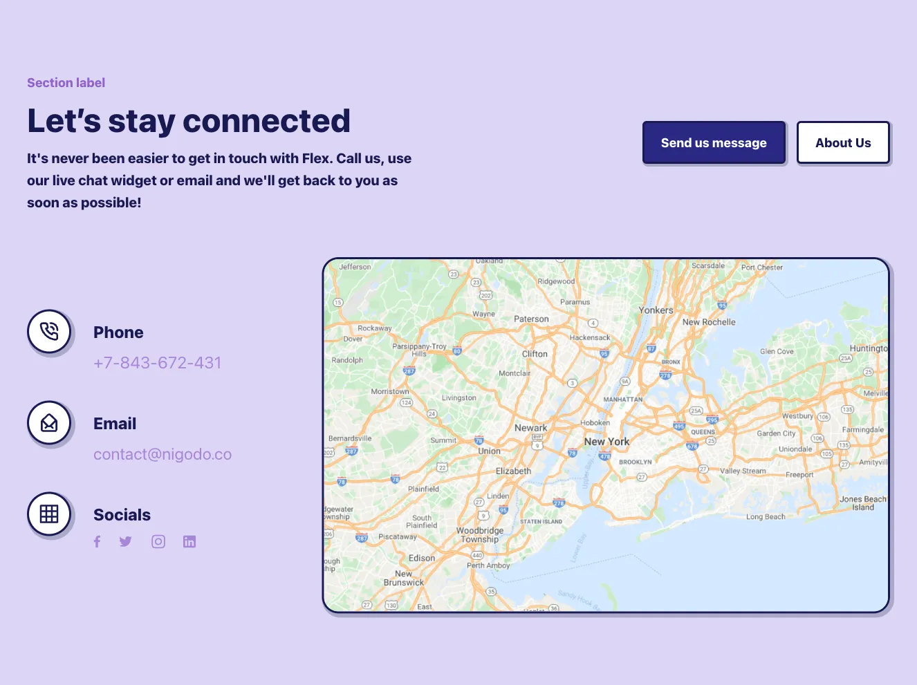
Three-Column Contact Info Cards with Icons

A row of three outlined cards, each with a circular icon at the top edge, a bold heading (Email, Phone, Office), supporting text, and a coral contact detail. The layout is a horizontal row of equal-width cards on a light background, used to present contact channels.

Contact component #1
Contact component #2
Contact component #3
Contact component #4
Contact component #5
Contact component #6
Contact component #7
Contact component #8
Contact component #9
Contact component #10
Contact component #11
Contact component #12
Contact component #13
Contact component #14
Contact component #15
Contact component #16
Contact component #17
Contact component #18
Contact component #19
Contact component #20
Contact component #21
Contact component #22
Contact component #23
Contact component #24
Contact component #25
Contact component #26
Contact component #27
Contact component #28
Contact component #29
Contact component #30
Contact component #31
Contact component #32
Contact component #33
Contact component #34
Contact component #35
Contact component #36
Contact component #37
Contact component #38
Contact component #39
Contact component #40
Contact component #41
Contact component #42
Contact component #43
Contact component #44
Contact component #45
Contact component #46
Contact component #47
Contact component #48
Contact component #49
Contact component #50
Contact component #51
Contact component #52
Contact component #53
Contact component #54
Contact component #55
Contact component #56
Contact component #57
Contact component #58
Contact component #59
Contact component #60
Contact component #61
Contact component #62
Contact component #63
Contact component #64
Contact component #65
Contact component #66
Contact component #67
Contact component #68
Contact component #69
Contact component #70
Contact component #71
Contact component #72
Contact component #73
Contact component #74
Contact component #75
Contact component #76
Contact component #77
Contact component #78
Contact component #79
Contact component #80
Contact component #81
Contact component #82
Contact component #83
Contact component #84
Contact component #85
Contact component #86
Contact component #87
Contact component #88
Contact component #89
Contact component #90
Contact component #91
Contact component #92
Contact component #93
Contact component #94
Contact component #95
Contact component #96
Contact component #97
Contact component #98
Contact component #99
Contact component #100
Contact component #101
Contact component #102
Contact component #103
Contact component #104
Contact component #105
Contact component #106
Contact component #107
Contact component #108
Contact component #109
Contact component #110
Contact component #111
Contact component #112
Contact component #113
Contact component #114
Contact component #115
Contact component #116
Contact component #117
Contact component #118
Contact component #119
Contact component #120

Contact from Atis

Tailwind Contact Component

Purple Contact Section with Office Details and Inquiry Form

A contact section on a solid purple background with a heading, office address, email, social icons, and a form with department radio options, subject, name, email, message fields, a terms checkbox, and a pink Get Started button. Contact information sits in a left column and the form in a right column.

Contact component #1
Contact component #2
Contact component #3
Contact component #4
Contact component #5
Contact component #6
Contact component #7
Contact component #8
Contact component #9
Contact component #10
Contact component #11
Contact component #12
Contact component #13
Contact component #14
Contact component #15
Contact component #16

Contact from Pstls.

Tailwind Contact Component

Contact section with contact details and message form

A light contact section with a serif "Contact" heading, email, phone, and social links on the left, and a card-style form with name, surname, email, phone, topic, message, file attachment, and a Send Now button on the right.

Contact component #1
Contact component #2
Contact component #3
Contact component #4

Contact from BoldUI

Tailwind Contact Component

Dark Contact Section with Address and Map Background

A dark contact section with a heading, short intro text, a yellow Activate demo call-to-action and a Share with friends link, plus an ellipse overlay showing an address and email over a dark map image. The layout stacks text and actions on the left with contact details on the right.

Contact component #1
Contact component #2
Contact component #3
Contact component #4
Contact component #5

Contact from Acros

Tailwind Contact Component

Contact Us Card Overlaid on Map

A contact section with a white rounded card on the left containing a 'Say Hello' heading, short body text, and address and contact info with teal icons, placed over a full-bleed city map with a red location pin on the right.

Contact component #1
Contact component #2
Contact component #3
Contact component #4
Contact component #5

Contact from Bendis

Tailwind Contact Component

Contact Call-to-Action Card Over Map

A white card overlaid on a blue header and a Google-style map of the San Francisco Bay Area, containing a bold heading encouraging quick action and address and contact email details in a two-column layout.

Contact component #1
Contact component #2
Contact component #3
Contact component #4
Contact component #5
Contact component #6
Contact component #7
Contact component #8

Contact from Metis

Tailwind Contact Component

Split-Screen Contact Form with Office Details

A two-column contact section with a heading and phone, email, and address details on the left, and a form with department radio options, subject, name, email, message fields, a terms checkbox, and a blue Submit button on the right.

Contact component #1
Contact component #2
Contact component #3
Contact component #4

A clear contact path is a key component of a successful website. The contact form or address data should be clearly highlighted on it. 


Choose from many variations of the Tailwind components contacts. The variants shown here are available in various UI libraries in the Shuffle editor. You will also find many other types of components that will be in the same style. This will allow you to build a comprehensive Tailwind website template. Each library is designed by a professional designer and coded by our team of developers.


Get access to all sections of the Tailwind components contacts, code and our editor. Try the demo for free.

The easiest way to create beautiful websites

Lifetime License

Create an account

OR USE EMAIL

We issue VAT invoices. Already have an account? Sign in

Why creators choose Shuffle

From idea to beautiful design in minutes.

Shuffle pairs an AI visual editor with 80+ UI libraries, so you can design, build and export production‑ready code without starting from scratch.

  • An AI Agent that builds with you Describe a page, watch it come to life, then fine-tune it visually or with a prompt.
  • Pick the best model for every task GPT-6 Astra, Claude Opus 5.5 and Gemini 3.8 in one place.
  • 13,400+ professionally designed components Prefer building by hand? Drag in pixel-perfect sections crafted by professional designers.
  • Export to the stack you love Tailwind CSS, Bootstrap, Next.js, Laravel, WordPress and beyond.
“Its AI-powered features have transformed how I work! Designing and building websites has become faster, easier, and far more efficient.”
Est. 2019
Helping web builders ship since 2019 7 years of steady development.

Make it yours with AI

Start with this component. Tell AI what to change.

Original
Preview the original component.
Your Version
Available when your generation is complete.
Code
Available when your generation is complete.
Original component

Add images & videos

Upload an asset, then tell AI how to use it.

How it works

Your uploaded file will be added directly to the generated component. After uploading, you can guide the AI on where exactly to use it, e.g. as a logo or as a section image.

© 2026 Shuffle. All rights reserved.