Redirecting to PayPal

Tailwind CSS Content Components

Browse 224 ready-made Tailwind CSS content components from multiple UI libraries. Every variant is fully responsive – copy the code or customize it in the visual editor and export clean code.

Content from Saturn

Tailwind Content Component

Rich Text Feature Section with Headline and Illustration

A two-column content section with a small orange 'Rich Text Module' label, a large mixed-weight headline, and a textured orange character illustration on the left, paired with multiple paragraphs of body text on the right. The layout is a split screen with no navigation, forms, or interactive controls visible.

Content component #1
Content component #2
Content component #3
Content component #4
Content component #5

Content from DarkPro

Tailwind Content Component

Dark blog article header with breadcrumb, author byline, hero code image, and body text

A dark-themed blog article page showing a breadcrumb trail, large centered headline, author avatar with name and date, a wide framed hero photo of code on a monitor, and a single-column body text block. The layout is a centered stack with no interactive controls visible.

Content component #1
Content component #2
Content component #3
Content component #4
Content component #5
Content component #6
Content component #7

Content from Solstice

Tailwind Content Component

Blog Article Page with Hero Image and Newsletter Signup

A single blog post layout with a back link, full-width hero photo, centered date and read time, large article title, and multi-section body text. It ends with a newsletter subscription callout and an author byline with a share button.

Content component #1
Content component #2
Content component #3
Content component #4
Content component #5
Content component #6
Content component #7
Content component #8
Content component #9
Content component #10
Content component #11
Content component #12
Content component #13
Content component #14
Content component #15
Content component #16
Content component #17
Content component #18
Content component #19
Content component #20
Content component #21
Content component #22
Content component #23
Content component #24
Content component #25
Content component #26
Content component #27
Content component #28
Content component #29
Content component #30
Content component #31
Content component #32
Content component #33
Content component #34
Content component #35
Content component #36
Content component #37
Content component #38
Content component #39
Content component #40

Your next website starts here

Design with AI and generate multiple website concepts in minutes. Make it yours with Shuffle: tweak every detail in a visual editor.

EXPORT CODE TO THE TECH YOU LOVE

Content from Nightsable

Tailwind Content Component

Blog article page with interview content and From the blog card grid

A dark-themed blog article layout showing an interview header, hero image, body text with headings, a blockquote, inline image, share buttons, and a three-card 'From the blog' grid below. The outer component is a blog post page with a footer-style related posts section.

Content component #1
Content component #2
Content component #3
Content component #4
Content component #5
Content component #6

Content from Zeus

Tailwind Content Component

Blog Article Header with Author and Hero Image

A centered blog article header showing breadcrumb navigation, a two-line bold heading, an author avatar with name and date, followed by a full-width photographic hero image. Decorative blue and yellow icon circles and dashed line swirls flank the heading area.

Content component #1
Content component #2
Content component #3
Content component #4
Content component #5
Content component #6
Content component #7
Content component #8
Content component #9
Content component #10
Content component #11

Content from Artemis Dashboard

Tailwind Content Component

Project Card Grid with Avatars and Progress Bars

A 4-column grid of white project cards, each showing a colored folder icon, project name, location, client name, overlapping avatars with a +3 count, a colored progress bar, and a phase badge with status text. The layout repeats identical cards across two rows on a light gray background.

Content component #1
Content component #2
Content component #3
Content component #4
Content component #5
Content component #6
Content component #7
Content component #8
Content component #9
Content component #10
Content component #11
Content component #12
Content component #13
Content component #14
Content component #15
Content component #16
Content component #17

Content from Wrexa

Tailwind Content Component

Dark Split-Layout Hero with Feature List and Photo Collage

A marketing hero section on a dark background with a large two-line-plus heading, short supporting text, a three-item feature list with dot bullets, and a purple call-to-action button. Photographs are arranged in a collage at the left, top right, and right edges.

Content component #1
Content component #2
Content component #3
Content component #4
Content component #5

Content from Zospace

Tailwind Content Component

Dark split-screen hero with heading and founder story link

A dark promotional hero section with a large centered-left heading "We're Zospace - Founded in London", a short supporting sentence, a small lightbulb icon, and a "Learn our story" text link with an arrow. A photograph of a smiling woman in sunlit street occupies the right half, with a smaller portrait overlapping the lower-left corner.

Content component #1
Content component #2
Content component #3
Content component #4
Content component #5

Content from Flex

Tailwind Content Component

Blog Article Layout with Hero Image, Pull Quote, and Share Links

A long-form article page with a centered byline, title, subtitle, category tag, full-width hero photo, body text with headings, a green-bordered pull quote, an inline image with caption, and a footer with copy link and social share buttons. The content is stacked vertically in a narrow centered column.

Content component #1
Content component #2
Content component #3
Content component #4
Content component #5
Content component #6
Content component #7
Content component #8
Content component #9
Content component #10
Content component #11
Content component #12

Content from Uinel

Tailwind Content Component

Split-screen feature section with prototype illustration and heading

A marketing feature section headed "Free your ideas" with a centered intro, followed by a split layout: a light gray panel showing an illustrative prototype card and a blue "1.3k Templates" tile on the left, and an orange icon, large heading, supporting text, and green "Official website" text link on the right.

Content component #1
Content component #2
Content component #3
Content component #4
Content component #5

Content from Yofte

Tailwind Content Component

Dark Blog Article Header with Hero Image and Body Text

A dark-background editorial article layout with a small eyebrow label, large bold heading, a wide photo banner with blue accent bars, and a centered text column with a lead paragraph and body copy. It reads as a blog or content post rather than a product marketing section.

Content component #1
Content component #2
Content component #3

Content from Nigodo

Tailwind Content Component

Blog article layout with hero image, pull quote, and share footer

A long-form blog article page showing a centered header with date, title, subtitle, and category tag, followed by a hero photo, body text sections, a blockquote attributed to an author, a repeated image with caption, and a footer with a Copy Link button and social icons. Content is arranged in a single centered column with a dark navy and pink accent palette.

Content component #1
Content component #2
Content component #3
Content component #4
Content component #5
Content component #6
Content component #7
Content component #8
Content component #9
Content component #10
Content component #11
Content component #12
Content component #13
Content component #14
Content component #15
Content component #16
Content component #17
Content component #18
Content component #19
Content component #20
Content component #21
Content component #22
Content component #23
Content component #24
Content component #25
Content component #26
Content component #27
Content component #28
Content component #29
Content component #30
Content component #31
Content component #32
Content component #33
Content component #34
Content component #35
Content component #36
Content component #37
Content component #38
Content component #39
Content component #40

Content from Pstls.

Tailwind Content Component

Blog article layout with hero image, serif headings, pull quote, and body text

A long-form blog article page showing a published date, large serif headline, intro paragraph, full-width hero photo, and body sections with an inline image, numbered list, and styled pull quote. The content is centered in a narrow reading column with generous whitespace and a light background.

Content component #1
Content component #2
Content component #3
Content component #4

Content from BoldUI

Tailwind Content Component

Dark Blog Article Header with Author Byline and Split Photo

A dark-themed blog article layout with breadcrumbs, a bold uppercase headline, an author avatar with name and role, and body text on the left, paired with a full-height portrait photo on the right. A top-right panel shows a 'Read next article' link with a yellow arrow.

Content component #1
Content component #2
Content component #3
Content component #4
Content component #5
Content component #6
Content component #7
Content component #8
Content component #9
Content component #10
Content component #11

Content from Acros

Tailwind Content Component

Blog Article Header and Body Layout

A blog article page with breadcrumb navigation, a teal hashtag tag, a serif headline, author and date metadata, a full-width photo, and a centered body text column. It is a content reading layout rather than a marketing section or application UI.

Content component #1
Content component #2
Content component #3
Content component #4
Content component #5
Content component #6
Content component #7
Content component #8
Content component #9
Content component #10

Content from Bendis

Tailwind Content Component

Blog article header with hero image, breadcrumbs, title, author byline, and body text

A blog article page layout featuring a full-width skateboarding photo at top, followed by breadcrumb navigation, a bold centered serif-free headline, an author avatar with name and date, and a narrow column of body paragraphs. It presents editorial article content rather than interactive controls.

Content component #1
Content component #2
Content component #3
Content component #4
Content component #5
Content component #6
Content component #7
Content component #8
Content component #9

Content from Shuffle UX

Tailwind Content Component

Blog article header with breadcrumb, headline, author byline, and image placeholder

A centered article header showing a breadcrumb trail (Home, Blog, Article), a bold two-line headline, an author avatar with name and date, followed by a full-width gray image placeholder block. The layout is a simple centered stack on a white background.

Content component #1
Content component #2
Content component #3
Content component #4
Content component #5
Content component #6
Content component #7
Content component #8
Content component #9

Content from Cronos

Tailwind Content Component

Blog article header with breadcrumb, author byline, and hero landscape image

A centered blog article page header showing breadcrumb navigation (Home, Blog, Article), a bold serif-style heading, an author avatar with name and date, and a full-width green hillside photo with decorative colored squares, followed by body paragraphs in a narrow centered column.

Content component #1
Content component #2
Content component #3
Content component #4
Content component #5
Content component #6
Content component #7
Content component #8
Content component #9
Content component #10
Content component #11
Content component #12
Content component #13

Content from NEUB

Tailwind Content Component

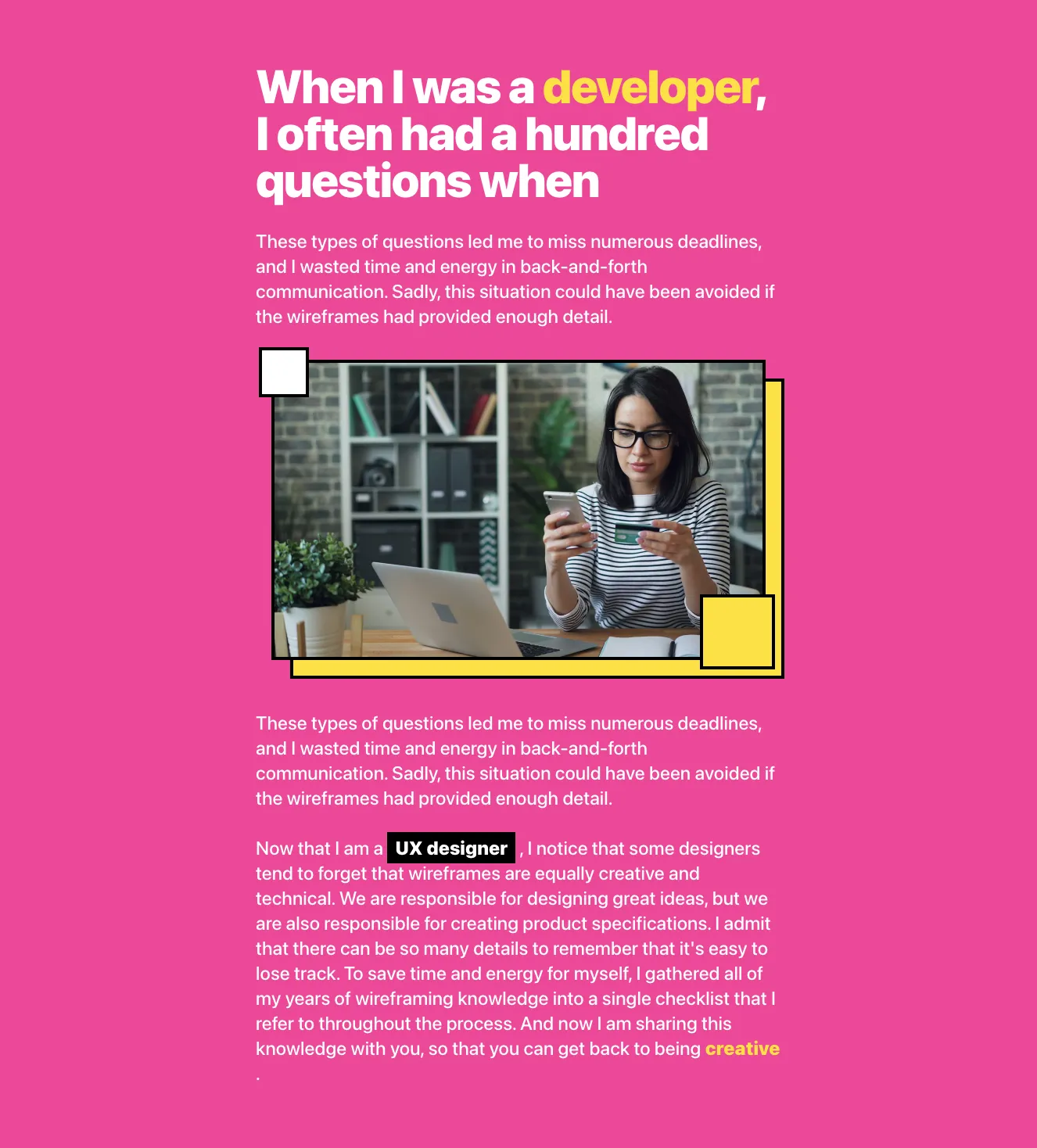
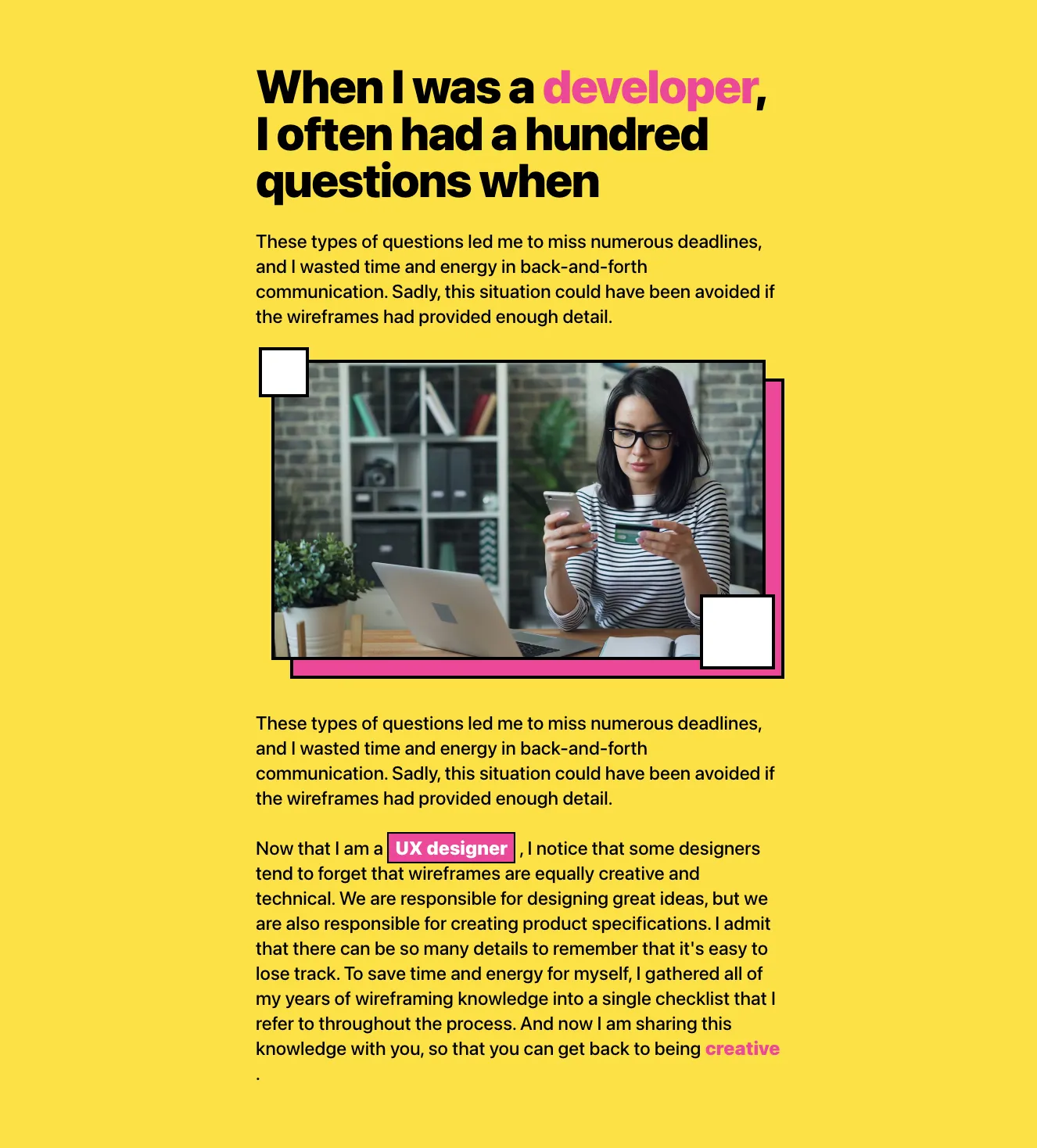
Blog Article Header with Hero Image and Quote Blocks

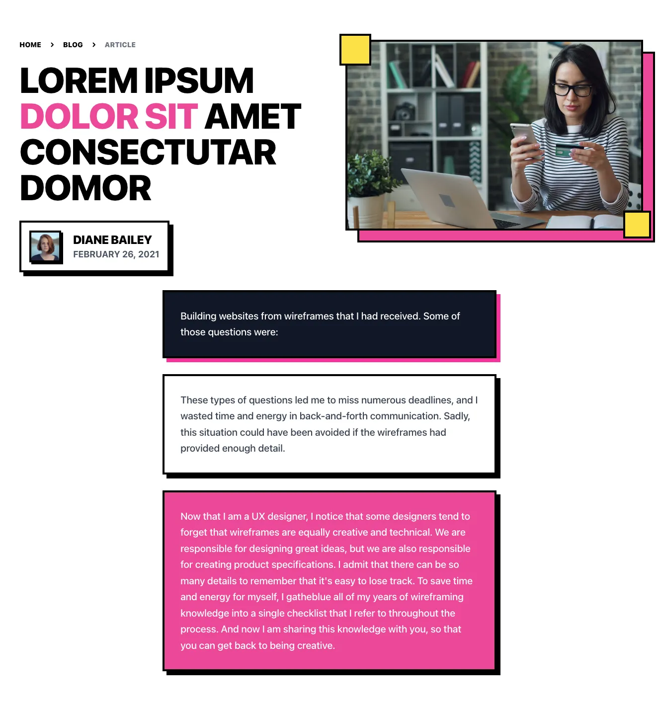
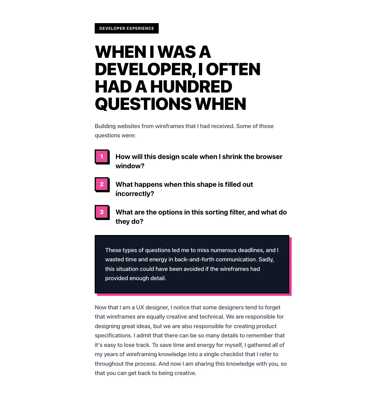
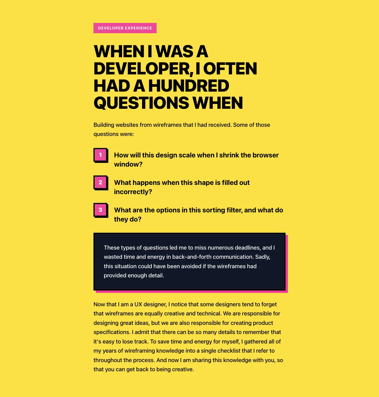
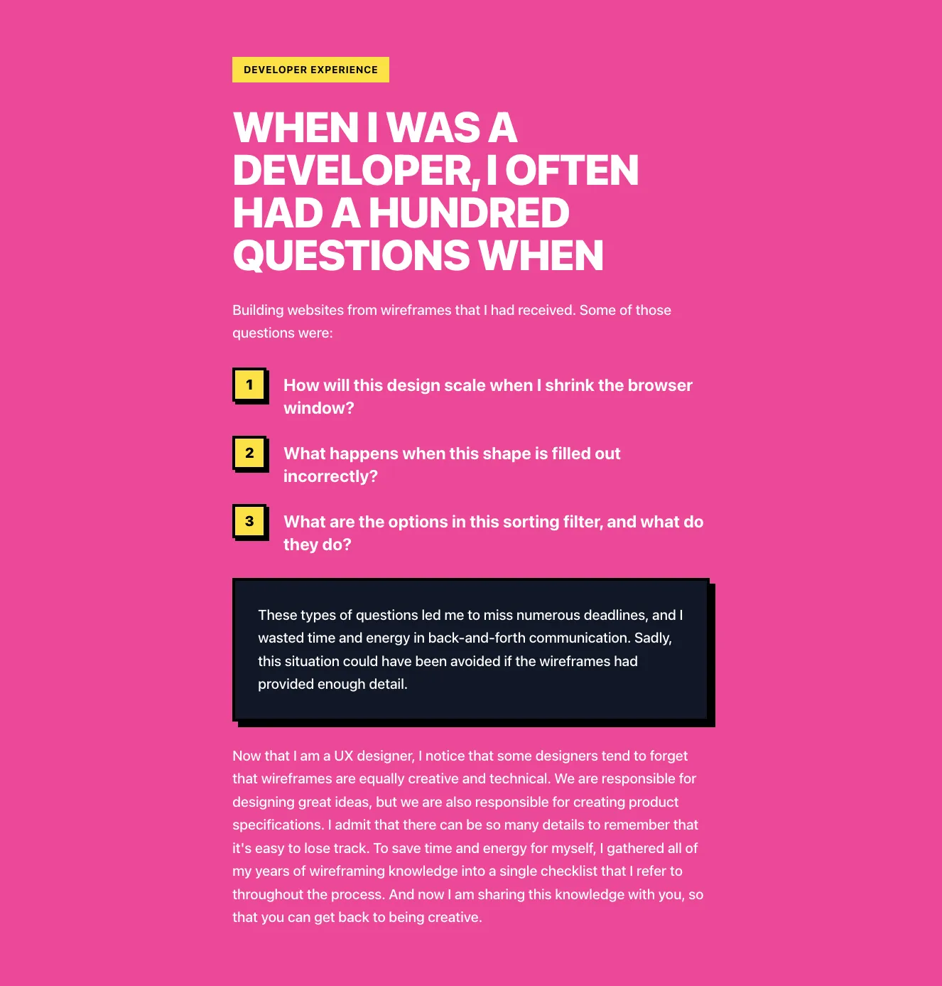
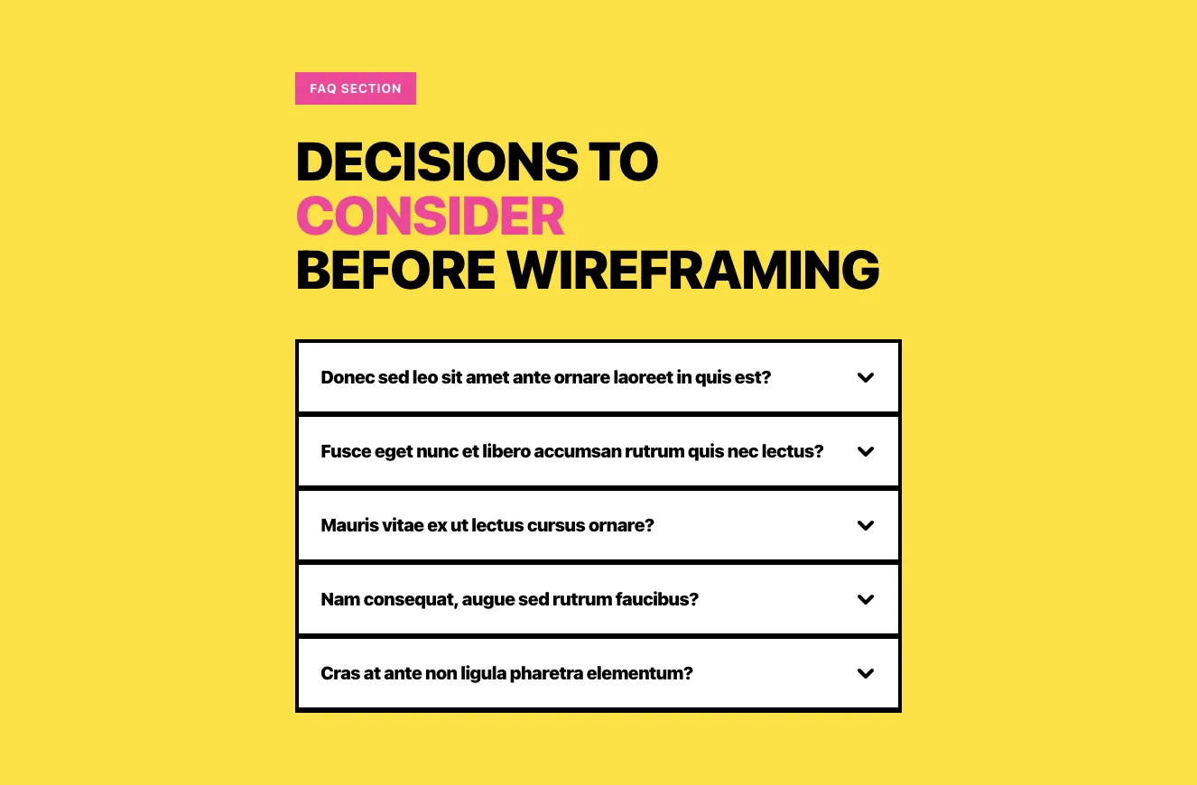
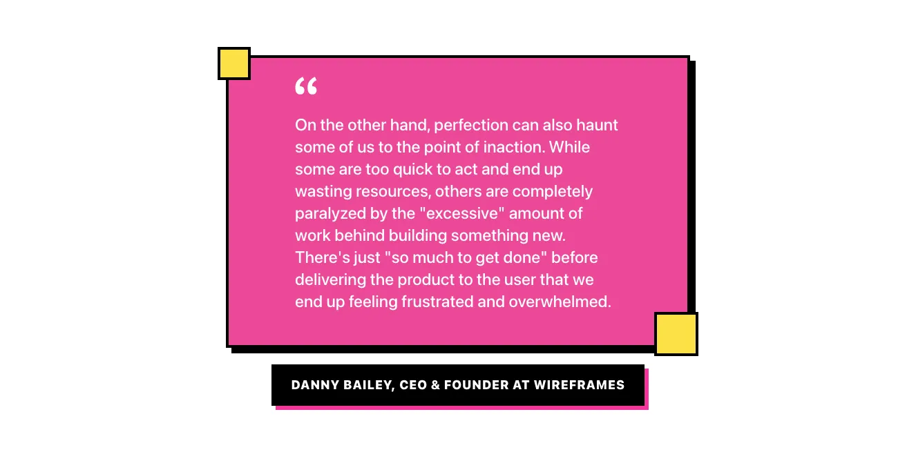
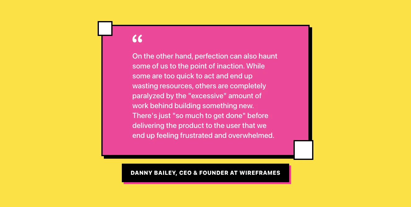
A yellow-background blog article layout showing breadcrumbs, a bold multi-line headline with a pink accent word, author byline with avatar and date, a framed hero photo with pink offset border, and stacked text callout blocks in pink, dark, and light styles. Content is arranged in a centered vertical stack with neo-brutalist hard black shadows and borders.

Content component #1
Content component #2
Content component #3
Content component #4
Content component #5
Content component #6
Content component #7
Content component #8
Content component #9
Content component #10
Content component #11
Content component #12
Content component #13
Content component #14
Content component #15
Content component #16
Content component #17
Content component #18
Content component #19
Content component #20
Content component #21
Content component #22
Content component #23
Content component #24
Content component #25
Content component #26
Content component #27

Content from Casper

Tailwind Content Component

Dark Split-Screen Hero with Headline and Space Illustration

A dark promotional section with a large headline and muted supporting text on the left, and a subheading, body paragraphs, and a 3D space illustration of a robot on the right. It introduces a UI library with a split-screen layout and no visible navigation or form controls.

Content component #1
Content component #2
Content component #3
Content component #4
Content component #5

Content makes the page. In our Tailwind content components, we provide you with many possible variations of content presentation. Regardless of its type and length, you'll find a way to show what's important to your audience. 


Browse the Tailwind navigation component variants available in our editor. Under each of them is clear code that you can easily edit. Components are sorted by UI libraries, which consist of many other elements in the same style. Each of these libraries was created by our talented designers to allow you to create diverse and pretty pages.


See all variations of Tailwind navigation components and the code underneath them in Shuffle Editor.


Try demo for free.


The easiest way to create beautiful websites

Lifetime License

Create an account

OR USE EMAIL

We issue VAT invoices. Already have an account? Sign in

Why creators choose Shuffle

From idea to beautiful design in minutes.

Shuffle pairs an AI visual editor with 80+ UI libraries, so you can design, build and export production‑ready code without starting from scratch.

  • An AI Agent that builds with you Describe a page, watch it come to life, then fine-tune it visually or with a prompt.
  • Pick the best model for every task GPT-6 Astra, Claude Opus 5.5 and Gemini 3.8 in one place.
  • 13,400+ professionally designed components Prefer building by hand? Drag in pixel-perfect sections crafted by professional designers.
  • Export to the stack you love Tailwind CSS, Bootstrap, Next.js, Laravel, WordPress and beyond.
“Its AI-powered features have transformed how I work! Designing and building websites has become faster, easier, and far more efficient.”
Est. 2019
Helping web builders ship since 2019 7 years of steady development.

Make it yours with AI

Start with this component. Tell AI what to change.

Original
Preview the original component.
Your Version
Available when your generation is complete.
Code
Available when your generation is complete.
Original component

Add images & videos

Upload an asset, then tell AI how to use it.

How it works

Your uploaded file will be added directly to the generated component. After uploading, you can guide the AI on where exactly to use it, e.g. as a logo or as a section image.

© 2026 Shuffle. All rights reserved.