Redirecting to PayPal

Tailwind CSS How it works Components

Browse 212 ready-made Tailwind CSS how it works components from multiple UI libraries. Every variant is fully responsive – copy the code or customize it in the visual editor and export clean code.

How it works from NEUB

Tailwind How it works Component

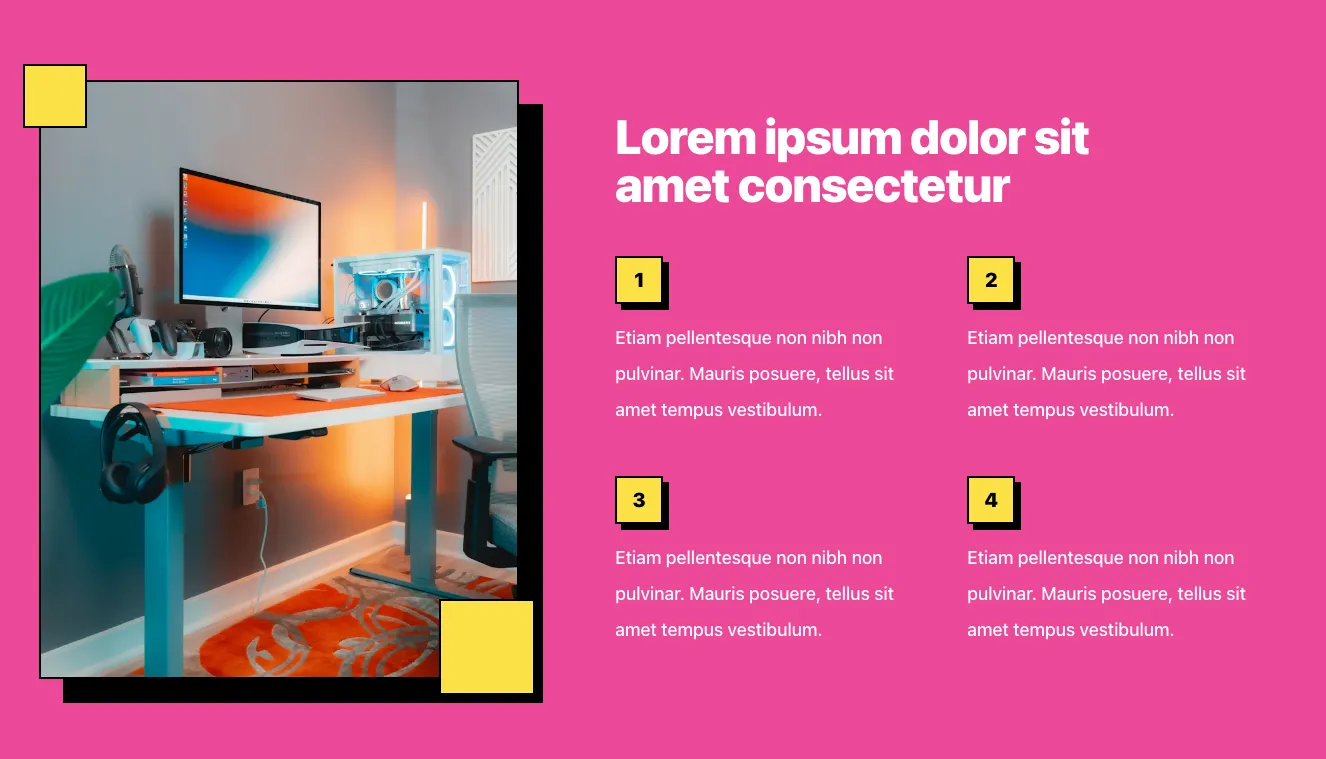
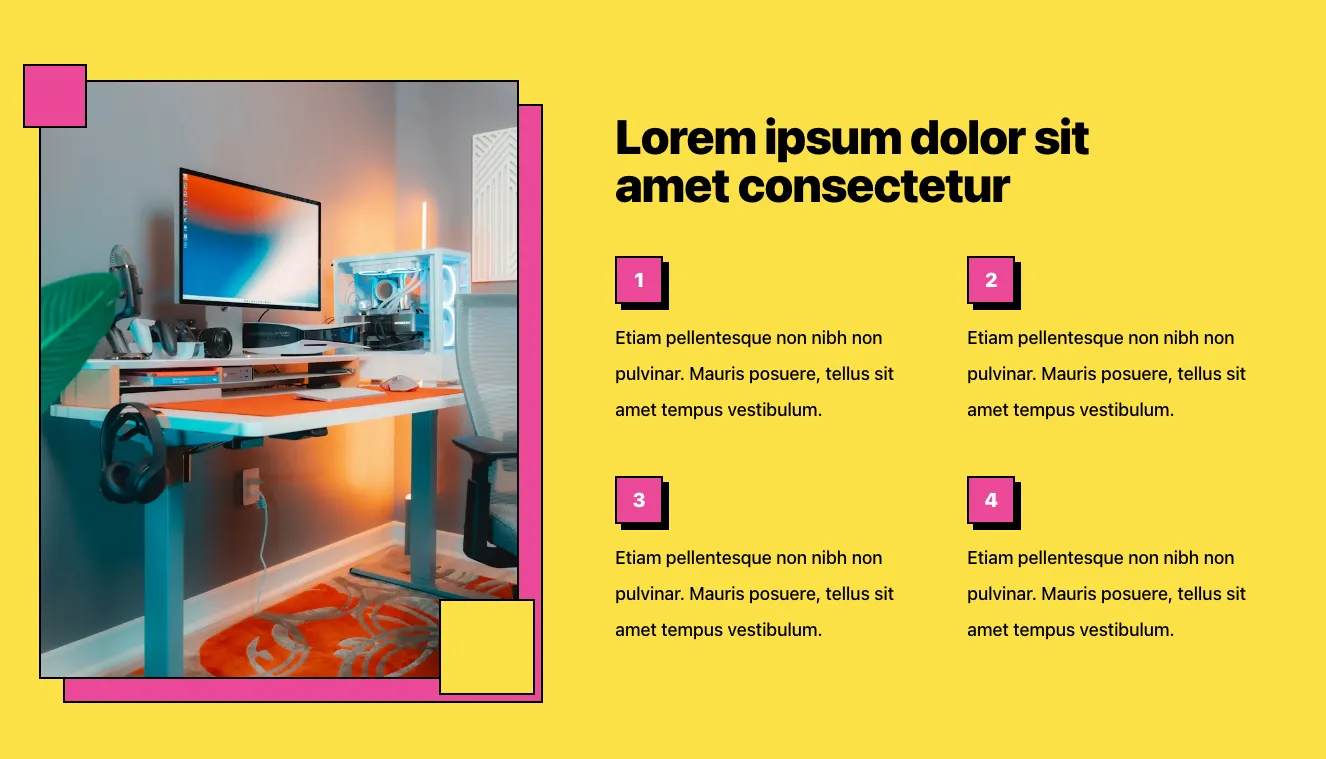
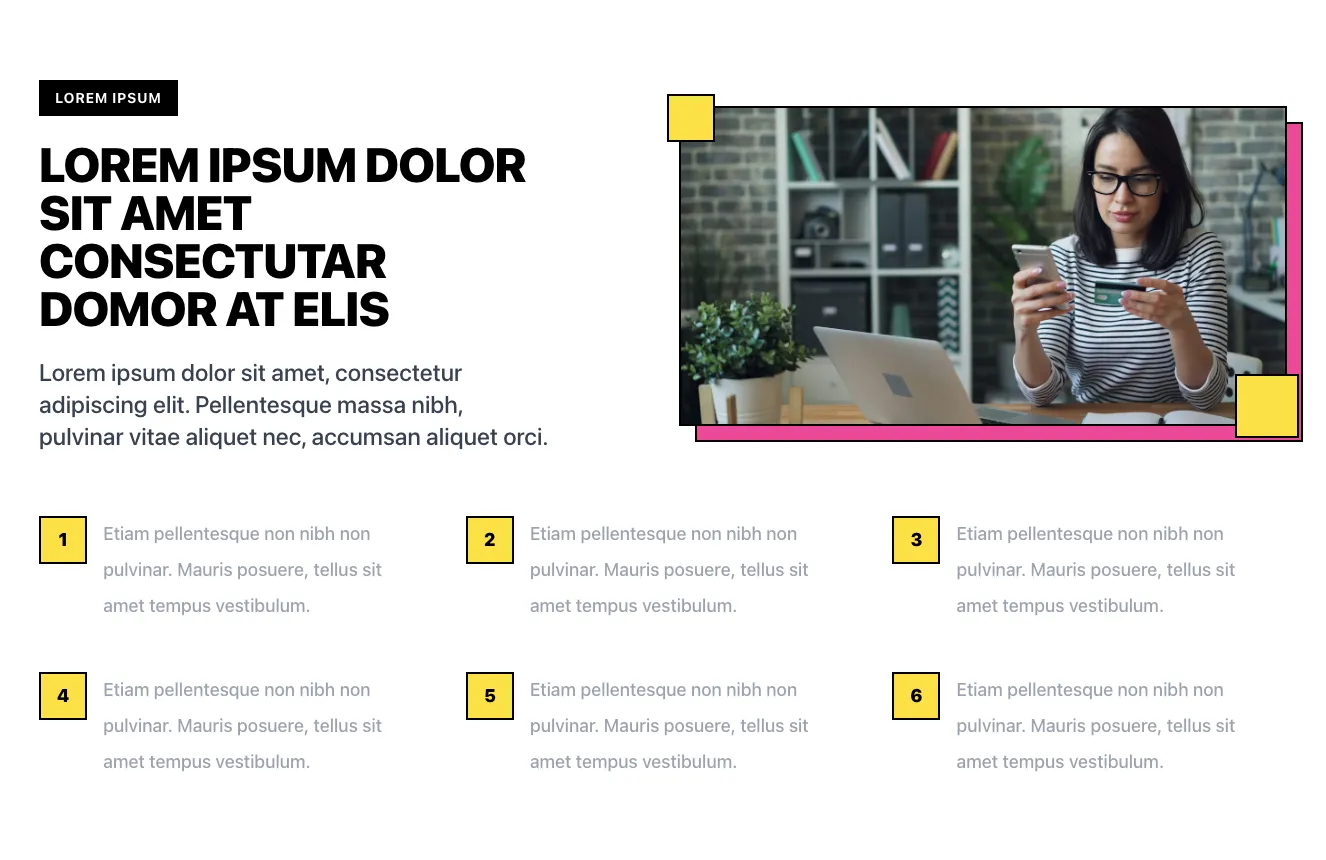
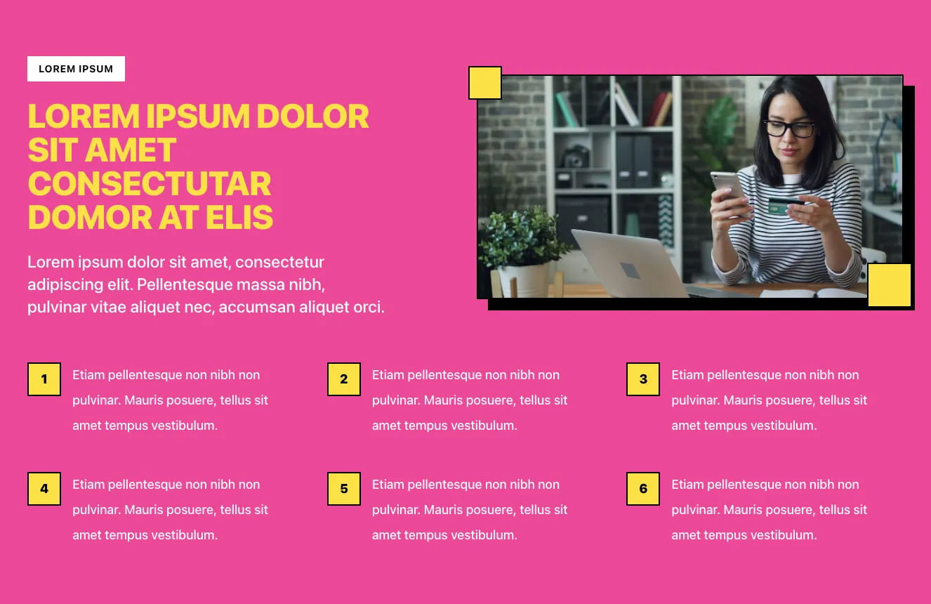
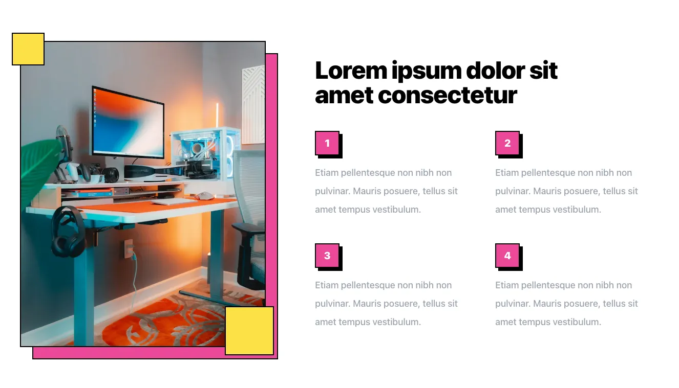
Split-Screen Feature Section with Desk Photo and Numbered Points

A marketing feature section with a bold heading on the right and a 2x2 grid of numbered pink badges with placeholder paragraph text. The left side shows a framed photo of a desk setup with a pink offset border and yellow corner accents.

How it works component #1
How it works component #2
How it works component #3
How it works component #4
How it works component #5
How it works component #6
How it works component #7
How it works component #8
How it works component #9
How it works component #10
How it works component #11
How it works component #12
How it works component #13
How it works component #14
How it works component #15

How it works from Casper

Tailwind How it works Component

How Does Casper Work three-step feature section

A dark marketing section titled 'How Does Casper Work' with three numbered steps (01. Upload, 02. Auto Generation, 03. Select & Send), each pairing a short text block with a gradient-framed 3D illustration in an alternating zigzag layout.

How it works component #1
How it works component #2
How it works component #3
How it works component #4

How it works from Vista

Tailwind How it works Component

How it works three-step feature section on dark background

A dark marketing section with a bold heading and three numbered steps connected by dotted lines, each with a circular pink-outlined icon, title, and short description explaining transaction input, categorization, and report generation.

How it works component #1
How it works component #2
How it works component #3
How it works component #4
How it works component #5
How it works component #6
How it works component #7
How it works component #8
How it works component #9
How it works component #10
How it works component #11
How it works component #12
How it works component #13
How it works component #14
How it works component #15

Your next website starts here

Design with AI and generate multiple website concepts in minutes. Make it yours with Shuffle: tweak every detail in a visual editor.

EXPORT CODE TO THE TECH YOU LOVE

How it works from Cyber

Tailwind How it works Component

Quantum Protocol Architecture Feature Section with Numbered Steps

A dark-themed marketing feature section with a large gradient heading, a tilted photograph of a person in a circular concrete opening on the left, and four numbered step blocks with monospace descriptions arranged in a two-by-two grid on the right.

How it works component #1
How it works component #2
How it works component #3
How it works component #4
How it works component #5

How it works from FilyTreck

Tailwind How it works Component

Dark Feature Slide with Numbered Heading, Photo, and Carousel Controls

A dark-themed feature section showing a faded step number "01", a large heading, a short paragraph, and a progress bar with previous/next circular buttons, paired with a rounded photo of people high-fiving. The layout is a split screen with text on the left and an image on the right.

How it works component #1
How it works component #2
How it works component #3
How it works component #4
How it works component #5

How it works from Aurora

Tailwind How it works Component

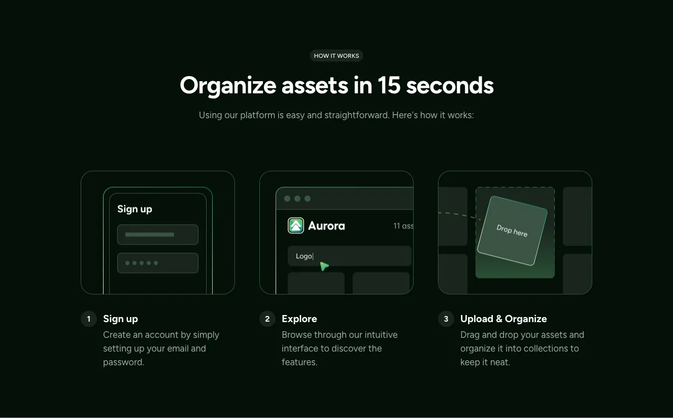
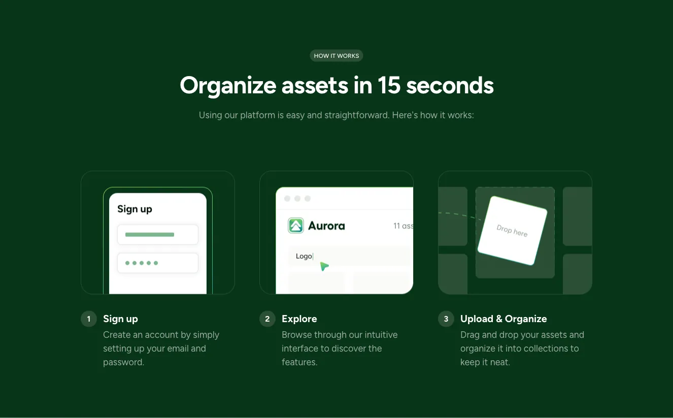
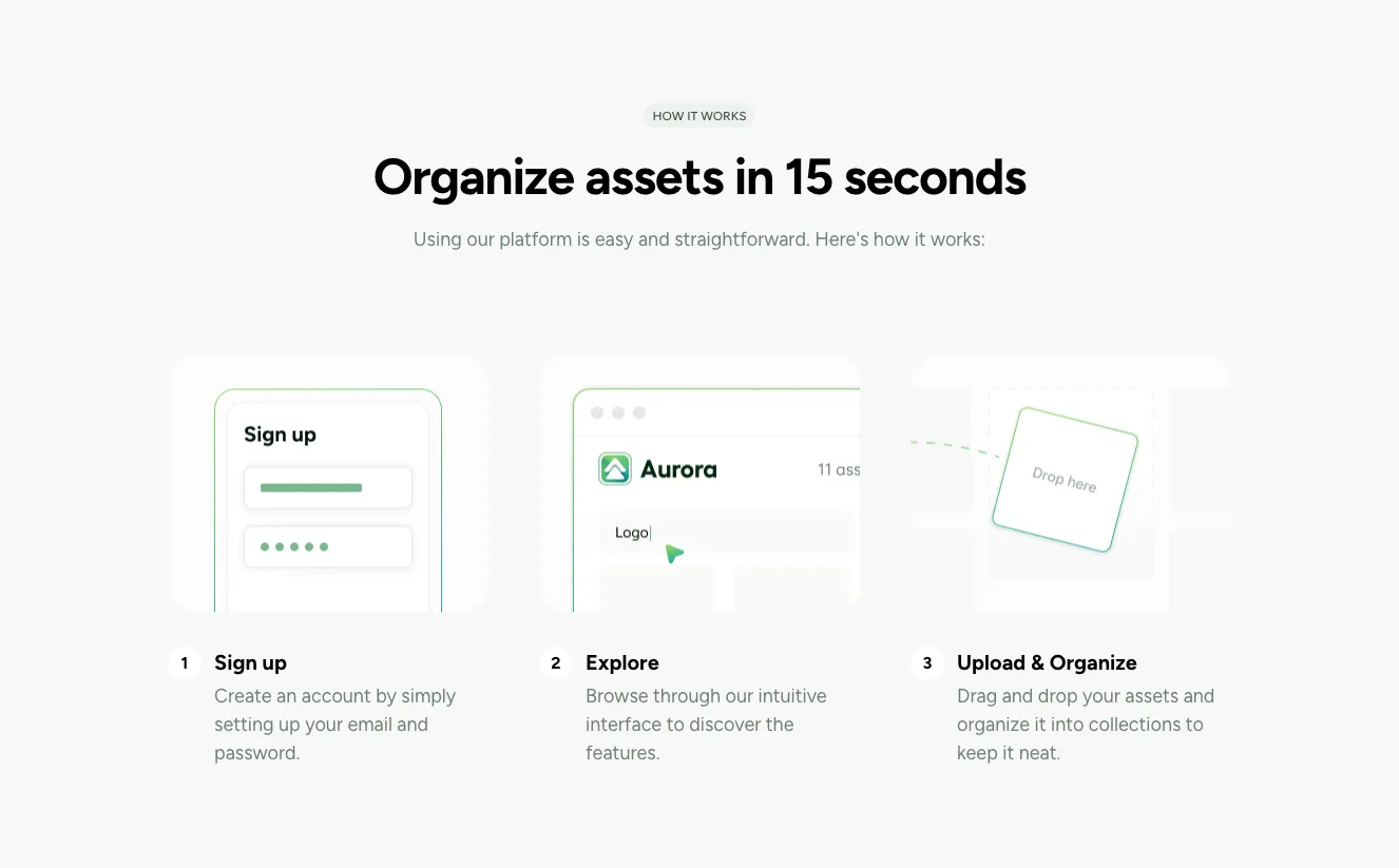
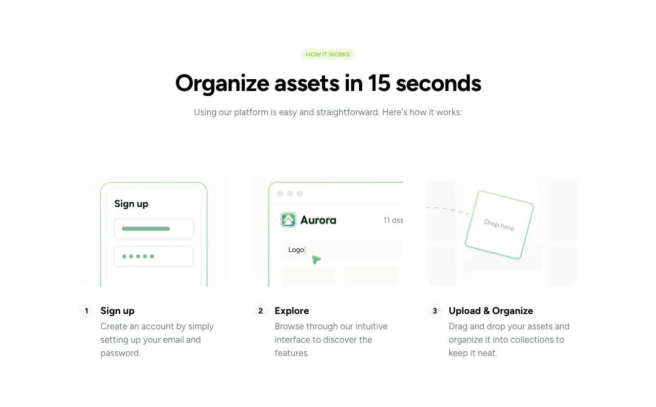
Asset Organization How-It-Works Section with Dashboard Preview

A marketing feature section titled 'Organize assets in 15 seconds' with a three-step numbered explainer above a framed preview of an asset management interface showing a search field, view toggles, a product image grid, and a floating action sidebar. The layout is a centered stack with a bordered preview panel below the steps.

How it works component #1
How it works component #2
How it works component #3
How it works component #4
How it works component #5
How it works component #6
How it works component #7
How it works component #8
How it works component #9
How it works component #10
How it works component #11
How it works component #12
How it works component #13
How it works component #14
How it works component #15
How it works component #16
How it works component #17
How it works component #18
How it works component #19
How it works component #20
How it works component #21
How it works component #22
How it works component #23
How it works component #24
How it works component #25

How it works from Consulty

Tailwind How it works Component

Three-Step Process Section with Photo Cards

A centered heading and subtitle introduce a row of three photo cards numbered 01 to 03, each with a title and short body text overlaid on the image. The layout is a horizontal three-column grid used to present a sequential process.

How it works component #1
How it works component #2

How it works from Suncealand

Tailwind How it works Component

How It Works Section with App UI Mockup for Podcast Distribution

A light beige marketing section with a pill eyebrow label, serif heading "How does it work?", and body copy describing podcast distribution, followed by a cropped browser-style mockup showing collaborator avatars, a purple podcast card with Edit and Remove links, an audio player, and a dated file row.

How it works component #1
How it works component #2
How it works component #3
How it works component #4
How it works component #5

Show your workflow and the way you operate with Tailwind how it works components. This will help you explain the important steps of the company or department process.

Choose from many variations of Tailwind components how it works section. Presented here are variants available in various UI libraries. You will also find many other types of components that will be in the same style. This will allow you to build a comprehensive Tailwind website template. Each library has been designed by a professional designer and coded by our team of developers.


Get access to all Tailwind components how it works sections, code and our editor. Try the demo for free.

The easiest way to create beautiful websites

Lifetime License

Create an account

OR USE EMAIL

We issue VAT invoices. Already have an account? Sign in

Why creators choose Shuffle

From idea to beautiful design in minutes.

Shuffle pairs an AI visual editor with 80+ UI libraries, so you can design, build and export production‑ready code without starting from scratch.

  • An AI Agent that builds with you Describe a page, watch it come to life, then fine-tune it visually or with a prompt.
  • Pick the best model for every task GPT-6 Astra, Claude Opus 5.5 and Gemini 3.8 in one place.
  • 13,400+ professionally designed components Prefer building by hand? Drag in pixel-perfect sections crafted by professional designers.
  • Export to the stack you love Tailwind CSS, Bootstrap, Next.js, Laravel, WordPress and beyond.
“Its AI-powered features have transformed how I work! Designing and building websites has become faster, easier, and far more efficient.”
Est. 2019
Helping web builders ship since 2019 7 years of steady development.

Make it yours with AI

Start with this component. Tell AI what to change.

Original
Preview the original component.
Your Version
Available when your generation is complete.
Code
Available when your generation is complete.
Original component

Add images & videos

Upload an asset, then tell AI how to use it.

How it works

Your uploaded file will be added directly to the generated component. After uploading, you can guide the AI on where exactly to use it, e.g. as a logo or as a section image.

© 2026 Shuffle. All rights reserved.