Can't find the right component?
Describe it and Shuffle AI builds it in seconds, ready to edit and export.
Browse 421 ready-made Tailwind CSS features components from multiple UI libraries. Every variant is fully responsive – copy the code or customize it in the visual editor and export clean code.
Create a free account to copy production-ready code from every component in the library.
Free account · No credit card · No password needed
Already have an account? Sign in
Components are just the start. See how a project goes from prompt to production‑ready code with Shuffle.
A marketing feature section with a tall architectural photograph on the left and a "Key Features" heading with three icon-led feature items on the right. Each item has a bold title and gray supporting text, with a small blue pill badge above the heading.
Create a free account to copy production-ready code from every component in the library.
Free account · No credit card · No password needed
Already have an account? Sign in
Components are just the start. See how a project goes from prompt to production‑ready code with Shuffle.
A light-background grid of six feature items in three columns and two rows, each with a circular outlined icon, a bold heading, and gray supporting text. It presents product features in a simple, repeated marketing layout.
Create a free account to copy production-ready code from every component in the library.
Free account · No credit card · No password needed
Already have an account? Sign in
Components are just the start. See how a project goes from prompt to production‑ready code with Shuffle.
A marketing feature section with a yellow badge, large bold heading, and body text on the left, and a two-by-two grid of outlined icons with titles and descriptions on the right. Used to describe product or service features on a light background.
Create a free account to copy production-ready code from every component in the library.
Free account · No credit card · No password needed
Already have an account? Sign in
Components are just the start. See how a project goes from prompt to production‑ready code with Shuffle.
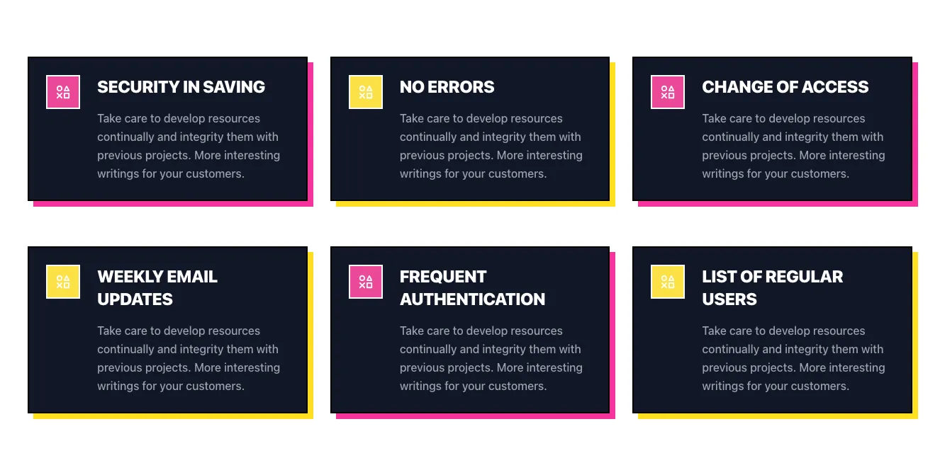
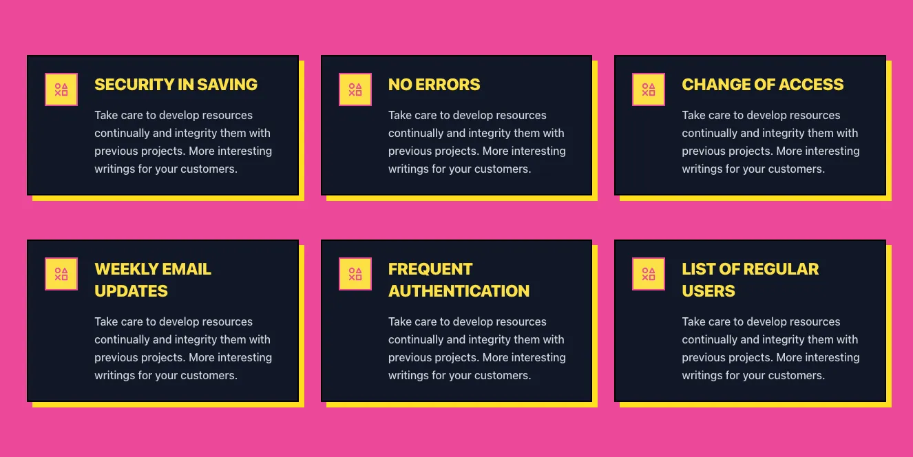
A 3x2 grid of dark feature cards, each with a small pink or yellow icon tile, bold uppercase heading, and gray body text. Cards use hard offset shadows in alternating pink and yellow, forming a bold feature showcase.
Create a free account to copy production-ready code from every component in the library.
Free account · No credit card · No password needed
Already have an account? Sign in
Components are just the start. See how a project goes from prompt to production‑ready code with Shuffle.
A dark-background marketing feature section with a "FEATURES" pill label, a large headline, three arrow-marked feature items with short descriptions, and a phone device mockup showing an illustrated 3D robot app screen over a gradient circle. The layout places text on the left and the device visual on the right.
Create a free account to copy production-ready code from every component in the library.
Free account · No credit card · No password needed
Already have an account? Sign in
Components are just the start. See how a project goes from prompt to production‑ready code with Shuffle.
A light-background hero section with a large bold headline, a green underline accent, two side-by-side rounded image cards with overlaid captions, and a centered dark "Get consultation" button. The layout is a vertical stack with a two-column card row beneath the heading.
Create a free account to copy production-ready code from every component in the library.
Free account · No credit card · No password needed
Already have an account? Sign in
Components are just the start. See how a project goes from prompt to production‑ready code with Shuffle.
A marketing feature section on a dark green rounded panel headed "Key to clean future" with a small "Solutions" eyebrow label. Four equal columns each show a lime icon, a title (EV charging, Solar Energy, Wind Energy, Hydropower), a short paragraph, and a "Read more" link.
Create a free account to copy production-ready code from every component in the library.
Free account · No credit card · No password needed
Already have an account? Sign in
Components are just the start. See how a project goes from prompt to production‑ready code with Shuffle.
A dark-themed marketing feature section with an eyebrow label, a large centered heading, and supporting text above a horizontal row of four rounded cards. Each card has a circular outlined icon, a bold title, and short descriptive text describing accounting, multiple accounts, analytics, and cloud access.
Create a free account to copy production-ready code from every component in the library.
Free account · No credit card · No password needed
Already have an account? Sign in
Components are just the start. See how a project goes from prompt to production‑ready code with Shuffle.
A six-card grid on a dark background, with each card showing a circular outlined icon, a gradient-colored uppercase heading, and monospaced body text. The cards are arranged in a three-column grid with slightly irregular corner cuts and glowing borders.
Create a free account to copy production-ready code from every component in the library.
Free account · No credit card · No password needed
Already have an account? Sign in
Components are just the start. See how a project goes from prompt to production‑ready code with Shuffle.
A dark-themed marketing feature section with a large 'Features' heading, supporting subtitle, a row of four cards each with a colored icon, title, and description, and an outlined 'See all features' button. The layout is a horizontal row of equal-width cards below the heading.
Create a free account to copy production-ready code from every component in the library.
Free account · No credit card · No password needed
Already have an account? Sign in
Components are just the start. See how a project goes from prompt to production‑ready code with Shuffle.
A light-themed feature section with a small FEATURE badge, a centered heading, and a three-by-two grid of icon-led feature items such as auto-tagging, collections, share links, team invites, video preview, and cloud storage. Each item has a bold title and gray supporting text, with a soft green glow along the bottom edge.
Create a free account to copy production-ready code from every component in the library.
Free account · No credit card · No password needed
Already have an account? Sign in
Components are just the start. See how a project goes from prompt to production‑ready code with Shuffle.
A dark-themed section with three feature cards in a horizontal row, each showing a heading, subtext, and yellow circular icon, followed by a centered testimonial-style rating block reading 'Top Rated Fashion Brand' with five stars and 4.8 rating from 30k reviews.
Create a free account to copy production-ready code from every component in the library.
Free account · No credit card · No password needed
Already have an account? Sign in
Components are just the start. See how a project goes from prompt to production‑ready code with Shuffle.
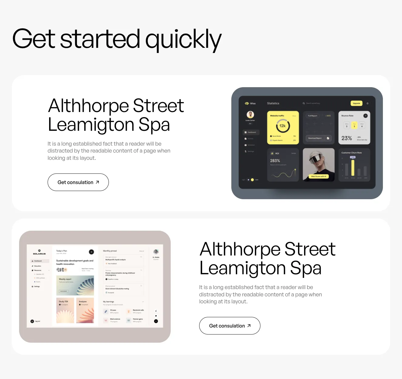
A marketing feature section with a light page heading above a dark rounded panel. The left side has a large headline, supporting text, and an outlined consultation button, while the right side shows a stacked dashboard screenshot with charts and contacts.
Create a free account to copy production-ready code from every component in the library.
Free account · No credit card · No password needed
Already have an account? Sign in
Components are just the start. See how a project goes from prompt to production‑ready code with Shuffle.
A full-width hero with a photograph of two people and overlaid white headline text, followed by three light gray service cards in a row, each with an orange icon, bold title, and gray body text. The layout stacks a promotional banner above a three-column feature row.
Create a free account to copy production-ready code from every component in the library.
Free account · No credit card · No password needed
Already have an account? Sign in
Components are just the start. See how a project goes from prompt to production‑ready code with Shuffle.
A dark marketing feature section with a centered serif heading "Create podcast every day" and a two-column layout pairing an illustrative recording-app screenshot on the left with a list of serif feature statements on the right. A scrolling marquee strip of uppercase labels runs along the bottom edge.
On this subpage, you can browse the different Tailwind features component themes that are available in our UI libraries. You will also find many other types of components that will follow a similar style. Each of these libraries has been developed by experienced designers along with our in-house development team.
Get access to all Tailwind features components, code and our editor. Test the editor demo for free.
How you’ll build with Shuffle.
© 2026 Shuffle. All rights reserved.
See what you're getting before you commit.
Switch the editor to Grid and every page of your project appears side by side on one canvas. Arrange them freely, zoom in and out, and add as many new pages as you need in a few clicks.
Describe what you need in one chat and the Agent does the rest: it adds new sections, edits copy and styles, moves blocks around or removes them across your whole page. No modes, no switching, just tell it what to change.
Not quite there yet? Ask for tweaks like missing assets, your logo or other details, and regenerate the design without starting from scratch.