<section class="py-20 bg-pink-500">
<div class="container px-4 mx-auto">
<div class="max-w-xl lg:max-w-2xl mx-auto text-center mb-12 lg:mb-16">
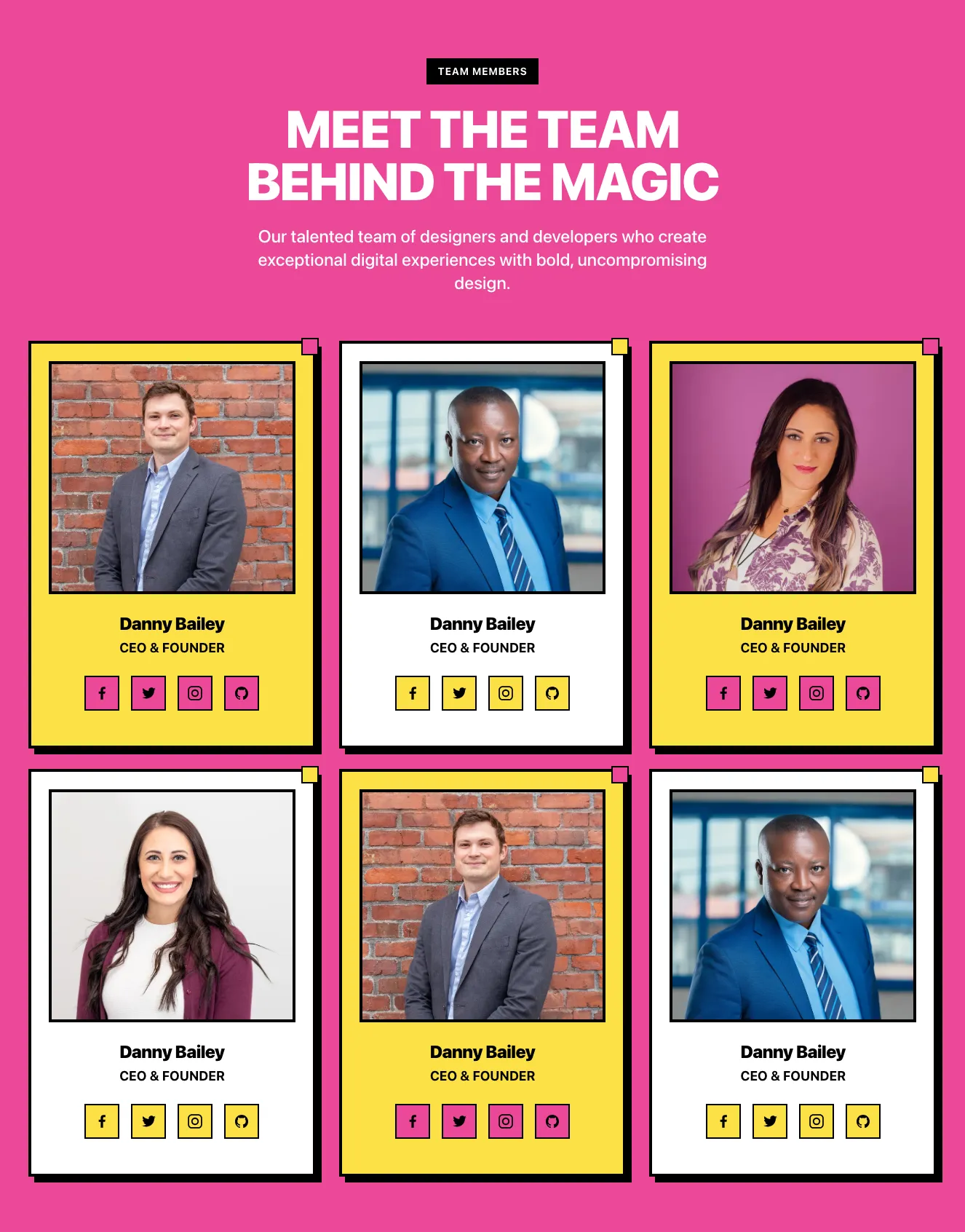
<span class="inline-block px-4 py-2 bg-yellow-300 text-black font-bold text-sm tracking-wider uppercase">MEET THE TEAM</span>
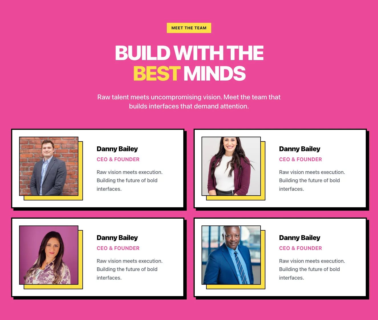
<h2 class="mt-8 mb-8 text-5xl sm:text-6xl lg:text-7xl leading-tight font-black font-heading tracking-tighter text-white">BUILD WITH THE <span class="text-yellow-300">BEST</span> MINDS</h2>
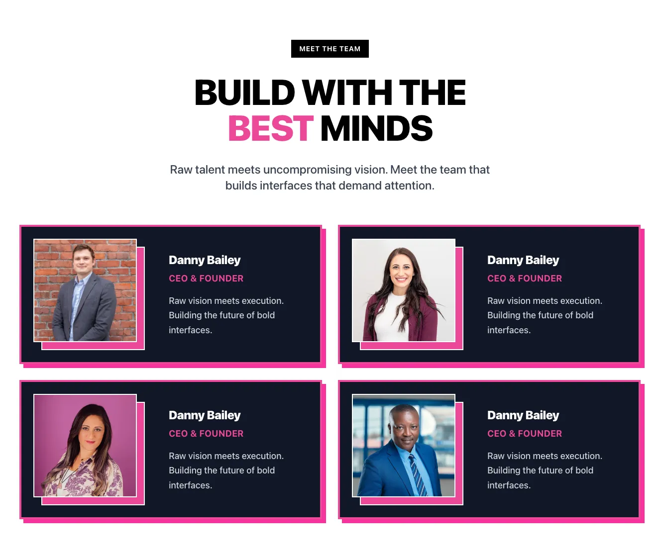
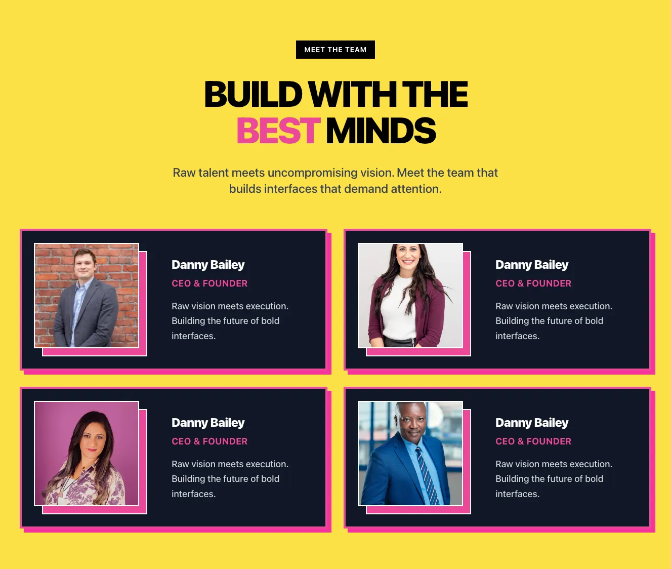
<p class="text-lg sm:text-xl lg:text-2xl leading-tight text-white font-medium max-w-xl md:max-w-2xl mx-auto">Raw talent meets uncompromising vision. Meet the team that builds interfaces that
demand attention.</p>
</div>
<div class="max-w-md lg:max-w-3xl mx-auto xl:max-w-none">
<div class="flex flex-wrap -m-4">
<div class="w-full xl:w-1/2 p-4">
<div class="bg-white p-8 border-4 border-black shadow-[8px_8px_0px_0px_#000000]">
<div class="flex flex-wrap lg:flex-nowrap items-center -mx-4">
<div class="w-full md:w-auto px-4 pl-10 lg:pl-4 mb-12 lg:mb-0">
<div class="relative w-52 h-52">
<div class="absolute inset-0 translate-x-2 translate-y-2 bg-yellow-300 w-52 h-52 border-2 border-black">
</div>
<img class="absolute inset-0 -translate-x-2 -translate-y-2 w-52 h-52 object-cover border-2 border-black bg-black" src="https://images.unsplash.com/photo-1627161684458-a62da52b51c3?q=80&w=849&auto=format&fit=crop&ixlib=rb-4.1.0&ixid=M3wxMjA3fDB8MHxwaG90by1wYWdlfHx8fGVufDB8fHx8fA%3D%3D" alt="">
</div>
</div>
<div class="w-full md:w-auto px-4">
<div class="pl-6">
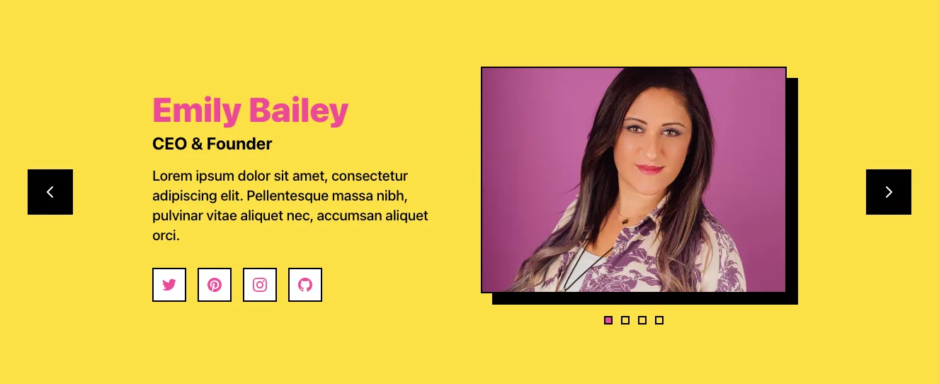
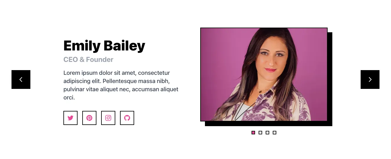
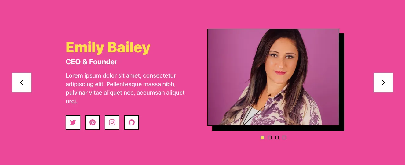
<h3 class="text-2xl font-black font-heading text-black mb-2 tracking-tight">Danny
Bailey</h3>
<p class="mb-4 text-lg text-pink-500 font-bold tracking-wide uppercase">
CEO & Founder</p>
<p class="text-lg text-gray-600 leading-relaxed font-medium">Raw vision
meets execution. Building the future of bold interfaces.</p>
</div>
</div>
</div>
</div>
</div>
<div class="w-full xl:w-1/2 p-4">
<div class="bg-white p-8 border-4 border-black shadow-[8px_8px_0px_0px_#000000]">
<div class="flex flex-wrap lg:flex-nowrap items-center -mx-4">
<div class="w-full md:w-auto px-4 pl-10 lg:pl-4 mb-12 lg:mb-0">
<div class="relative w-52 h-52">
<div class="absolute inset-0 translate-x-2 translate-y-2 bg-yellow-300 w-52 h-52 border-2 border-black">
</div>
<img class="absolute inset-0 -translate-x-2 -translate-y-2 w-52 h-52 object-cover border-2 border-black bg-black" src="https://images.unsplash.com/photo-1627161683077-e34782c24d81?q=80&w=703&auto=format&fit=crop&ixlib=rb-4.1.0&ixid=M3wxMjA3fDB8MHxwaG90by1wYWdlfHx8fGVufDB8fHx8fA%3D%3D" alt="">
</div>
</div>
<div class="w-full md:w-auto px-4">
<div class="pl-6">
<h3 class="text-2xl font-black font-heading text-black mb-2 tracking-tight">Danny
Bailey</h3>
<p class="mb-4 text-lg text-pink-500 font-bold tracking-wide uppercase">
CEO & Founder</p>
<p class="text-lg text-gray-600 leading-relaxed font-medium">Raw vision
meets execution. Building the future of bold interfaces.</p>
</div>
</div>
</div>
</div>
</div>
<div class="w-full xl:w-1/2 p-4">
<div class="bg-white p-8 border-4 border-black shadow-[8px_8px_0px_0px_#000000]">
<div class="flex flex-wrap lg:flex-nowrap items-center -mx-4">
<div class="w-full md:w-auto px-4 pl-10 lg:pl-4 mb-12 lg:mb-0">
<div class="relative w-52 h-52">
<div class="absolute inset-0 translate-x-2 translate-y-2 bg-yellow-300 w-52 h-52 border-2 border-black">
</div>
<img class="absolute inset-0 -translate-x-2 -translate-y-2 w-52 h-52 object-cover border-2 border-black bg-black" src="https://images.unsplash.com/photo-1551831600-00661f324319?q=80&w=687&auto=format&fit=crop&ixlib=rb-4.1.0&ixid=M3wxMjA3fDB8MHxwaG90by1wYWdlfHx8fGVufDB8fHx8fA%3D%3D" alt="">
</div>
</div>
<div class="w-full md:w-auto px-4">
<div class="pl-6">
<h3 class="text-2xl font-black font-heading text-black mb-2 tracking-tight">Danny
Bailey</h3>
<p class="mb-4 text-lg text-pink-500 font-bold tracking-wide uppercase">
CEO & Founder</p>
<p class="text-lg text-gray-600 leading-relaxed font-medium">Raw vision
meets execution. Building the future of bold interfaces.</p>
</div>
</div>
</div>
</div>
</div>
<div class="w-full xl:w-1/2 p-4">
<div class="bg-white p-8 border-4 border-black shadow-[8px_8px_0px_0px_#000000]">
<div class="flex flex-wrap lg:flex-nowrap items-center -mx-4">
<div class="w-full md:w-auto px-4 pl-10 lg:pl-4 mb-12 lg:mb-0">
<div class="relative w-52 h-52">
<div class="absolute inset-0 translate-x-2 translate-y-2 bg-yellow-300 w-52 h-52 border-2 border-black">
</div>
<img class="absolute inset-0 -translate-x-2 -translate-y-2 w-52 h-52 object-cover border-2 border-black bg-black" src="https://images.unsplash.com/photo-1666866868698-67ee989fba70?q=80&w=747&auto=format&fit=crop&ixlib=rb-4.1.0&ixid=M3wxMjA3fDB8MHxwaG90by1wYWdlfHx8fGVufDB8fHx8fA%3D%3D" alt="">
</div>
</div>
<div class="w-full md:w-auto px-4">
<div class="pl-6">
<h3 class="text-2xl font-black font-heading text-black mb-2 tracking-tight">Danny
Bailey</h3>
<p class="mb-4 text-lg text-pink-500 font-bold tracking-wide uppercase">
CEO & Founder</p>
<p class="text-lg text-gray-600 leading-relaxed font-medium">Raw vision
meets execution. Building the future of bold interfaces.</p>
</div>
</div>
</div>
</div>
</div>
</div>
</div>
</div>
</section>
Can't find the right component?
Describe it and Shuffle AI builds it in seconds, ready to edit and export.
Free to start
Generate with AI