Redirecting to PayPal

Tailwind CSS Team Components

Browse 208 ready-made Tailwind CSS team components from multiple UI libraries. Every variant is fully responsive – copy the code or customize it in the visual editor and export clean code.

Team from Saturn

Tailwind Team Component

Amazing Team Section with 8 Member Cards

A team introduction section with a heading, short subtitle, and a 4-column grid of eight white cards, each showing a colored-background portrait, name, and job title. The layout is a neutral, light-background grid with a serif italic accent word in the heading.

Team component #1
Team component #2
Team component #3
Team component #4
Team component #5

Team from DarkPro

Tailwind Team Component

Team Member Card Grid with Headshots on Dark Background

A dark-themed section with a centered eyebrow label, heading, and intro paragraph above a two-by-two grid of team member cards. Each card pairs a framed headshot with a name, role, and short bio on a purple-gradient panel.

Team component #1
Team component #2
Team component #3
Team component #4
Team component #5

Team from Flaro

Tailwind Team Component

Team Member Card Row with Intro Card

A horizontal row of three tall rounded cards: a solid indigo intro card titled 'Who We Are' with body text and a white call-to-action button, followed by two photo cards showing team members Leslie Alexander and Jenny Wilson with their names and 'Co-Founder, CEO' roles overlaid on gradient fades.

Team component #1
Team component #2
Team component #3
Team component #4
Team component #5
Team component #6

Your next website starts here

Design with AI and generate multiple website concepts in minutes. Make it yours with Shuffle: tweak every detail in a visual editor.

EXPORT CODE TO THE TECH YOU LOVE

Team from Gradia

Tailwind Team Component

Team Section with Headshots and Bios

A light-background team section titled "Our happy team" with a short subtitle and a two-column grid of four members, each showing a circular headshot alongside placeholder bio text and a bold name and role. The layout alternates image position left and right across rows, and the section uses no visible CTA or interactive controls.

Team component #1
Team component #2
Team component #3
Team component #4
Team component #5
Team component #6

Team from Zanrly

Tailwind Team Component

Dark Team Member Card Grid with Social Links

A dark-themed "Our Team" section showing three identical team member cards in a row, each with a portrait photo, name, role, and social media icon buttons. Section heading and eyebrow label sit centered above the grid.

Team component #1
Team component #2
Team component #3
Team component #4
Team component #5
Team component #6
Team component #7
Team component #8
Team component #9
Team component #10
Team component #11
Team component #12
Team component #13
Team component #14
Team component #15
Team component #16
Team component #17
Team component #18
Team component #19
Team component #20
Team component #21
Team component #22
Team component #23
Team component #24
Team component #25
Team component #26
Team component #27
Team component #28
Team component #29
Team component #30
Team component #31
Team component #32
Team component #33
Team component #34
Team component #35
Team component #36
Team component #37
Team component #38
Team component #39
Team component #40

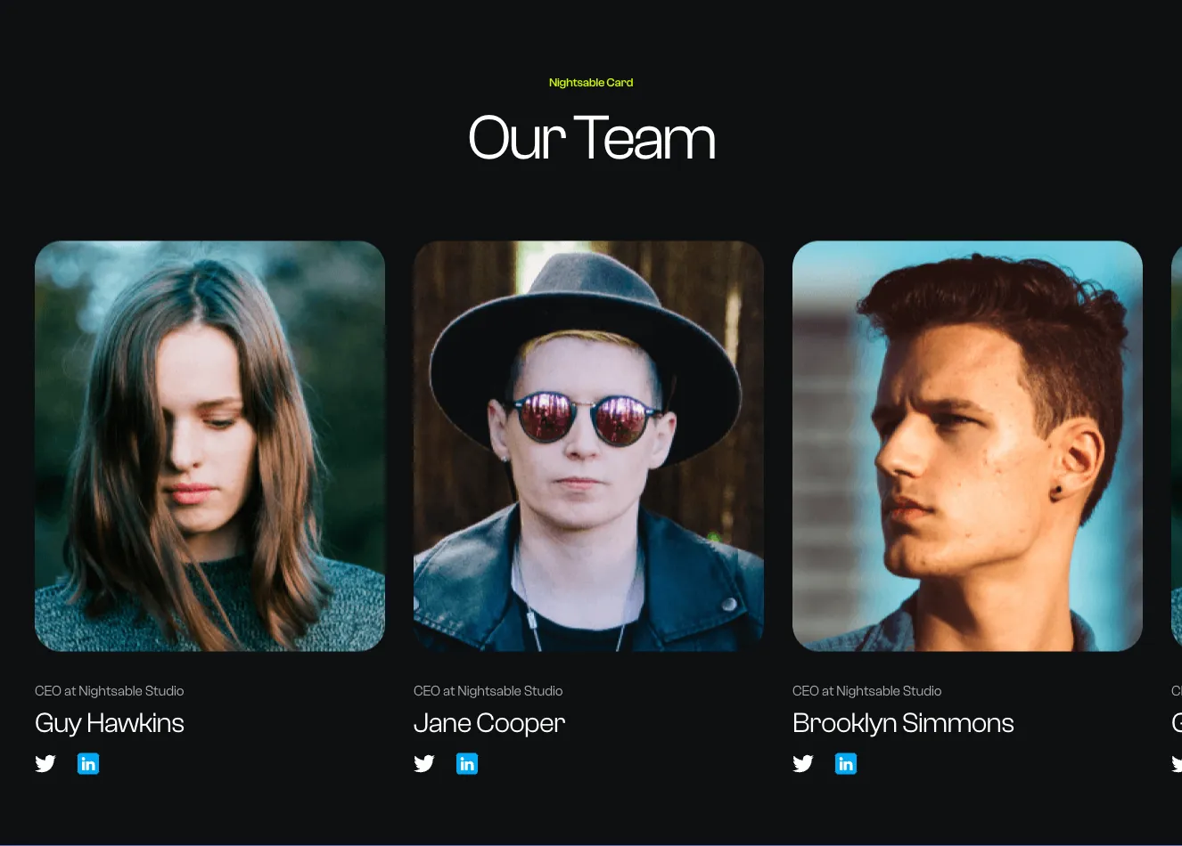
Team from Nightsable

Tailwind Team Component

Dark Team Member Card Grid with Circular Avatars

A dark-themed "Our Team" section displaying six team members in a three-column grid, each with a circular portrait, role label, and name. The layout is centered with a small green eyebrow label above the heading, and no interactive controls are visible.

Team component #1
Team component #2
Team component #3
Team component #4
Team component #5

Team from Zeus

Tailwind Team Component

Hero Heading with Team Member Card Grid

A centered marketing header with an eyebrow label, bold two-line heading, and gray intro paragraph, followed by a two-column grid of four team member cards. Each card pairs a rounded portrait photo with a name, role, and body text.

Team component #1
Team component #2
Team component #3
Team component #4
Team component #5

Team from Zospace

Tailwind Team Component

Dark Team Member Card Grid with Staggered Portraits

A dark-themed "Our Team" section showing three staff members with portrait photos above blue cards containing names, roles, and arrow links, with a centered outlined "More" button below. The cards are staggered vertically, with the middle card offset lower than the flanking cards.

Team component #1
Team component #2
Team component #3
Team component #4
Team component #5

Team from Wrexa

Tailwind Team Component

Creative Team Section with Quote and Staggered Team Member Cards

A light-background team showcase section with a large quotation at top and three staggered white cards below, each showing a circular avatar, role label, name, and a teal Learn More link. The cards are offset vertically to create a rhythm across a faint arc-shaped background line.

Team component #1
Team component #2
Team component #3
Team component #4
Team component #5
Team component #6

Team from Flex

Tailwind Team Component

Team Section with Eight Member Profile Cards

A team introduction section with a small TEAM label, a bold heading and subtitle, followed by a two-row, four-column grid of member cards showing circular photos, names, green job titles, short quotes, and social icons. The layout uses a light background with a subtle grid texture and wavy top and bottom edges.

Team component #1
Team component #2
Team component #3
Team component #4
Team component #5
Team component #6
Team component #7
Team component #8
Team component #9
Team component #10
Team component #11
Team component #12
Team component #13
Team component #14
Team component #15
Team component #16
Team component #17
Team component #18
Team component #19
Team component #20
Team component #21
Team component #22
Team component #23
Team component #24
Team component #25
Team component #26
Team component #27
Team component #28
Team component #29
Team component #30
Team component #31
Team component #32
Team component #33
Team component #34
Team component #35

Team from Uinel

Tailwind Team Component

Split Team Cards and Testimonial Carousel Section

A light-background two-column section with a team member card carousel on the left (Team heading, role badges, prev/next arrows) and a customer testimonial carousel on the right (Opinion heading, quote text, author with avatar, progress bar). Content is centered within each column, separated by a dashed vertical divider.

Team component #1
Team component #2
Team component #3
Team component #4
Team component #5
Team component #6
Team component #7
Team component #8

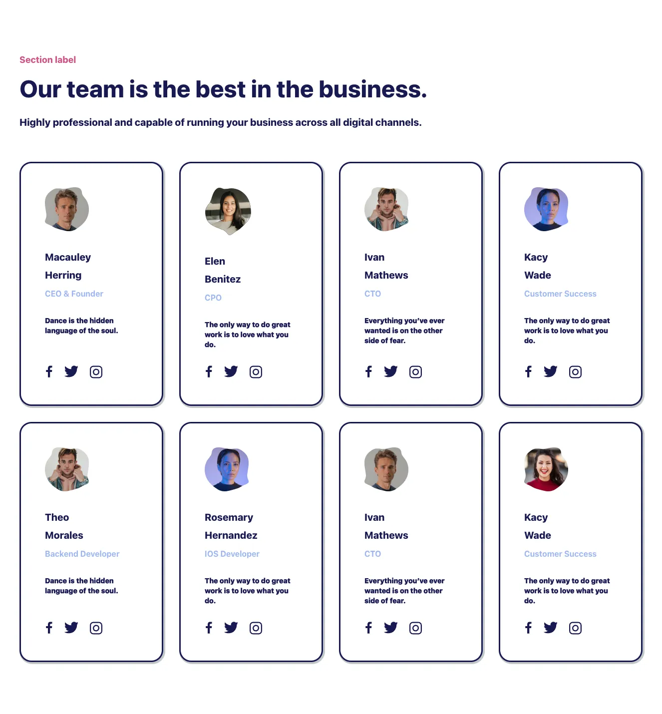
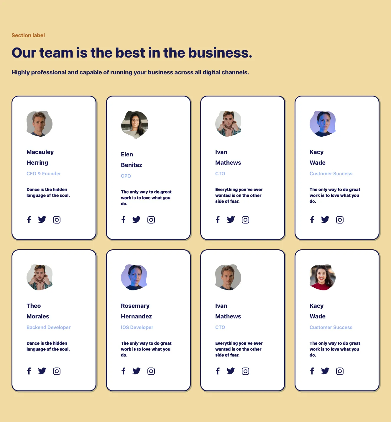
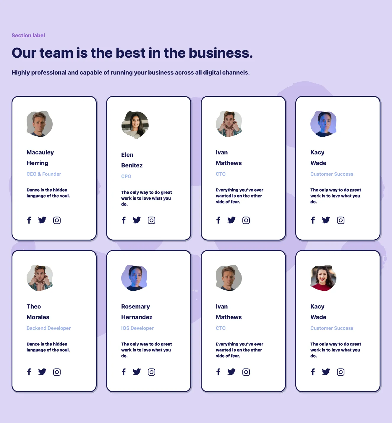
Team from Nigodo

Tailwind Team Component

Team member card grid with section heading

A marketing section with an eyebrow label, large heading, and subheading above an 8-card grid of team members. Each card shows a blob-cropped headshot, name, role, short quote, and social icons, arranged in a 4-column grid with navy outlined cards.

Team component #1
Team component #2
Team component #3
Team component #4
Team component #5
Team component #6
Team component #7
Team component #8
Team component #9
Team component #10
Team component #11
Team component #12
Team component #13
Team component #14
Team component #15
Team component #16
Team component #17
Team component #18
Team component #19
Team component #20
Team component #21
Team component #22
Team component #23
Team component #24
Team component #25
Team component #26
Team component #27
Team component #28
Team component #29
Team component #30
Team component #31
Team component #32
Team component #33
Team component #34
Team component #35
Team component #36
Team component #37
Team component #38
Team component #39
Team component #40
Team component #41
Team component #42
Team component #43
Team component #44
Team component #45
Team component #46
Team component #47
Team component #48
Team component #49
Team component #50
Team component #51
Team component #52
Team component #53
Team component #54
Team component #55
Team component #56
Team component #57
Team component #58
Team component #59
Team component #60
Team component #61
Team component #62
Team component #63
Team component #64
Team component #65
Team component #66
Team component #67
Team component #68
Team component #69
Team component #70
Team component #71
Team component #72
Team component #73
Team component #74
Team component #75
Team component #76
Team component #77
Team component #78
Team component #79
Team component #80
Team component #81
Team component #82
Team component #83
Team component #84
Team component #85
Team component #86
Team component #87
Team component #88
Team component #89
Team component #90
Team component #91
Team component #92
Team component #93
Team component #94
Team component #95
Team component #96
Team component #97
Team component #98
Team component #99
Team component #100
Team component #101
Team component #102
Team component #103
Team component #104
Team component #105
Team component #106
Team component #107
Team component #108
Team component #109
Team component #110
Team component #111
Team component #112
Team component #113
Team component #114
Team component #115
Team component #116
Team component #117
Team component #118
Team component #119
Team component #120
Team component #121
Team component #122
Team component #123
Team component #124
Team component #125
Team component #126
Team component #127
Team component #128

Team from Atis

Tailwind Team Component
Team component #1
Team component #2
Team component #3
Team component #4
Team component #5
Team component #6
Team component #7
Team component #8
Team component #9
Team component #10
Team component #11
Team component #12
Team component #13
Team component #14
Team component #15
Team component #16
Team component #17
Team component #18

Team from Pstls.

Tailwind Team Component

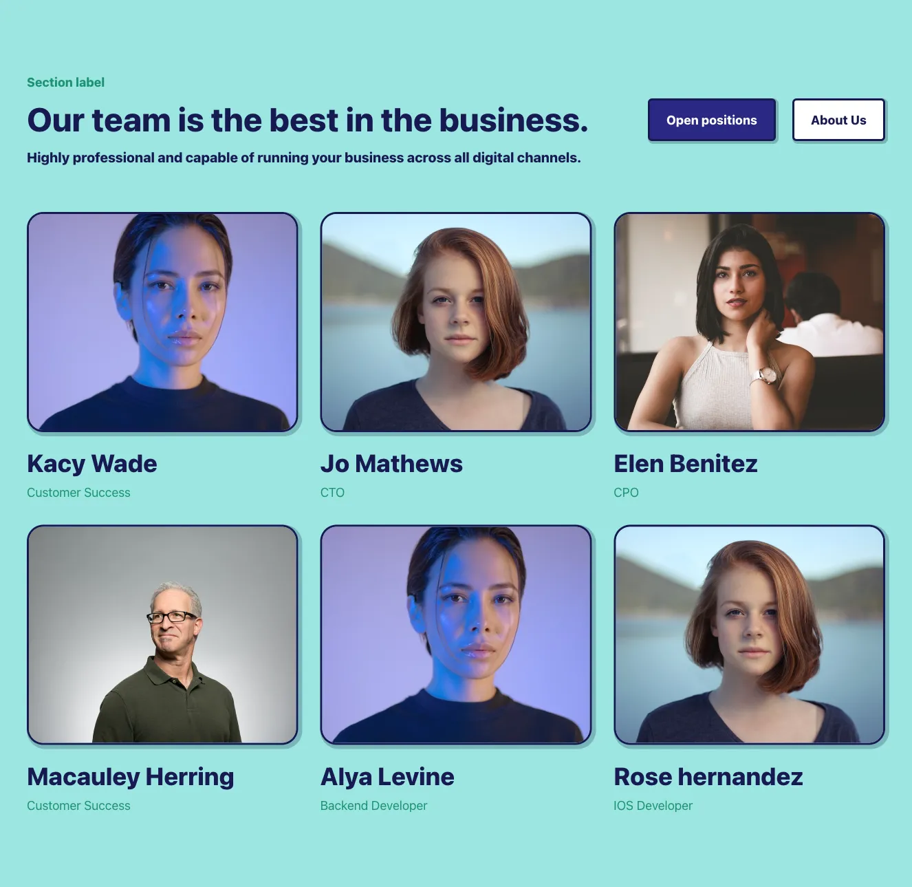
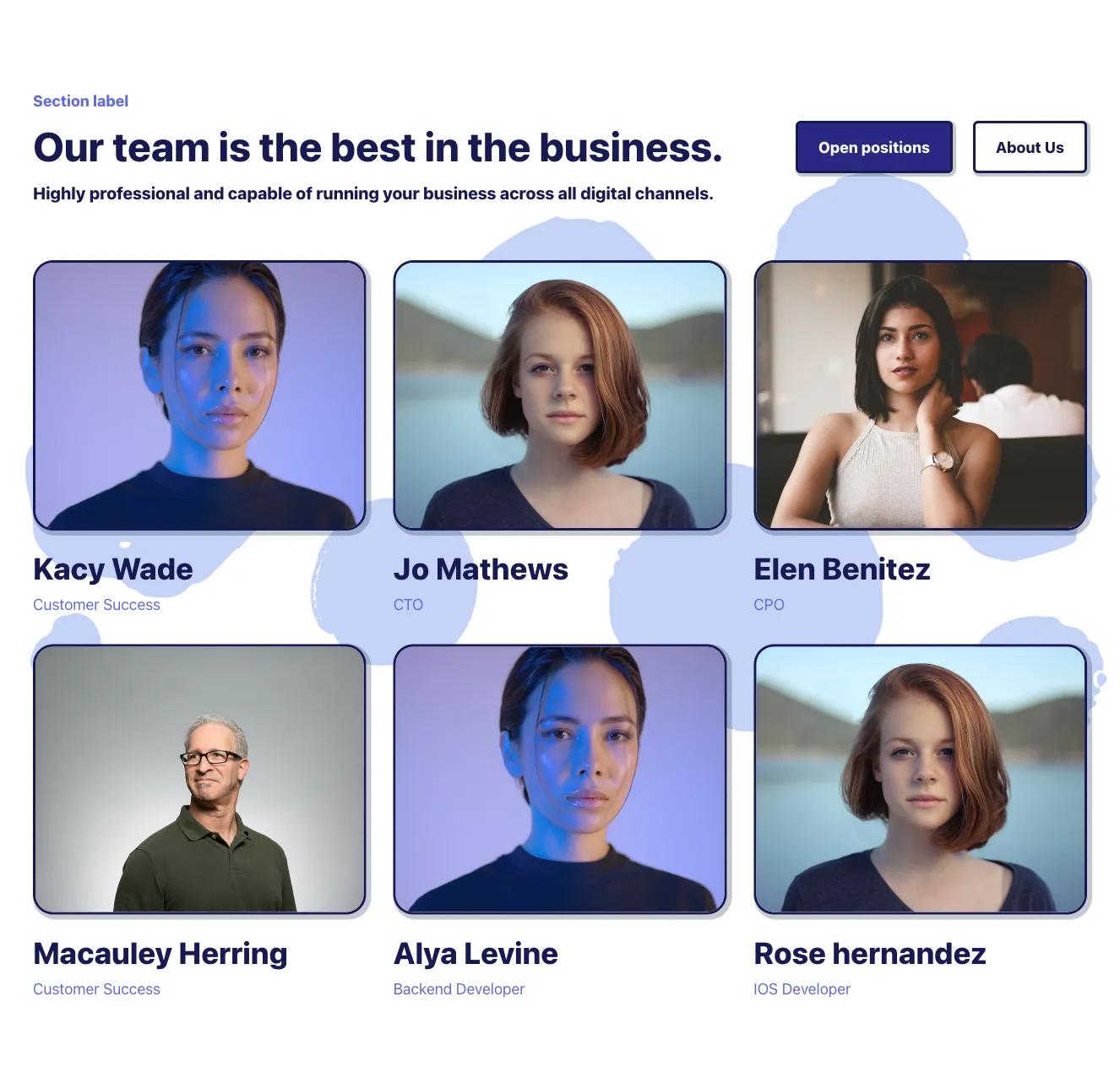
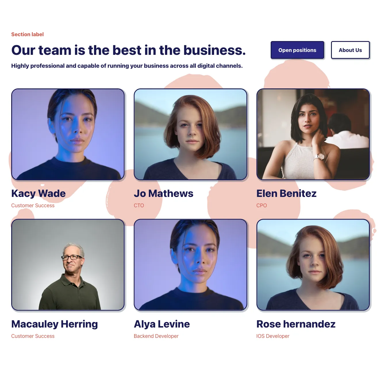
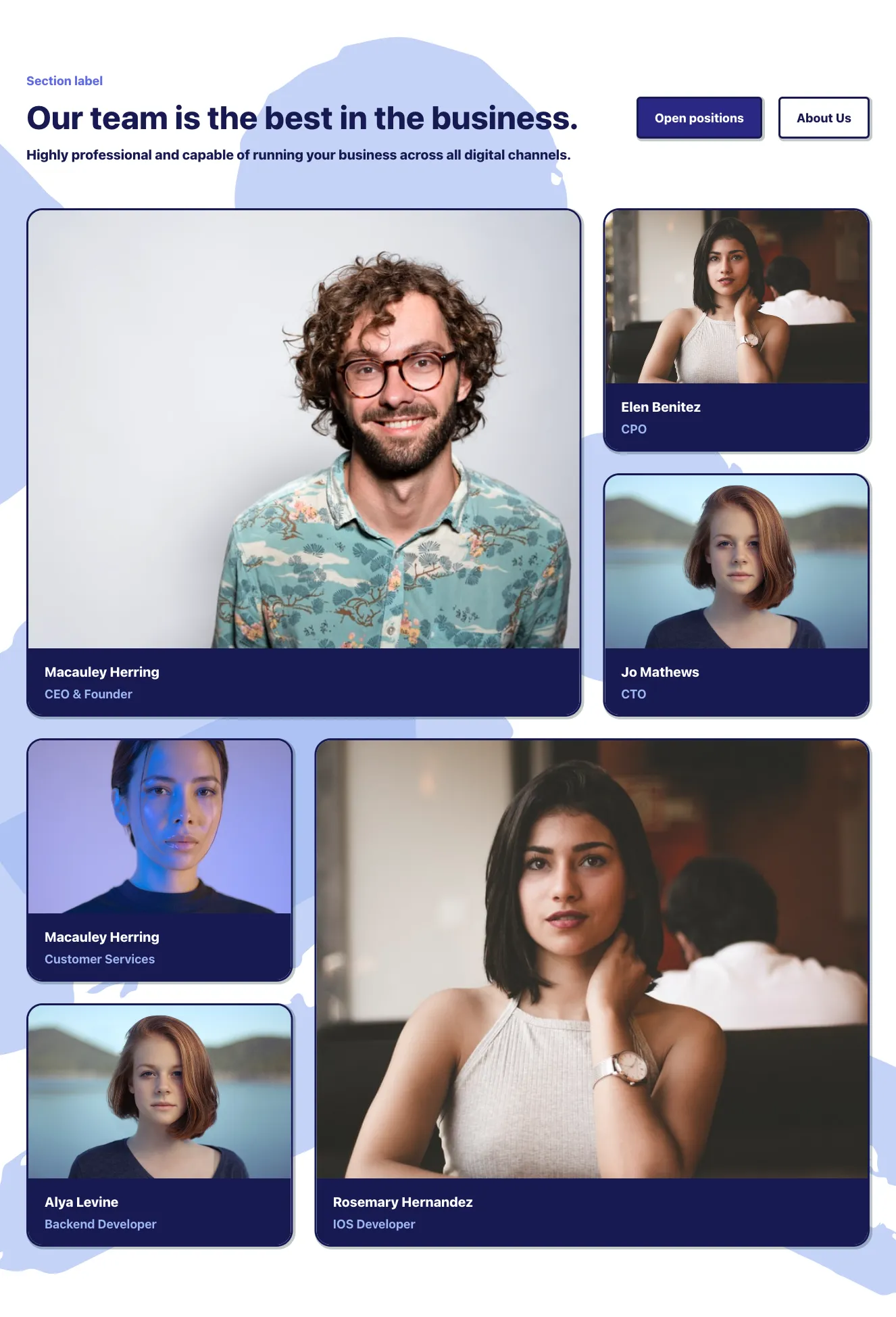
Team Member Card Grid with Serif Heading

A marketing team section with a large serif 'Team' heading and intro paragraph above a 3-column grid of six team member cards, each showing a portrait photo, name, and job title. Pastel offset background blocks sit behind the photos for a layered effect.

Team component #1
Team component #2
Team component #3
Team component #4

Team from BoldUI

Tailwind Team Component

Dark Team Member Grid with Tilted Portrait Shapes

A dark-background team section with a small blue eyebrow label, a centered uppercase heading, and a 3x2 grid of team member portraits set in colored tilted oval shapes. Each card shows a name in bold white and a muted uppercase job title beneath it.

Team component #1
Team component #2
Team component #3
Team component #4
Team component #5

Team from Acros

Tailwind Team Component

Team Section with Heading and 2x2 Member Card Grid

A team introduction section with an eyebrow label, serif heading, and short paragraph on the left, and a two-by-two grid of team member cards on the right. Each card shows a photo, name, role, and three social icon buttons.

Team component #1
Team component #2
Team component #3
Team component #4
Team component #5

Team from Bendis

Tailwind Team Component

Team Member Card Grid with Slanted Photos

A two-by-two grid of team member cards, each showing a name, role, short lorem ipsum bio, and a slanted-edge portrait photo on a light background. A centered eyebrow label and bold heading with supporting paragraph introduce the section.

Team component #1
Team component #2
Team component #3
Team component #4
Team component #5
Team component #6
Team component #7
Team component #8
Team component #9

Team from Metis

Tailwind Team Component

Team Section with Heading and Member Avatar Grid

A split-layout team section with a pill label, large heading, and supporting paragraph on the left, and a two-column grid of circular avatar photos with names and job titles on the right. The design is light and minimal with generous whitespace and no interactive controls visible.

Team component #1
Team component #2
Team component #3
Team component #4
Team component #5

Team from Shuffle UX

Tailwind Team Component

Team Member Card Grid with Headline Intro

A light-background section with a centered eyebrow label, two-line bold heading, and intro paragraph above a 2x2 grid of team member cards. Each card pairs a gray image placeholder with a name, role, and short bio text.

Team component #1
Team component #2
Team component #3
Team component #4
Team component #5

Team from Cronos

Tailwind Team Component

Team Member Card Grid with Section Heading

A centered section with a small badge label, large heading, and intro paragraph above a two-by-two grid of team member cards. Each card pairs a photo with a green name, bold role title, and gray placeholder bio text.

Team component #1
Team component #2
Team component #3
Team component #4
Team component #5

Show team members in an attractive and interesting way. Our UI libraries contain many variations of Tailwind teams components. Showing the entire team or its key figures builds credibility and attests to the professionalism of the company. It is easier to trust a specific person than a little-known and impersonal organization.


In this mode, you will see versions of the Tailwind teams components that are available within our UI libraries. You will also find many other types of components that will be in the same theme. Our UI libraries are prepared by experienced designers and the code underneath them is created by an in-house team of developers. 


Get access to all Tailwind teams components, code and our editor. Try the demo for free.

The easiest way to create beautiful websites

Lifetime License

Create an account

OR USE EMAIL

We issue VAT invoices. Already have an account? Sign in

Why creators choose Shuffle

From idea to beautiful design in minutes.

Shuffle pairs an AI visual editor with 80+ UI libraries, so you can design, build and export production‑ready code without starting from scratch.

  • An AI Agent that builds with you Describe a page, watch it come to life, then fine-tune it visually or with a prompt.
  • Pick the best model for every task GPT-6 Astra, Claude Opus 5.5 and Gemini 3.8 in one place.
  • 13,400+ professionally designed components Prefer building by hand? Drag in pixel-perfect sections crafted by professional designers.
  • Export to the stack you love Tailwind CSS, Bootstrap, Next.js, Laravel, WordPress and beyond.
“Its AI-powered features have transformed how I work! Designing and building websites has become faster, easier, and far more efficient.”
Est. 2019
Helping web builders ship since 2019 7 years of steady development.

Make it yours with AI

Start with this component. Tell AI what to change.

Original
Preview the original component.
Your Version
Available when your generation is complete.
Code
Available when your generation is complete.
Original component

Add images & videos

Upload an asset, then tell AI how to use it.

How it works

Your uploaded file will be added directly to the generated component. After uploading, you can guide the AI on where exactly to use it, e.g. as a logo or as a section image.

© 2026 Shuffle. All rights reserved.