Can't find the right component?
Describe it and Shuffle AI builds it in seconds, ready to edit and export.
Browse 178 ready-made Tailwind CSS e-commerce (products) components from multiple UI libraries. Every variant is fully responsive – copy the code or customize it in the visual editor and export clean code.
Create a free account to copy production-ready code from every component in the library.
Free account · No credit card · No password needed
Already have an account? Sign in
Components are just the start. See how a project goes from prompt to production‑ready code with Shuffle.
A ecommerce product listing page titled "New in" showing a filter bar (Category, Size, Colors, Price, Brand), a 4-column grid of product cards with images, names, and blue prices, and a "More products" button at the bottom. Light background with minimal white cards.
Create a free account to copy production-ready code from every component in the library.
Free account · No credit card · No password needed
Already have an account? Sign in
Components are just the start. See how a project goes from prompt to production‑ready code with Shuffle.
A product detail layout showing a main product image with thumbnail gallery on the left and product name, star rating, price, quantity and size selectors, add-to-cart button, and share icons on the right. Tabs for description, reviews, shipping, and brand appear below.
Create a free account to copy production-ready code from every component in the library.
Free account · No credit card · No password needed
Already have an account? Sign in
Components are just the start. See how a project goes from prompt to production‑ready code with Shuffle.
A shopping results page showing a 3-column grid of product cards with image, title, and price, paired with a left filter sidebar for category, color, delivery method, price, size, and localization. A results header with sort dropdown and grid/list view toggle sits above the grid, and a Show more button ends the list.
Create a free account to copy production-ready code from every component in the library.
Free account · No credit card · No password needed
Already have an account? Sign in
Components are just the start. See how a project goes from prompt to production‑ready code with Shuffle.
A light-background section headed "Categories" with a short subtitle, showing six white rounded cards in a 3-column grid, each with a colored icon circle and label, followed by a centered dark pill "Show more" button. It presents category or feature options rather than promoting an app or purchase.
Create a free account to copy production-ready code from every component in the library.
Free account · No credit card · No password needed
Already have an account? Sign in
Components are just the start. See how a project goes from prompt to production‑ready code with Shuffle.
An ecommerce product detail section showing a large product image with thumbnail gallery, title, rating, price, size and color selectors, and an Add To Cart button, followed by a Recently Added section with three product cards showing badges, wishlist icons, and prices.
Create a free account to copy production-ready code from every component in the library.
Free account · No credit card · No password needed
Already have an account? Sign in
Components are just the start. See how a project goes from prompt to production‑ready code with Shuffle.
A dark-themed product listing section headed by a 'Trending' label and 'The best of the best' heading, showing four product cards in a horizontal row. Each card displays a product photo on a white background, a price in a lime accent, and a product name.
Create a free account to copy production-ready code from every component in the library.
Free account · No credit card · No password needed
Already have an account? Sign in
Components are just the start. See how a project goes from prompt to production‑ready code with Shuffle.
A product search results page showing a filter sidebar on the left (categories, color swatches, delivery checkboxes, size buttons, city and region fields, price slider) and a grid of product cards on the right with images, names, prices, and NEW/LIMITED/SALE badges. A sort dropdown and grid/list view toggle sit above the grid.
Show the benefits, photo, price and product description clearly. Well-designed Tailwind products components will allow you to draw your audience's attention to elements that encourage conversions.
Browse and choose one variant from Tailwind components products sections. They are part of UI library components created by our talented designers and coded by our development team.
Purchase a subscription to get access to the drag and drop editor, all UI libraries and code under each component.
How you’ll build with Shuffle.
© 2026 Shuffle. All rights reserved.
See what you're getting before you commit.
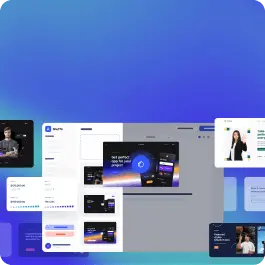
Switch the editor to Grid and every page of your project appears side by side on one canvas. Arrange them freely, zoom in and out, and add as many new pages as you need in a few clicks.
Describe what you need in one chat and the Agent does the rest: it adds new sections, edits copy and styles, moves blocks around or removes them across your whole page. No modes, no switching, just tell it what to change.
Not quite there yet? Ask for tweaks like missing assets, your logo or other details, and regenerate the design without starting from scratch.