Redirecting to PayPal

Tailwind CSS Testimonials Components

Browse 281 ready-made Tailwind CSS testimonials components from multiple UI libraries. Every variant is fully responsive – copy the code or customize it in the visual editor and export clean code.

Testimonials from Cronos

Tailwind Testimonials Component

Split-screen testimonial with portrait, quote, and pager dots

A two-column testimonial section with a framed portrait and decorative colored blocks on the left, and a large quote mark, bold heading, supporting text, and attribution for Danny Bailey, CEO & Founder, on the right. Pagination diamonds below the image suggest a rotating carousel.

Testimonials component #1
Testimonials component #2
Testimonials component #3
Testimonials component #4
Testimonials component #5

Testimonials from NEUB

Tailwind Testimonials Component

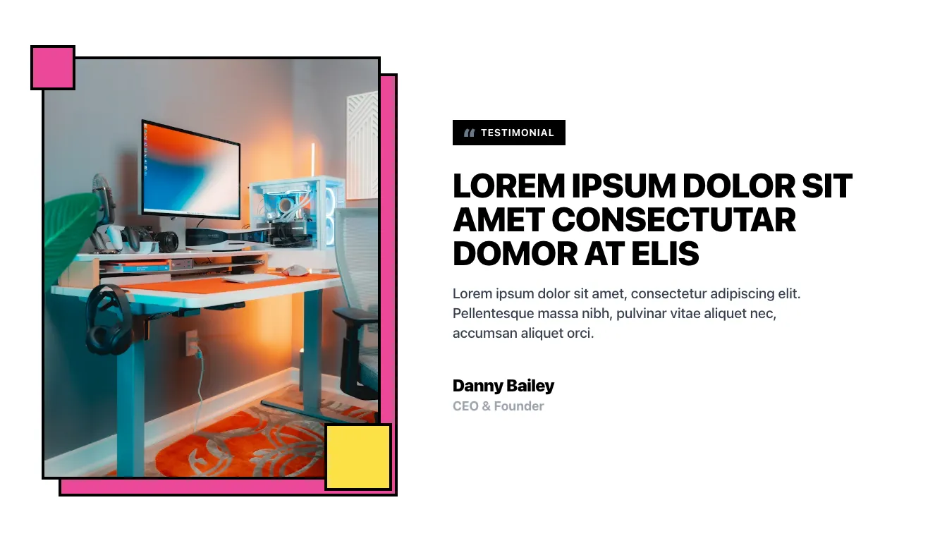
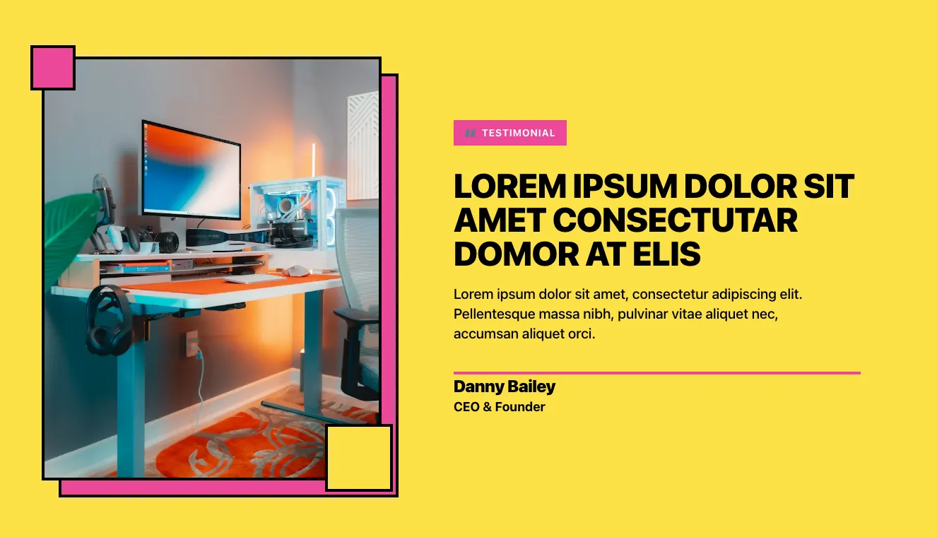
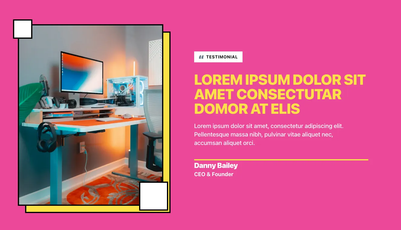
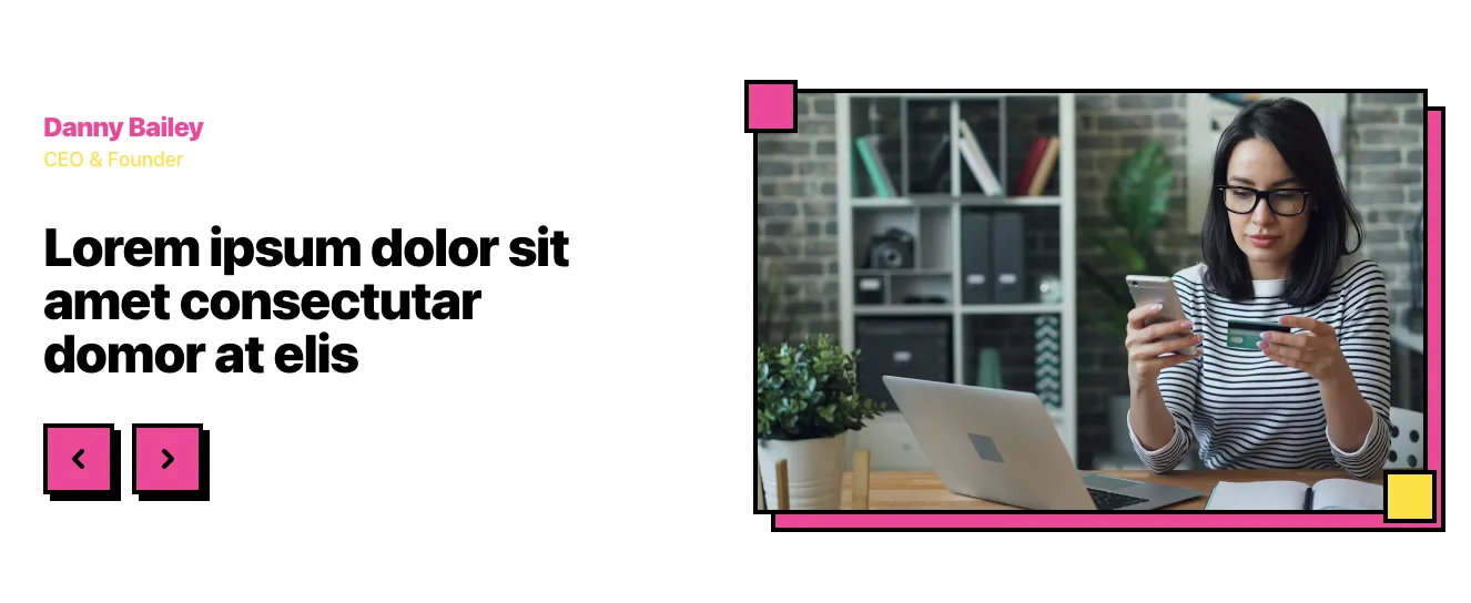
Testimonial Section with Office Desk Photo and Pink Offset Frame

A split-screen testimonial section with a framed photo of a desk setup on the left and a black "Testimonial" label, large uppercase heading, short body paragraph, and attributed name and title on the right. Decorative pink and yellow offset blocks with black outlines frame the image.

Testimonials component #1
Testimonials component #2
Testimonials component #3
Testimonials component #4
Testimonials component #5
Testimonials component #6
Testimonials component #7
Testimonials component #8
Testimonials component #9
Testimonials component #10
Testimonials component #11
Testimonials component #12
Testimonials component #13
Testimonials component #14
Testimonials component #15

Testimonials from Casper

Tailwind Testimonials Component

Dark Hero Section with Stacked Testimonial Cards and 3D Robot Mascot

A dark-themed hero section with a large heading claiming trust from over 100k people, supporting text, and a call-to-action button on the left, paired with a staggered stack of customer testimonial cards showing avatars, names, titles, five-star ratings, and quotes on the right. A decorative 3D robot character with a sword sits at the lower left.

Testimonials component #1
Testimonials component #2
Testimonials component #3
Testimonials component #4
Testimonials component #5
Testimonials component #6
Testimonials component #7
Testimonials component #8

Your next website starts here

Design with AI and generate multiple website concepts in minutes. Make it yours with Shuffle: tweak every detail in a visual editor.

EXPORT CODE TO THE TECH YOU LOVE

Testimonials from Mirga

Tailwind Testimonials Component

Testimonial Card with Carousel Navigation

A white rounded card titled Testimonials showing a single customer quote centered in an outlined box, with an avatar, name, and company beneath and previous/next arrow buttons at bottom right. The layout is a centered stack on a light gray background, presenting one review at a time.

Testimonials component #1
Testimonials component #2
Testimonials component #3
Testimonials component #4
Testimonials component #5

Testimonials from Flow

Tailwind Testimonials Component

Split-Screen Testimonial with Portrait and Carousel Arrows

A light testimonial section pairing a rounded portrait photo on the left with a large quotation, customer name, and service label on the right. Previous and next arrow controls sit below the quote, suggesting a testimonial slider.

Testimonials component #1
Testimonials component #2
Testimonials component #3
Testimonials component #4
Testimonials component #5
Testimonials component #6
Testimonials component #7
Testimonials component #8
Testimonials component #9
Testimonials component #10
Testimonials component #11
Testimonials component #12
Testimonials component #13
Testimonials component #14
Testimonials component #15

Testimonials from Vista

Tailwind Testimonials Component

Dark Testimonials Carousel with Pink Speech Bubble Quote

A centered testimonials section on a dark background with a small eyebrow label, a bold heading, a single pink speech-bubble quote card, and pagination indicators showing a multi-slide carousel. The quote card has a tail pointing downward and a dark offset shadow layer beneath it.

Testimonials component #1
Testimonials component #2
Testimonials component #3
Testimonials component #4
Testimonials component #5
Testimonials component #6
Testimonials component #7
Testimonials component #8
Testimonials component #9
Testimonials component #10
Testimonials component #11
Testimonials component #12
Testimonials component #13
Testimonials component #14
Testimonials component #15

Testimonials from Cyber

Tailwind Testimonials Component

Dark Quote Card with Portrait and Gradient Headline

A dark-themed testimonial-style section pairing a framed portrait photo on the left with a large gradient uppercase headline, monospaced body text, and a name and title attribution on the right. It has no visible navigation or form controls, and the layout is split into two columns.

Testimonials component #1
Testimonials component #2
Testimonials component #3
Testimonials component #4
Testimonials component #5

Testimonials from FilyTreck

Tailwind Testimonials Component

Testimonial Cards with Pros and Cons Lists

A testimonials section with a large heading and two side-by-side review cards, each showing a reviewer avatar, name, star rating, quote text, a green advantages list, and a gray defects list. Left and right arrow buttons sit at the edges for navigating between reviews.

Testimonials component #1
Testimonials component #2
Testimonials component #3
Testimonials component #4
Testimonials component #5

Testimonials from Aurora

Tailwind Testimonials Component

Testimonials Section with Three Customer Quote Cards

A centered testimonials section with a small pill label, a bold two-line heading, and three light cards each showing a company logo, a quote, and a founder avatar with name and title. The layout is a horizontal row of equal-width cards that builds trust through customer social proof.

Testimonials component #1
Testimonials component #2
Testimonials component #3
Testimonials component #4
Testimonials component #5
Testimonials component #6
Testimonials component #7
Testimonials component #8
Testimonials component #9
Testimonials component #10
Testimonials component #11
Testimonials component #12
Testimonials component #13
Testimonials component #14
Testimonials component #15
Testimonials component #16
Testimonials component #17
Testimonials component #18
Testimonials component #19
Testimonials component #20
Testimonials component #21
Testimonials component #22
Testimonials component #23
Testimonials component #24
Testimonials component #25

Testimonials from asitrastudio

Tailwind Testimonials Component

Centered testimonial carousel with quote, author attribution, and prev/next arrows

A light gray rounded container displaying a centered testimonial quote with a small pill label, author avatar with name and title, and circular previous and next arrow buttons. The layout is a vertically stacked, centered arrangement suitable for rotating customer or executive quotes.

Testimonials component #1
Testimonials component #2
Testimonials component #3
Testimonials component #4
Testimonials component #5

Testimonials from Coleos

Tailwind Testimonials Component

Split-screen testimonial with portrait photo and quote

A two-column testimonial section with a rounded portrait photograph on the left and a quote icon, large heading, lorem ipsum body text, and attribution for Danny Bailey, CEO & Founder, on the right. It uses a light background and builds trust through a personal endorsement.

Testimonials component #1
Testimonials component #2
Testimonials component #3
Testimonials component #4
Testimonials component #5
Testimonials component #6

Testimonials from Consulty

Tailwind Testimonials Component

Dark Testimonial Carousel with Quote Mark and Author Attribution

A centered testimonial slide on a black background showing a large quotation mark, a multi-line quote, a thin divider, and an avatar with name and job title. Circular previous and next arrow buttons flank the quote, suggesting a carousel control.

Testimonials component #1
Testimonials component #2
Testimonials component #3
Testimonials component #4
Testimonials component #5
Testimonials component #6
Testimonials component #7

Tailwind components testimonials showcase customer reviews of your product or service. Nothing says so much about them as feedback from other people. This type of message is more credible than marketing slogans. Add to it the image of the users and the possibility of confirming their reality. In this way, you will increase the chances of conversion from wary customers.


On this subpage, you can browse a variety of Tailwind testimonials component themes that are available within our UI libraries. You will also find many other types of components that will be in the same style. Each of these libraries has been prepared by experienced designers along with our in-house team of developers.


Get access to all Tailwind testimonials components, code and our editor. Test the editor demo for free.

The easiest way to create beautiful websites

Lifetime License

Create an account

OR USE EMAIL

We issue VAT invoices. Already have an account? Sign in

Why creators choose Shuffle

From idea to beautiful design in minutes.

Shuffle pairs an AI visual editor with 80+ UI libraries, so you can design, build and export production‑ready code without starting from scratch.

  • An AI Agent that builds with you Describe a page, watch it come to life, then fine-tune it visually or with a prompt.
  • Pick the best model for every task GPT-6 Astra, Claude Opus 5.5 and Gemini 3.8 in one place.
  • 13,400+ professionally designed components Prefer building by hand? Drag in pixel-perfect sections crafted by professional designers.
  • Export to the stack you love Tailwind CSS, Bootstrap, Next.js, Laravel, WordPress and beyond.
“Its AI-powered features have transformed how I work! Designing and building websites has become faster, easier, and far more efficient.”
Est. 2019
Helping web builders ship since 2019 7 years of steady development.

Make it yours with AI

Start with this component. Tell AI what to change.

Original
Preview the original component.
Your Version
Available when your generation is complete.
Code
Available when your generation is complete.
Original component

Add images & videos

Upload an asset, then tell AI how to use it.

How it works

Your uploaded file will be added directly to the generated component. After uploading, you can guide the AI on where exactly to use it, e.g. as a logo or as a section image.

© 2026 Shuffle. All rights reserved.