Can't find the right component?
Describe it and Shuffle AI builds it in seconds, ready to edit and export.
Browse 253 ready-made Tailwind CSS pricing components from multiple UI libraries. Every variant is fully responsive – copy the code or customize it in the visual editor and export clean code.
Create a free account to copy production-ready code from every component in the library.
Free account · No credit card · No password needed
Already have an account? Sign in
Components are just the start. See how a project goes from prompt to production‑ready code with Shuffle.
A pricing section with a centered heading, subtitle, and Monthly/Yearly billing tabs above three plan cards (Starter, Pro, Premium) listing features and an action button. The Pro card is highlighted with a dark slate background and inverted button.
Create a free account to copy production-ready code from every component in the library.
Free account · No credit card · No password needed
Already have an account? Sign in
Components are just the start. See how a project goes from prompt to production‑ready code with Shuffle.
A centered pricing section with a heading, subtitle, and Monthly/Yearly tabs above three plan cards (Starter, highlighted Starter, Premium) listing features and Start Now buttons. The middle card uses a dark teal background to emphasize the featured plan.
Create a free account to copy production-ready code from every component in the library.
Free account · No credit card · No password needed
Already have an account? Sign in
Components are just the start. See how a project goes from prompt to production‑ready code with Shuffle.
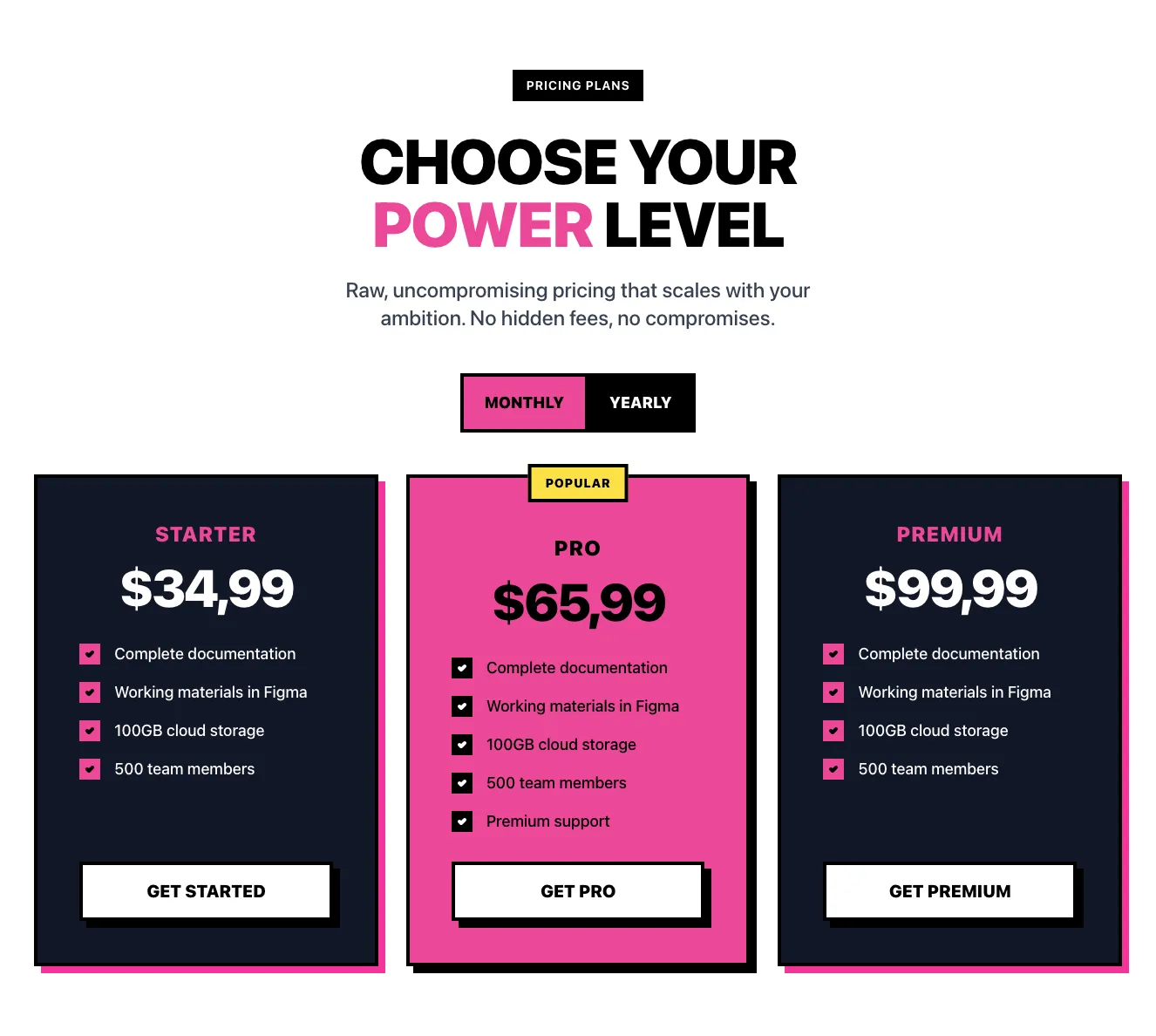
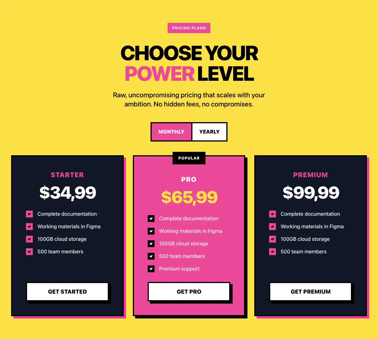
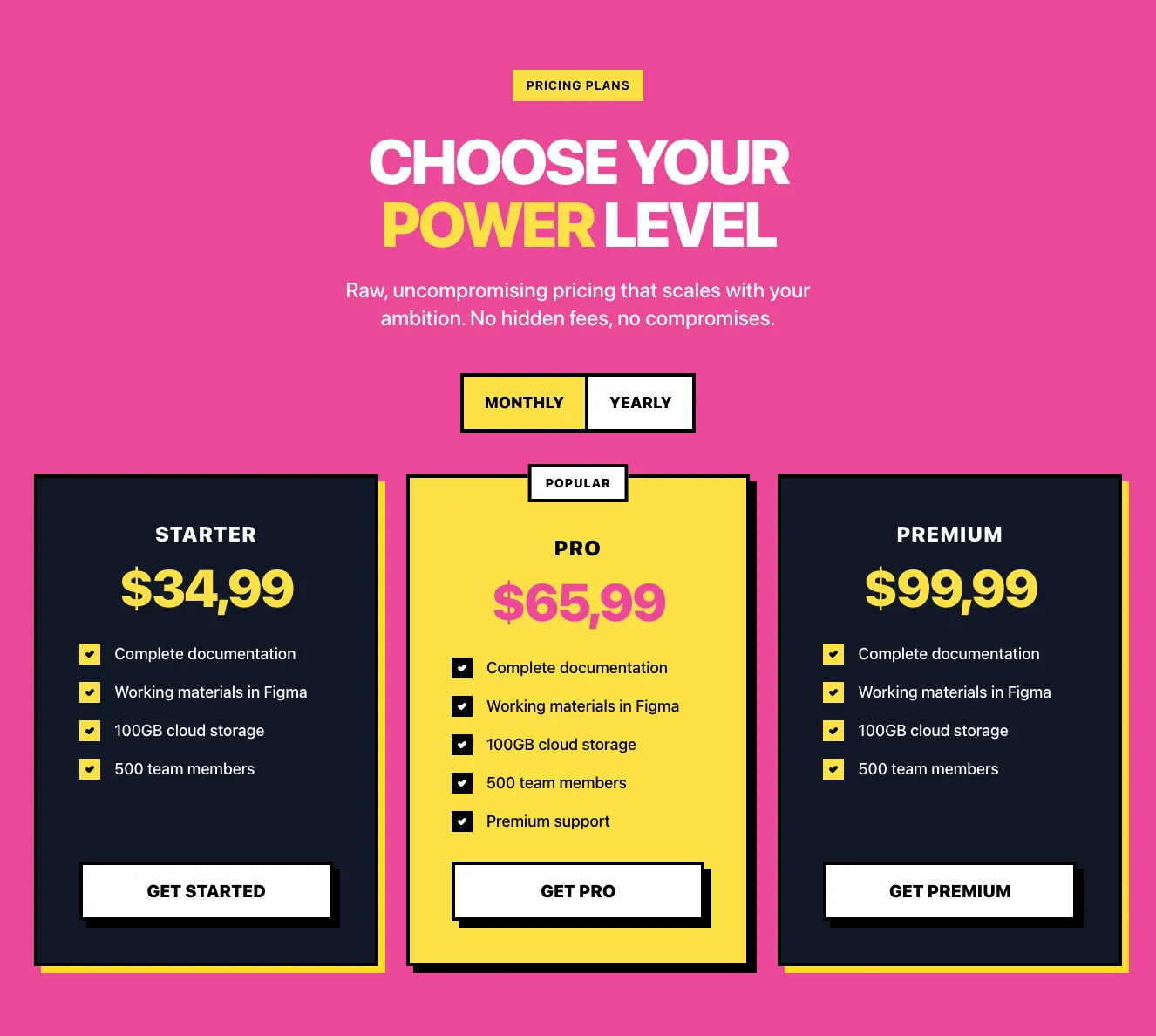
A marketing pricing section with a headline, monthly/yearly billing switch, and three plan cards (Starter, Pro, Premium) listing features and call-to-action buttons. The middle Pro card is highlighted in pink with a yellow Popular badge.
Create a free account to copy production-ready code from every component in the library.
Free account · No credit card · No password needed
Already have an account? Sign in
Components are just the start. See how a project goes from prompt to production‑ready code with Shuffle.
A dark-background pricing section titled "Choose Your Plan" with three white cards for Beginner, Intermediate, and Advanced tiers, each showing a price, feature checklist with check and cross icons, a purple CHOOSE PLAN button, and an illustrated 3D header image.
Create a free account to copy production-ready code from every component in the library.
Free account · No credit card · No password needed
Already have an account? Sign in
Components are just the start. See how a project goes from prompt to production‑ready code with Shuffle.
A dark-themed pricing section with a large heading and subtitle above a feature comparison layout. The left column lists features (Cloud storage, Users, Commercial rights) while two rounded plan cards labeled Starter and Professional show prices, /per mo labels, and checkmarked feature values.
Create a free account to copy production-ready code from every component in the library.
Free account · No credit card · No password needed
Already have an account? Sign in
Components are just the start. See how a project goes from prompt to production‑ready code with Shuffle.
A pricing section with a centered heading and subtext, a monthly billing toggle with an annual savings badge, and three plan cards (Premium, Basic, and a dark-highlighted Custom plan) each showing price or custom tier, a call-to-action button, and a checklist of included features.
Create a free account to copy production-ready code from every component in the library.
Free account · No credit card · No password needed
Already have an account? Sign in
Components are just the start. See how a project goes from prompt to production‑ready code with Shuffle.
A dark-themed pricing section with a centered heading, a Monthly/Yearly billing toggle, and three plan cards: Basic, Pro (highlighted with a red border and RECOMMENDED label), and Enterprise. Each card lists a price, a Get started button, and a feature list with icons.
Create a free account to copy production-ready code from every component in the library.
Free account · No credit card · No password needed
Already have an account? Sign in
Components are just the start. See how a project goes from prompt to production‑ready code with Shuffle.
A dark-themed pricing section headed by a gradient heading and monospace subtext, with a Monthly/Yearly toggle above three angled plan cards (Basic, Pro, Elite) listing prices, feature checklists, and call-to-action buttons. The center Pro card is highlighted with a purple border and a Premium badge.
Create a free account to copy production-ready code from every component in the library.
Free account · No credit card · No password needed
Already have an account? Sign in
Components are just the start. See how a project goes from prompt to production‑ready code with Shuffle.
A dark-themed pricing section that introduces three subscription plans (Starter, Enterprise, Business) in a three-column card grid, with a heading, supporting text, a customer avatar row, and a monthly/yearly billing switch. Each card lists its price, feature checklist, and a 'Choose a plan' call-to-action, with 'Most popular' highlighting the middle tier.
Create a free account to copy production-ready code from every component in the library.
Free account · No credit card · No password needed
Already have an account? Sign in
Components are just the start. See how a project goes from prompt to production‑ready code with Shuffle.
A dark-themed pricing section headed "Flexible pricing plan for your startup" with a Monthly/Yearly billing switch and three side-by-side plan cards (Starter, Team, Enterprise). The highlighted Team card carries a RECOMMENDED tab and a solid lime call-to-action, and each card lists features with check icons.
Create a free account to copy production-ready code from every component in the library.
Free account · No credit card · No password needed
Already have an account? Sign in
Components are just the start. See how a project goes from prompt to production‑ready code with Shuffle.
A pricing section headed "Premium Membership" with a billed monthly/yearly toggle and three side-by-side plan cards showing price, a CTA button, and checkmarked feature lists. The middle Basic plan card is highlighted with a blue gradient and a filled blue CTA button.
Create a free account to copy production-ready code from every component in the library.
Free account · No credit card · No password needed
Already have an account? Sign in
Components are just the start. See how a project goes from prompt to production‑ready code with Shuffle.
A light-themed pricing section titled "Select a suitable plan" showing three side-by-side plan cards (Starter, Pro, Business) with pastel header bands, checkmark feature lists, one-time prices, and "Choose This Plan" buttons, with the Pro button filled black as the highlighted option. A row of trust labels (Secure Checkout, Satisfaction Guaranteed, 24/7 Async Support) sits below the cards.
Create a free account to copy production-ready code from every component in the library.
Free account · No credit card · No password needed
Already have an account? Sign in
Components are just the start. See how a project goes from prompt to production‑ready code with Shuffle.
A dark-themed pricing section with a serif heading 'Choose the plan' and three plan cards (Free, Business, Business Plus) showing prices per month and TRY IT buttons. The middle Business card is highlighted with a purple background and border.
A well-designed price list determines the conversion rate. That's why in Shuffle Editor we give you access to very many variants of thoughtfully designed Tailwind pricing components.
Each Tailwind pricing component variant is a UI library component. We select the best designers to create our libraries, and the code underneath them is created by our in-house development team. Therefore, our libraries meet your needs, allowing you to create complete and functional Tailwind UI templates.
Get access to all Tailwind pricing components, code and our editor. Try the demo for free!
How you’ll build with Shuffle.
© 2026 Shuffle. All rights reserved.
See what you're getting before you commit.
Switch the editor to Grid and every page of your project appears side by side on one canvas. Arrange them freely, zoom in and out, and add as many new pages as you need in a few clicks.
Describe what you need in one chat and the Agent does the rest: it adds new sections, edits copy and styles, moves blocks around or removes them across your whole page. No modes, no switching, just tell it what to change.
Not quite there yet? Ask for tweaks like missing assets, your logo or other details, and regenerate the design without starting from scratch.