Redirecting to PayPal

Tailwind CSS Logo clouds Components

Browse 340 ready-made Tailwind CSS logo clouds components from multiple UI libraries. Every variant is fully responsive – copy the code or customize it in the visual editor and export clean code.

Logo clouds from Shuffle UX

Tailwind Logo clouds Component

Four-Logo Customer Trust Strip

A horizontal row of four equal-sized light gray cards, each displaying a company logo (Slack, Dropbox, Spotify, Stripe) centered inside. The strip is used as social proof to build trust, with no text beyond the logos and no interactive controls visible.

Logo clouds component #1
Logo clouds component #2
Logo clouds component #3
Logo clouds component #4
Logo clouds component #5
Logo clouds component #6
Logo clouds component #7
Logo clouds component #8
Logo clouds component #9
Logo clouds component #10
Logo clouds component #11
Logo clouds component #12

Logo clouds from Cronos

Tailwind Logo clouds Component

Customer Logo Strip with Slack, Dropbox, Spotify, and Stripe

A horizontal row of four company logos centered on a light gray panel, used as social proof on a marketing page. Decorative teal and yellow squares frame the corners of the section.

Logo clouds component #1
Logo clouds component #2
Logo clouds component #3
Logo clouds component #4
Logo clouds component #5
Logo clouds component #6
Logo clouds component #7
Logo clouds component #8
Logo clouds component #9
Logo clouds component #10
Logo clouds component #11
Logo clouds component #12
Logo clouds component #13
Logo clouds component #14
Logo clouds component #15
Logo clouds component #16
Logo clouds component #17

Logo clouds from NEUB

Tailwind Logo clouds Component

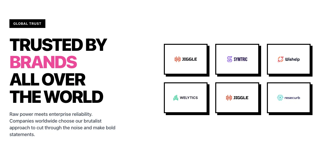
Four-Up Pink Logo Card Row with Hard Shadows

A horizontal row of four equal-sized pink rectangular cards, each with a black border and offset black drop shadow, containing a single company logo centered inside (Jiggle, Symtric, Wishelp, Resecurb). It reads as a client or partner logo strip with no visible navigation or interactive controls.

Logo clouds component #1
Logo clouds component #2
Logo clouds component #3
Logo clouds component #4
Logo clouds component #5
Logo clouds component #6
Logo clouds component #7
Logo clouds component #8
Logo clouds component #9
Logo clouds component #10
Logo clouds component #11
Logo clouds component #12

Your next website starts here

Design with AI and generate multiple website concepts in minutes. Make it yours with Shuffle: tweak every detail in a visual editor.
EXPORT CODE TO THE TECH YOU LOVE

Logo clouds from Casper

Tailwind Logo clouds Component

Dark Blue Hero with Headline and Company Logo Strip

A centered hero section on a dark navy gradient background featuring a large two-line headline 'Over 100+ Company Use Casper', a short subtext paragraph, and a horizontal row of gray partner company logos below. Decorative 3D and star graphics flank the top corners.

Logo clouds component #1
Logo clouds component #2
Logo clouds component #3
Logo clouds component #4
Logo clouds component #5

Logo clouds from Mirga

Tailwind Logo clouds Component

Partner logo showcase card with 'Trusted by brands all over' heading

A white rounded card on a light gray background with a small 'Our Partners' label, a large heading 'Trusted by brands all over:', and a horizontal row of partner logos including DocuSign, Maze, and Lander, cropped at the right edge. It uses social proof to build trust in a marketing context.

Logo clouds component #1
Logo clouds component #2
Logo clouds component #3
Logo clouds component #4
Logo clouds component #5
Logo clouds component #6
Logo clouds component #7

Logo clouds from Flow

Tailwind Logo clouds Component

Partner logo strip with trust heading

A horizontal row of grayscale placeholder partner logos beside a short heading reading 'Global partners that trusted us'. It is used to display social proof on a white background.

Logo clouds component #1
Logo clouds component #2
Logo clouds component #3
Logo clouds component #4
Logo clouds component #5
Logo clouds component #6
Logo clouds component #7
Logo clouds component #8
Logo clouds component #9
Logo clouds component #10
Logo clouds component #11
Logo clouds component #12
Logo clouds component #13
Logo clouds component #14
Logo clouds component #15

Logo clouds from Vista

Tailwind Logo clouds Component

Dark Logo Cloud with Tagline

A dark-background section with a short centered tagline and a two-row grid of eight white partner or customer logos. It functions as social proof with no visible navigation, forms, or interactive controls.

Logo clouds component #1
Logo clouds component #2
Logo clouds component #3
Logo clouds component #4
Logo clouds component #5
Logo clouds component #6
Logo clouds component #7
Logo clouds component #8
Logo clouds component #9
Logo clouds component #10
Logo clouds component #11
Logo clouds component #12
Logo clouds component #13
Logo clouds component #14
Logo clouds component #15

Logo clouds from Cyber

Tailwind Logo clouds Component

Dark Logo Card Row with Four Company Logos

A horizontal row of four equal-sized dark cards, each containing a white company logo (Jiggle, Symtric, Wishelp, Resecurb) with thin gradient-colored borders. The row is presented on a dark background and reads as a customer or partner logo showcase.

Logo clouds component #1
Logo clouds component #2
Logo clouds component #3
Logo clouds component #4
Logo clouds component #5
Logo clouds component #6
Logo clouds component #7
Logo clouds component #8

Logo clouds from FilyTreck

Tailwind Logo clouds Component

Dark Split Hero with Trusted Brand Logo Grid

A dark-background section with a bold heading, supporting paragraph, and blue Get started button on the left, paired with a 3x3 grid of rounded tiles displaying brand logos on the right. The layout is a split screen emphasizing social proof through partner or customer logos.

Logo clouds component #1
Logo clouds component #2
Logo clouds component #3
Logo clouds component #4
Logo clouds component #5

Logo clouds from Aurora

Tailwind Logo clouds Component

Trusted by the Best Logo Cloud on Dark Background

A dark-background social proof section with the heading 'TRUSTED BY THE BEST' above a two-row, four-column grid of white placeholder company logos. It is used to build trust by showing partner or customer brands.

Logo clouds component #1
Logo clouds component #2
Logo clouds component #3
Logo clouds component #4
Logo clouds component #5
Logo clouds component #6
Logo clouds component #7
Logo clouds component #8
Logo clouds component #9
Logo clouds component #10
Logo clouds component #11
Logo clouds component #12
Logo clouds component #13
Logo clouds component #14
Logo clouds component #15
Logo clouds component #16
Logo clouds component #17
Logo clouds component #18
Logo clouds component #19
Logo clouds component #20
Logo clouds component #21
Logo clouds component #22
Logo clouds component #23
Logo clouds component #24
Logo clouds component #25

Logo clouds from asitrastudio

Tailwind Logo clouds Component

Partners logo section with heading and sponsor link

A light-background section with a large heading "Meet our partners" and a text link "I will become a sponsor" on the left, paired with a two-row grid of eight partner logos (YouTube, Visa, IKEA, Microsoft, Amazon, PayPal) on the right. It functions as a social proof strip for sponsors and partners.

Logo clouds component #1
Logo clouds component #2
Logo clouds component #3
Logo clouds component #4
Logo clouds component #5

Logo clouds from Coleos

Tailwind Logo clouds Component

Logo Strip with Oracle, Google, Meta, and Amazon

A horizontal row of four company logos displayed on a light gray rounded panel, likely used as social proof or customer/partner logos. The logos are evenly spaced with no headings, text, or interactive controls visible.

Logo clouds component #1
Logo clouds component #2
Logo clouds component #3
Logo clouds component #4
Logo clouds component #5
Logo clouds component #6
Logo clouds component #7
Logo clouds component #8
Logo clouds component #9
Logo clouds component #10
Logo clouds component #11
Logo clouds component #12
Logo clouds component #13
Logo clouds component #14
Logo clouds component #15
Logo clouds component #16
Logo clouds component #17
Logo clouds component #18
Logo clouds component #19
Logo clouds component #20
Logo clouds component #21
Logo clouds component #22
Logo clouds component #23
Logo clouds component #24

Logo clouds from Consulty

Tailwind Logo clouds Component

Trusted-by logo strip with 2400+ brands

A centered social-proof section with a short 'Trusted by 2400+ brands & companies worldwide' heading above a horizontal row of five placeholder company logos. It uses a minimal white background to build trust through customer logos.

Logo clouds component #1
Logo clouds component #2
Logo clouds component #3
Logo clouds component #4

Logo clouds from Suncealand

Tailwind Logo clouds Component

Trust Logo Strip with 'Trusted by 400+ global brands' Heading

A horizontal strip on a cream background with a centered heading reading 'Trusted by 400+ global brands' above a row of five customer logos (Barclays, Spotify, Zoopla, Okta, Miro). It is a social-proof section with no interactive controls.

Logo clouds component #1
Logo clouds component #2
Logo clouds component #3
Logo clouds component #4
Logo clouds component #5
Logo clouds component #6

Showcase your best customers with Tailwind logo clouds components. Skillfully integrate them into your website layout.

Choose from many variations of Tailwind components logo clouds. Presented here are variants available in various UI libraries. You will also find many other types of components that will be in the same style. Each library has been designed by a professional designer and coded by our team of developers.


Get access to all Tailwind components logo clouds, code and our editor. Try the demo for free.

The easiest way to create beautiful websites

Lifetime License

Create an account

OR USE EMAIL

We issue VAT invoices. Already have an account? Sign in

Why creators choose Shuffle

From idea to beautiful design in minutes.

Shuffle pairs an AI visual editor with 80+ UI libraries, so you can design, build and export production‑ready code without starting from scratch.

  • An AI Agent that builds with you Describe a page, watch it come to life, then fine-tune it visually or with a prompt.
  • Pick the best model for every task GPT-6 Astra, Claude Opus 5.5 and Gemini 3.8 in one place.
  • 13,400+ professionally designed components Prefer building by hand? Drag in pixel-perfect sections crafted by professional designers.
  • Export to the stack you love Tailwind CSS, Bootstrap, Next.js, Laravel, WordPress and beyond.
“Its AI-powered features have transformed how I work! Designing and building websites has become faster, easier, and far more efficient.”
Est. 2019
Helping web builders ship since 2019 7 years of steady development.

Make it yours with AI
Start with this component. Tell AI what to change.
Original
Preview the original component.
Your Version
Available when your generation is complete.
Code
Available when your generation is complete.
Original component

Add images & videos

Upload an asset, then tell AI how to use it.
How it works

Your uploaded file will be added directly to the generated component. After uploading, you can guide the AI on where exactly to use it, e.g. as a logo or as a section image.
© 2026 Shuffle. All rights reserved.