Redirecting to PayPal

Tailwind CSS Hero section Components

Browse 366 ready-made Tailwind CSS hero section components from multiple UI libraries. Every variant is fully responsive – copy the code or customize it in the visual editor and export clean code.

Generate Hero section with AI

Hero section from Acros

Tailwind Hero section Component

Hero Section with Dark Background, Serif Heading, and Photo Collage

A hero section below a navigation bar featuring a dark background, a large serif headline, supporting text, a teal primary button and an outlined secondary button, with a tilted framed photograph on the right. The layout is split-screen with text on the left and image on the right.

Hero section component #1
Hero section component #2
Hero section component #3
Hero section component #4
Hero section component #5
Hero section component #6
Hero section component #7

Hero section from Bendis

Tailwind Hero section Component

Hero Section with Navigation Header and Client Logo Strip

A full-width landing page hero with a blue top navigation bar (logo, About, Company, Services, Testimonials, Sign in, Sign Up), a red abstract marbled background, a large centered headline, a yellow Get Started Free call-to-action button, and a white strip of client logos below. The header and hero are the outer component visible in the screenshot.

Hero section component #1
Hero section component #2
Hero section component #3
Hero section component #4
Hero section component #5
Hero section component #6
Hero section component #7

Hero section from Metis

Tailwind Hero section Component

Metis Hero Section with Dashboard Preview and Customer Logos

A landing page hero with a navigation bar, centered headline and subheading, two CTA buttons, and a faded dashboard illustration surrounded by pastel blobs. A row of muted company logos sits below the illustration as social proof.

Hero section component #1
Hero section component #2
Hero section component #3
Hero section component #4
Hero section component #5
Hero section component #6
Hero section component #7
Hero section component #8
Hero section component #9
Hero section component #10

Hero section from Shuffle UX

Tailwind Hero section Component

Split-screen hero with heading, body text, and two CTA buttons

A marketing hero section with a bold multi-line heading, supporting paragraph, and primary and secondary buttons on the left, paired with a large gray image placeholder on the right. A minimal navigation bar with a Contact Us button sits above, and a scroll-down chevron appears at the bottom.

Hero section component #1
Hero section component #2
Hero section component #3
Hero section component #4
Hero section component #5
Hero section component #6

Hero section from Cronos

Tailwind Hero section Component

Cronos Hero Section with Illustration and Trial CTA

A hero section for the Cronos brand with a navigation bar, a large green serif-style heading, supporting text, and two buttons on the left, paired with a flat illustration of people working with a laptop on the right. The layout is a split-screen with text left and illustration right on a cream background.

Hero section component #1
Hero section component #2
Hero section component #3
Hero section component #4
Hero section component #5
Hero section component #6
Hero section component #7
Hero section component #8
Hero section component #9
Hero section component #10
Hero section component #11
Hero section component #12
Hero section component #13
Hero section component #14
Hero section component #15
Hero section component #16
Hero section component #17
Hero section component #18
Hero section component #19
Hero section component #20
Hero section component #21
Hero section component #22
Hero section component #23

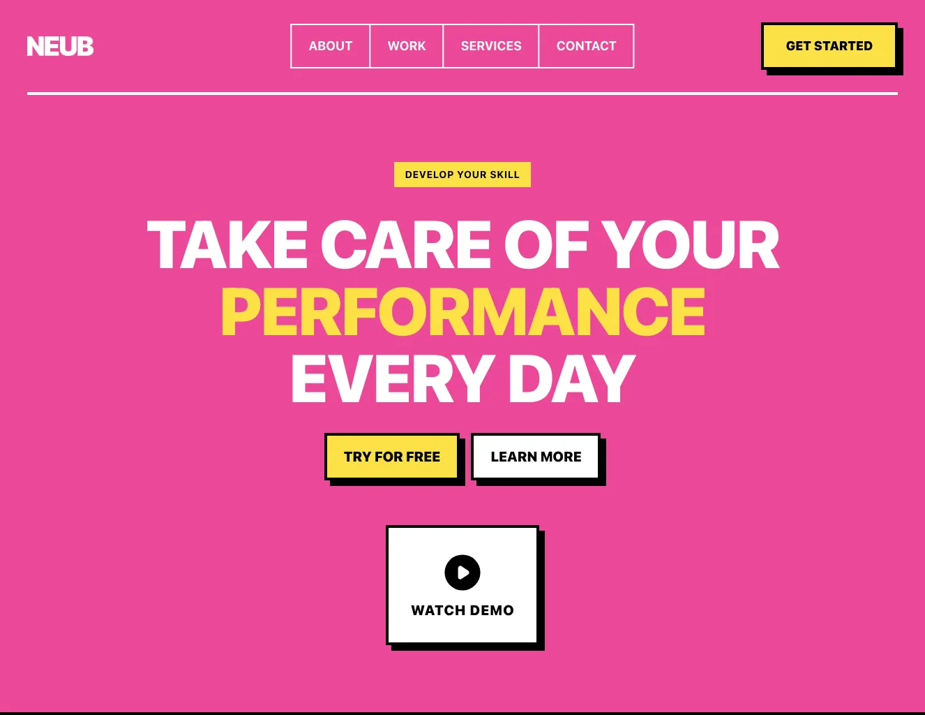
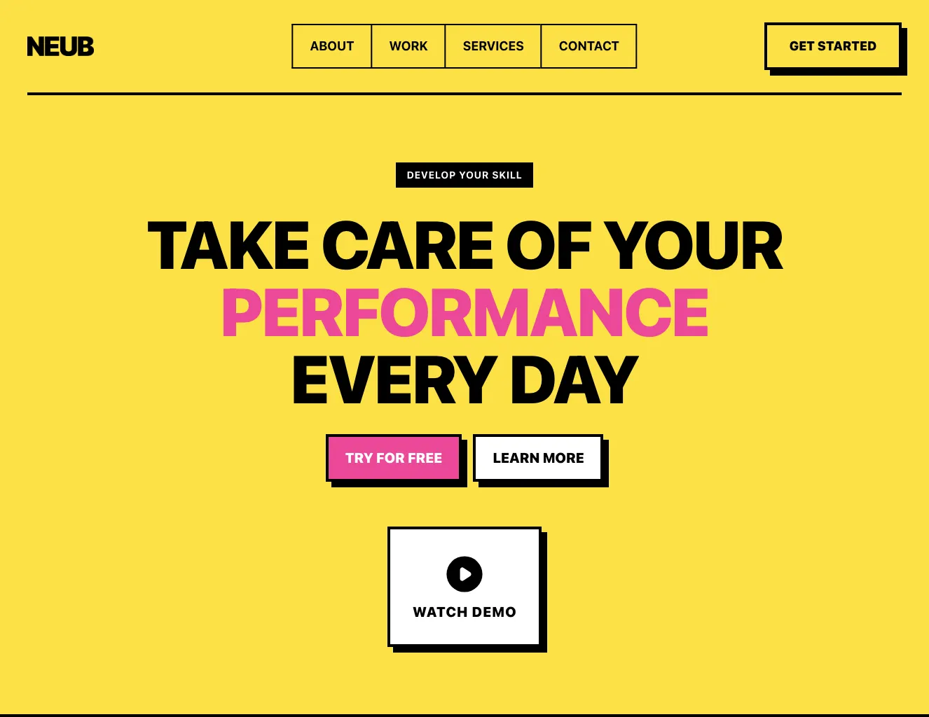
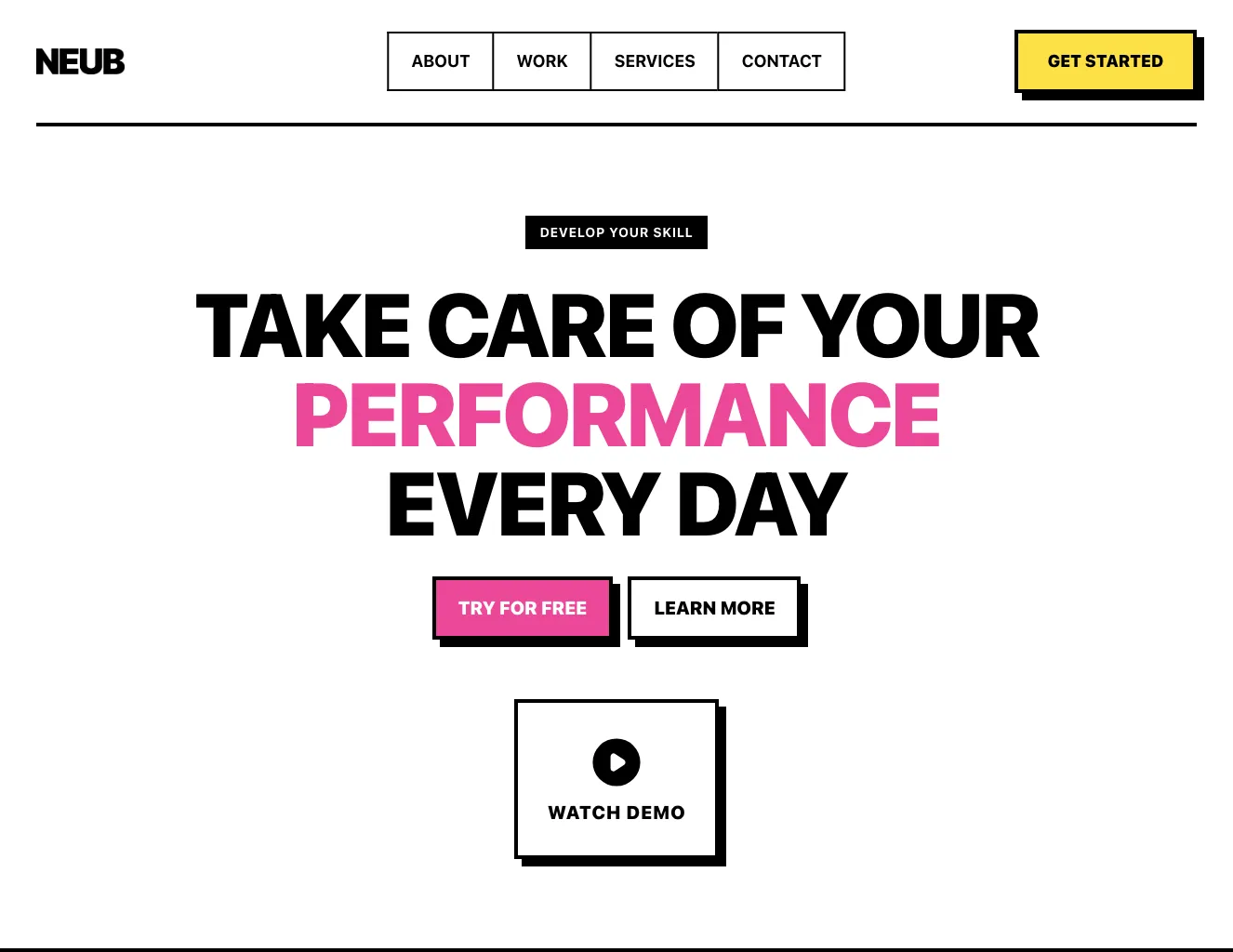
Hero section from NEUB

Tailwind Hero section Component

Neo-Brutalist Hero Section with Navigation and Stats

A full-width landing page header combining a bordered top navigation bar, a bold headline "BUILD BOLD INTERFACES" with CTA buttons, a framed photo with pink and yellow accent blocks, and a row of four statistics below. The layout is split between text on the left and an image on the right.

Hero section component #1
Hero section component #2
Hero section component #3
Hero section component #4
Hero section component #5
Hero section component #6
Hero section component #7
Hero section component #8
Hero section component #9
Hero section component #10
Hero section component #11
Hero section component #12
Hero section component #13
Hero section component #14
Hero section component #15
Hero section component #16
Hero section component #17
Hero section component #18

Hero section from Casper

Tailwind Hero section Component

Casper AI Hero with Four-Tile Tool Grid

A hero section with a large outlined and solid "CASPER AI" headline above a four-tile grid of AI tools (Chat Assistant, Image Optimizing, Video Editor, Content Copywriting), each with a numbered label and 3D illustration on a colored background. A navigation bar with Sign In and Sign Up buttons sits at the top.

Hero section component #1
Hero section component #2
Hero section component #3
Hero section component #4
Hero section component #5
Hero section component #6
Hero section component #7
Hero section component #8

Hero section from Mirga

Tailwind Hero section Component

Mirga Hero Section with Navigation and Feature Cards

A marketing landing page hero with a top navigation bar containing the Mirga logo, Login and Sign up free links, a large headline with a highlighted phrase, a Join now call-to-action, and a photo with a Watch video button. Below the hero are three cards showing a lecture promotion, a 88% royalties statistic, and a Unlocking Digital Potential heading with a link.

Hero section component #1
Hero section component #2
Hero section component #3
Hero section component #4
Hero section component #5
Hero section component #6
Hero section component #7

Hero section from Vista

Tailwind Hero section Component

Vista bookkeeping hero with dashboard preview

A dark-to-pink gradient hero section for a bookkeeping product, featuring a centered headline, a short subtitle, a Get started call to action, and a dashboard preview card showing accounts and overdue bills. Floating pink feature tags and avatar circles surround the headline.

Hero section component #1
Hero section component #2
Hero section component #3
Hero section component #4
Hero section component #5
Hero section component #6
Hero section component #7
Hero section component #8
Hero section component #9
Hero section component #10
Hero section component #11
Hero section component #12
Hero section component #13
Hero section component #14
Hero section component #15

Hero section from Flow

Tailwind Hero section Component

Flow Energy Hero with Navigation and EV Charging Showcase

A marketing hero section for a green energy company, with a top navigation bar, a large headline, supporting text, two CTA buttons, and a split layout showing a lime-green panel with a circular photo of a person charging an electric vehicle plus a floating parking/plug status card.

Hero section component #1
Hero section component #2
Hero section component #3
Hero section component #4
Hero section component #5
Hero section component #6
Hero section component #7
Hero section component #8
Hero section component #9
Hero section component #10
Hero section component #11
Hero section component #12
Hero section component #13
Hero section component #14
Hero section component #15

Hero section from Cyber

Tailwind Hero section Component

Dark Cyberpunk Hero with Neon Headline and Code Panel

A full-width dark hero section with a top navigation bar, a large neon-gradient headline "HACK THE FUTURE", supporting monospace text, two call-to-action buttons, and a framed code-editor illustration on the right. The layout is a split screen with text on the left and a visual panel on the right.

Hero section component #1
Hero section component #2
Hero section component #3
Hero section component #4
Hero section component #5
Hero section component #6

Hero section from FilyTreck

Tailwind Hero section Component

Split-screen hero with app download promotion and phone mockup

A landing page hero section for the FilyTreck productivity product, with a large headline and call-to-action on the left and a light gray panel on the right promoting the mobile app with App Store and Google Play badges and a phone device mockup. The top navigation bar includes links, Login and Get started buttons.

Hero section component #1
Hero section component #2
Hero section component #3
Hero section component #4
Hero section component #5

Hero section from Shopky

Tailwind Hero section Component

Shopky Fashion Hero with Navigation and Brand Logo Strip

A fashion storefront hero section beneath a top navigation bar with logo, links, search input, cart and account icons. It pairs a model photograph panel with a yellow promotional card headlined "Improve Your Style with Our Premium Collection" and a Shop Now button, followed by a row of brand logos.

Hero section component #1
Hero section component #2
Hero section component #3
Hero section component #4
Hero section component #5
Hero section component #6
Hero section component #7
Hero section component #8

Hero section from Vendia

Tailwind Hero section Component

Summer Collection Hero with Navigation Bar

A full-width hero section for an ecommerce site featuring a dark top navigation bar with logo, menu links, and cart icon, above a gradient yellow-to-blue background. It displays a large bold 'SUMMER COLLECTION' heading, supporting text, an 'Explore Collections' call-to-action link, and a cropped photo of a smiling woman in front of a white circle.

Hero section component #1
Hero section component #2
Hero section component #3
Hero section component #4
Hero section component #5
Hero section component #6
Hero section component #7
Hero section component #8
Hero section component #9
Hero section component #10

Hero section from Aurora

Tailwind Hero section Component

Aurora marketing hero with asset dashboard preview

A landing page hero section for Aurora, a marketing asset management product, with a navigation bar, promotional announcement pill, large centered headline, subheading, and a green 'Request Access' call to action. Below the CTA, a device-style preview shows an asset library dashboard with search, view toggles, avatars, and image cards.

Hero section component #1
Hero section component #2
Hero section component #3
Hero section component #4
Hero section component #5
Hero section component #6
Hero section component #7
Hero section component #8
Hero section component #9
Hero section component #10
Hero section component #11
Hero section component #12
Hero section component #13
Hero section component #14
Hero section component #15
Hero section component #16
Hero section component #17
Hero section component #18
Hero section component #19
Hero section component #20
Hero section component #21
Hero section component #22
Hero section component #23
Hero section component #24
Hero section component #25

Hero section from asitrastudio

Tailwind Hero section Component

Architecture Studio Hero with Headline and Image Gallery Preview

A light-background hero section for an architecture branding agency, with a large two-line headline, a short right-aligned agency description, a top navigation bar with a consultation button, and a row of rounded architectural photographs below a divider.

Hero section component #1
Hero section component #2
Hero section component #3
Hero section component #4
Hero section component #5

Hero section from Coleos

Tailwind Hero section Component

Dark Hero Banner with Headline, CTA Buttons, and Carousel Controls for Coleos Sport Shoes

A full-width dark hero section for an athletic footwear storefront, with a centered large headline, supporting paragraph, a primary purple "Start Buying" button, a secondary "Check our Catalog" link, and previous/next carousel arrows with pagination dots. A model photo sits on the left and a colorful sneaker on the right, with a top navigation bar above.

Hero section component #1
Hero section component #2
Hero section component #3
Hero section component #4
Hero section component #5
Hero section component #6
Hero section component #7
Hero section component #8
Hero section component #9
Hero section component #10
Hero section component #11
Hero section component #12
Hero section component #13
Hero section component #14
Hero section component #15

Hero section from Consulty

Tailwind Hero section Component

Consulty Hero Section with Navigation Bar and Consultation CTAs

A full-width hero section with a dark top navigation bar and a large headline over a photographic background of a seated person using a laptop. It includes a subtitle, primary orange and secondary white call-to-action buttons, and a row of three tab-style labels at the bottom.

Hero section component #1
Hero section component #2
Hero section component #3
Hero section component #4
Hero section component #5

Hero section from Suncealand

Tailwind Hero section Component

Dark Hero Section with Serif Headline and Audio App Illustration

A dark promotional hero section with a large serif headline 'Little things do make a difference.', a short subtext, and two call-to-action buttons (Get Started, Download). Illustrative device-style cards showing an audio level meter and a chat message interface sit to the left of the text.

Hero section component #1
Hero section component #2
Hero section component #3
Hero section component #4
Hero section component #5
Hero section component #6

Hero section from Sirius Dashboard

Tailwind Hero section Component

Analytics Dashboard Page Header with Action Buttons

A horizontal page header row showing a teal gauge icon, the heading "Analytics Dashboard", a supporting subtitle, and three action buttons: Export, Settings, and a primary blue Download Report button. It serves as a header bar for an analytics dashboard view with rounded, outlined controls.

Hero section component #1
Hero section component #2
Hero section component #3
Hero section component #4
Hero section component #5
Hero section component #6
Hero section component #7
Hero section component #8
Hero section component #9
Hero section component #10
Hero section component #11

The header is the section at the very top of the page. It is not just a navigation bar, which you will find in another category. Tailwind header component is a combination of menu and layout of the first view available to the user. It is a critical section in the viewer's interaction with the page. It determines whether the user stays and explores its content or abandons the session. That is why in Shuffle components we pay great attention to aesthetics and visibility of key information.


Choose from many variations of Tailwind headers. Presented here are variants available in various UI libraries. You will also find many other types of components that will be in the same style. Each library has been designed by a professional designer and coded by our team of developers.


Get access to all Tailwind headers, code and our editor. Try the demo for free!

The easiest way to create beautiful websites

The selected plan includes lifetime access to Shuffle Editor.

Lifetime License

Create an account

OR USE EMAIL

VAT included where applicable. Invoices provided.

Why creators choose Shuffle

From idea to beautiful design in minutes.

Shuffle pairs an AI visual editor with 80+ UI libraries, so you can design, build and export production‑ready code without starting from scratch.

  • An AI Agent that builds with you Describe a page, watch it come to life, then fine-tune it visually or with a prompt.
  • Pick the best model for every task GPT-6 Astra, Claude Opus 5.5 and Gemini 4 Argon in one place.
  • 13,400+ professionally designed components Prefer building by hand? Drag in pixel-perfect sections crafted by professional designers.
  • Export to the stack you love Next.js, Astro, Laravel, WordPress, Shopify, static HTML and beyond.
“Its AI-powered features have transformed how I work! Designing and building websites has become faster, easier, and far more efficient.”
Est. 2019
Helping web builders ship since 2019 7 years of steady development.

Make it yours with AI

Start with this component. Tell AI what to change.

Original
Preview the original component.
Your Version
Available when your generation is complete.
Code
Available when your generation is complete.
Original component

Add images & videos

Upload an asset, then tell AI how to use it.

How it works

Your uploaded file will be added directly to the generated component. After uploading, you can guide the AI on where exactly to use it, e.g. as a logo or as a section image.

© 2026 Shuffle. All rights reserved.