Browse 319 ready-made Tailwind CSS components from the Nigodo UI library. Every variant is fully responsive – copy the code or customize it in the visual editor and export clean code.
 Tailwind CSS
 Nigodo
Full Shuffle Editor access for just $10
Great for quick projects and for testing everything Shuffle can do. One-time payment, not a subscription.
Get 7-Day PassNew to Shuffle? Try our tools:

Create a free account to copy production-ready code from every component in the library.
Free account · No credit card · No password needed
Already have an account? Sign in
A centered error state displaying an ERROR 404 badge, a bold 'Page not found' heading, a short explanatory line, and two action buttons: a filled 'Go back to Homepage' button and an outlined 'Try Again' button. The layout is a vertically stacked, centered block on a white background with navy text and a teal badge accent.

Create a free account to copy production-ready code from every component in the library.
Free account · No credit card · No password needed
Already have an account? Sign in
A centered authentication card titled 'Sign in' with email and password fields, a remember-me checkbox, a forgot-password link, a primary sign-in button, and a sign-up link. The form is stacked vertically on a plain light background with a small logo at the top.

Create a free account to copy production-ready code from every component in the library.
Free account · No credit card · No password needed
Already have an account? Sign in
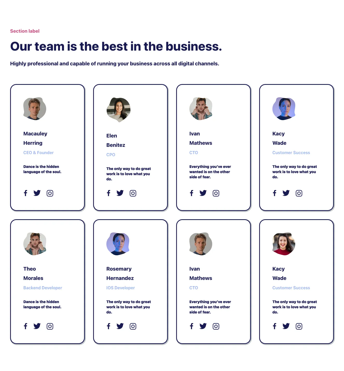
A marketing team section with a small pink section label, large heading, and subheading above an 8-card grid in a 4-column layout. Each card shows an avatar, name, role, quote, and social icons inside outlined navy borders with offset shadows.

Create a free account to copy production-ready code from every component in the library.
Free account · No credit card · No password needed
Already have an account? Sign in

Create a free account to copy production-ready code from every component in the library.
Free account · No credit card · No password needed
Already have an account? Sign in
A centered marketing-style newsletter signup block on a white background, with a small eyebrow label, bold heading, supporting line, an email input paired with a dark navy Subscribe button, and a small privacy note beneath. It is designed to collect an email address for newsletter subscription.

Create a free account to copy production-ready code from every component in the library.
Free account · No credit card · No password needed
Already have an account? Sign in

Create a free account to copy production-ready code from every component in the library.
Free account · No credit card · No password needed
Already have an account? Sign in
A light, bordered notice asking users to accept third-party cookies for personalisation, with a policy link and two actions, Decline and Allow. The content is arranged horizontally with the message on the left and the buttons on the right.

Create a free account to copy production-ready code from every component in the library.
Free account · No credit card · No password needed
Already have an account? Sign in
A light footer section with a centered Nigodo logo, a horizontal row of navigation links (Product, Features, Pricing, Resources, Careers, Help, Privacy), and a copyright line below a divider. It provides bottom-of-page site navigation and company information.

Create a free account to copy production-ready code from every component in the library.
Free account · No credit card · No password needed
Already have an account? Sign in
A blog or news listing section with a heading, search input, category tabs, and a two-column grid of article cards each showing an image, category tag, author and date, title, excerpt, and Read More link. A Show more button sits below the grid.

Create a free account to copy production-ready code from every component in the library.
Free account · No credit card · No password needed
Already have an account? Sign in
A light-background footer with the Nigodo logo centered above a horizontal row of text links (Product, Features, Pricing, Resources, Careers, Help, Privacy) and a copyright line below a divider. Bordered by thin dark navy rules at top, middle, and bottom.

Create a free account to copy production-ready code from every component in the library.
Free account · No credit card · No password needed
Already have an account? Sign in
A marketing pricing section with a section label, heading, and subheading above three outlined plan cards showing tier name, price per month, billing note, feature checklist, and a Get Started button. The cards are arranged horizontally in a grid with a light background.

Create a free account to copy production-ready code from every component in the library.
Free account · No credit card · No password needed
Already have an account? Sign in

Create a free account to copy production-ready code from every component in the library.
Free account · No credit card · No password needed
Already have an account? Sign in

Create a free account to copy production-ready code from every component in the library.
Free account · No credit card · No password needed
Already have an account? Sign in

Create a free account to copy production-ready code from every component in the library.
Free account · No credit card · No password needed
Already have an account? Sign in
A row of three outlined cards, each with a circular icon at the top edge, a bold heading (Email, Phone, Office), supporting text, and a coral contact detail. The layout is a horizontal row of equal-width cards on a light background, used to present contact channels.

Create a free account to copy production-ready code from every component in the library.
Free account · No credit card · No password needed
Already have an account? Sign in

Create a free account to copy production-ready code from every component in the library.
Free account · No credit card · No password needed
Already have an account? Sign in

Create a free account to copy production-ready code from every component in the library.
Free account · No credit card · No password needed
Already have an account? Sign in
A marketing feature section with a small pink section label, a bold navy heading, and a subtitle above a 3x2 grid of outlined cards. Each card has a pastel blob icon, a bold title, and centered descriptive text describing CRM, analytics, team management, website building, app integration, and setup.

Create a free account to copy production-ready code from every component in the library.
Free account · No credit card · No password needed
Already have an account? Sign in
A horizontal row of three outlined cards showing Email, Phone, and Office contact details, each topped by a circular line icon overlapping the card border. The layout is a simple three-column grid with bold navy headings, placeholder subtext, and gray contact details.

Create a free account to copy production-ready code from every component in the library.
Free account · No credit card · No password needed
Already have an account? Sign in

Build websites faster with an AI Visual Editor



© 2026 Shuffle. All rights reserved.
See what you're getting before you commit.
Switch the editor to Grid and every page of your project appears side by side on one canvas. Arrange them freely, zoom in and out, and add as many new pages as you need in a few clicks.
Describe what you need in one chat and the Agent does the rest: it adds new sections, edits copy and styles, moves blocks around or removes them across your whole page. No modes, no switching, just tell it what to change.
Not quite there yet? Ask for tweaks like missing assets, your logo or other details, and regenerate the design without starting from scratch.
























