Browse 482 ready-made components from the Flex UI library. Every variant is fully responsive – copy the code or customize it in the visual editor and export clean code.
 Flex
Flex
Full Shuffle Editor access for just $10
Great for quick projects and for testing everything Shuffle can do. One-time payment, not a subscription.
Get 7-Day PassNew to Shuffle? Try our tools:

Create a free account to copy production-ready code from every component in the library.
Free account · No credit card · No password needed
Already have an account? Sign in

Create a free account to copy production-ready code from every component in the library.
Free account · No credit card · No password needed
Already have an account? Sign in


Create a free account to copy production-ready code from every component in the library.
Free account · No credit card · No password needed
Already have an account? Sign in

Create a free account to copy production-ready code from every component in the library.
Free account · No credit card · No password needed
Already have an account? Sign in
A centered marketing hero with an 'Application' eyebrow label, a bold heading, and a laptop device mockup displaying a dashboard screenshot with sidebar, chart, and tables. Supporting text and two call-to-action buttons (Learn More and About Us) sit below the mockup.

Create a free account to copy production-ready code from every component in the library.
Free account · No credit card · No password needed
Already have an account? Sign in

Create a free account to copy production-ready code from every component in the library.
Free account · No credit card · No password needed
Already have an account? Sign in
A horizontal row of five company logos beneath a light gray caption reading 'Trusted by the top companies in this industry'. The section uses social proof to build trust on a light background.

Create a free account to copy production-ready code from every component in the library.
Free account · No credit card · No password needed
Already have an account? Sign in

Create a free account to copy production-ready code from every component in the library.
Free account · No credit card · No password needed
Already have an account? Sign in

Create a free account to copy production-ready code from every component in the library.
Free account · No credit card · No password needed
Already have an account? Sign in

Create a free account to copy production-ready code from every component in the library.
Free account · No credit card · No password needed
Already have an account? Sign in

Create a free account to copy production-ready code from every component in the library.
Free account · No credit card · No password needed
Already have an account? Sign in
A centered dark-themed sign-in card with a logo, heading, email and password fields, a remember-me checkbox, forgot password link, green primary Sign In button, and sign-up prompt. Designed for account authentication with a minimal, spacious layout.
Create a free account to copy production-ready code from every component in the library.
Free account · No credit card · No password needed
Already have an account? Sign in
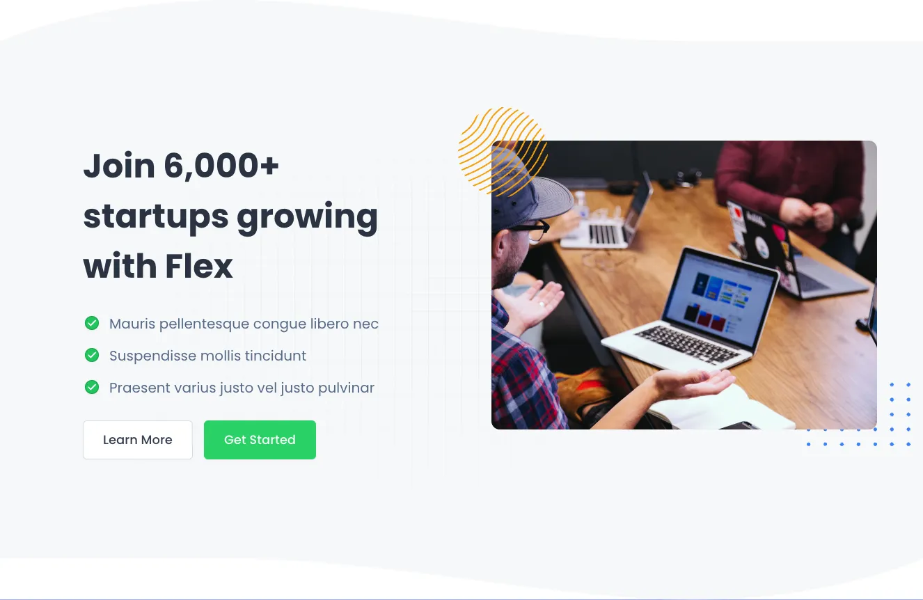
A landing page hero section with a bold multi-line heading, three green-checked feature bullets, and Learn More and Get Started buttons on the left, paired with a photograph of people working around a laptop on the right. Decorative yellow line-art and blue dot accents frame the image on a light gray background.

Create a free account to copy production-ready code from every component in the library.
Free account · No credit card · No password needed
Already have an account? Sign in
A light-background rich text marketing block for a SaaS business platform, with a small green label, a large bold heading, a subheading, and body paragraphs split across two columns. It contains no buttons, images, or interactive controls.

Create a free account to copy production-ready code from every component in the library.
Free account · No credit card · No password needed
Already have an account? Sign in
A centered testimonial section on a dark slate background with a green 'QUOTES' label, a large white quotation, a circular author avatar, name and title, and three pagination dots indicating a slider. Decorative oversized quote marks and wavy edges frame the content.

Create a free account to copy production-ready code from every component in the library.
Free account · No credit card · No password needed
Already have an account? Sign in
A centered authentication card on a light background with a logo, heading, email and password fields, remember-me checkbox, forgot-password link, full-width green Sign In button, and sign-up link. The layout is a single vertical stack focused on account login.

Create a free account to copy production-ready code from every component in the library.
Free account · No credit card · No password needed
Already have an account? Sign in
A full-screen dark error state showing an 'Error 404' badge, a 'Page not found' heading, a brief apology message, and two buttons to return home or retry. Decorative colored line and dot patterns frame the corners.

Create a free account to copy production-ready code from every component in the library.
Free account · No credit card · No password needed
Already have an account? Sign in
A full-width yellow-toned alert banner displaying a bold heading 'Attention alert example', supporting body text, a warning triangle icon, and a close (X) control at the right edge. It conveys a cautionary status message in a single horizontal row.

Create a free account to copy production-ready code from every component in the library.
Free account · No credit card · No password needed
Already have an account? Sign in
A light, centered hero section with a bold heading, a two-line supporting paragraph, and a single green "Get Started" call-to-action button. It introduces a small SaaS business with minimal decoration and no imagery.

Create a free account to copy production-ready code from every component in the library.
Free account · No credit card · No password needed
Already have an account? Sign in
A marketing feature section with a small eyebrow label, a large two-line heading, and a two-column grid of four numbered steps with green circular markers, short headings, and descriptive text. A photo of a woman sketching wireframes on a whiteboard sits on the left with decorative yellow line art and blue dot patterns.

Create a free account to copy production-ready code from every component in the library.
Free account · No credit card · No password needed
Already have an account? Sign in
A single white rounded card with a bold heading 'Card heading title', a three-dot overflow menu at top right, a thin divider, and a large light gray placeholder block below. The layout is a single vertical stack with minimal styling.

Build websites faster with an AI Visual Editor



© 2026 Shuffle. All rights reserved.
See what you're getting before you commit.
Switch the editor to Grid and every page of your project appears side by side on one canvas. Arrange them freely, zoom in and out, and add as many new pages as you need in a few clicks.
Describe what you need in one chat and the Agent does the rest: it adds new sections, edits copy and styles, moves blocks around or removes them across your whole page. No modes, no switching, just tell it what to change.
Not quite there yet? Ask for tweaks like missing assets, your logo or other details, and regenerate the design without starting from scratch.

























