Redirecting to PayPal

Tailwind CSS Components – Flex Library

Browse 345 ready-made Tailwind CSS components from the Flex UI library. Every variant is fully responsive – copy the code or customize it in the visual editor and export clean code.

Tailwind Component #121

Tailwind Component

Personal info account settings form

A settings form for editing personal information, including name, email, photo upload, role, country, timezone, domain fields, and bio. It has a header with Cancel and Save buttons and uses a white card with labeled rows separated by thin dividers.

Tailwind Component #122

Tailwind Component

Tailwind Component #123

Tailwind Component

Tailwind Component #124

Tailwind Component

Tailwind Component #125

Tailwind Component

Tailwind Component #126

Tailwind Component

Task distribution pie chart card with new and completed task stats

A white card titled Task distribution showing a blue pie chart split into Frontend, Backend, and Management segments with a legend below. A footer row displays two summary metrics: 1024 new tasks and 442 completed tasks.

Tailwind Component #127

Tailwind Component

Tailwind Component #128

Tailwind Component

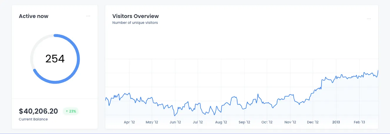
Analytics Dashboard Cards: Active Users and Visitors Overview

A dashboard section with two white cards on a light background: a left card showing a circular gauge of 254 active users and a current balance, and a right card with a line chart of unique visitors across months. The layout places a narrow stat card beside a wide chart card with minimal borders and subtle grid lines.

Tailwind Component #129

Tailwind Component

Tailwind Component #130

Tailwind Component

App showcase section with laptop dashboard mockup and CTA buttons

A centered marketing section headed 'Great work starts with your app' featuring a laptop mockup of a Flex analytics dashboard, followed by a short philosophy paragraph and Learn More and About Us buttons. The section uses decorative orange stripes and blue dot grids on a light background.

Tailwind Component #131

Tailwind Component

Repeated profile cards with avatar, name, email, Message button, and stats

A row of four identical white profile cards, each showing a circular avatar, name, email, a green Message button with envelope icon, and a footer with Posts, Following, and Followers counts. The layout is a horizontal grid of user profile cards with a light background.

Tailwind Component #132

Tailwind Component

Tailwind Component #133

Tailwind Component

Error 404 Page Not Found Screen with Homepage and Retry Buttons

A full-page error state displaying an Error 404 badge, a bold 'Page not found' heading, supporting text, and two action buttons: a green primary button to return to the homepage and an outlined secondary Try Again button. Decorative colored line and dot patterns frame the corners on a light background.

Tailwind Component #134

Tailwind Component

Page header with heading, description, and action buttons

A page header row showing a bold heading and short supporting text on the left, with three action buttons on the right: an outlined button, a green filled button, and a dark icon-only plus button. Simple, horizontal layout suited to dashboard or admin page headers.

Tailwind Component #135

Tailwind Component

Tailwind Component #136

Tailwind Component

Tailwind Component #137

Tailwind Component

Tailwind Component #138

Tailwind Component

Tailwind Component #139

Tailwind Component

Tailwind Component #140

Tailwind Component

The easiest way to create beautiful websites

The selected plan includes lifetime access to Shuffle Editor.

Lifetime License

Create an account

OR USE EMAIL

VAT included where applicable. Invoices provided.

Why creators choose Shuffle

From idea to beautiful design in minutes.

Shuffle pairs an AI visual editor with 80+ UI libraries, so you can design, build and export production‑ready code without starting from scratch.

  • An AI Agent that builds with you Describe a page, watch it come to life, then fine-tune it visually or with a prompt.
  • Pick the best model for every task GPT-6 Astra, Claude Opus 5.5 and Gemini 4 Argon in one place.
  • 13,400+ professionally designed components Prefer building by hand? Drag in pixel-perfect sections crafted by professional designers.
  • Export to the stack you love Next.js, Astro, Laravel, WordPress, Shopify, static HTML and beyond.
“Its AI-powered features have transformed how I work! Designing and building websites has become faster, easier, and far more efficient.”
Est. 2019
Helping web builders ship since 2019 7 years of steady development.

Make it yours with AI

Start with this component. Tell AI what to change.

Original
Preview the original component.
Your Version
Available when your generation is complete.
Code
Available when your generation is complete.
Original component

Add images & videos

Upload an asset, then tell AI how to use it.

How it works

Your uploaded file will be added directly to the generated component. After uploading, you can guide the AI on where exactly to use it, e.g. as a logo or as a section image.

© 2026 Shuffle. All rights reserved.