Redirecting to PayPal

Tailwind CSS Components – Cyber Library

Browse 110 ready-made Tailwind CSS components from the Cyber UI library. Every variant is fully responsive – copy the code or customize it in the visual editor and export clean code.

Tailwind Component #21

Tailwind Component

Dark-background skateboarding photo collage gallery

A dark-themed gallery of five skateboarding photographs arranged in a staggered grid, with images at slight rotations. The outer component is a photo collage showcasing skateboarding scenes such as graffiti walls, a concrete pipe, and a skate tunnel, with no visible navigation or controls.

Tailwind Component #22

Tailwind Component

Dark Logo Card Row with Four Company Logos

A horizontal row of four equal-sized dark cards, each containing a white company logo (Jiggle, Symtric, Wishelp, Resecurb) with thin gradient-colored borders. The row is presented on a dark background and reads as a customer or partner logo showcase.

Tailwind Component #23

Tailwind Component

Cyberpunk Gradient Email Subscription Banner

A dark, skewed banner with a gradient heading 'SUBSCRIBE TO FEED', supporting text, and an email input paired with a gradient 'EXECUTE' button. The parallelogram-shaped panel and monospace styling give it a futuristic, cyberpunk look.

Tailwind Component #24

Tailwind Component

Neural Network Archives Card Grid with Image Cards

A dark-themed grid of five content cards under a centered heading and monospace intro text, each card showing a photo, timestamp, bold title, short description, and an ACCESS DATA link with accent-colored text. The layout uses one wide card on the top row and smaller cards below, with a cyberpunk-styled presentation.

Tailwind Component #25

Tailwind Component

Cyberpunk 404 Error Page with Neural Pathway Message

A split-screen 404 error page on a dark background, with a glowing triangle graphic labeled 404 on the left and a heading, system error text, and two action buttons on the right. It uses neon cyan, purple, and green accents with monospace body text and a stylized error tag.

Tailwind Component #26

Tailwind Component

Quantum Protocol Architecture Feature Section with Numbered Steps

A dark-themed marketing feature section with a large gradient heading, a tilted photograph of a person in a circular concrete opening on the left, and four numbered step blocks with monospace descriptions arranged in a two-by-two grid on the right.

Tailwind Component #27

Tailwind Component

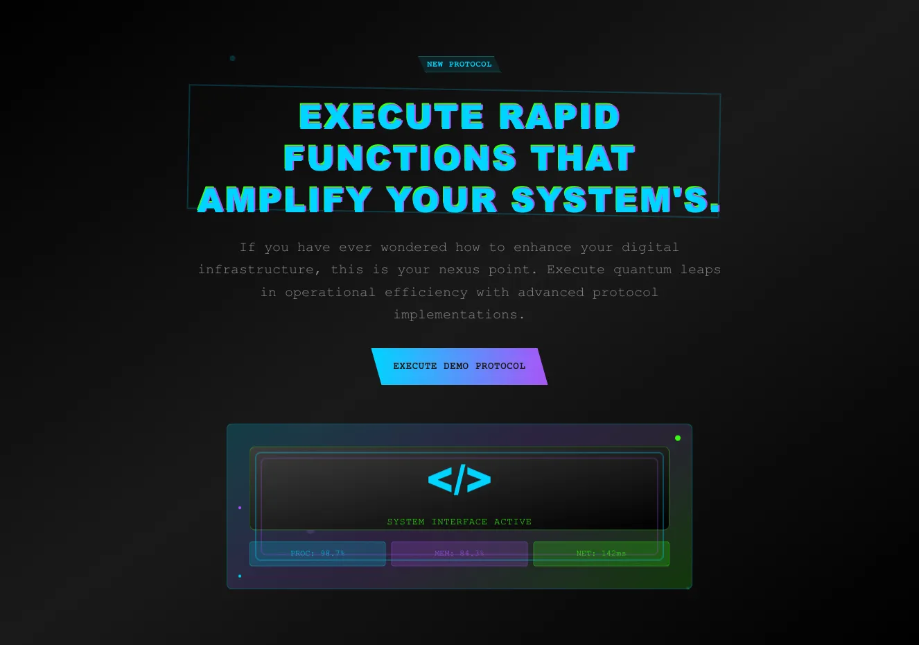
Dark Neon Hero Section with Glitch Heading and Demo CTA

A centered dark hero section with a small 'NEW PROTOCOL' badge, a large cyan-glitch uppercase heading inside an angled outline frame, monospace body text, and a gradient cyan-to-purple call-to-action button. A decorative code-interface panel with status metrics sits below the call to action.

Tailwind Component #28

Tailwind Component

Four Circular Progress Metric Stats on Dark Background

A horizontal row of four circular progress gauges, each showing a percentage with a bold uppercase label and monospaced subtitle, on a dark background. The gauges use distinct neon accent colors (cyan, purple, green, cyan) to visually separate the metrics.

Tailwind Component #29

Tailwind Component

Dark Sidebar Menu with Image Gallery Grid

A dark-themed layout with a vertical text menu on the left, where the active item NEURAL MATRIX is highlighted in cyan with an underline, and a grid of four photo cards on the right showing skateboarding imagery. The outer component is a navigation list paired with a photo card grid, with no visible CTA or form controls.

Tailwind Component #30

Tailwind Component

Neural Network Pricing Tiers with Pro and Premium Cards

A dark, cyberpunk-styled pricing section presenting two subscription tiers side by side, each with a price, feature checklist, and call-to-action button. A left-aligned heading and intro paragraph introduce the packages above the cards.

Tailwind Component #31

Tailwind Component

Dark Gradient Logo Card Row for Partner or Client Logos

A horizontal row of four dark, gradient-bordered rectangular cards each displaying a company logo such as Jiggle, Symtric, Wishelp, and Resecurb. The cards are evenly spaced on a near-black background and function as a logo showcase, likely for partners, clients, or integrations.

Tailwind Component #32

Tailwind Component

Dark Support Hero with Gradient Heading and Map Panel

A dark promotional hero section with a large gradient "NEED ASSISTANCE?" heading and monospace supporting text on the left, paired with a framed map illustration labeled GPS COORD LOCKED on the right. It invites users to contact support through a cyber-themed message, but no button or form is visible.

Tailwind Component #33

Tailwind Component

Neural Interface Protocols Data Entry Log Page

A dark-themed log entry page with a breadcrumb trail, a large gradient heading reading NEURAL INTERFACE PROTOCOLS, a user profile card for Danny Bailey with avatar and timestamp, and a hero photo of a skateboarder on a graffiti wall. Below, three stacked text panels present the log body in monospaced type.

Tailwind Component #34

Tailwind Component

Dark Site Footer with Logo, Navigation Links, Copyright, and Social Icons

A dark-themed footer bar showing a gradient <CYBER/> logo, uppercase navigation links (About, Company, Services, Testimonials), a copyright line, and five social media icons separated by a thin divider line above.

Tailwind Component #35

Tailwind Component

Cyberpunk Subscribe to Feed Newsletter Strip

A dark horizontal newsletter signup banner with a cyan heading "SUBSCRIBE TO FEED", a short descriptive paragraph, an email input field, and an "EXECUTE" submit button. Angled, skewed containers and gradient blue-to-purple accents give it a futuristic cyberpunk style.

Tailwind Component #36

Tailwind Component

Three-Column Feature Highlights with Glowing Icons on Dark Background

A dark-themed horizontal row of three feature items, each with a glowing gradient circular icon, a multicolor uppercase heading, and centered monospace descriptive text. It presents short feature descriptions without visible buttons, forms, or navigation.

Tailwind Component #37

Tailwind Component

Protocol Queries Access Terminal FAQ Accordion

A dark, futuristic header with a cyan monospace subtitle and bold heading, followed by a stack of five slanted accordion rows with uppercase question text and chevron indicators. The rows use dark gradient backgrounds with teal, purple, and green accents, forming a question-list section.

Tailwind Component #38

Tailwind Component

Dark Hero with Founder Name, Gradient Headline, and Tilted Portrait

A dark promotional hero section presenting CEO Danny Bailey with a gradient-colored multi-line headline and a slightly rotated portrait photo on a dark panel. Previous and next arrow buttons appear at the lower left, and the text is left-aligned beside the image.

Tailwind Component #39

Tailwind Component

Cyberpunk 404 Error Page Hero with Split Layout

A dark-themed 404 error section with a glitch-style headline, monospace error copy, and primary and secondary action buttons on the left, paired with a neon-gradient 404 panel and status badges on the right. The layout is split-screen and the styling is stylized with neon gradients, slanted shapes, and monospace typography.

Tailwind Component #40

Tailwind Component

Cyberpunk Sign-In Split Screen with Hero Heading and Login Form

A dark split-screen authentication section with a large glowing headline and descriptive text on the left, and a sign-in card on the right containing email and password fields, a gradient primary button, and social login buttons for Facebook and Twitter.

The easiest way to create beautiful websites

The selected plan includes lifetime access to Shuffle Editor.

Lifetime License

Create an account

OR USE EMAIL

VAT included where applicable. Invoices provided.

Why creators choose Shuffle

From idea to beautiful design in minutes.

Shuffle pairs an AI visual editor with 80+ UI libraries, so you can design, build and export production‑ready code without starting from scratch.

  • An AI Agent that builds with you Describe a page, watch it come to life, then fine-tune it visually or with a prompt.
  • Pick the best model for every task GPT-6 Astra, Claude Opus 5.5 and Gemini 4 Argon in one place.
  • 13,400+ professionally designed components Prefer building by hand? Drag in pixel-perfect sections crafted by professional designers.
  • Export to the stack you love Next.js, Astro, Laravel, WordPress, Shopify, static HTML and beyond.
“Its AI-powered features have transformed how I work! Designing and building websites has become faster, easier, and far more efficient.”
Est. 2019
Helping web builders ship since 2019 7 years of steady development.

Make it yours with AI

Start with this component. Tell AI what to change.

Original
Preview the original component.
Your Version
Available when your generation is complete.
Code
Available when your generation is complete.
Original component

Add images & videos

Upload an asset, then tell AI how to use it.

How it works

Your uploaded file will be added directly to the generated component. After uploading, you can guide the AI on where exactly to use it, e.g. as a logo or as a section image.

© 2026 Shuffle. All rights reserved.