Browse 110 ready-made components from the Cyber UI library. Every variant is fully responsive – copy the code or customize it in the visual editor and export clean code.
 Cyber
Cyber
Full Shuffle Editor access for just $10
Great for quick projects and for testing everything Shuffle can do. One-time payment, not a subscription.
Get 7-Day PassNew to Shuffle? Try our tools:

Create a free account to copy production-ready code from every component in the library.
Free account · No credit card · No password needed
Already have an account? Sign in
A dark-themed marketing feature section with a bold cyan headline, a short monospace intro paragraph, and a framed code-editor screenshot on the right. Six numbered steps in a three-column grid below describe system protocol features using parallelogram number badges.

Create a free account to copy production-ready code from every component in the library.
Free account · No credit card · No password needed
Already have an account? Sign in
A dark-themed card grid under a gradient display heading and monospace intro paragraph. Six bordered cards each show a timestamp, uppercase title, monospace body text, and a colored action link with a chevron.


Create a free account to copy production-ready code from every component in the library.
Free account · No credit card · No password needed
Already have an account? Sign in
A thin dark header bar with a search icon on the left, a centered gradient wordmark reading '<CYBER/>' in cyan-to-purple tones, and a hamburger menu icon on the right. The layout is a horizontal row with minimal decoration and a subtle scanline texture on a near-black background.

Create a free account to copy production-ready code from every component in the library.
Free account · No credit card · No password needed
Already have an account? Sign in
A full-width dark notification banner with a bold cyan heading, a monospaced explanatory paragraph about data cookies, and two action buttons: a gradient 'Allow Access' primary button and an outlined green 'Deny Protocol' secondary button. It is styled as a retro-futuristic cookie consent prompt.

Create a free account to copy production-ready code from every component in the library.
Free account · No credit card · No password needed
Already have an account? Sign in
A dark-themed hero section with a gradient-outlined heading "QUANTUM INTERFACE," a monospaced intro paragraph, three gradient-tinted feature labels with icons, and a framed code editor screenshot on the right. The layout is a split screen with text on the left and an illustrative image on the right.

Create a free account to copy production-ready code from every component in the library.
Free account · No credit card · No password needed
Already have an account? Sign in
A dark, neon-styled testimonial section with a monospace eyebrow label, a large cyan heading reading "System Testimonials Detected," and a single centered testimonial card featuring an avatar, name, title, and quote. Left and right gradient arrow buttons and pagination dots suggest a carousel for browsing testimonials.
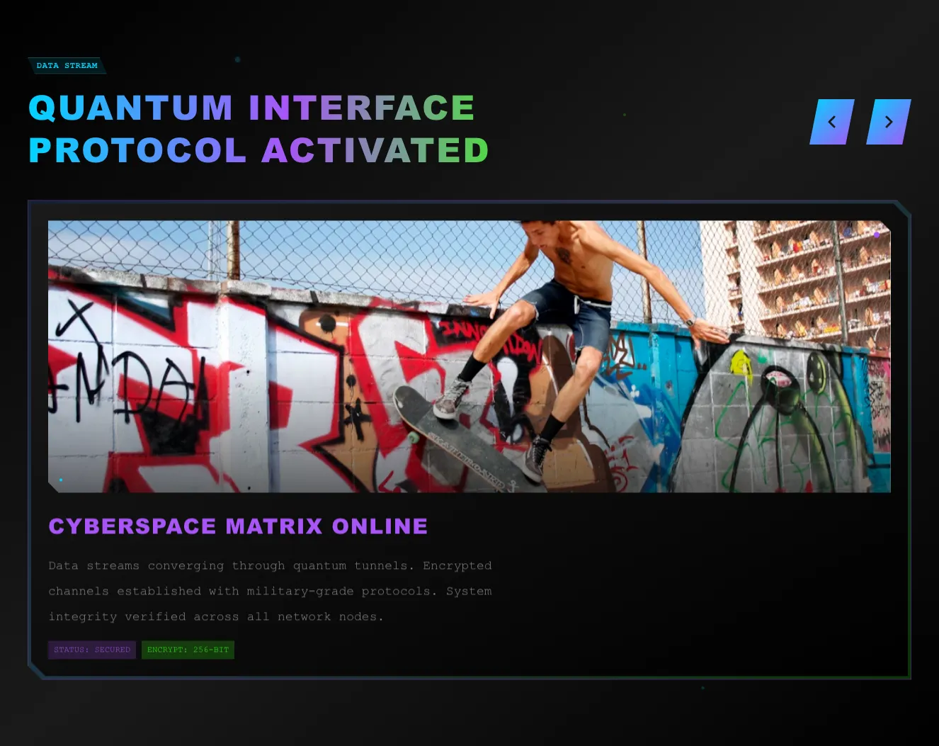
Create a free account to copy production-ready code from every component in the library.
Free account · No credit card · No password needed
Already have an account? Sign in

Create a free account to copy production-ready code from every component in the library.
Free account · No credit card · No password needed
Already have an account? Sign in

Create a free account to copy production-ready code from every component in the library.
Free account · No credit card · No password needed
Already have an account? Sign in

Create a free account to copy production-ready code from every component in the library.
Free account · No credit card · No password needed
Already have an account? Sign in

Create a free account to copy production-ready code from every component in the library.
Free account · No credit card · No password needed
Already have an account? Sign in

Create a free account to copy production-ready code from every component in the library.
Free account · No credit card · No password needed
Already have an account? Sign in

Create a free account to copy production-ready code from every component in the library.
Free account · No credit card · No password needed
Already have an account? Sign in

Create a free account to copy production-ready code from every component in the library.
Free account · No credit card · No password needed
Already have an account? Sign in

Create a free account to copy production-ready code from every component in the library.
Free account · No credit card · No password needed
Already have an account? Sign in

Create a free account to copy production-ready code from every component in the library.
Free account · No credit card · No password needed
Already have an account? Sign in

Create a free account to copy production-ready code from every component in the library.
Free account · No credit card · No password needed
Already have an account? Sign in

Create a free account to copy production-ready code from every component in the library.
Free account · No credit card · No password needed
Already have an account? Sign in

Create a free account to copy production-ready code from every component in the library.
Free account · No credit card · No password needed
Already have an account? Sign in

Create a free account to copy production-ready code from every component in the library.
Free account · No credit card · No password needed
Already have an account? Sign in

Build websites faster with an AI Visual Editor



© 2026 Shuffle. All rights reserved.
See what you're getting before you commit.
Switch the editor to Grid and every page of your project appears side by side on one canvas. Arrange them freely, zoom in and out, and add as many new pages as you need in a few clicks.
Describe what you need in one chat and the Agent does the rest: it adds new sections, edits copy and styles, moves blocks around or removes them across your whole page. No modes, no switching, just tell it what to change.
Not quite there yet? Ask for tweaks like missing assets, your logo or other details, and regenerate the design without starting from scratch.

























