Can't find the right component?
Describe it and Shuffle AI builds it in seconds, ready to edit and export.
Browse 2 ready-made Tailwind CSS tabs components from the Dashy UI library. Every variant is fully responsive – copy the code or customize it in the visual editor and export clean code.
Create a free account to copy production-ready code from every component in the library.
Free account · No credit card · No password needed
Already have an account? Sign in
Components are just the start. See how a project goes from prompt to production‑ready code with Shuffle.
A horizontal tab bar with icon and label items for My Account, Licenses, Products, and Transactions on a light gray background. The active tab uses darker text and a person icon, while inactive tabs appear in muted gray, indicating a settings or account management section switcher.
Choose from 2 variations of Tailwind Tabs components. Presented here are variants available in Dashy library.
Get access to all Tailwind Tabs components, code and our visual editor. Try the demo for free!
How you’ll build with Shuffle.
© 2026 Shuffle. All rights reserved.
See what you're getting before you commit.
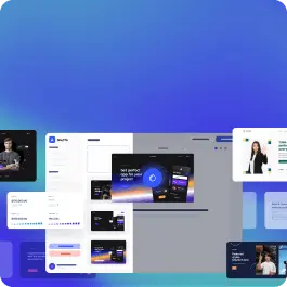
Switch the editor to Grid and every page of your project appears side by side on one canvas. Arrange them freely, zoom in and out, and add as many new pages as you need in a few clicks.
Describe what you need in one chat and the Agent does the rest: it adds new sections, edits copy and styles, moves blocks around or removes them across your whole page. No modes, no switching, just tell it what to change.
Not quite there yet? Ask for tweaks like missing assets, your logo or other details, and regenerate the design without starting from scratch.